The compromise of how Android and iOS 18 do themed icons

iOS 18 will add the ability for users to theme their home screen by setting all icons to a custom color tint. As someone who is familiar with the Android world as well, my natural reaction is to go, "ooh, how is this similar and different to how Android does it?" so I busted out the old Pixel 7 and took a look.
Android
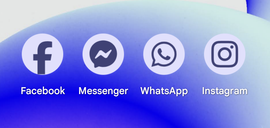
On Android, app developers need to submit their icons in a specific way to make them available for theming like this. If an app developer doesn't do this and just has an image file for an icon, then they won't get themed. What this ends up meaning is that icons that are set up for theming look great and those that are not stick out like a sore thumb.
The good news is that as far as I can tell, adoption of this is quite high, and even companies like Meta, which I've seen people suggest would never let their brand be changed, supports this and their icons look good.
So yeah, the highs are high and look good, but the lows are frustrating inconsistencies.
This tinting is a part of Material You, which actually themes much more of the system software than just icons, but we're focusing on home screens today.
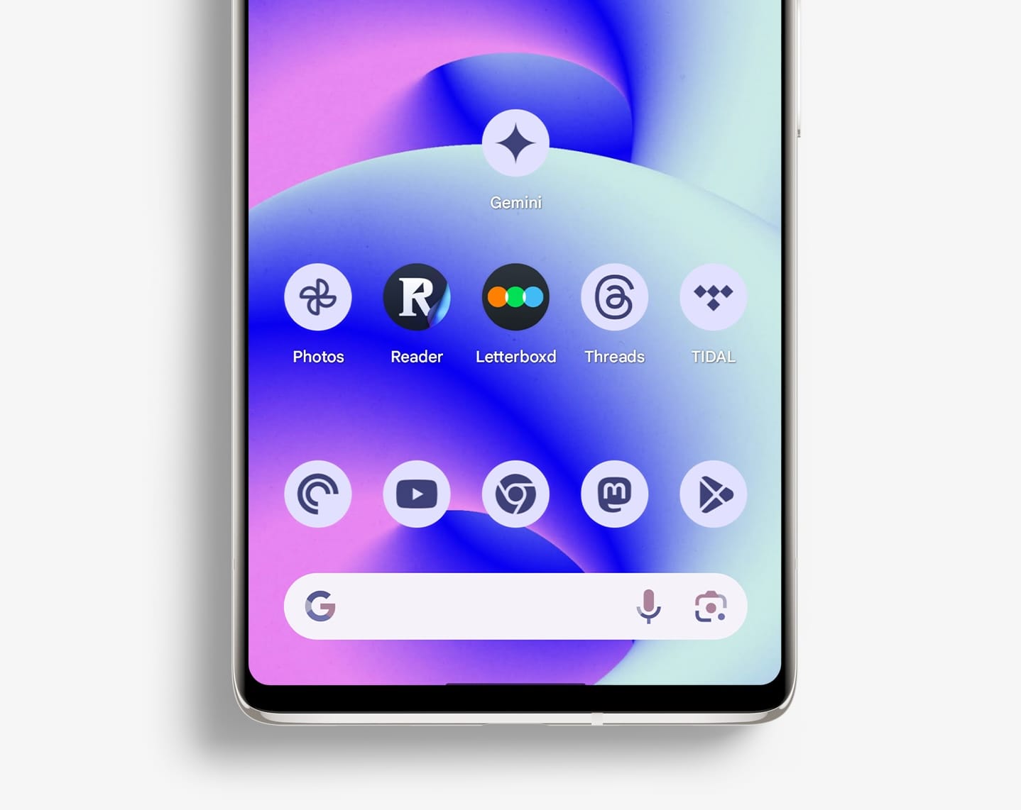
iOS 18
iOS 18 takes a different approach, in that it will change every single icon for you, no matter what. This removes the case above where apps like Letterboxd and Readwise Reader don't support theming, but in my view, also makes it so that every icon looks pretty bad.
Most of the icons are so low contrast and muddy looking that I don't think they look great. Apple is letting developers upload their icons in new formats to better take advantage of this feature, but honestly Apple's icons already do this and I don't think they look great either.
A big problem here for me is that tinting makes basically every icon background black. This kills the contrast for me and just gives me a look that I don't personally like.
Which is better?
Fanboys on both ends will hate this, but I think a combination of these approaches would be best. I do like that Apple's system enforces tinting across all apps. I'd love to live in a world where every app developer immediately supported a new icon format, but we don't live in that world, and we can see from the Android ecosystem that even years later, some devs will just never get around to it.
My beef with Apple's approach is just that I think it looks bad. I've seen some people on social media say that people like me just don't get it and that people want to customize their home screen to look what I think is ugly, but I think this argument pushes nuance out of the way in interest of implying, "Apple knows best, your opinion doesn't count." I don’t think that letting people set thing how they want is bad (I want to do this too), what I think is that these dark and dreary icons aren't what people are looking for. Just Google "aesthetic iphone" and see what comes up. Here's a collage of a few of the top image results I saw:
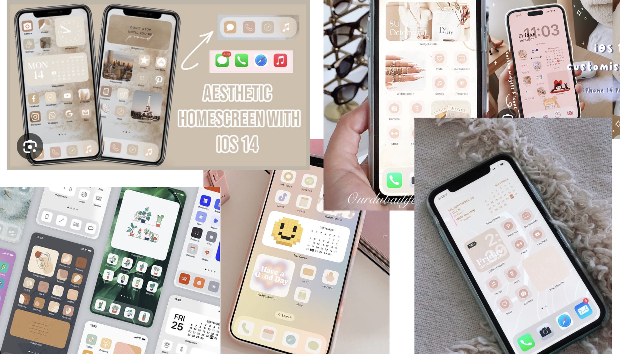
How many people were using black icons that look anything like what you can create in iOS 18 beta 1? I'm not seeing many, and my concern is that the current system mandates a specific style that will not resonate with many of the people this is theoretically made for.
What I'd love to see is Apple allow users to set a light or dark theme for their tinted icons. Then make it so that developers who adopt the new icon format get great icons that look more like what can be done on Android (Android supports a dark background option as well, for what it's worth), and then forcibly change the icons that still use PNG files for their icons. This would get us some consistency while also rewarding those developers who have upgraded to support theming more intentionally.
I'm hoping Apple iterates on this feature a decent amount between now and September when we expect iOS 18 to release to the public.