Just Some Tips Anyone Can Use to Level Up Their Design Game

— 15 min read

Below is a cleaned up transcript of a talk I recently gave at work to an audience of mostly developers. I used Claude (Opus) to clean up the transcript and have edited out some sections due to discussions of our internal systems.
Hello, everybody. Welcome to the very succinctly titled, "Just Some Tips Anyone Can Use to Level Up Their Design Game." This isn't going to be a very heady conversation about design. We're not going to talk about hard and fast rules or great theories about the practice or anything. What I wanted to do today, knowing the audience, especially developers who have varying levels of passion for design– I know some of you really love it– and I wanted to just give some tips that are good things to keep in mind while you're working on things. Because while oftentimes you're given an exact spec to work from and know exactly what to deliver, sometimes you're making decisions on your own, and I wanted to give some tips that might help with that.
I will lead off by saying a lot of this is just my opinion. Not all of it is hard and fast rules. You can feel free to riff on some of the things I'm going to say and you can disagree with some of them too. But in my experience, I found these to be pretty helpful tidbits.
So very, very quickly, what is design?

Is design having a very clean, neat workspace? Not really, although we tend to be those sorts of people. Does it mean finding the right– or not the right tools– the best tools, the newest tools, the most expensive tools to do things? Not really either. Is it staring at your computer screen wondering if you don't actually have imposter syndrome, but you are actually an imposter and don't know what you're doing? Yeah, it can be that.
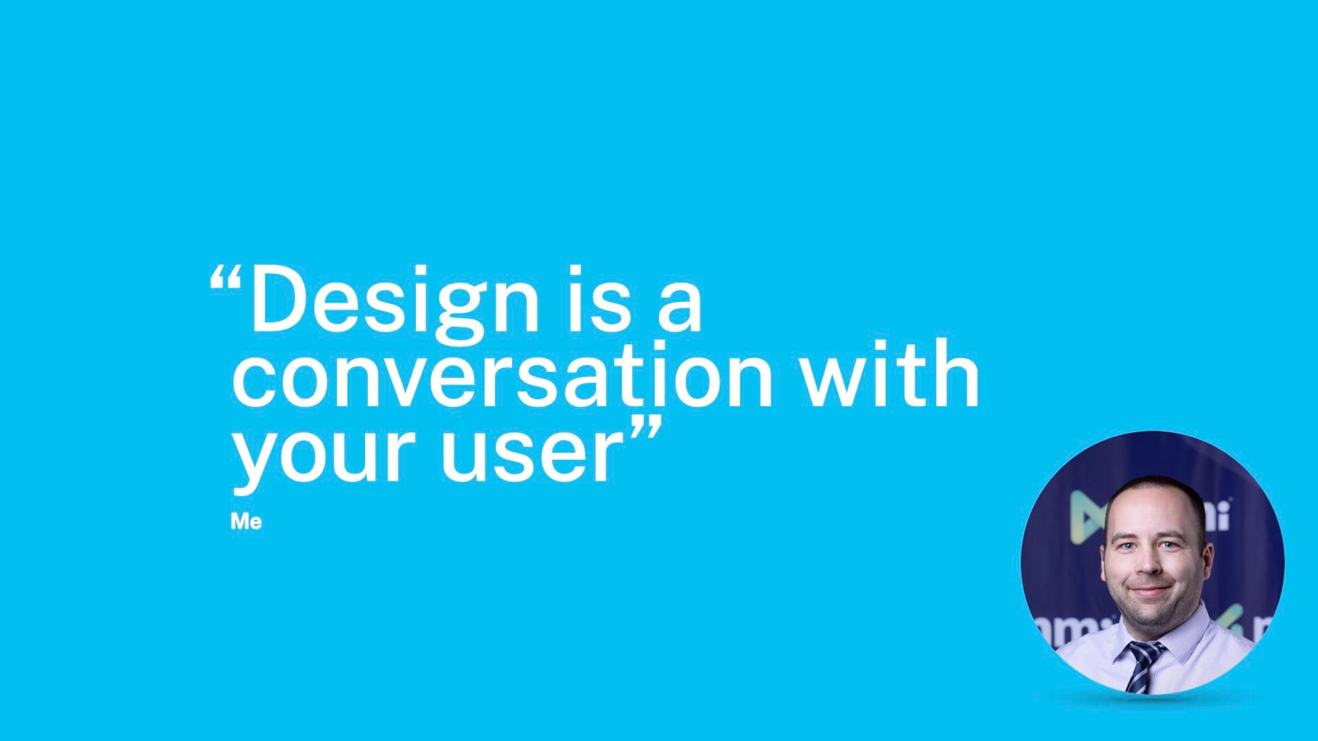
But the quote that I like for what is design is "design is a conversation with your user". If you are sitting next to someone at a computer and you know how to use the thing and they don't, it's very easy for you to say, click here, do this. When you click this, this is what's going to happen. It's very easy to do that. The goal of a good user interface is to give someone that experience without you having to be in the room with them. And so that's what we're trying to do all the time. I didn't cite this one, so I will mention– this is just a thing I've thought myself. It's very possible someone else has said something like this, but I think this is a pretty good way to look at design work most of the time.
So let's get into the tips, the things you can actually use. And we're going to start by saying some of this talk is pulled directly from the documentation. So you don't have to remember this presentation. You don't have to look for the slide deck. You don't have to look at the video recording to see what the tips were. A lot of this is just literally copy and pasted from our design system. And some of that will be pretty clear as we go.
Buttons

Let's start with buttons, which are the thing my family thinks I do all day.
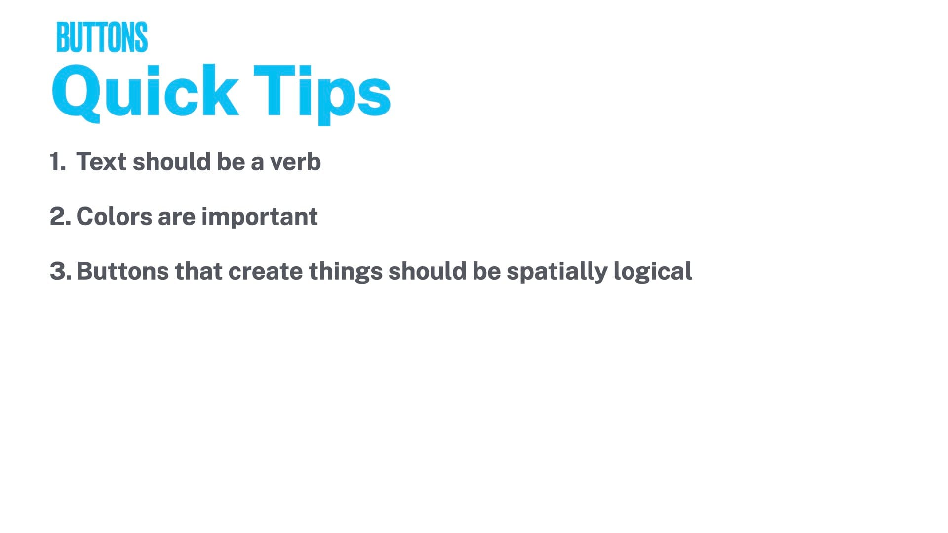
When you're thinking about what text to put on a button, the text should be a verb. If the user is going to perform an action when they click this, make it a verb. Things like OK generally aren't great.
Colors are important as well. This varies by design system. But NMI's one-platform design system uses colors to indicate what the button is going to do. We'll show some examples of that.
And finally, buttons that create things on the page should be spatially logical. So put the button where the thing will be added. Don't put a button in the top left that adds a thing to the bottom right of the page, for example.
So let's take a look at some good and bad examples of what I think button design is.
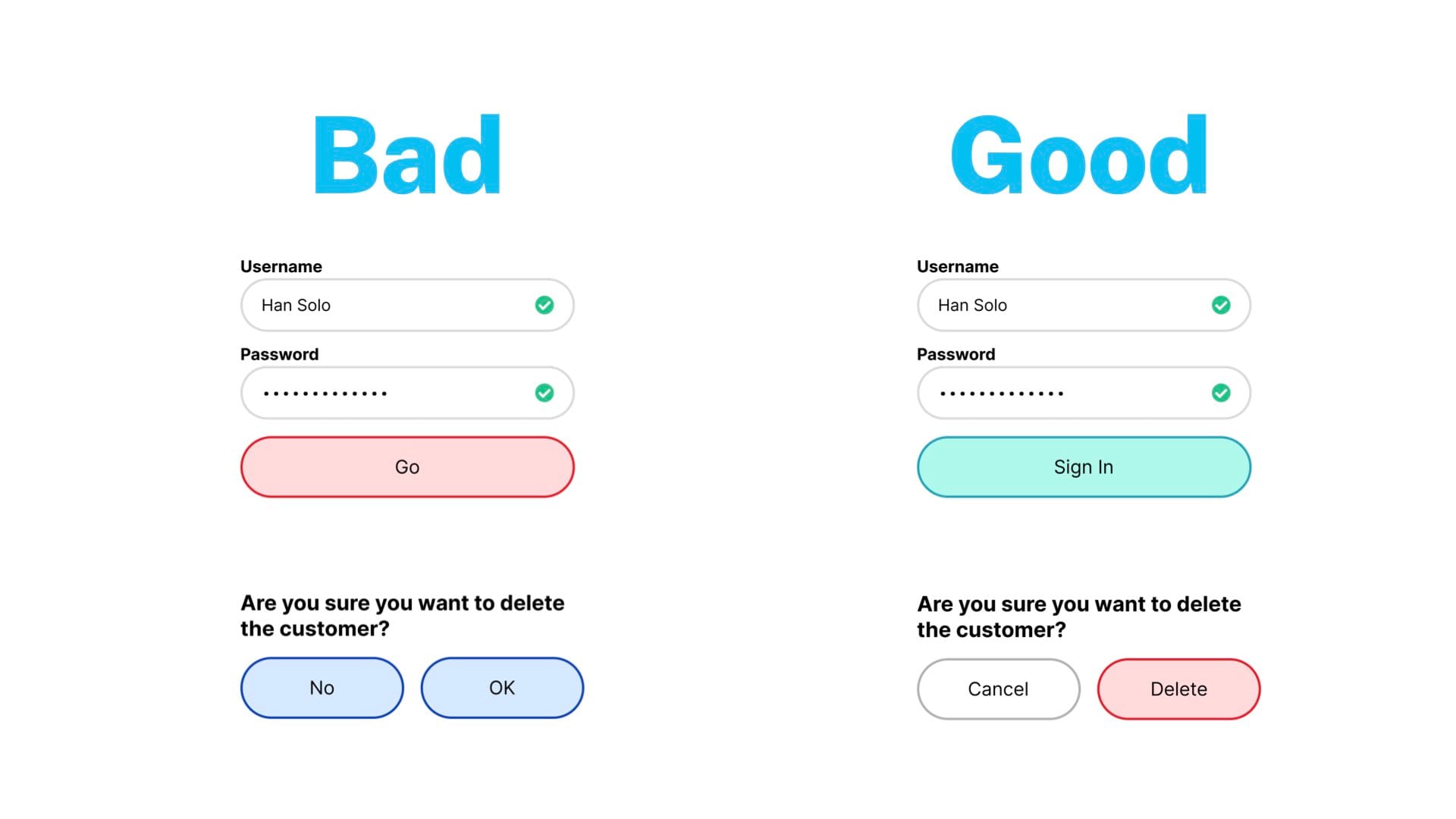
Ln the left, we have a login page, username, password. Now realizing the username has a space in it. So that's a goof, but here we are, we're doing it live.
But the button is what's interesting, and I think it's pretty clear what's wrong with this button. "Go" is a verb, but it's not very specific to the task at hand.
And red…unless this is the company's primary brand color and all of their buttons are red, you probably don't want to use a red for this situation.
On the right, I would recommend using a green button or a blue button in most cases, or again, the company's brand color. And then sign in is a more clear action than go. So what are you doing? You're signed in. The button says sign in. And then similarly, down below, there's kind of a confirmation box. Are you sure you want to delete the customer? No or OK? So I've already slandered OK as a message for a button. But I think it's bad here too. OK, I'm going to delete the customer, I guess. You're making the user do more thinking about what this is going to do. The color is also the same between these, so there's no hierarchy of which is the kind of confirmation action and which is the let's cancel out of this thing action.
Over on the right is how I would fix it. Delete is the action that you're doing. So that's the verb. And then cancel is a white button or a transparent or gray or whatever your kind of cancel state is and is clearly the secondary thing to not do what you're suggesting. Also red, again, a destructive action. Red is very good for those situations.
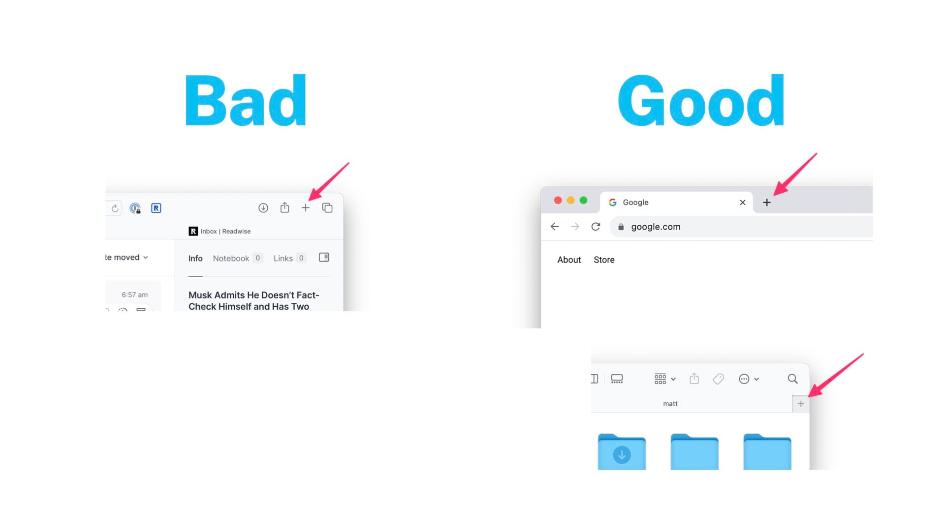
And then finally, the spatial situation. Over on the left, we have a screenshot of Safari where the new tab button is up in the control strip area. And it's not where the new tab goes. There it's pretty close, but that whole command bar is customizable so the user could actually throw it anywhere they want. It could be nowhere near where the new tabs go. Chrome is the screenshot on the right, and that does it, I would say, in a better way, spatially where the new tab is going to go. In fact, every other browser does it that way. And Safari used to do it that way. And Apple still does it in the Finder. As you can see in the screenshot at the bottom right, the new tab in the Finder is where the new tab goes. And I would say, in general, that is a more logical place for something like that to belong.
Modals

Now let's go to modals, which I have a particular passion for. I could probably do 30 minutes on just modals on their own. But in general, when you're building a modal alert that's going to pop up over the interface, you tend to be asking the user to confirm something. And when in doubt, the way I like to structure these is you have a header, a body, and actions. The header is where you ask the user a question. The body is where you give them context. And the ramifications of what's going to happen if they perform the action. And then at the bottom, you have the actions where you give the user the choice to do the thing or not. Or there could be more options.
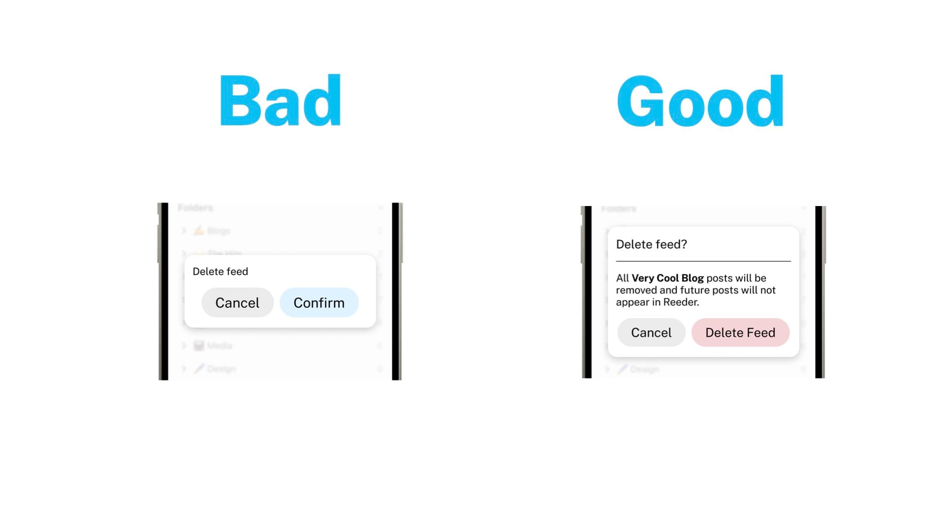
So here's an example, a good and bad example. Let's pretend this is like a feed reader app or news reader app, and you're deleting a feed. You hit the trash can icon or something, and you get this pop up to confirm, hey, you don't want this feed anymore. On the left, you can go back to the button issues I had in the previous section. But delete feed, is it the right one that I miss click on the wrong trash can icon? Am I deleting the feed that I want to keep? Unclear with this.
Over on the right, we have a header where we ask the question, do you want to delete the feed? We have the body where we describe it. And in this case, we're using dynamic text to show the name of the thing as well to confirm you know exactly which one you clicked on and what you're going to be doing. The ramifications, it'll be removed, and no future posts will appear. And then delete feed as the button text in red to show it's a destructive action. And what I like about this is that's a lot of text, honestly. It's maybe more than you need. But I'm using it to illustrate the point of how these work. But what I like about this is that no matter how much the user chooses to read in the modal on the right, they will know what's going to happen. If they literally just see the red button and say, see delete feed, they know it's going to happen when they click the button. They can look at the header. They can look at the body to get more info if they want. But even if they refuse to read all of your UI text, they'll be able to find the right thing. So that's a good modal.
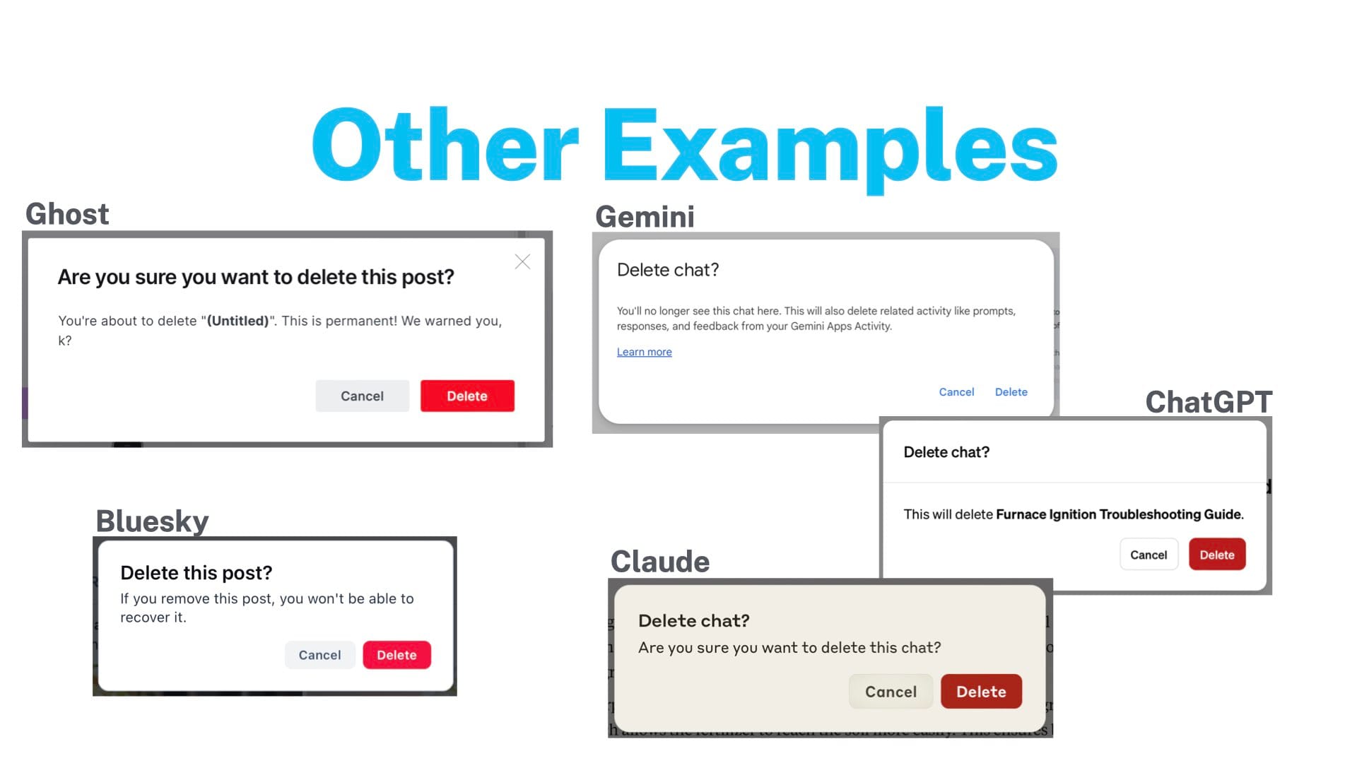
And then I went out to the web to find some more examples out there. And to my pleasure, basically everyone does this kind of setup, header, body, and then actions. And so we have two examples on the left. One is Ghost, which is a blogging platform, Blue Sky, a social network. They kind of do a similar thing. Ghost actually does almost exactly what I suggested. So love that.
And then I went to the robots and looked at Gemini, ChatGPT, and Claude to see how they did modals when deleting a chat. I think ChatGPT and Claude are good here. ChatGPT is a little better because they do dynamically put in the name of the chat. So you make sure you're deleting the right thing. And Google just kind of blows it. They have a header. They have text. But the text is not specific. It's not dynamic. It's pretty vague. And they've got a whole link to another website to tell you exactly what's going on. And then they commit the sin of your delete and cancel buttons are the exact same weight. So yeah, I don't prefer that. Maybe there's someone at Google who has a very good argument for why this is right. But I disagree with them.
Errors
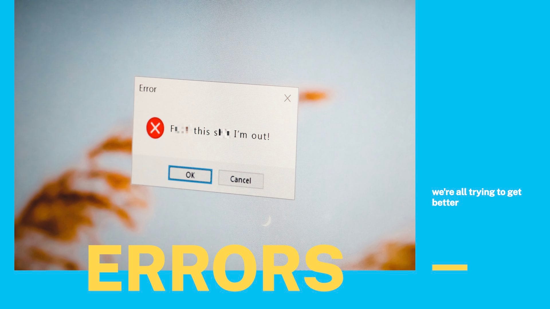
Now let's move on to error messages. So just a couple of quick tips for this. Whenever you are showing someone an error message, whether it be they're filling out a form or they tried to do something and it failed, you want to make sure three things are true.
- You first want to make sure that the user knows something went wrong in the first place. You don't want something to fail silently.
- You want to tell them what's wrong. They should know what they did wrong.
- And kind of related, number three, you should tell them how to fix it. So what did I do wrong? How do I fix it? And oh, yeah, there's something wrong in the first place to look at.
Edited out a segment looking and good and bad examples from our UI.
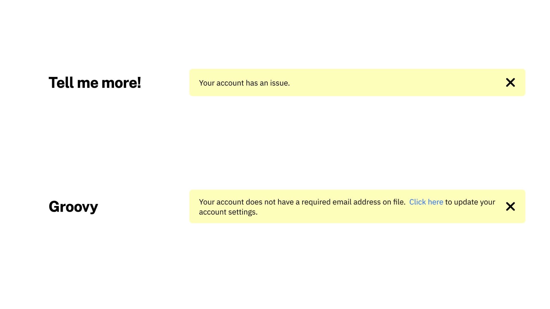
Similarly, you may have a situation where you need to show an alert on the page. And so this is an example. This is actually similar to something we did for the portal recently. You could do an alert that says your account has an issue. That's not good. I don't think we have this exact message somewhere, or maybe we do. But this is not helpful. It does tell them that something's wrong. But what is it? How do they fix it? No idea. Whereas the one on the bottom is much better. It tells them the issue. Your account does not have a required email address on file. Click here to update your account settings. So that gives them a one-click thing to go to a page to fix the thing that's wrong with their account. So the bottom one is– again, this one's pretty obvious. But it's much better to have all three of those bits. So again, for error messaging or danger alert messaging, make sure they know something's wrong. Tell them what's wrong, and tell them how to fix it.
Colors
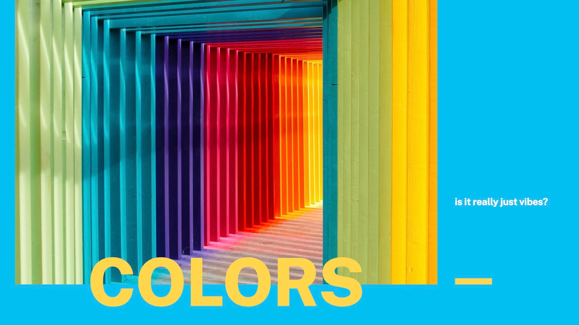
And then this is maybe my favorite section of the presentation, colors. So I have two things here. Number one is a tip about using color and using color only. And then I have a story about NMI's color system, which also tangents into my favorite thing about colors.
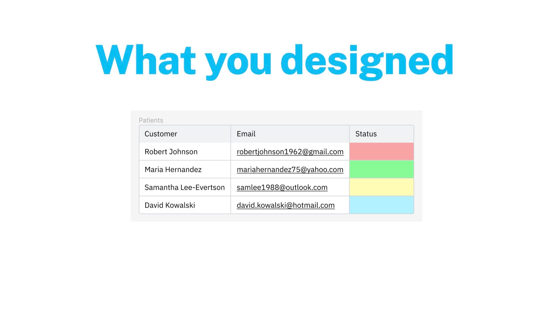
So here's the danger of using colors only to indicate something. Again, this is kind of a contrived example, but we'll illustrate the point. Let's pretend this is a piece of health care software for patients, and you have the patient's name, their email address, and their status. And those statuses maybe mean improving, declining, holding steady, in-processing. And if you're doing this just with colors, maybe it looks clean, maybe it looks nice, but it's not immediately obvious to a user what each of those means. You can probably intuit that green is good and red is bad, but yellow and blue, which one's better, which one's worse? Are they different? Are they the same? Unclear, you need a key on the page that could add some clutter and is going to be away from the customer. Or jeez, I've worked in payments a long time. The patient is on the list.
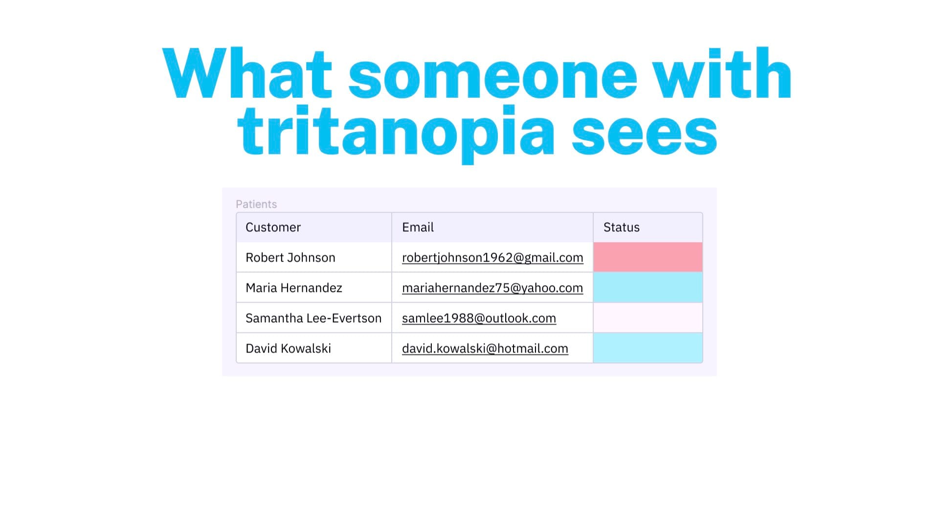
And if you're color blind, you may not be able to tell the difference between these colors. So if you have great vision, you might be able to see the difference between these colors very clearly, but depending on what sort of color blindness or just vision issues you have, you may not be able to tell the difference between things that are supposed to be quite distinct, but just don't look that way to you.
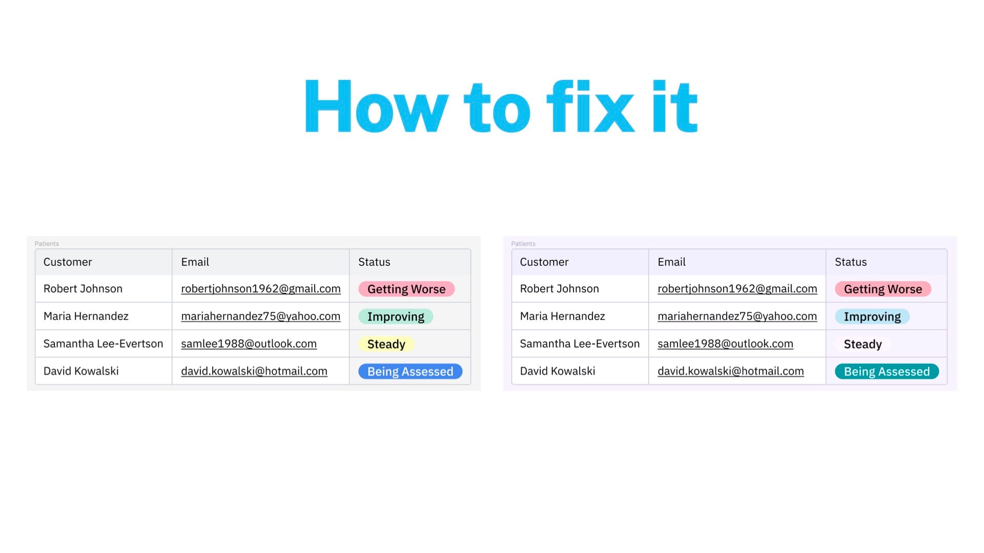
So how would you fix this? It's pretty easy. I would use labels, for example. There's other ways to do it, but the way that would work very quickly for this exact situation is let's use labels. You can still use colors. We can still use red, green, yellow, and blue. But the text is there as well. So you need– it's like a two-factor situation. You can use colors to indicate things, and that's totally fine. That's totally great, and you should do that. But don't use only color. You can't guarantee everyone's going to be able to see it. There's all sorts of situations where it's not going to be reliable. So color plus an icon is good. Color plus text is always good. You could add all three. But yeah, don't do just color because it's not going to be reliable.
Edited out a segment explaining why we don't use exactly our brand colors in the UI.
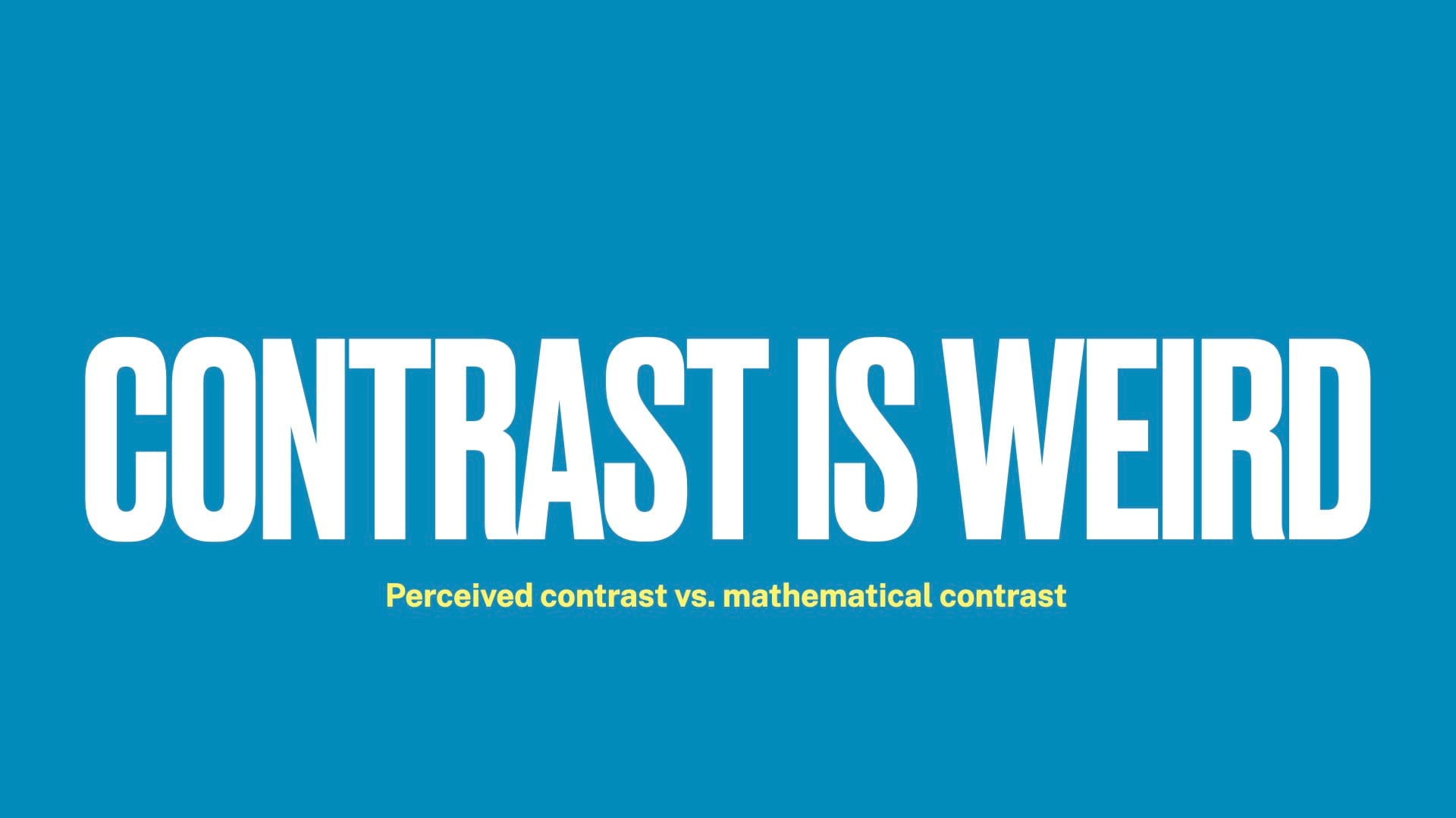
But this gets me into my favorite thing about color, which is that contrast is really, really weird. There's a difference between perceived contrast and mathematical contrast. So what we were just looking at here is a text color and a background color. Math is done, and you're given a number about how contrasty that is. And at certain points, you get more and more acceptable. But the mathematical contrast isn't always the correct contrast.
So here's two buttons. And I will pause for a second if anyone would like to vote for left or right. I'm curious which one you guys think looks more legible and looks better or if there is a difference between the two.
Edited out section where I showed our buttons, which show the same phenomenon as what's in the next comparison.
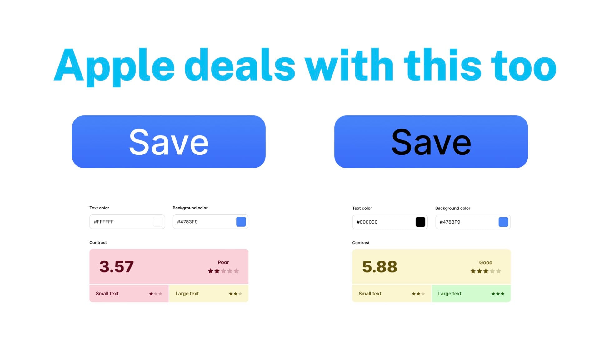
In a similar way, I looked at Apple's buttons that they use in Mac OS. And the one on the left is what they use. The one on the right is the same background but with black text. Mathematically, the one on the right is more contrasty and more legible. I will pause again, but I will say I vehemently disagree that the right one is more legible. But maybe that's just me with my vision.
From the audience: I find the left to be more legible, just to be clear.
So yes. So theirs is more extreme, but we're in this weird middle ground. You get into this weird state where technically there's more contrast on that black text one. But most people tend to agree that the white text is easier to read. It's a weird thing. So you should definitely care about color contrast. But it gets kind of funky.
One final edit to remove a lengthy explanation of our color system.
Wording
And the final section I have today is about wording, how to write things in interfaces. So ironically, this is the wordiest slide in the entire deck.
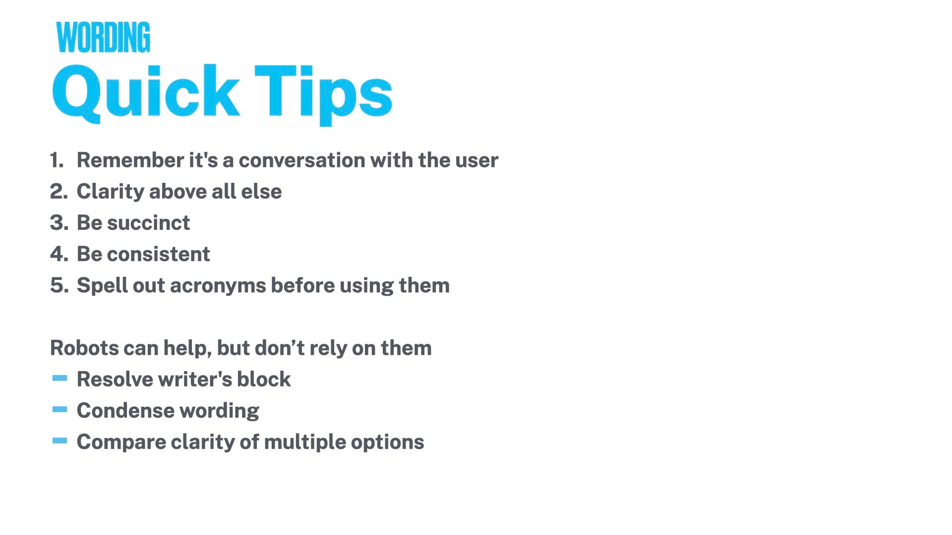
But yeah, I think a couple of things, just quick tips, are, again, going back to that thing I said at the start, it's everything that you're putting into the interface is a conversation with the person who's using it. So you want to make sure that it's clear, you're helpful, you're friendly, all that good stuff. Clarity is easily the most important thing. You want to be very explicit with what's going to happen. Flowery language is not helpful in these kind of situations.
So be succinct. Be consistent with how you say things on other pages, other parts of the interface. And remember that when someone's reading the text, again, most of us just kind of go through interfaces pretty quickly. Don't read everything in detail. If you do, amazing. But I certainly don't, and I know a lot of people don't. If they're reading the text that you wrote, it's probably because they don't know what to do and they need help. So you want to quickly get them the help they need and kind of understand that's the context.
And then number five is a pet peeve of mine. If you're using an acronym for something, always spell it out first. Even if you assume the user knows it, they know what MC means, means merchant central. Write out merchant central, put MC in parentheses, and then you can use that going forward. Although again, MC is probably the worst abbreviation because that's also MasterCard. So don't use MC ever. But for other abbreviations, make sure you write it out first just to make sure people are on the same page as to what you mean.
And then my last thing, which is a very 2023, 2024 thing, the robots can help. The chat GPTs can help. But I would absolutely suggest not relying on them or trusting them implicitly with anything. I'm sure you guys already know this. You would agree with this with writing your code for you. I would say it's true for writing your UI text. I find a lot of value in them for resolving writer's block when I just don't know what to put in this alert. And I just write out the situation to the robot and say, give me five examples of what I could write. And that's a good starting point.
I also find them useful for condensing wording. I tend to write longer things and have trouble cutting them down. So I found them helpful with being a little more economical with my writing. And compare clarity of multiple options. So if you have– I did this recently with some emails that we want to send out. I had a couple of different ways of writing things. I wasn't sure which one was more clear. And I was able to feed them into the robots and have them give me some relatively useful info on which are arguments as to why one might be more clear to people than the other.
So yeah, use them. I think they're good. But don't rely on them. Don't write everything with it.

And that brings us to the end of the deck. Thank you so much for listening. I hope it was interesting. And I will be happy to answer any questions or field any arguments you guys have.