A New Look for BirchTree

It's been a while since I made a meaningful change to the site, and today's change will hopefully just make BirchTree a slightly more delightful place to visit.
This update hopes to accomplish a few things:
- Get the headline higher on the page, especially on desktops/tablets.
- More clearly link to the other work I'm proud of.
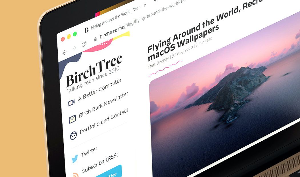
That's not a ton, but it's a blog, how much are you going to change at once, right? The biggest change is that we now have a left navigation on desktop that I think looks quite nice and gets you over the my YouTube channel and newsletter, the things I'm putting the most effort into growing these days. You won't see this on the phone, of course, but I think I've done a pretty good job of compressing it down to the phone's screen.
And of course, since all this can live on the side of the screen, I was able to bump up the headline for each article way up to the top of the page. You should be able to read my shorter posts without scrolling an inch now, which I think is nice.
Anyway, it's inevitable that I introduced some bugs here and there, so if you find anything wrong, feel free to let me know on Twitter or via email (you can find both in the new navigation 😉).


