Bircharoo is my Obsidian theme
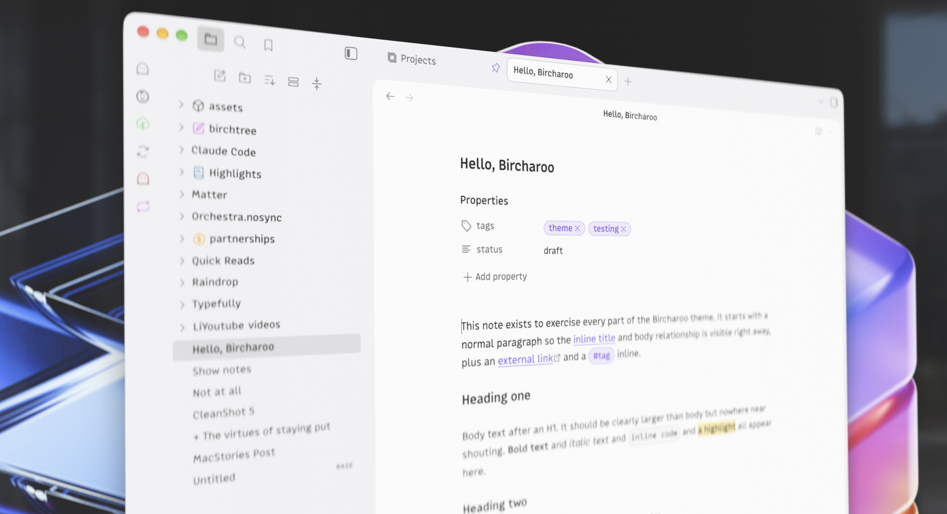
This is gonna be a short one, but I made a simple Obsidian theme. It's called Bircharoo and it's the theme I've wanted for myself. There are over 700 themes out there already, and surely one of them would get me close to what I wanted. But I've tried a bunch and nothing ever quite got me exactly what I personally wanted from a theme. There was always something that was off, whether it would be the button styling or the size of headings…it was always something I wished I could tweak.
So I did. Here's a couple of the things I wanted to get right for my own taste in this theme.
Heading sizing
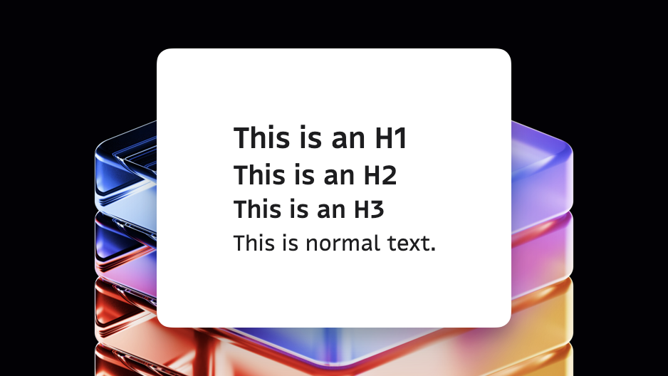
In my subjective opinion, I think headings are something Obsidian themes generally don't quite nail. More often they're not, they're huge, but other times they're inexplicably small or are all caps. I just don't love them. My headings are a bit larger than normal text, they're bold, but that's it.
Of note, the theme does not prescribe any fonts or colors for you. It instead follows whatever fonts and colors you choose in your Obsidian appearance settings. I’m using MonoLisaText in these screenshots, which also happens to be the font I use on this blog.
Buttons, selects, and tabs
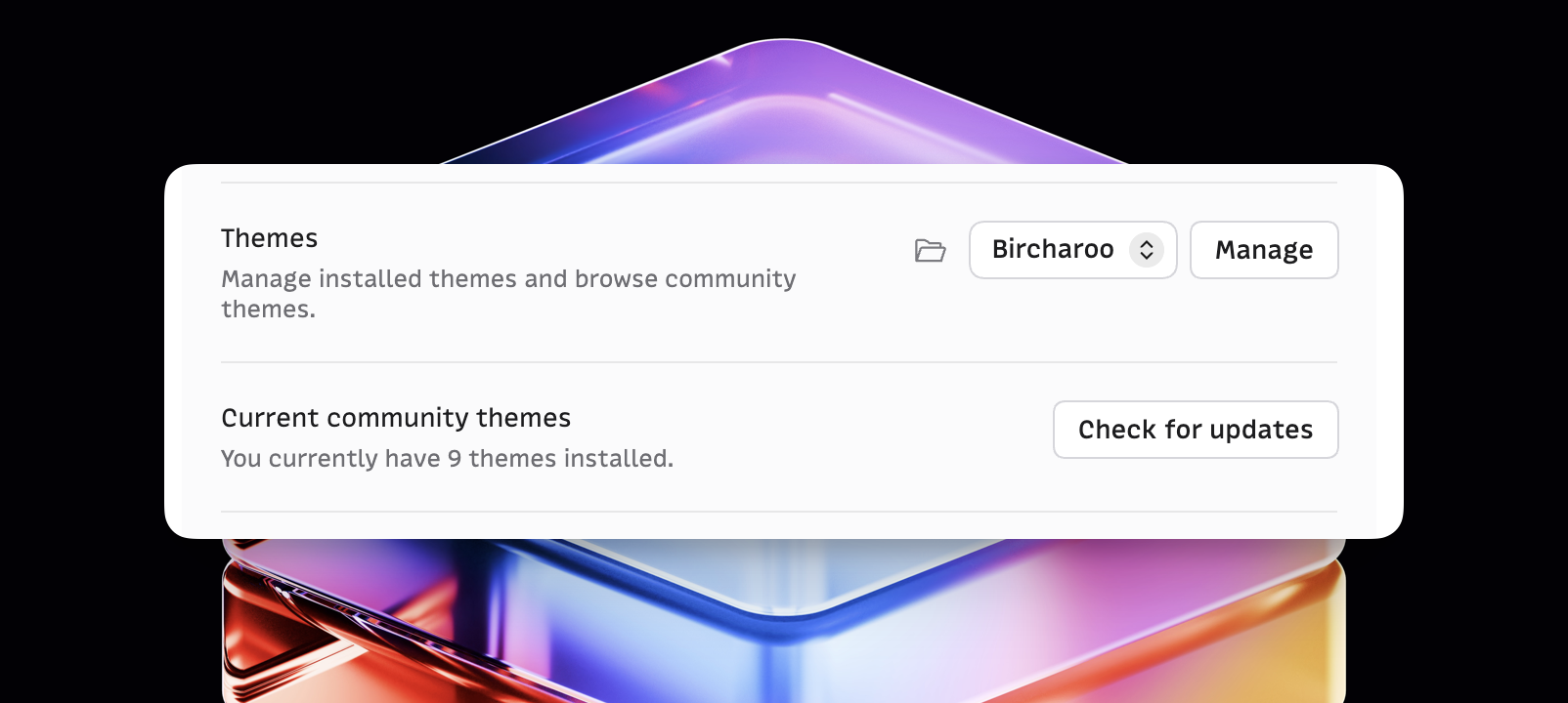

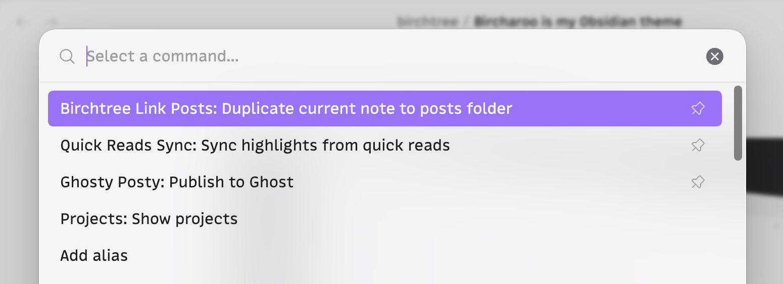
A good theme doesn't just make the writing and reading experiences good; it should make the entire app feel great. I haven't emulated macOS, which some other themes have tried. I've gone for something simple and clean. None of this is reinventing the wheel, but in a way that's hard to communicate in a couple screenshots, I've made it so Obsidian just feels really crisp and clean throughout with some relatively simple styling.
A nice empty state
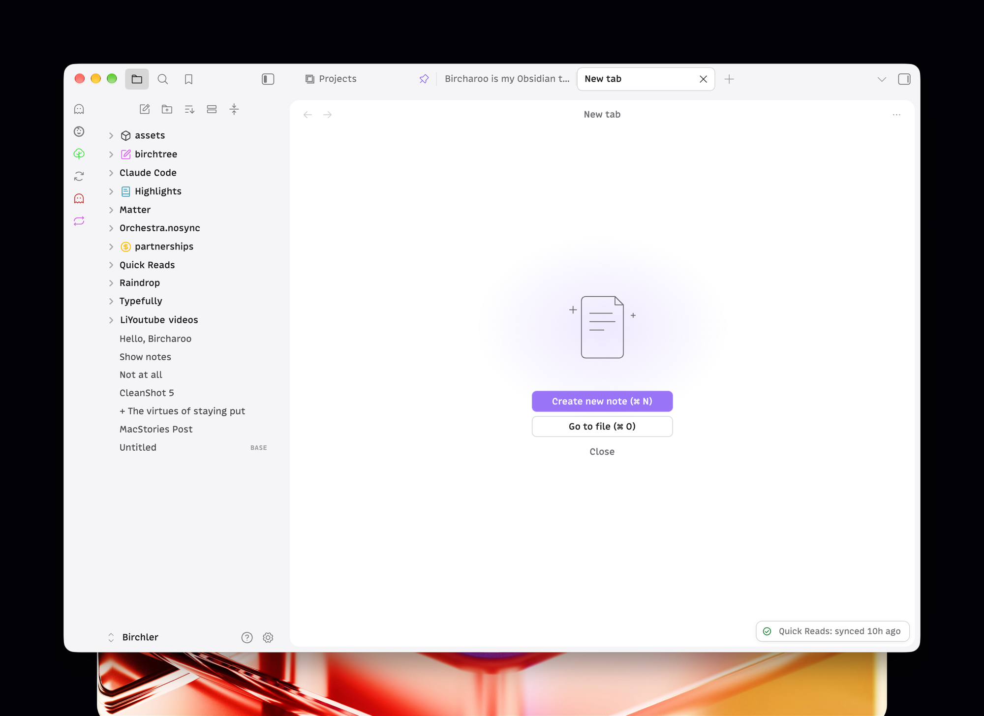
An underappreciated aspect of a good Obsidian theme is what they do with the empty state, which is when you don't have a document open yet. I haven't gone too crazy here, but I've styled the actions to be button elements, and I've added a little SVG of a document. Again, it's not a huge thing, but it's a level up compared to what you get by default.
Icons
I really love Phosphor icons and use them in my apps and Tangerine Neue, and I've incorporated a bunch of them into the UI when you use this theme.
Motion
I like a little tasteful motion in my UIs, and that's what this theme has. The left and right sidebars both animate in and out. The settings page animates in, and buttons have very subtle motion that makes them feel a little bit more tactile when you interact with them.
Mobile
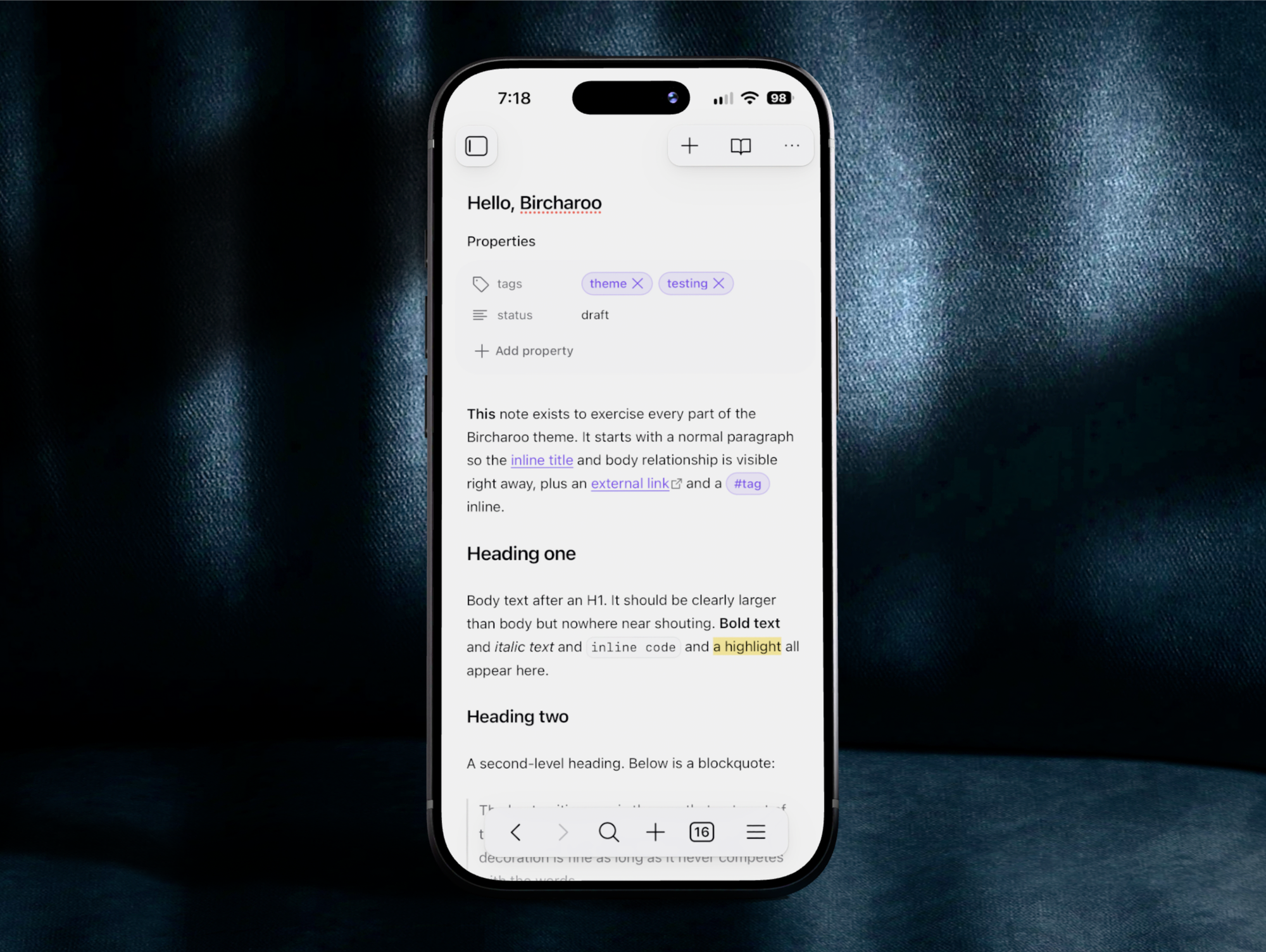
Finally, I've taken care to make sure that the app scales nicely to mobile so that people like me who actually use the app quite a bit on their phone get a good experience there as well.
I did not try to emulate iOS components for the mobile layout, nor did I try to make the bottom nav emulate liquid glass. Obsidian does not use many native iOS components, and I think it’s better to lean into that rather than trying to emulate the system. It’s like people who used to theme Windows to look like macOS. It might trick you for half a second, but once you see the differences, it just feels cheap and I don’t think that’s the way to go.
Try it out
Bircharoo is on the Obsidian marketplace and you can install it directly from Obsidian.