🎂 BirchTree Turns 10 (so let’s look at my embarrassing old designs)

Today is BirchTree’s 10th anniversary.
This anniversary always sneaks up on me, so I don’t have any grand plans for celebrating, but this seemed like a big one. All I can do is share some mildly interesting facts about how things have changed in the past decade.
The Domain
First off, I have not owned the birchtree.me domain for all 10 years, this site used to be hosted at mattbirchler.me. I didn’t get the current BirchTree domain until late 2013, as I was holding out for the .com. To this day, someone is still squatting on birchtree.com and as far as I can tell, it is not for sale. At this point, there’s no reason at all for me to change, so I’m glad I didn’t wait.
The Platforms
BirchTree has run on a bunch of different platforms over the years. This is not exact down to the day, but this is my vague timeline of blogging platforms:
- 2010-2012 - WordPress
- 2012-2013 - Squarespace
- 2013-2014 - Ghost
- 2014-2019 - WordPress (self-hosted)
- 2019-today - Ghost (self-hosted)
So yeah, I have changed technologies a bunch of times, but it was really front-heavy and in the past 6 years I’ve only made one change as I’ve gotten more picky about what could cause me to change.
The Stats
Back in 2013 I had a notification set up to email me if I got over 10 visitors in a day. Yes, 3 years into my blog, I was excited to get over 10 people on the site. Admittedly the site kind of sucked for those first few years, so I don’t blame anyone, but if you want to know how long it can take to get any traction at all, hopefully that sheds some light on how long it can take.
I have a screenshot from 2014 where I got 700 views in a day, and it was an exponential spike (maybe 10-20x) from the days before. Without getting too into the weeds on numbers, that would be a quite low day for BirchTree today. I’m certainly no 9to5Mac or Daring Fireball, but I no longer feel like an unknown quantity in the Apple nerd community, and that’s all I could ever have asked for.
The stats aren’t really what’s important, it’s more the feedback that comes from a wider audience. It means that I usually get feedback, both good and bad, on the things I write. This in turn helps me write better because I hear more opinions and get called out when I made an egregious error. It forces me to be more thoughtful, and has also helped me become a better writer, so if you’ve complimented or dragged me on Twitter for something I’ve written in the past…thank you ❤️
The Designs (dear god, some of the designs)
So I have a tendency to fiddle with my site’s design all the time, and hey, why not, it’s fun! I don’t have screenshots of every design over the years, and the 2010 and 2011 designs are lost to the sands of time, but here are a few that give you a good idea to its growth.
2012
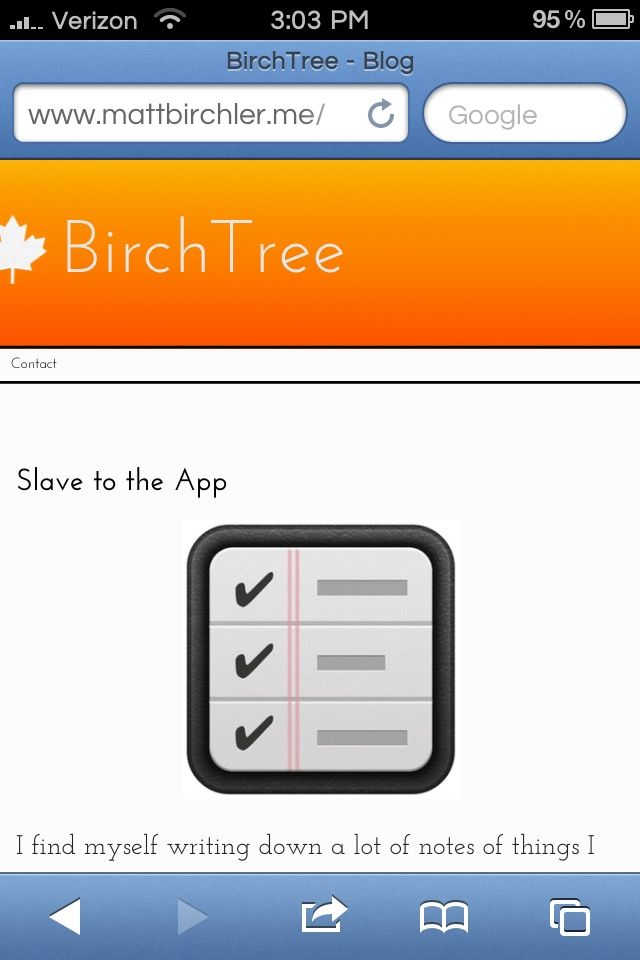
So, kind of terrible. I’m using a maple leaf as an icon, largely because I could not draw a nice birch tree anything to save my life. I also have the world’s smallest menu text ever, and I’m inexplicably using a slab serif font for my body text. And that orange gradient? Why????
This was near the end of my Squarespace run, and outside of being the first time I played around with premium fonts, there’s not a lot I like about this design.
2013
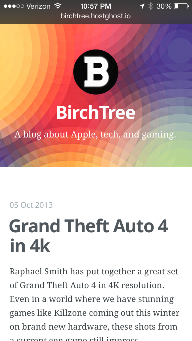
This was from when I switched over to Ghost, and you can tell because I’m literally using the default Ghost theme. For what it’s worth, it looks pretty decent. This was where I gave up on having a tree-based icon and changed to a simple “B” (also in a slab serif, I guess I was going through a phase), and introduced more color to my site.
I don’t like how much space the header takes up here, as it kicks the content down to the bottom half of the screen, but I can’t even judge myself that much here because outside of dragging in a header image and logo, this wasn’t my design, so let’s move on.
2015
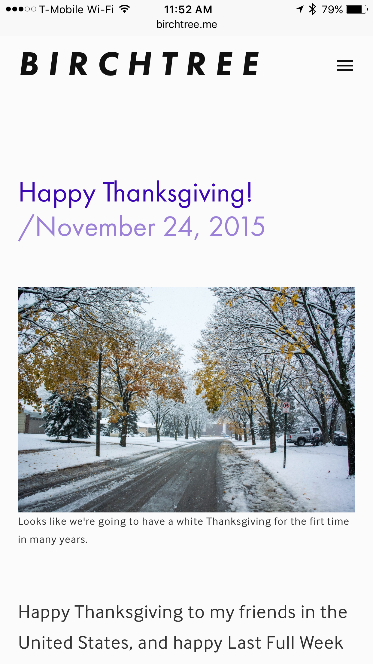
This is after I made the move to WordPress, and this brought me back to my own designs. I actually think this holds up pretty well! This was the first time I used Raleway as the font for BirchTree, and it’s also where I brought purple into the mix. At the time, most sites were going with dark reds and blues for brand colors, and it was quite unusual for a site to lean into purple like this (Matt Gemmell was on the same page at the time, though).
I think the kerning on the BirchTree text is off, and there is way too much whitespace between the header and body, and images in general, but it’s legible, simple, and pretty decent overall.
2016
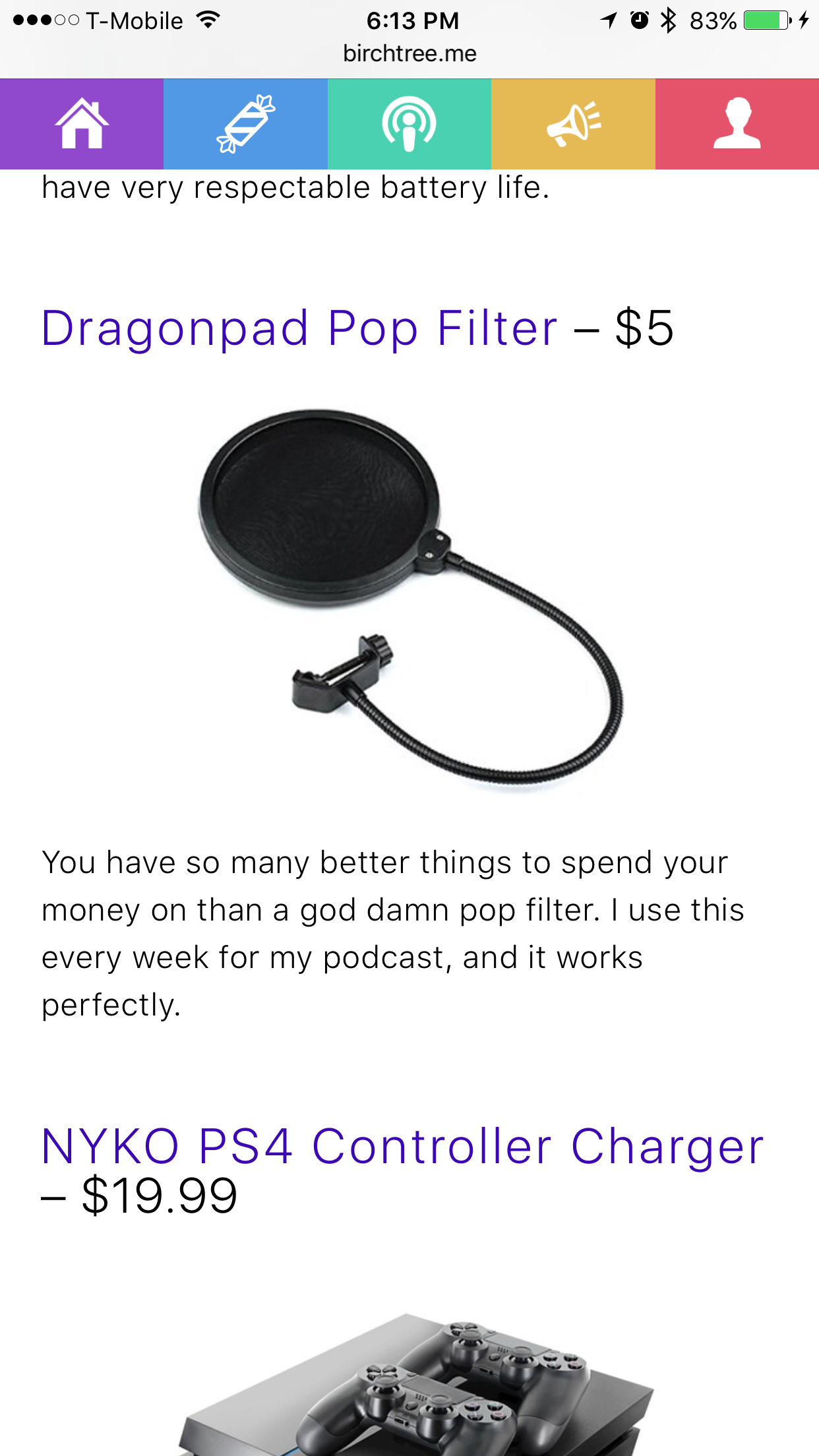
The next iteration was largely the same, but I removed the hamburger menu and adopted a menu bar with access to my favorite pages. These never got much play, as you can’t tell what they do, so I should have seen that coming. As that was the only real change, I guess I’d say this was a bit of a failure.
On the other hand, this brought with it my first color scheme, one that would stick around through 2019.
2019 (February)
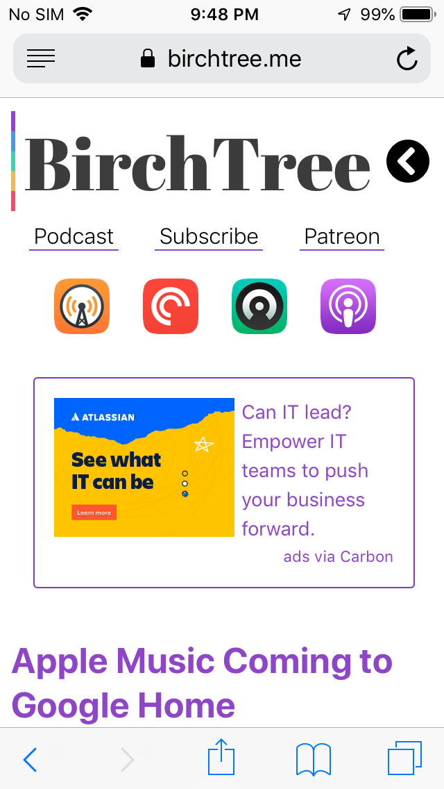
This was the end of an era. I kept the new 5 color scheme, but made it more subtle than before. I also shifted focus to my podcast pretty heavily, and I adopted a serifed font for the site title.
The purple was still there, and I’d switched to using system fonts in an attempt to be more neutral on each platform. In theory this was good, but it lead to major headaches on Android and Windows, as Roboto and Segue UI are just too divergent from San Francisco to lay out the same.
2019 (August)
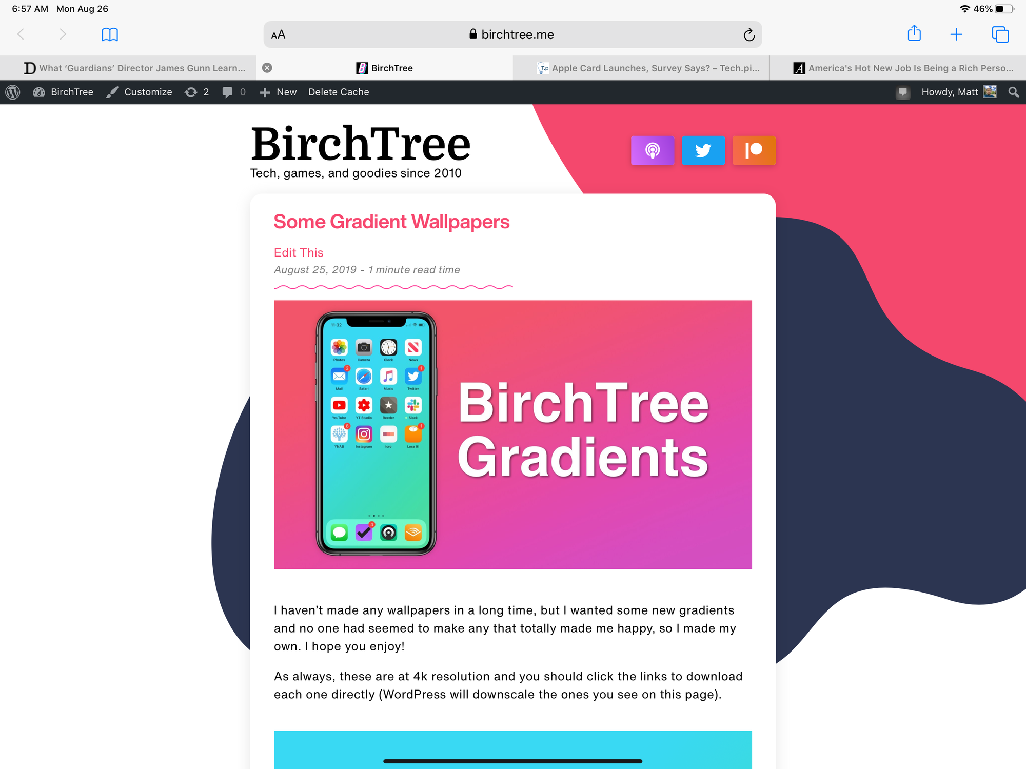
That design only lasted a few months, and in August 2019, I did a full reboot of the site, which I expect you will find quite familiar. The big change here was moving to a card-based interface, hovering over red and blue blobs. I also gave up my purple branding for a more red-ish pink.
I think this design looks great, and I love how fun and unique it is. Not speaking poorly of anyone else, but this is more fun than basically any other tech blog out there. I also adopted Helvetica Now for the headline and body fonts, which normalized the design across platforms, and was legible everywhere.
My biggest criticism is that the podcast, Twitter, and Patreon buttons look out of place, as if they were taken from some other project, even through they were 100% custom designed by me for this. Oops.
But of course, this is not what the site looks like now, so let’s go to 2020.
2020
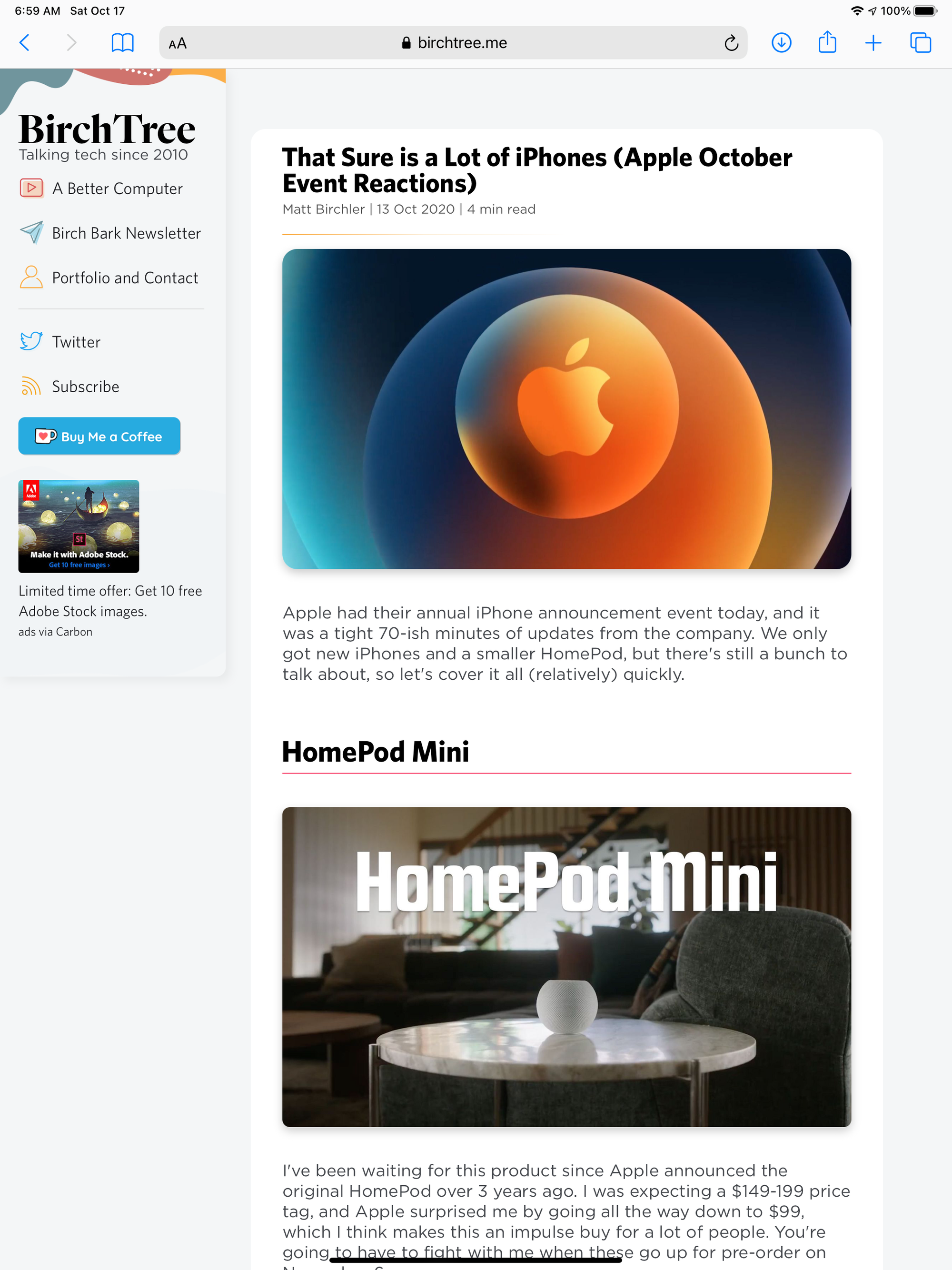
Ah, that’s the stuff! While I loved the previous design, it was very loud and like many software redesigns, I decided to pull back a little in the next update to make things a little less dramatic.
This latest design brings a sidebar back for the first time in who knows how long, and I adopted a new color scheme, which is basically a desaturated version of the old one, brought new icons into the fold, and upgraded the typography quite a bit.
I like that this still feels pretty unique (the theme is 100% my code, so it had better be), but in a more subtle way than before. It’s also more accessible, both from a code perspective, and from a discoverability angle. Even on the phone, I’ve removed the hamburger menu and just link to my important pages right at the top as clearly as possible.
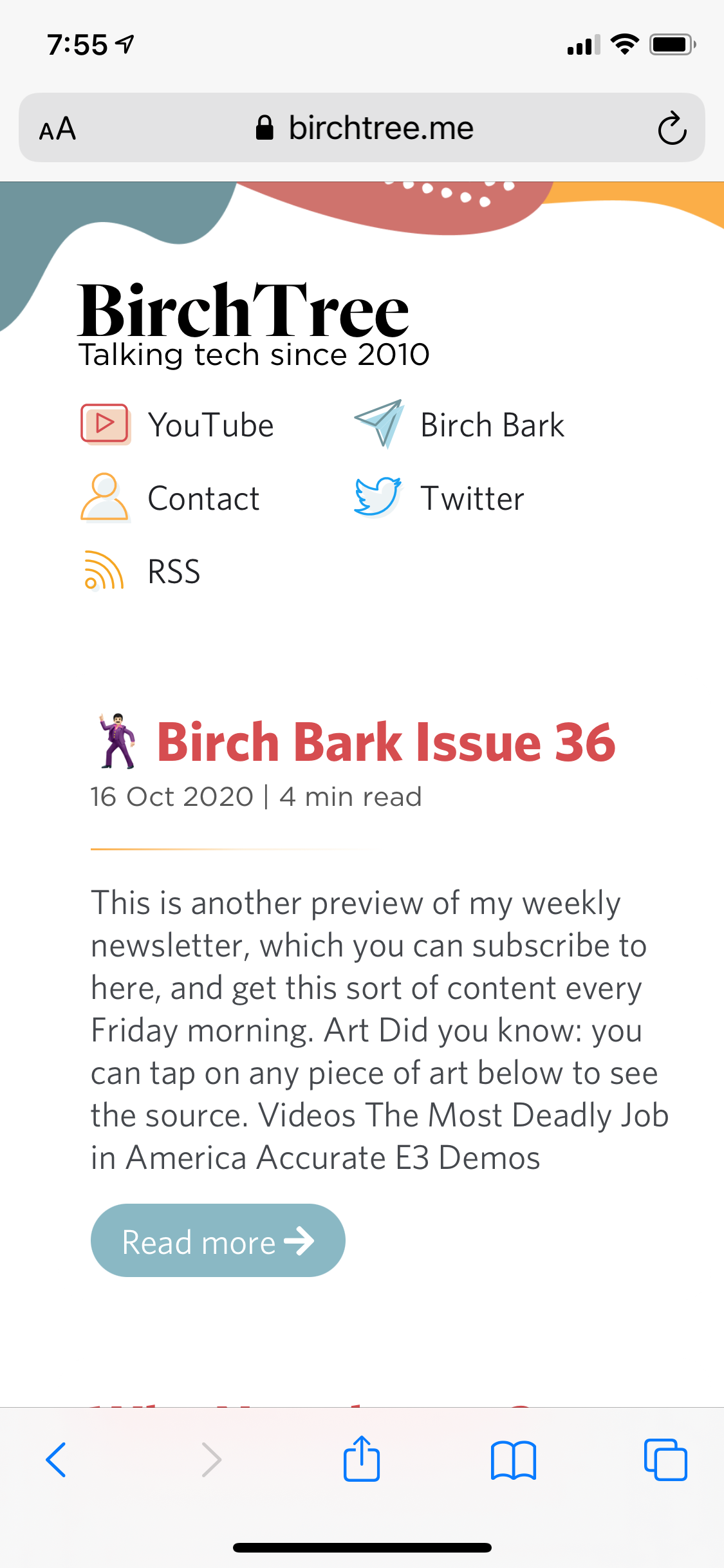
The typography is finally something I think will stand the test of time. Fonts are from Hoefler & Co, and I think manage to look nice while being perfectly legible.
I still have room to tweak, and there are layout gaffs here and there that I need to get around to fixing, but overall I’m pleased with where I am today.
The Next 10 Years
I have every expectation that in 10 years BirchTree will still be around. I still love writing here, even if blogs are less trendy than they once were, and I shift some of my focus to YouTube. There’s just something about having my own blog where I can write whatever I want, in whatever format I want, that I always hope to have around. Twitter is nice, but it feels ephemeral and 280 characters is not enough space to make most points. YouTube is great, but the production time is much longer, even for something simple. A blog post can go from idea to published in a few minutes.
Whether you’ve been following along for 10 years or this is your first time hearing about this site, I hope you enjoy the site and subscribe to keep up with whatever’s coming next. Thank you so much for reading!
