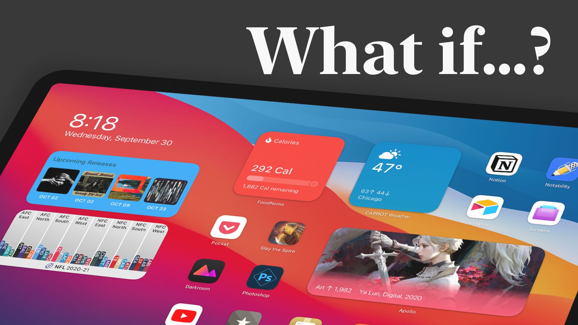
Concept: Proper Widget Support on the iPad

Widgets on the iPhone are great! Widgets on the iPad are…okay.
Whenever I post something about wishing I could put widgets on my iPad home screen in the same way I can on my iPhone, I always get pushback that the icon spacing on the iPad makes this impossible and it would be a major undertaking to make it happe. Outside of this being a silly thing to say about a company who does far more complicated things all the time and has some of the best developers inthe world, I did this design specifically to address those concerns.
Fun fact, did you know that depending on your iPad size, mode, and orientation, your icons will be either 38, 46, 58, 62, 64, 68, 76, 88, 96, 102, 118, or 137 points apart in the UI? It's true! This idea that the icon grid is in any way fixed and can not change is not backed up by how the home screen already works. My solution actually reduces the variance in spacing that we have today, somewhat ironically making the grid more consistent than it is today.
Anyway, check out the video below and let me know what you think! From my perspective, this feature can't come soon enough.


