Data Density on the iPad

I picked up an iPad Air 2 this week and am just putting it through its paces. After quite extensive, totally necessary testing, I have confirmed that it is indeed a great Hearthstone device. But can it do more? Oh yes it can.
After setting up and logging into a ton of apps, I am thrilled with how apps like Instapaper, Editorial Outlook, and ProTube do a great job of taking advantage of the extra screen real estate on the iPad. My wife was particularly impressed with how much nicer Pinterest is to use than on the phone.
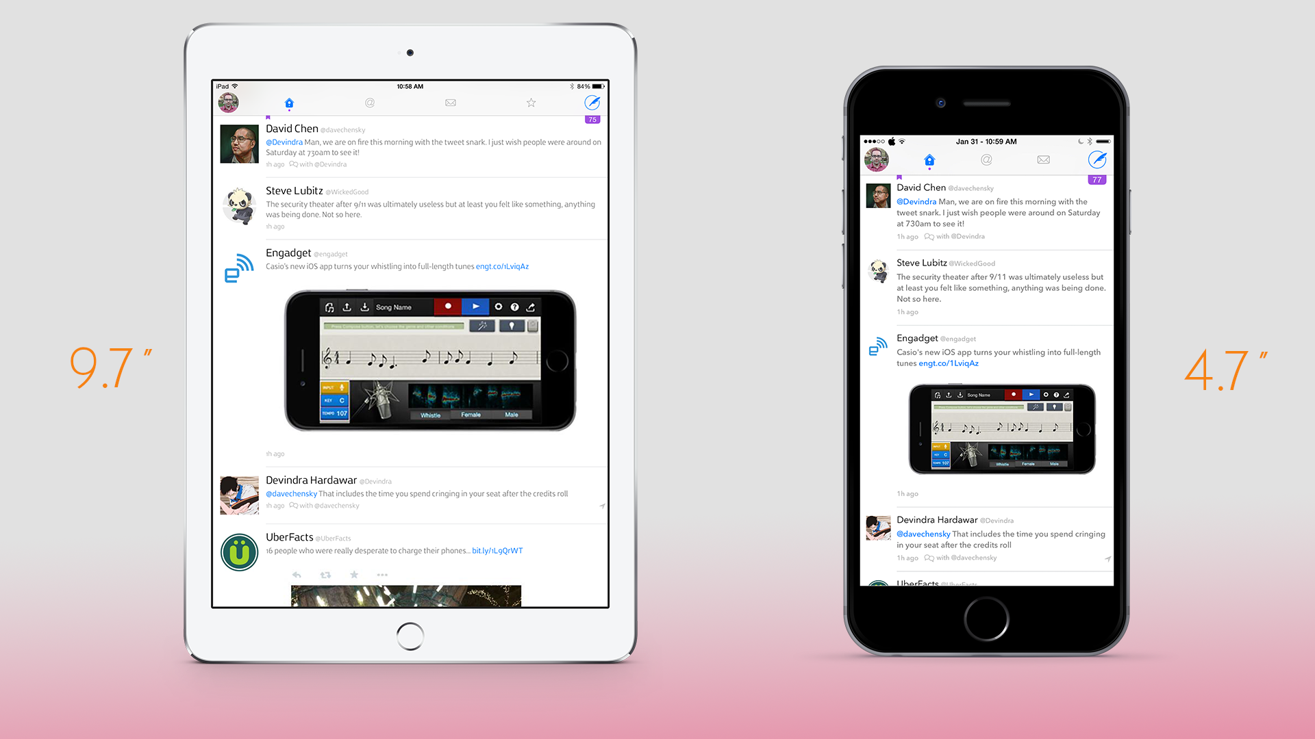
But one class of app that don't seem to scale well to the larger screen are Twitter apps. The comparison above shows Twitterrific on the iPad and iPhone 6 side by side, and despite having over twice the vertical area, I see basically the same amount of data on screen at a time. It's insane, and no Twitter app seems to do a much better job of this. They're all just blown up versions of their iPhone counterparts. I just feels like a total waste of potential. I still think the original Twitter app for iPad was the best tablet Twitter client ever. Watch this video for a reminder for how fluid and data-rich that interface was.
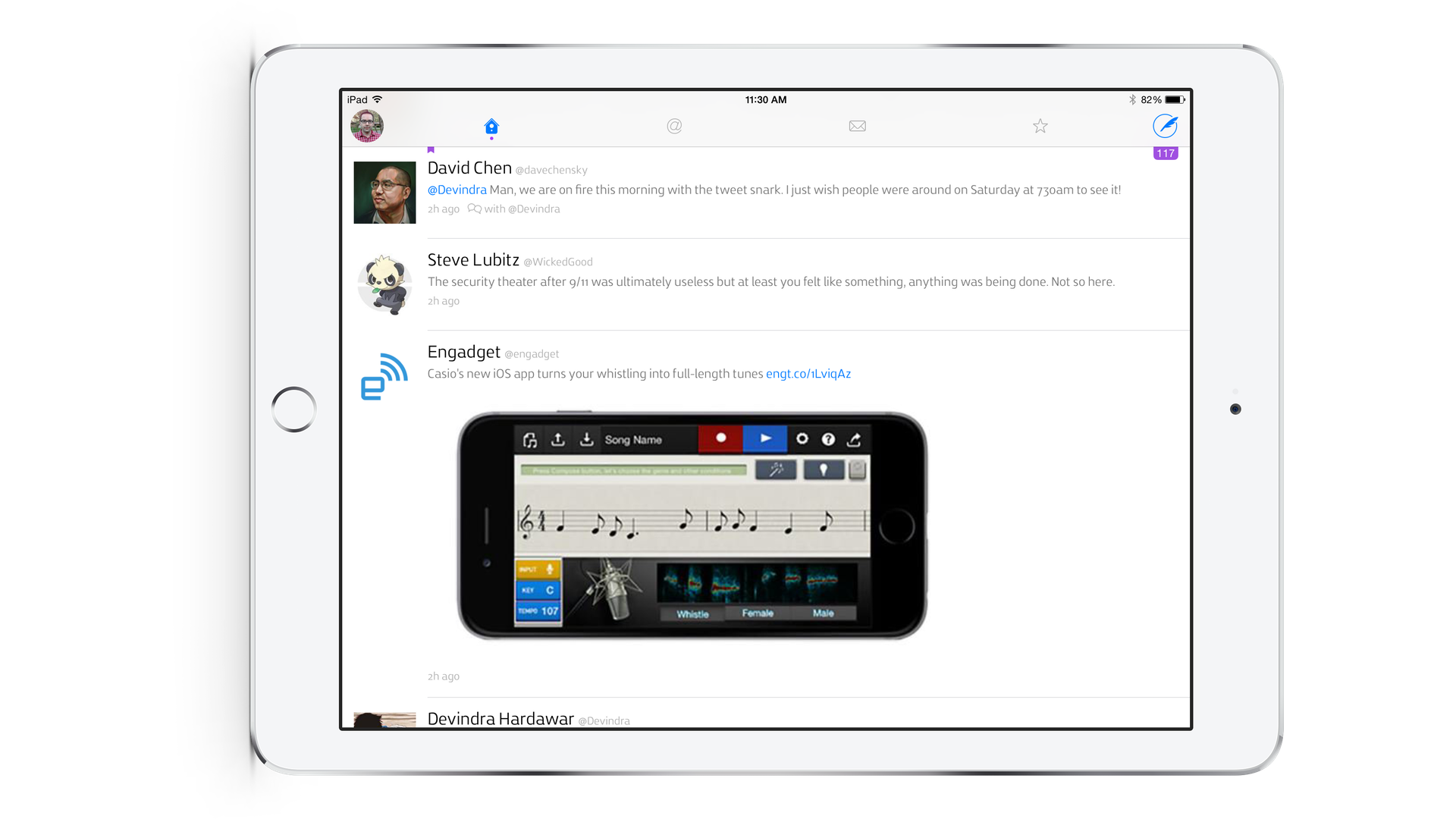
As an extra bit of humor, how about how useful Twitterrific is when in landscape. 3 tweets on about 50 square inches of screen is kind of insane.


