How Today's Apple Products Impact the Birchler Budget
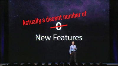
Apple had quite the day, and I think they did quite well overall. This was definitely a better showing than their WWDC keynote back in June (much less dancing). Lots of stuff was shown off, but a few things caught my eye, and most importantly, my wallet's attention.
Please Take My Money!: Apple TV
Oh how Apple's hobby has grown up! Nothing got me more willing to pull out my wallet than this little black box. The interface certainly familiar to those who have used the current model, but it's a brilliant evolution.
Siri is the headline feature here, and with good reason. The demos they showed on stage were really great, and I was especially impressed with the multi-step requests: “Show me kids movies.” “Only animated ones.” “Just the new ones.” Seeing the interface refine the search over and over was spellbinding, and makes me wish the Siri was this capable on iOS.
The added ability to switch apps, check the weather, see sports scores, and the brilliant “what did (s)he say?” features all make Siri look better than it ever has before.
But even more than Siri, I thought the best looking thing about the new Apple TV was its speed. The UI was buttery smooth with zero delay between actions. This is certainly not the case with the current Apple TV. A fast navigational UI is nice, but what impressed me the most was the scrubbing forwards and back within videos. It was smoother than any other streaming device I have seen. It’s technically a little thing, but it’s something that’s always frustrating on just about every video player in the world, and it’s something you’ll appreciate overtime you use your Apple TV.
I can't upgrade for a month, but I'll survive: iPhone 6S Plus
Do you think Apple likes Force Touch? Outside of the expected straight technical improvements (faster, better camera, etc.), Force Touch is really the only notably new thing about the 6S line. But man, does it look nice. I think the big fear going into the event was that the feature would be confusing and feel forced onto the interface. Fortunately, that doesn't appear to be the case.
From my viewing of the feature, it breaks down like this:
Home Screen: Press down on an app to see some actions that can be performed. Launch straight into a certain view or initiate an action. Being able to jump right into Facebook's status compose screen is very convenient, but thinking about how an app like Workflow could use this menu to launch your workflows is mind-meltingly awesome. I cannot wait for developers to play with this feature and see how far they can push it.
In Apps: Much like Quick Look on the Mac, pressing down a little on a bit of content lets you preview it without committing to switching tasks. You can press down on an address in an iMessage to see a pop up of that location on a map. If you want to get directions, press harder and the Maps app will launch. If you don't want to see any more, just lift your finger and you're still in Maps. The ways this changes multitasking is huge!
There are more things that it does (switching between apps by pressing on the corner of the screen made me swoon), but the rest seems like power-user features. I appreciate that Apple seems to have focused their implementation of the technology in a way that makes sense.
I want to want to buy you: iPad Pro
Before even talking about the iPad Pro, I have to mention how insanely overpowered last year's iPad Air 2 was. It's so powerful that Apple didn't even bother updating it this year. Speaking as someone who owns one though, I totally get it. This thing is a freaking beast! But anyway, on to the Pro.
The iPad Pro is so close to the ultimate portable computer for me. The size makes it something that I could use as my main computer, iOS 9's new multitasking features make it a better desktop replacement, and that keyboard means that I can treat it like a PC if I need that. However, it still runs the same apps as the current iPad, just bigger. I believe in the iPad and I think that it's an amazing platform, but there are times where I still need a traditional PC and the iPad Pro won't help me in those situations. As I wrote a couple months ago, iOS is 90% there for me, but the 10% it can't do means I still need a Mac in my life.
The thing that would have put this thing over the top for me, strap in for this one, would have been if they somehow allowed you to run iOS and OS X on it. I know that's crazy and the technical hurdles to doing something like this are vast, but I think that it's what I would need to go all in on the iPad today. I rarely compliment Microsoft for leading the way, but I think they got this right with their Surface line. Tablet mode when I'm holding just the screen and desktop mode when I attach a keyboard.
The real solution to this is that the apps need to get so good on the iPad and iOS needs to get more optimizations to separate it from the version of iOS we have on the iPhone. I think we're very, very close to that day, and I would definitely trade me iPad in for this if it didn't cost me anything, but at $799 plus more for the stylus and keyboard, I can't legitimize it yet.


