Liquid glass one month later
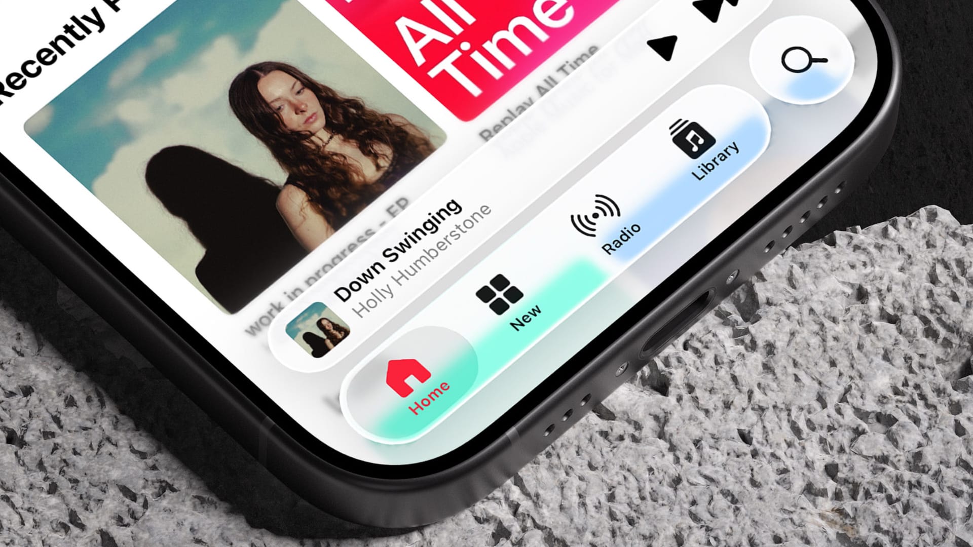
I've been using all of the "26" Apple operating system betas for about a month now, and I've gotten past the "hot takes" stage and feel like I have a more complete feeling about the UI. I'm not going to go on for 1,000 words on it right now, but I'll just say it's very much all over the map. There are plenty of times where the UI looks positively gorgeous. In the Apple Music screenshot above, I think those elements look stunning, and they look even better in motion as content swirls around the background as I scroll. I also really like the address bar at the bottom of Safari, which really comes to life when scrolling sites with fun colors. Tellingly, I have an iPhone still on iOS 18 and it does feel a bit dull in comparison.
But there are also times where it doesn't look great and can be genuinely hard to read. This got better in the second round of betas, but it's definitely not completely fixed yet. And even when it is working right, UI elements bounce from what I can only describe as light mode to dark mode over and over as their background content changes. I find this distracting and visually unpleasant. Even with the Apple Music example above, I specifically scrolled to a point where I thought the UI looked best rather than scrolling to a random spot because it looks perfect everywhere.
If I could sum it up briefly, I'd say that liquid glass is highly dependent on the content it's covering to determine how delightful it is as a UI. That's a real challenge to overcome and it's a big reason why we tend to see these highly-transparent interface designs get more and more opaque in time. The highs are very high in my book, but there are still plenty of "yikes" moments that I wish weren't there and I hope get improved by the fall.