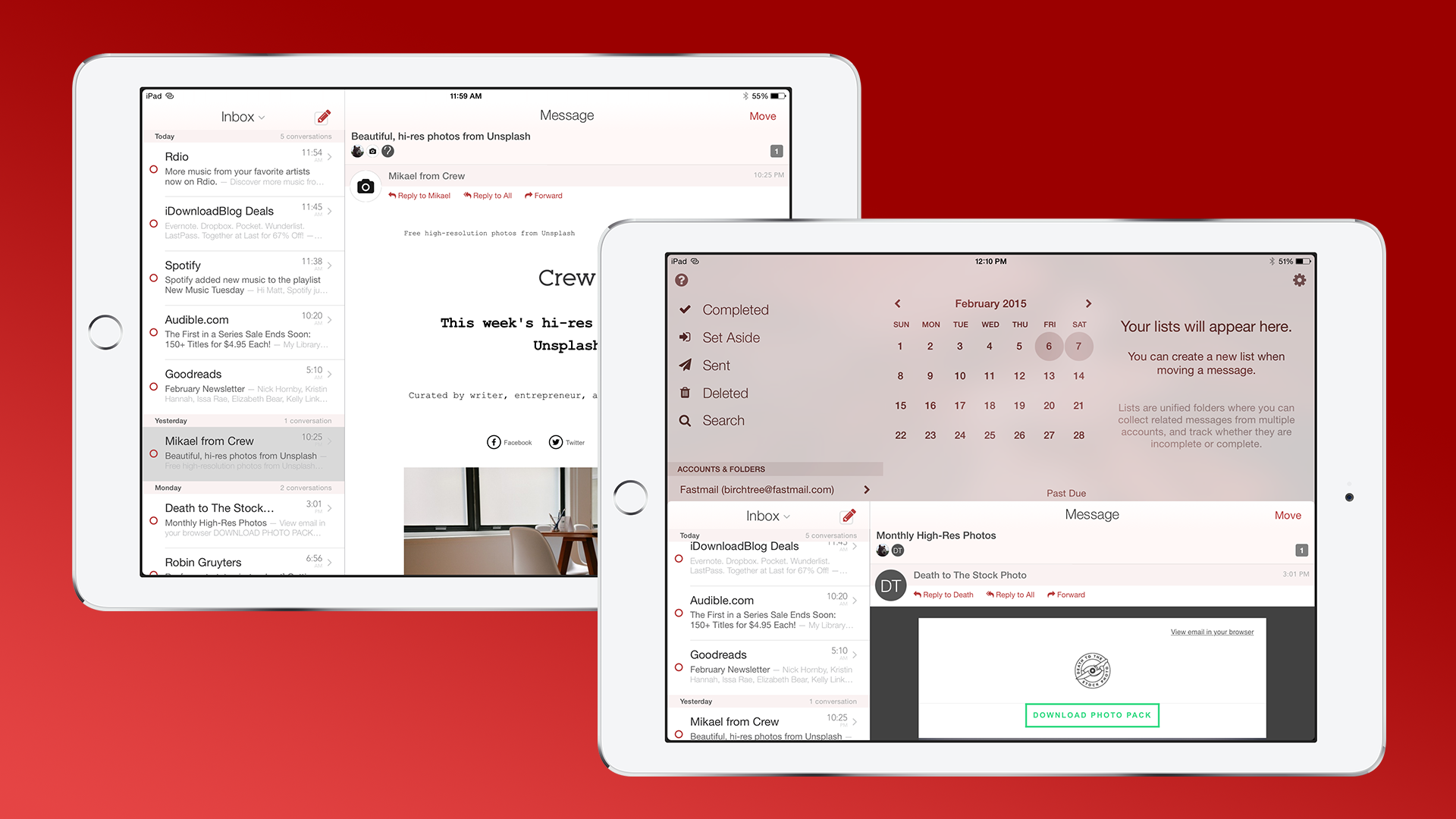
App Review: Mail Pilot 2 for iOS

I guess this is email season, because this is the second email app review I'm writing this week. Mail Pilot 2 is a major update to Mindsense's innovative email app for iOS. Back in January 2012, the concept of triage get your emails by swiping them was a new concept (and OMG look at that interface!). In early 2015 it's the norm. Mailbox gets the credit for really popularizing the idea, and you can even see it in Microsoft's and Apple's apps today. Frankly, if an email app is released today and it doesn’t have this interaction, you have to wonder what they're doing. So how does Mail Pilot stand out from the crowd when everyone has adopted their interaction model? Let's take a look.

Navigation
Let's get the basics out of the way first. Mail Pilot still has its original email swiping interface. Swipe left to mark as completed (or "read" in typical email jargon) and swipe right to set a reminder for that message on a later date. One of the limitations of Mail Pilot’s interface in this regard is that you can only set a reminder for 1-5 days from now (or 1-7 on iPad). You can't set one for even longer in the future, or for a specific time. For example, I can't get an email in the morning and set it to remind me about that email that evening. This is some thing that other apps like Outlook and Mailbox give you more freedom to do, and I do miss it in a mail Pilot. Additionally, if I want to set a reminder for more than 4 days, I have to move over to their Mac app.
Some of this makes sense. Mail Pilot treats your email more like tasks than messages. You don't mark emails "read", you mark them "completed". And if you think about your inbox as a list of things you need to get done today, then it doesn't matter what time messages appear. Your Today View in OmniFocus shows you everything for the day, even things that aren't supposed to happen until later. The goal is to get your inbox clear by the time you go to sleep. Once I was able to convert to this style of thinking, I came to peace with this system (although I have to admit that I would welcome time-specific reminders in a future update).
In addition to a nice email triage experience, Mail Pilot also brags about their use of the z-axis for navigating around the app. The basic concept is that every screen is always there, and you can swipe one screen out of the way to get at the screen below. I like this concept quite a bit, but the implementation is a little off for me.
Let's take an example, if I'm in my inbox and want to go back to my list of folders, I have to swipe down from the very top of the screen. While this may not have been a problem on the iPhone 5S and earlier, it's a challenge on the iPhone 6. This makes Mail Pilot a two-handed app if you have one of the latest iPhones. I don't know exactly how they could do it, but a horizontal implementation of this same concept would be a welcome change.
Despite my minor frustration, I still enjoy Mail Pilot’s navigation. I always feel like I can get where I need to go quickly, and I'm never confused about how to get there.
For a more detailed look at the navigation concept, Mindsense has a blog post explining the thinking behind it.

Attachments
I don't send a ton of email, but when I do, I'm almost certainly attaching at least one file. This is a wild card when it comes to iOS email app; you never really know how one app is going to treat them. I'm happy to say that Mail Pilot has one of the better implementations I have seen on iOS.
Utilizing the new features introduced in iOS 8, Mail Pilot has a document picker built into the app that allows you to browse not just your phone, but third party storage like Dropbox. In my testing, I attached files from Dropbox, iCloud Drive, Google Drive, Transmit, and Box. Each service worked just as you'd expect. I also attempted to attach multiple files from different services in the same email and it didn't skip a beat.
One way that Mail Pilot differs from the other email app that came out this week is that Mail Pilot downloads the files you want and makes them proper attachments. This is in opposition to Outlook that creates a publicly shareable link and put it in your message. Each way has its advantages and disadvantages. Mail Pilot's use of honest-to-goodness attachments means that those on restricted networks (like me when I'm at work) can open these files without trouble. It may not be like this everywhere, but sites like Dropbox are blocked at my work, so a public link from Dropbox is worthless to me there. On the other hand, creating a public link means that you don't have to worry about file size limits. I tried attaching a 180MB video to an email in Mail Pilot, and it downloaded the link but was unable to attach it to my message. Outlook accomplished the same thing in seconds by placing a link in my message.
Mail Pilot will work or not depending on your specific needs for attaching documents. It would be nice if the app recognized when you were trying to attach a large file and would ask you if you'd like it to paste a public link in your message.

Privacy
The biggest knock I got against my review of Outlook was that I didn't discuss the privacy implications of the service. That word "service" is the key differentiator between something like Outlook or Mailbox and Mail Pilot. While those other apps are "services" that run your email through their servers to process them, Mail Pilot is just an "app". It doesn't do anything on their servers (I believe their servers only host their home and support websites). Mindsense is in the business of selling you a nice app or two, it doesn't have any interest in collecting any data from you.
Here's their statement on the matter:
Mail Pilot never stores, processes, or transmits your personal data through any third-party servers. All of your account information, passwords, personal data, and messages are securely stored on your device. All communication occurs directly between your device and your email server.
I'm not particularly paranoid about privacy, but this should please those who are. Again, based in my interactions this week, this issue drives people absolutely crazy.

iCloud Sync
The final big feature I want to mention is one that I sadly could not get to work everywhere. My iPad was able to use the feature to grab my accounts without issue, but even after trying everything on my Mac, I was not able to get it to work there.
The idea of the feature is that you can add an email account to either your Mac, iPhone, or iPad, and you'll be able to add them to your other apps without entering your preferences again. In theory, this sounds nice, but it was honestly less than 30 seconds of work for me to manually add my 3 email accounts to the Mac app. Even with this sync feature, you do still have to enter your passwords again for each account.
I'll also mention here that Mail Pilot Does not feature any traditional sync or Continuity features. However, since it is just a regular email app, you can pair it with whatever other apps you'd like. Want to use Mail Pilot on your phone but love Airmail on your Mac? No problem!

Mail Pilot for Mac
Mail Pilot also has a Mac app, which was updated this week as well to version 1.2. This was my first time using the Mac app, and I have to say that it's very nice. Like most mail apps, there are keyboard shortcuts for everything. I love that they decided to put a bar across the bottom of the window to show you everything you can do to a message and what the corresponding shortcut is. This is helping me get up to speed on how to best use the app quicker than if I was figuring these out on my own.
The app also shares all of the scheduling features of its iOS counterparts. There are different views for Inbox, Today, Set Aside, and Upcoming. I don't use these a ton right now, but I am going to try to adapt my workflow to use them more. Time will tell if I use these much.
I will definitely give the developers credit for not just blowing up their mobile app for the desktop. This is a full featured Mac app with a fiddly preferences pane for you to customize the app to your heart's content. It's not quite as robust as Apple's Mail or Airmail, but it's going to be enough for most people.
Like I said above, Mail Pilot is just an app, so you don't have to use both the iOS and Mac apps, but you will get a more consistent experience than you would with anything else.
Random Bits
Compatability - Mail Pilot shines in this area. It supports Gmail, iCloud, Yahoo, Outlook.com, Fastmail, AOL, and any generic IMAP account you may have. Bottom line: unless you have some weird email account that doesn't support IMAP, you can use Mail Pilot.
Themes - Mail Pilot has a pretty good look right out of the box, but if red's not your style, you can select from blue,careen, orange, or white alternatives. The themes look fine, but none look better to me than the standard red.
Settings - Mail Pilot does not sport many settings. You can set your default account, the theme, your signatures, and what notifications you'd like to receive. That's it. Also, unlike Apple’s Mail app or Outlook, you can't set it up to notify you of emails from certain people. I tend not to fiddle too much with my email apps, but that is one thing that I've gotten used to and miss now that it's gone.
Speed - I originally stopped using the original Mail Pilot because it was too slow. Maybe it was the slower iPhone I had back then or maybe they did some awesome optimization behind the scenes, because Mail Pilot 2 is really fast on my iPhone and iPad. The Mac app too is more responsive, although animations stutter a bit on my Mac mini.
Universal app - Mail Pilot is a universal app and it is even better on the iPad. The interface has the same z-axis concept, but feels like it has more room to breath on the iPad's larger screen. My issue with reaching the top of the screen is also eliminated, since I'm always using two hands anyway.
I'm not sure if I'm going to stick with Mail Pilot for the long run. I think that Mail Pilot has a lot going for it. The app looks nice, has a unique and intuitive interface, handles attachments well, and is a big win for those who are concerned with privacy. There are a couple things I would love to see changed, but s if right now they're not enough to scare me away. I'll be using Mail Pilot as my daily email app for the foreseeable future.
Mail Pilot is available on both App Stores today. It's a free update to everyone who bought the apps already. If you haven't jumped on board yet, they're both on sale.


