Making Control Center and Notifications More Discoverable with a Cursor on the iPad

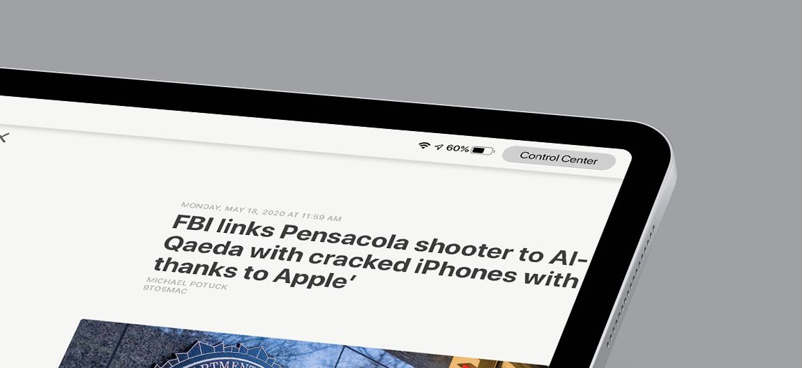
So this is a little janky, but I mocked up a quick idea to make the options to access notifications and Control Center more discoverable when using a cursor. Here's an animated version:

The currnet UI just highlights the date/time or battery/wifi/etc blocks, and clicking on them brings up notifications or Control Center. If you don't know how this works already, you may not even be able to guess which is which, since "what happens when I click the battery icon?" isn't natually answered by either option. 🙃
Apple should spend more than 30 minutes on it and make it prettier. Also, if you decide the menu bar can expand, then you don't need to keep buttons in the same place. Hell, you could even add more things up there if you wanted, so there's quite a bit of iteration to happen here. But this was my first stab at something I hope others will take further.


