Portrait Mode Confusion

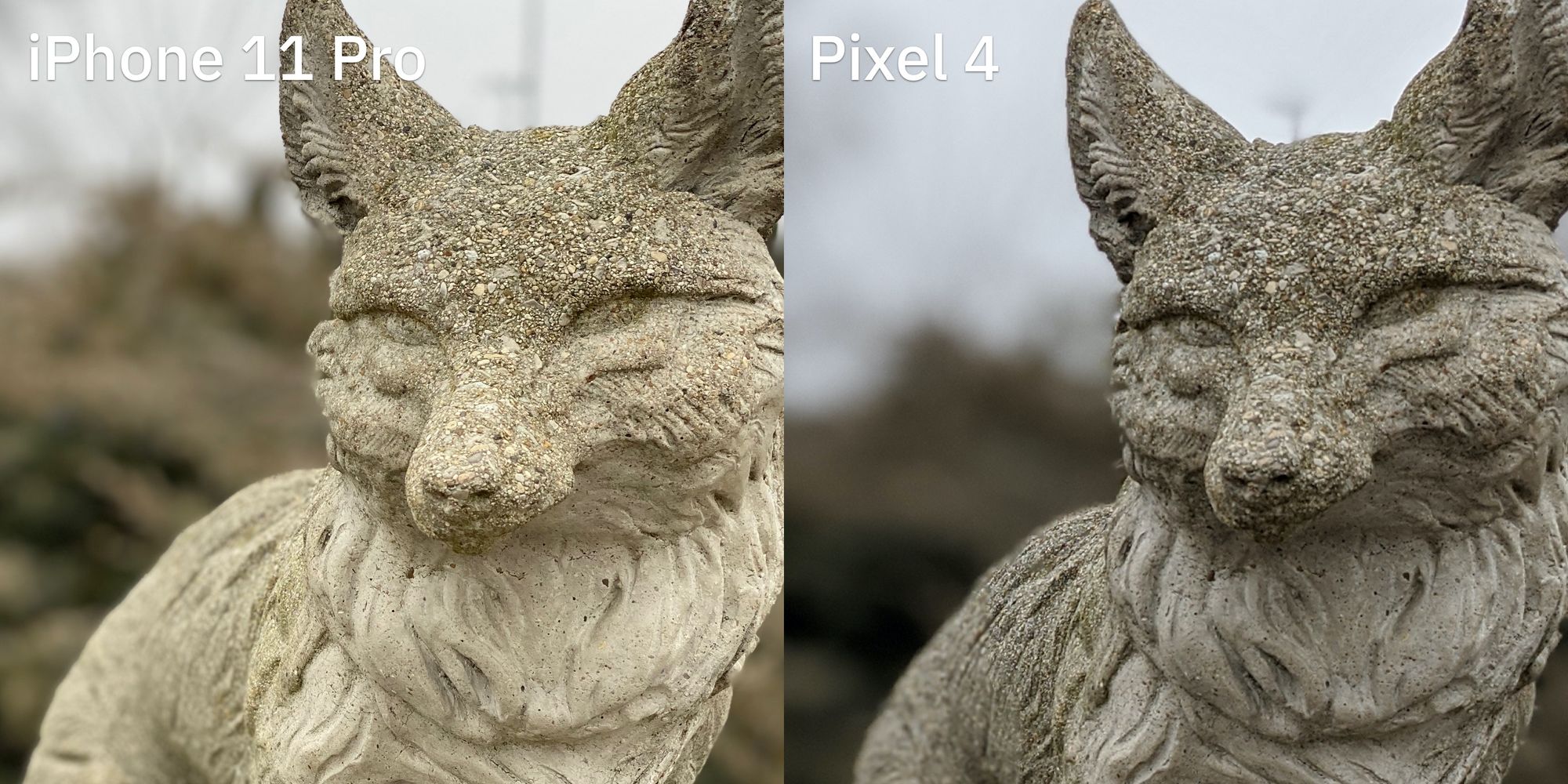
This photo comparison was really interesting to me. I shared a portrait taken from the iPhone 11 Pro and Pixel 4 and asked people which they preferred. Opinions were split, to say the least. Here are the photos for your viewing pleasure:


I personally think the iPhone shot is way better than the Pixel one. The colors are far more accurate to reality, and also looks better in my opinion. When I zoom in on the images, the statue itself is sharp on the iPhone photo, but looks way over-sharpened on the Pixel one. The fake bokeh is similar on each photo, but I think the iPhone's is a little more pleasant and has a better roll-off on the statue.
But these feelings are not universal!
Devon thinks the PIxel one looks way better.
I prefer the look and feel of the second photo, for sure. Quality is all together higher, but could be lighting factors.
Kareem agrees.
- Not too bright. Not too dark, perfectly balanced.
Fouzan triples down.
IMO 1 is too vibrant for the overcast day it was shot in.
You could increase contrast with 2 and fix it. The DOF effect is very unrealistic with 1, and really bothers me. It wouldn’t be easy to fix.
What I find most interesting about these is that numerous people who thought the Pixel was better cited the "accuracy" as a reason for this. The reason this is interesting is that, as the person there, I can tell you the Pixel shot looks much different from the reality of the scene. For example, the fox statue is straight up not the color shown in the Pixel photo, while the iPhone one is pretty spot on.


