Samsung Galaxy Watch Active: An Apple Watch Fan’s Sorta-Review
Before we get going, let me just say that I picked up this watch 4 days ago and have used for 3 full days as I write these words. I normally would wait to pass judgement and write a full review, but I simply can’t use this watch anymore and need to return it before it fills me with even more…”rage” isn’t the right word…hmm…let’s just say this filled me with massive disappointment that no tech product has made me feel in recent memory.
Let’s go.
Design
This watch looks cheap and generally unattractive. I got the silver model and I might think better of it if I got the black one, but I was not proud to wear this on my wrist. Other people feel this way about the Apple Watch, so I get if people will disagree with this, but I personally almost wanted to wear long sleeves to cover this up.
The buttons on the side are nearly flush, but not quite with the body and are inexplicably different colors. They’re not bold colors either, just subtly different for no apparent reason. They do at least feel good to press. And the band it comes with is kind of like the Sport Band the Apple Watch uses, but has a metal clasp that again, is not very appealing to me.
The good news is that this uses a standard 20mm connector, so there are lots of regular watch bands you can buy to use with this.
First Impressions
Setup was seemingly simple, but my phone locked up and I had to wait about 10 minutes for it to reboot itself as the buttons and screen were completely unresponsive. Then setup was easy and kind of “just worked” like you would expect from a smart watch.
But then I saw this gem.
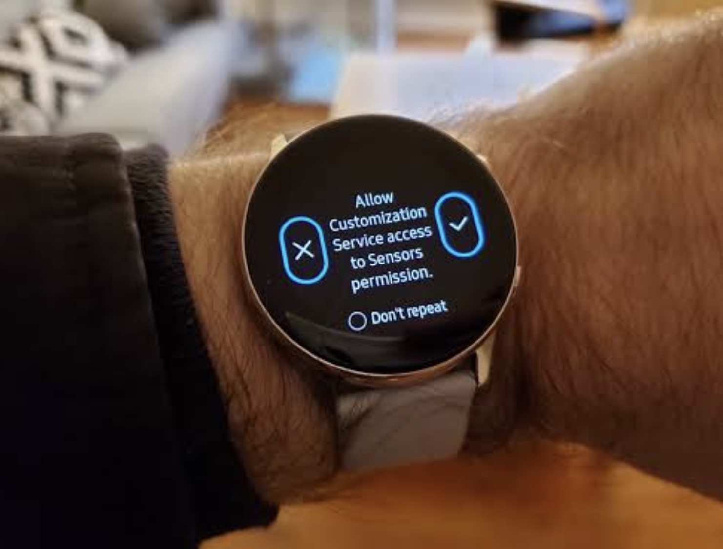
What the hell does this even mean? I'm pretty tech savvy and this confuses the hell out of me, so I can't imagine what less advanced users think. Anyway, I agreed to it since I kind of assume lots of stuff wouldn't work if I don't allow this.
Bixby
“Hi Bixby, what's the weather?”
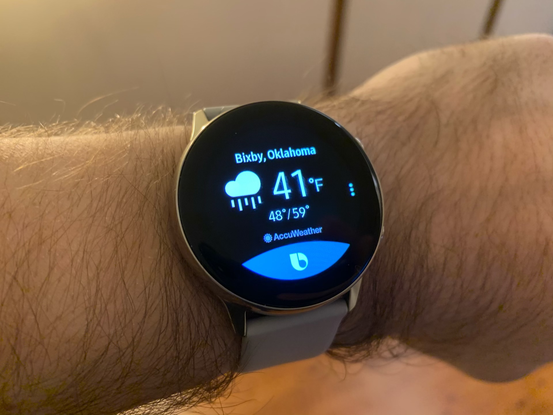
Well, I don't know how I expected that to go 🤦♂️
Bixby is the only voice assistant you can use on this device; Google Assistant is not an option. I'll also note here that none of Google’s apps work with the watch either. Notifications work (more on these later), but they feel very much siloed off from your watch.
Watch Faces
The watch face is the most important part of a smart watch’s software and this watch has a collection of faces that I simply don’t like. The best watch face is called Breath, and is very similar to the watch face with the same title on the Apple Watch. Here’s the thing though, this is the best face on the Active and it’s one of the more ho-hum faces on the Apple Watch.
Here are all of the watch faces that come installed on the device out of the box:
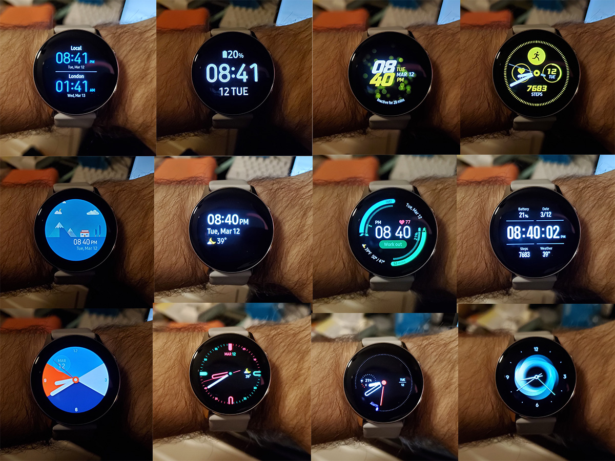
None of these look good to me, with most of them being frankly unacceptable.
Not only do I think these look bad, but they are also shocking sparse on content. If you want your watch face to give you more than the time and the current temp, then these are going to let you down. Complications are sort of here, but most watch faces only let you change their colors to one of three options.
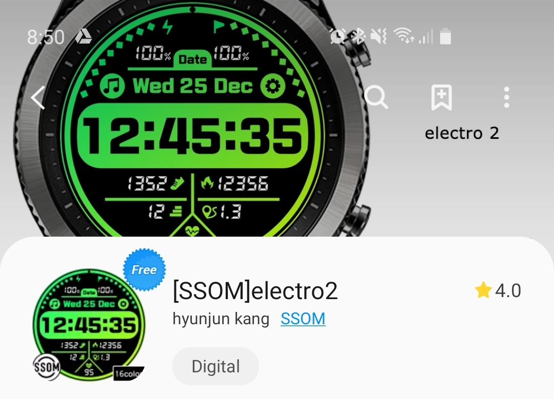
And then we need to talk about the third party faces. These are more of a dumpster fire than I ever expected. I strongly believe that the iOS development community can make some very nice faces for the Apple Watch, but the watch faces I see available for the Samsung line of watches makes me question that belief. This is the most popular free watch face on the Galaxy Store tonight:
And this ugliness is not alone, here are the featured collections of faces:
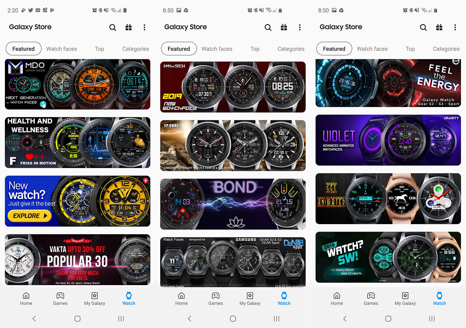
These are all basically the same ugly-ass style and I think they look abysmal. I don’t say that lightly and I hate to say that about something other people really enjoy, but these are rough and I would never be caught dead with these on my wrist. Watch faces should embrace their digital nature, not emulate $20 Timexes.
These were a massive disappointment and are one of the main reasons I can’t wait to get this off my wrist.
A Round Watch Face
I had little interest in a round Apple Watch before, and now I have zero interest in a round watch from Apple. I wrote this way back in 2015 about how round watches are wrong for digital watches and that they were just a fad. I underestimated how long this style would last on the Android side, but I think I was completely right about round being a bad shape.
The bottom line here is that none of the things I’m looking at on my watch are round. Text messages, Slacks, emails, news, and the rest are all much better displayed on a rectangular screen. I think Samsung knows this too because all content displays in a thin rectangle in the center of the screen. They do this to minimize the content that is cut off by the rounded screen, but it also means that everything takes up a ton of vertical space. Short headlines in my Inoreader notifications required me to scroll to see everything, and even further to see the actions I could take on that notification. The two below screens could effectively display the same amount of content that the Gear Active can:
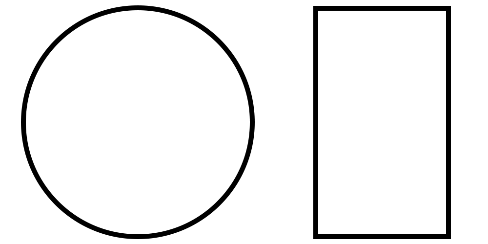
This screen shape usually means tons of empty black space that takes up room on my wrist but provides zero value.
About the only things that are built with the round screen in mind are the native Samsung apps, most of which have some UI that wraps around the edge of the screen. These are fine and relatively well made, but most of them would work just was well on a square screen.
Performance
Let’s talk about something good to break up the bad stuff. Performance on this thing is actually quite good! Everything happens pretty quick and I almost never felt like I was waiting on the watch to do something. Considering where we started in 2014/15 with the first smart watches, this is very welcome.
I really have nothing else to say here other than I’m happy to see Samsung build an operating system around the hardware at hand and not throwing too much at this teeny tiny computer.
Workout Tracking
Another pretty good note is workout tracking itself, which is the main reason you should get this watch. Workouts start fast and there are tons of them available. My testing of this was quite limited due to my short time with the watch, but the app launches instantly and it does an incredibly good job of auto-pausing workouts when you stop for a minute. It paused a few seconds after I stopped walking during a dog walk, and started up almost immediately after I started walking again. This was fantastic.
They of course also have Samsung Health, which has you “fill your heart” instead of your rings, with goals for calories burned, minutes active, and hours standing.
The watch will also yell at you for sitting too long, but unlike the Apple Watch it will ask you to do a quick arm workout at your desk instead of making you stand up. It’s pretty cool, although not something I’ll probably do again.
Battery Life
Battery life has been good, with me getting almost 2 days with the screen off all the time (like the Apple Watch) and then a little less than 24 hours when I enabled the alway-on display. Neither of these are super exciting, but they definitely get the job done.
As for charging, it takes well over an hour to charge this thing up. I don't know the exact time, but it's slower than I expected. As a cool trick for those with a Galaxy S10, I love the ability to charge straight from my phone.
It's worth noting that while it charges from the Galaxy S10, it does not work with any of my Qi wireless chargers, so it appears to pick and choose what devices may charge it, just like the Apple Watch.
Notifications
Hot damn, this is what made me quit this thing. This is the newest Galaxy Watch and I’m using it with Samsung’s newest phone, the S10e. By all accounts, I should be Samsung’s ideal customer and am using the optimal combination for this product.
I say that because the experience I had with the “smart” things this watch does feels terrible and almost acts like they’re products not really meant to work together.
https://twitter.com/mattbirchler/status/1105535909871665152
There is no way to authenticate yourself on the watch (no pin, not pattern, and no biometrics) and it behaves exactly the same whether it’s on your wrist or sitting loose on a table. This is convenient for YouTubers recording videos, but it’s possibly the worst software decision in this entire product.
Since the watch can never trust that it is indeed me who is asking it to do something (without authentication how can it know someone didn’t just steal it off my wrist and is now sending nasty texts in my name?), it needs to confirm every single action I take on notifications by asking me to use my phone to authenticate the request. Pardon my French, but how in the Sam hell is this acceptable behavior for a smart watch? The point of the watch is to let me do things without the phone! Even mundane things like archiving emails resulted in a message on the phone that said “check your phone” and the action would not take place until I authenticated with my face of fingerprint.
Seriously…
It was at that moment, after asking my watch to archive an email and confirming it on my phone that I decided to return this thing.
On the plus side, there is a cool feature you can turn on (off by default) that makes it so that if a notification comes in, you raise your wrist to look at it, and then unlock your phone, the phone will open up to the content of that notification. This is clever in that the feeling of “oh, this is something I should handle on my phone” is a relatively common experience when using a smart watch, and being able to instantly get you into the thing you were alerted by is clever. I would love to see this added to the Apple Watch.
Conclusion
There is probably more to say and I likely didn’t cover everything about this watch, but if you’ve made it this far in the review I suspect you are not planning on getting this watch. If you are, please know that it’s going to be better for a workout tracker than a full on smart watch. If that’s what you’re looking for, then this might be a decent solution. It’s $199, runs well, has pretty good health tracking tools, and works with Android and iOS. It also supports Samsung Pay so you can make payments with NFC from the watch, which you won’t get on most fitness-focused bands.
On the other hand, if you are using iOS I simply can not recommend this when the Apple Watch exists. Best Buy currently has the Apple Watch Series 3 for $199 which eliminates the price difference, and even at the normal $279 price point, I truly think the additional functionality would be worth the extra cost to just about everyone.
My “review” has certainly not been comprehensive, but hopefully you at least understand my feelings towards this device. I truly dislike it at a very core level. I went in with high hopes and had them dashed in fantastic fashion. This watch might be right for some people, and I hope they do enjoy it greatly, but it is certainly not for me, and I think if you are used to the Apple Watch’s form, functionality, and attention to detail, you will feel the same.

