macOS Isn't as Small As You Think

I think Apple should add touch to Macs, and I think that this will allow them to not only make current form factors better, but it will allow them to create Macs that are more flexible, more powerful, and more accessible than any Macs before them.
That said, there are people in the Mac community who disagree with me here, and their number one concern is that macOS has a UI that is simply unusable with touch. It's the ace-in-the-hole argument, and it's honestly something I haven't pushed back on because it feels true.
But is it?
The Comparison
I decided to look at two devices in my home that would be as fair as possible for this comparison:
- 14" MacBook Pro (2021)
- iPad mini (2021)
My MacBook is a pretty average Mac laptop size, and the iPad mini is the literal smallest iPad Apple makes. Nobody is out there saying that the iPad mini is unusable via touch, in fact many people in the enthusiast community will tell you the iPad mini is the epitome of the iPad lineup.
Given that, I think the touch targets on the iPad mini are reasonable for most people, and I think even "don't bring touch to my Mac" people would agree here.
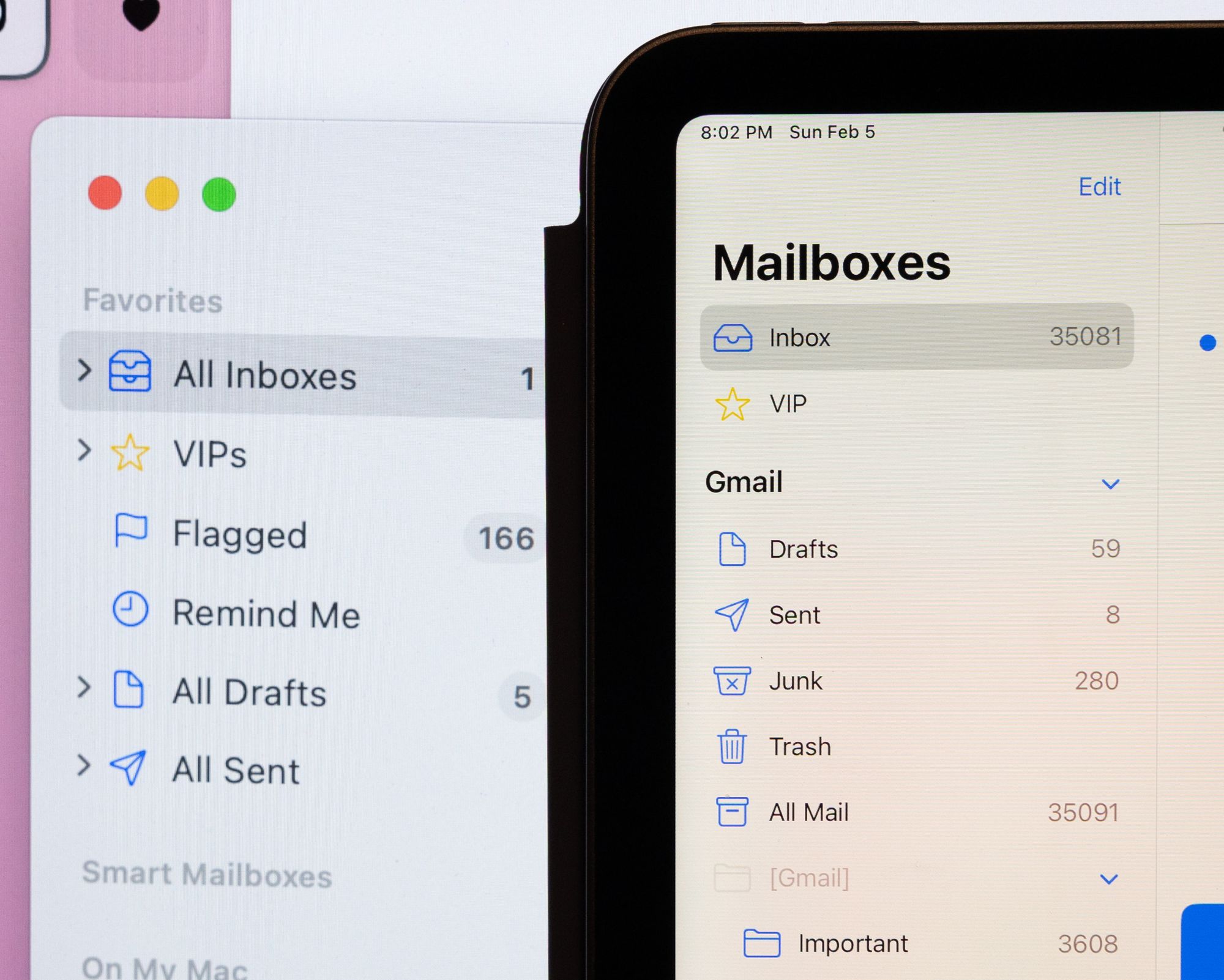
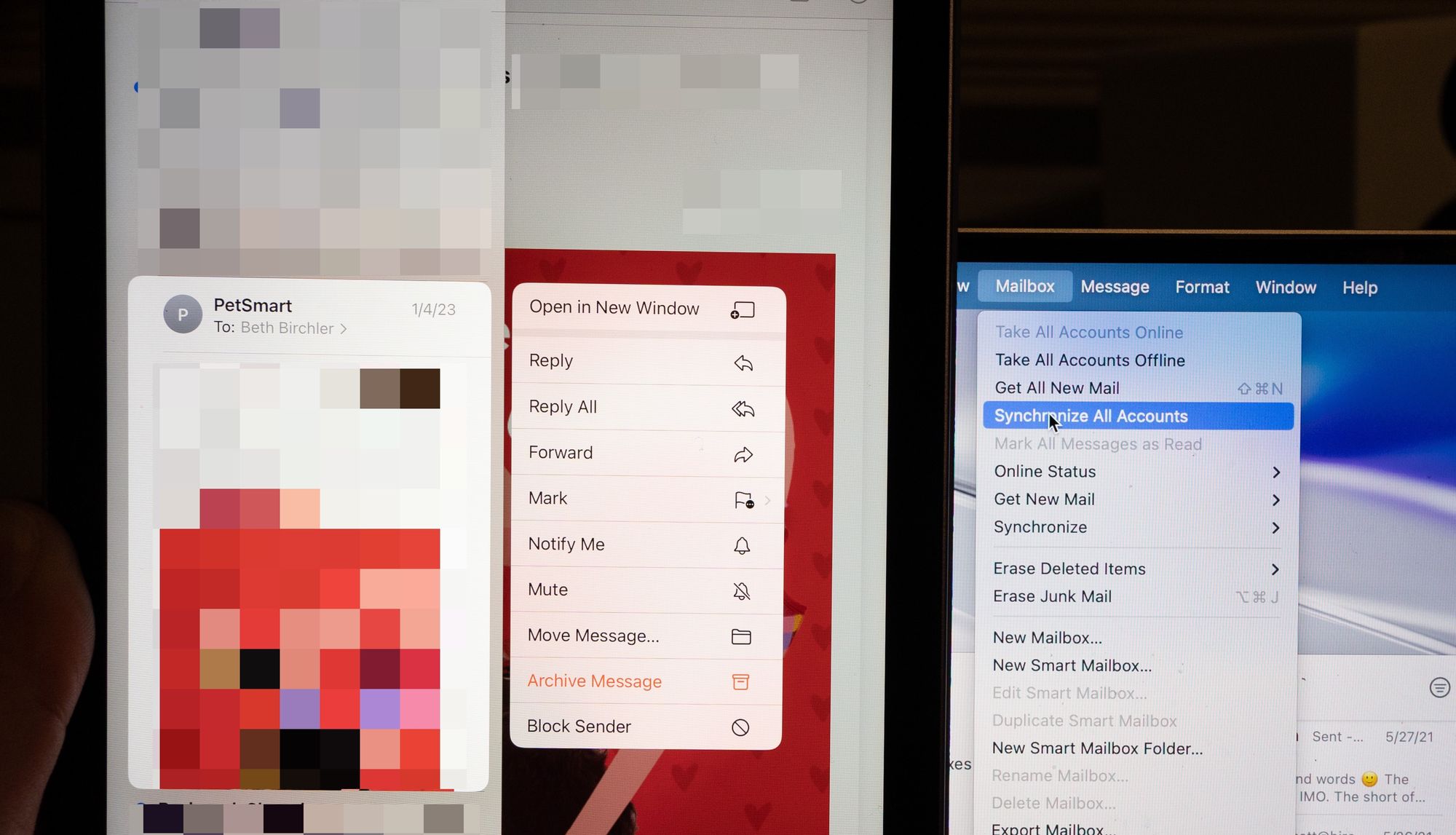
I first looked at Mail, Apple's default mail app, and likely one of the most commonly used apps on both iPadOS and macOS. Here's a photo of the title bar icons on the two devices in this comparison:
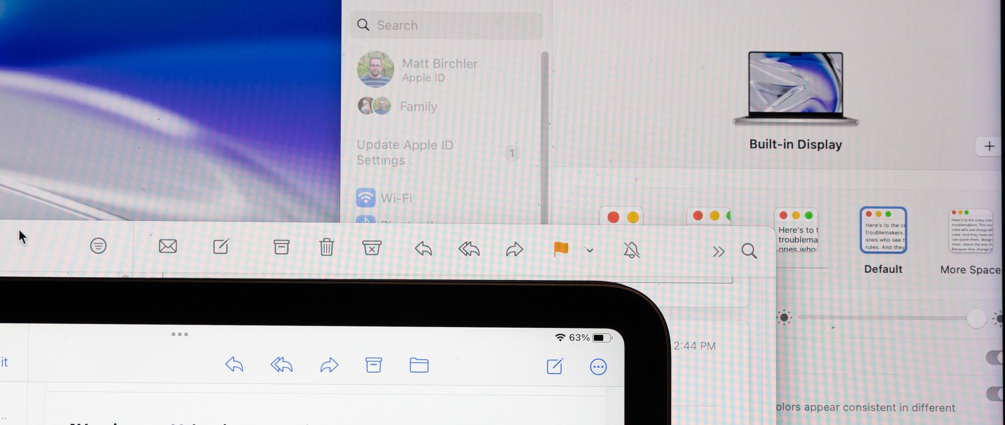
As you can see, they're effectively identical. If anything, the iPad icons are slightly oversized since they're a bit closer to the camera, but I think it's fair to say they're within the margin of error. The sizing and spacing are effectively identical.
Oh, and I've included the System Settings window in the background to prove that I'm using the default display scaling option. There are actually 3 zoom levels that could make the Mac UI bigger if I wanted!
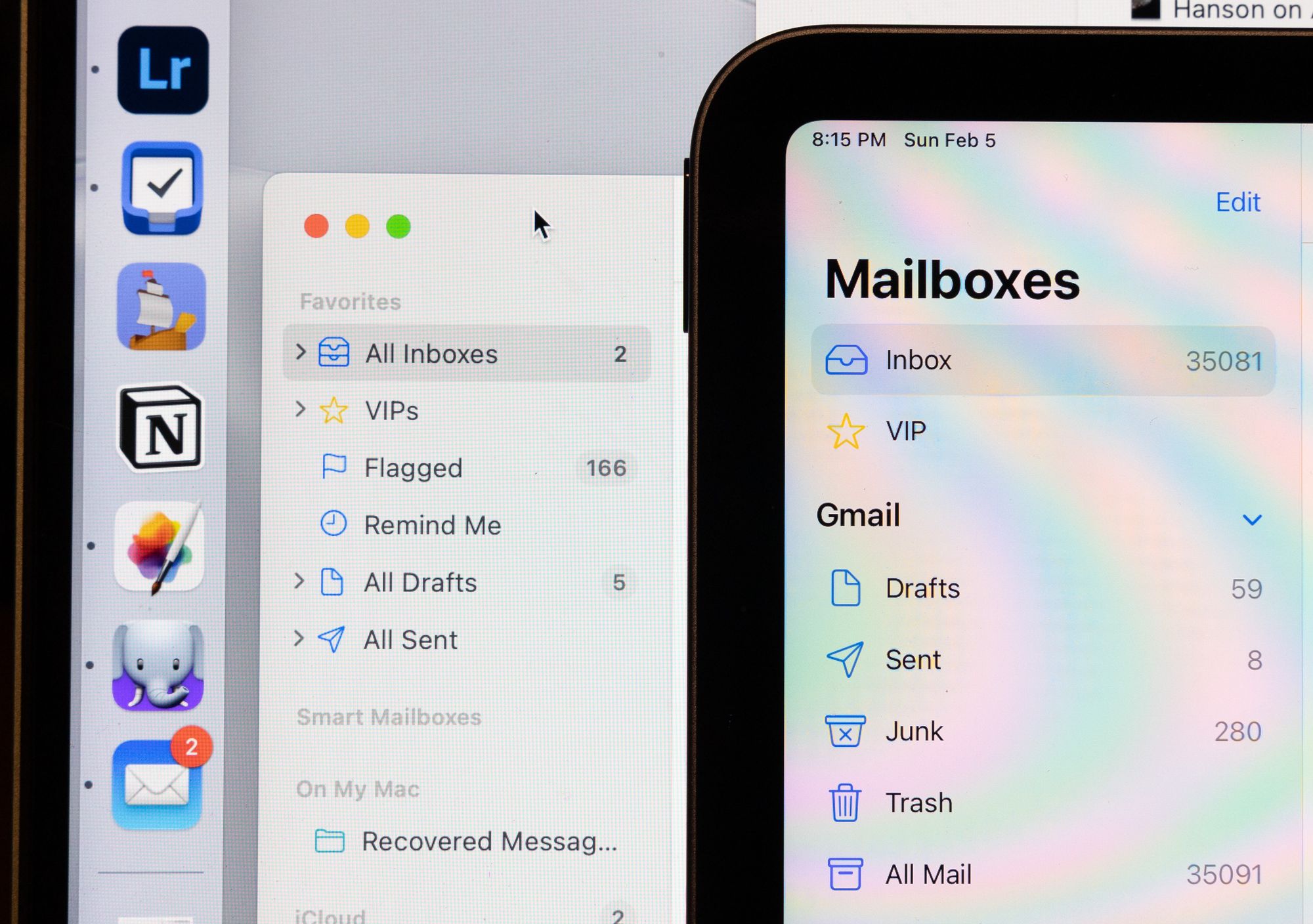
There is a bit of a difference in the sidebar, but a couple pixels of vertical padding would normalize these. In fact, when I compare the iPad to what Mail looks like on my 27" display, the Mac's touch targets are actually bigger.
Menus are the one place there is a bit of a difference, but it's very subtle.
Add like 2-3px of padding to the macOS menus and they're exactly the same.
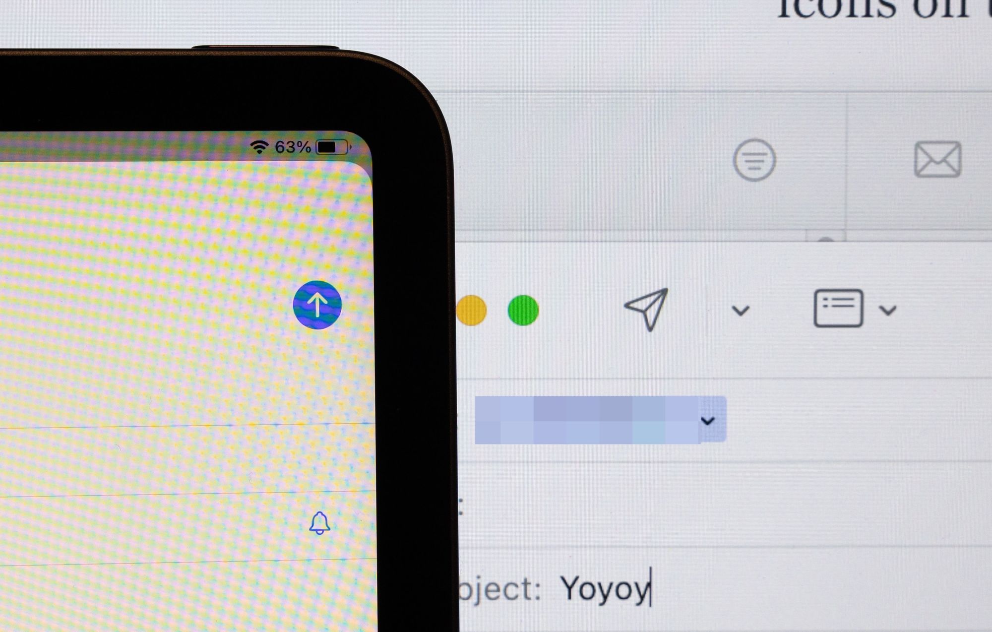
And when you're about to send that email…yeah, the send buttons are the same size again.
Other Apps
These general trends persisted across all of Apple's apps I checked out, largely because Apple's apps (mostly) all use the same system controls.
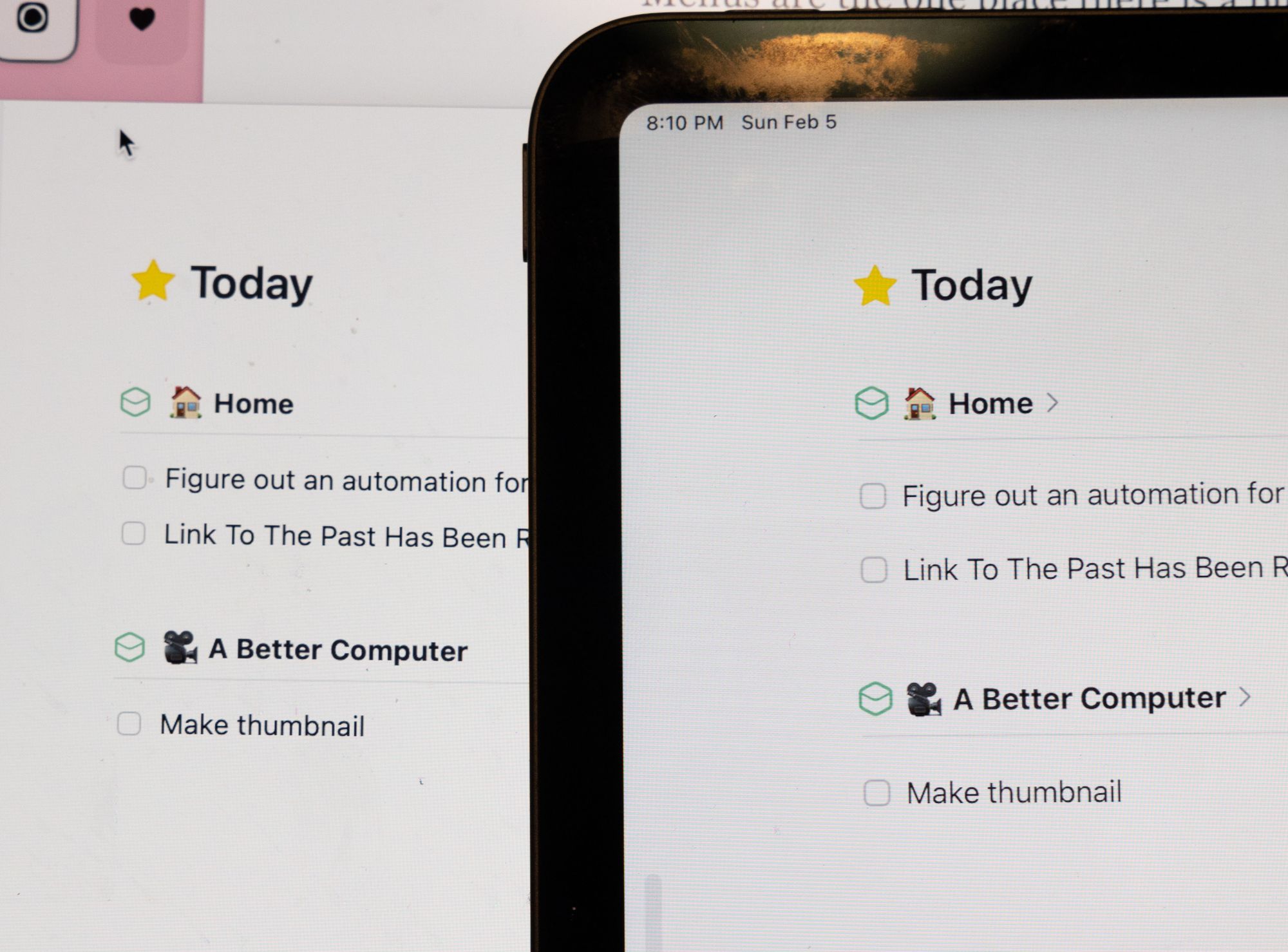
Third party apps also showed very similar results. Here's Things 3, for example, showing the same todo items at exactly the same size.
Again, all of these comparisons are being done at the default UI scaling mode. If you have less than perfect vision and boost the UI size at all, by all accounts, the UI on a Mac is as big, if not bigger than the same UI elements on an iPad mini.
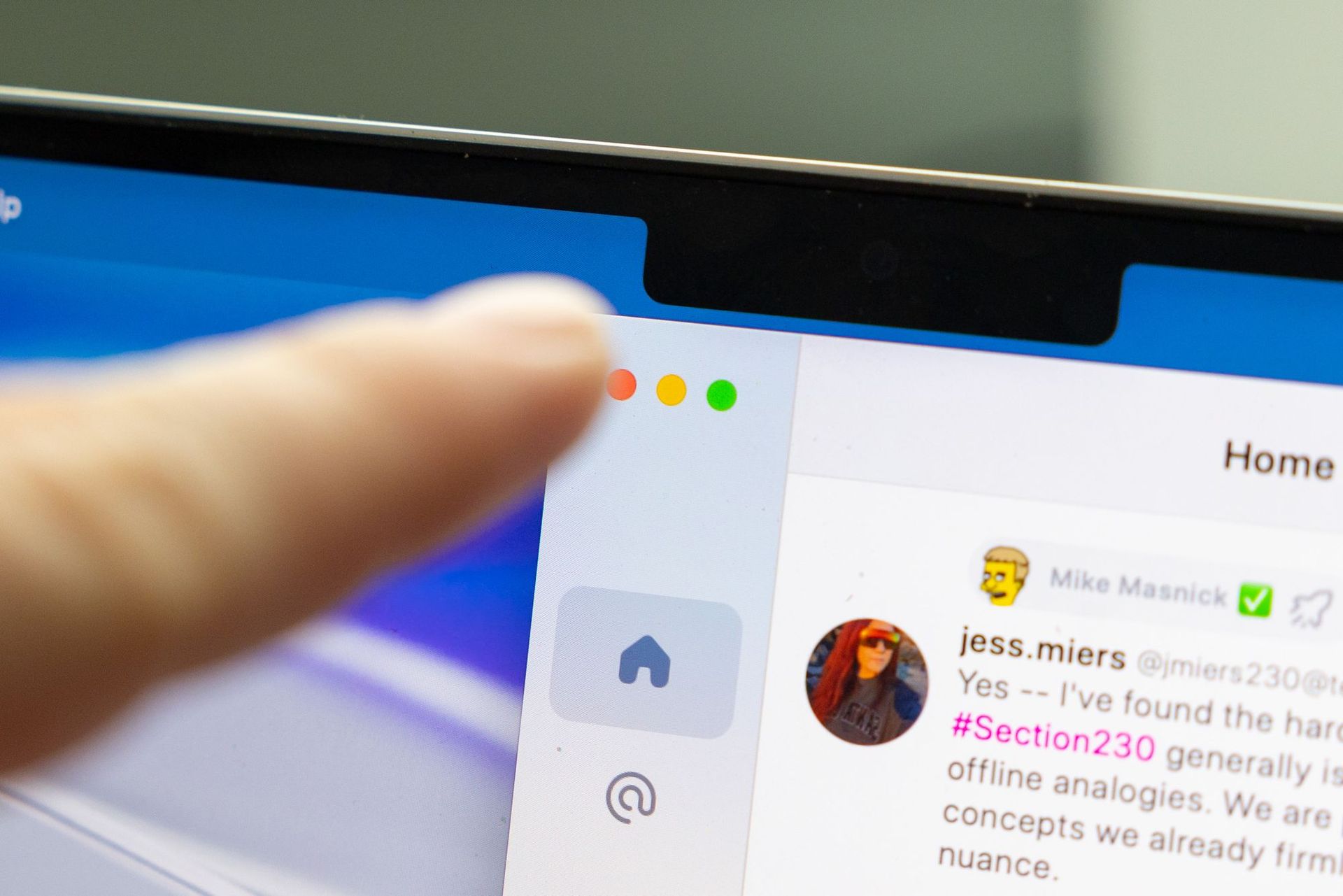
But Those Window Buttons
Admittedly, those close/minimize/maximize buttons on macOS windows are pretty small, and they are not super friendly to touch. I would suggest two possible solutions here.
- Add a few pixels of horizontal padding when using a touch-enabled screen.
- Add a new touch-centric method of performing these actions.
I will remind you that iPadOS uses this control to do these actions:
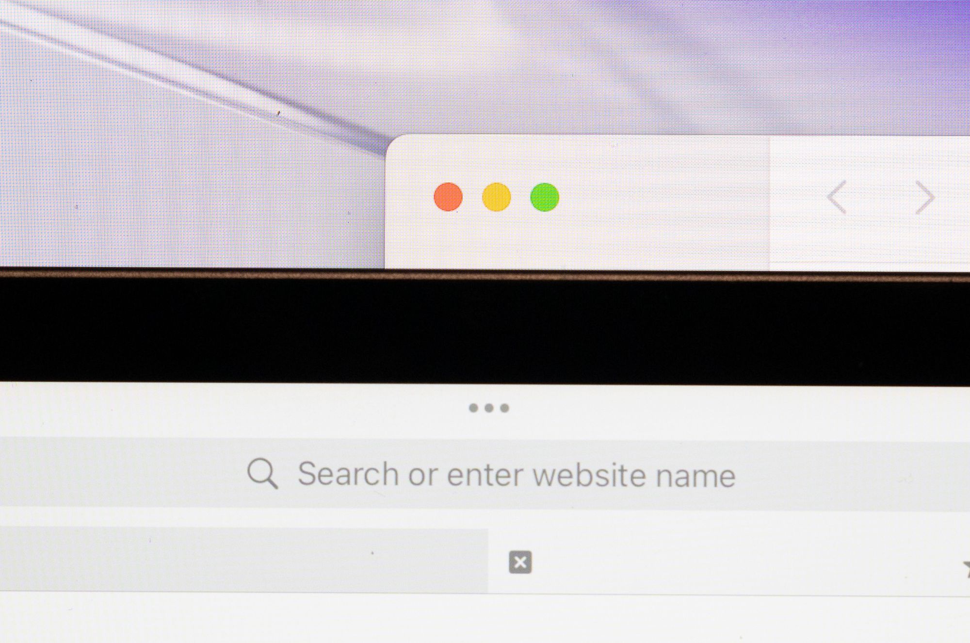
If anything, the macOS targets are easier to hit than this tiny little thing! I actually think these are a bit small on both platforms, and having a larger UI element to manage windows would be a decent enhancement to both of them.
Takeaway
I will say that there are certainly some macOS UI elements that could be tricky to use with touch, but I think they're the exception, not the rule. Still, Apple will certainly make some UI changes to accommodate touch as an officially-supported input method on the platform.
And as Apple has been pushing developers to move to SwiftUI in recent years, I would expect those apps to automatically get these enhancements, and I wouldn't be surprised in many UIKit apps got some of these enhancements "for free" as well. That's not to mention all the Catalyst apps that were originally built to run as touch-first apps, as well as the iPhone and iPad apps that run natively on all Macs with Apple silicon.
There's a narrative out there that touch is just so incompatible with macOS and that in order to make it work, the macOS UI would have to get blown up to comical proportions, but I don't think that's the case. Changes will be made, but I think macOS is more touch-friendly today than many people give it credit for.
Aside: some will reference their experience using macOS on an iPad with Screens or some other screen sharing software. I will note that most (all?) of those people are connecting to computers plugged into 27" monitors, and Screens simulates a 27" screen when doing this sort of screen share. Yes, obviously UI elements optimzed for a 27" display and then scaled down to an 11" iPad display is going to be tricky to use. As we saw in these real-life photos, the UI on a 14" MacBook Pro is basically identical already to the UI on an 8" iPad mini, so I would suggest this remote desktop comparison isn't a realistic or useful comparison.