Things Might Look Wrong for Bit…
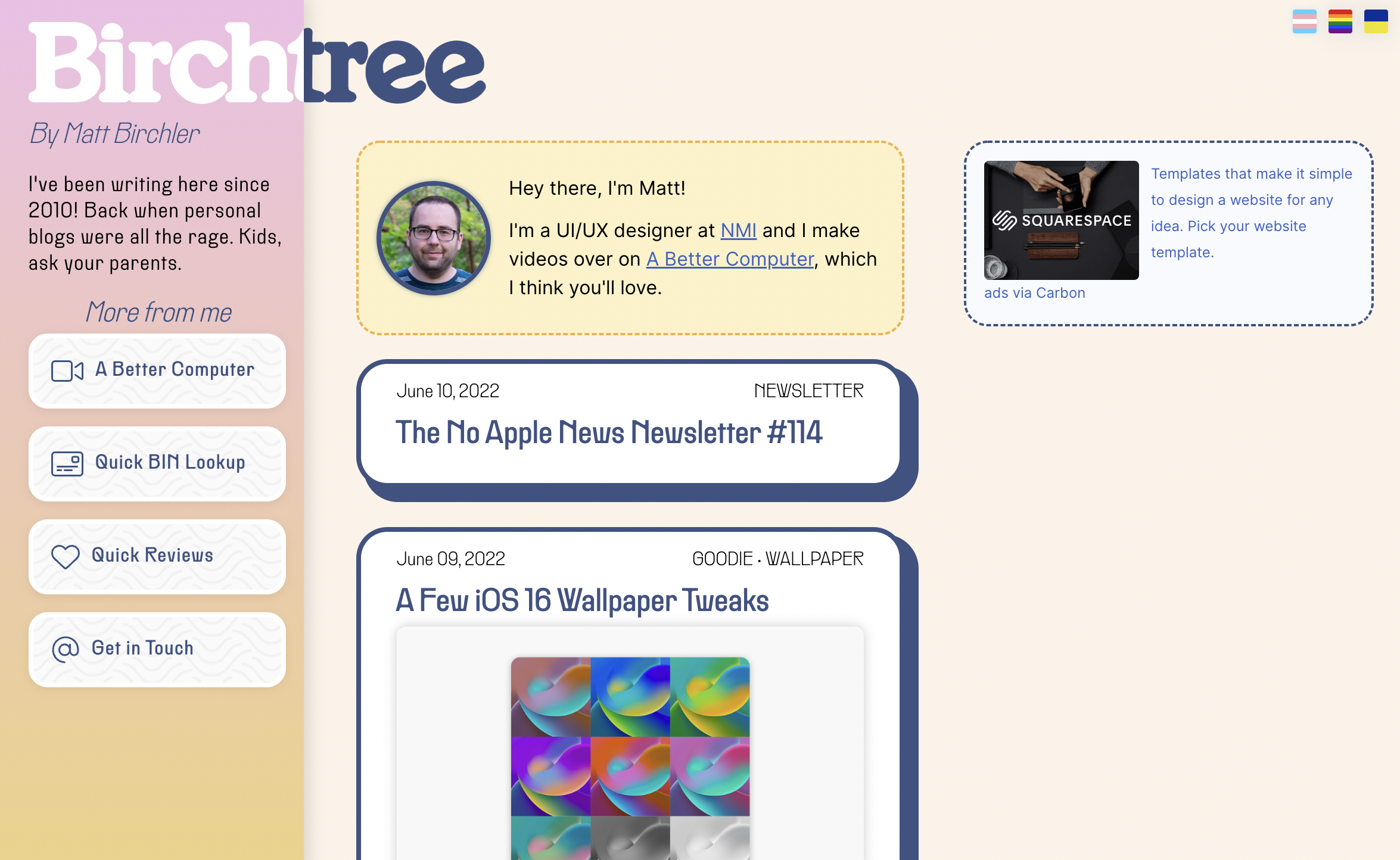
Welcome to the latest look for Birchtree!
I wanted the site to get a bit more adventurous, maybe even a bit more divisive. I hope most of you like the new look, but I'm honestly okay with some people not digging it. If this site were a big business or I was making it for someone else, I wouldn't make it like this at all. But it's 2022 and this is a personal blog; if you can't be weird here, then where can you be weird?
I did have some actual ideas for this redesign, and they were:
- Birchtree is now ad free (on mobile)! For many years I've run one ad on this site, it's from a company I like, and I like the sorts of products they advertise. I'm still using these ads, and they look great on desktops and iPads, but if you're browsing on your phone then you won't see ads at all. They're gone from mobile because they just took up more space than I wanted and they weren't making me enough money to warrant that sacrifice of space. I reserve the right to change this in the future, but for now enjoy the ad-free experience on your phone.
- Share my other projects more clearly. This site used to be the center of my online work, but it's just not anymore. To better call out those other things, especially for people who are just coming across my work, I wanted to explain like a human what these other things are. Hence the "name tag" at the top of the page that explains what I do quickly and clearly. If you're reading on mobile, I've killed the menu links in favor of another sentence in there with links to me other web projects.
- Become more legible. The old site never quite had the font weights correct and line length was out of control on a desktop screen. I personally found it a bit hard to read my own stuff, which is never a good sign. It wasn't bad, but I knew I could do better.
- Along the same lines, I wanted to use the fonts I love. The site now runs 3 fonts: Henrietta, Rader, and Inter. The site title uses Henrietta, most UI text and headings are using Rader (this is my font for everything on A Better Computer as well), and Inter is used for all article text.
- How about some god damned whimsy? I want Birchtree to stand out from the reset of the sites you visit, and I was becoming more and more blah about the trendiness of the last design. The new site has 3D animations, bolder colors, and got me using shadows and borders in ways I've never really done in web design before. I'm not saying it's perfect, but I like it.
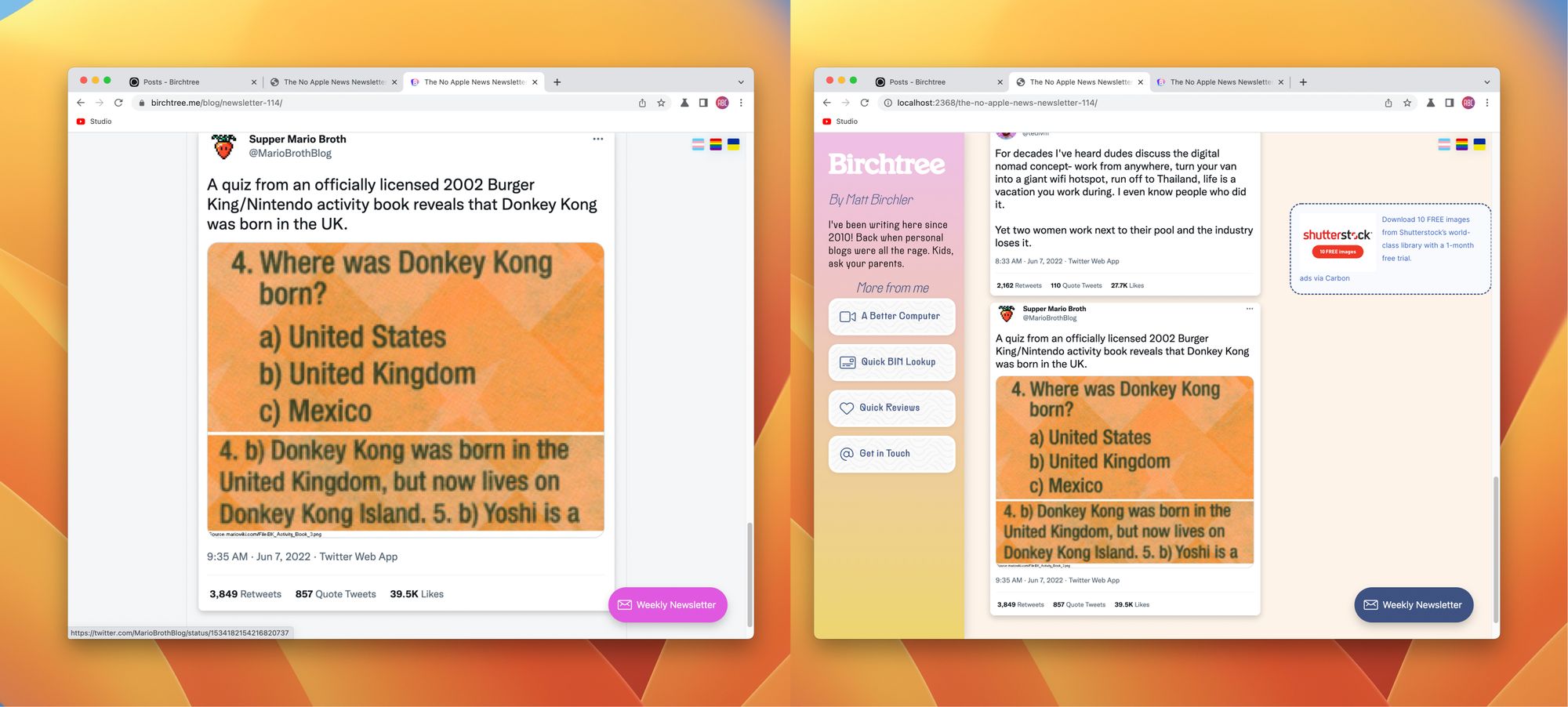
- Use the space better. I post a lot of images on this site, and the wide width of the content meant images took up basically the whole screen at times. Below is a side-by-side comparison of the same post in each design, and I much prefer the new one. Similarly, I have condensed the home page to only show titles and header images so I can list more things at once. If you need to zoom in on something, pinch-to-zoom 🙂
Oh, and because caching can cause things to look really weird for a while, here's what the site should look like if everything has been successful.
