Undiscoverable, Essential UI
I wrote this back in Febraury:
Without even leaving the Finder and Desktop I was able to find a bunch of things that long-time Mac users had never known about because they never discovered them in their daily use.
Fast forward 8 miserable months later and Mac users are freaking out over "proxy icons" hiding themselves until you hover over them. For those hearing "proxy icon" for the first time, fear not, I was in your shoes as well. This is a proxy icon (the icon next to my home folder title):

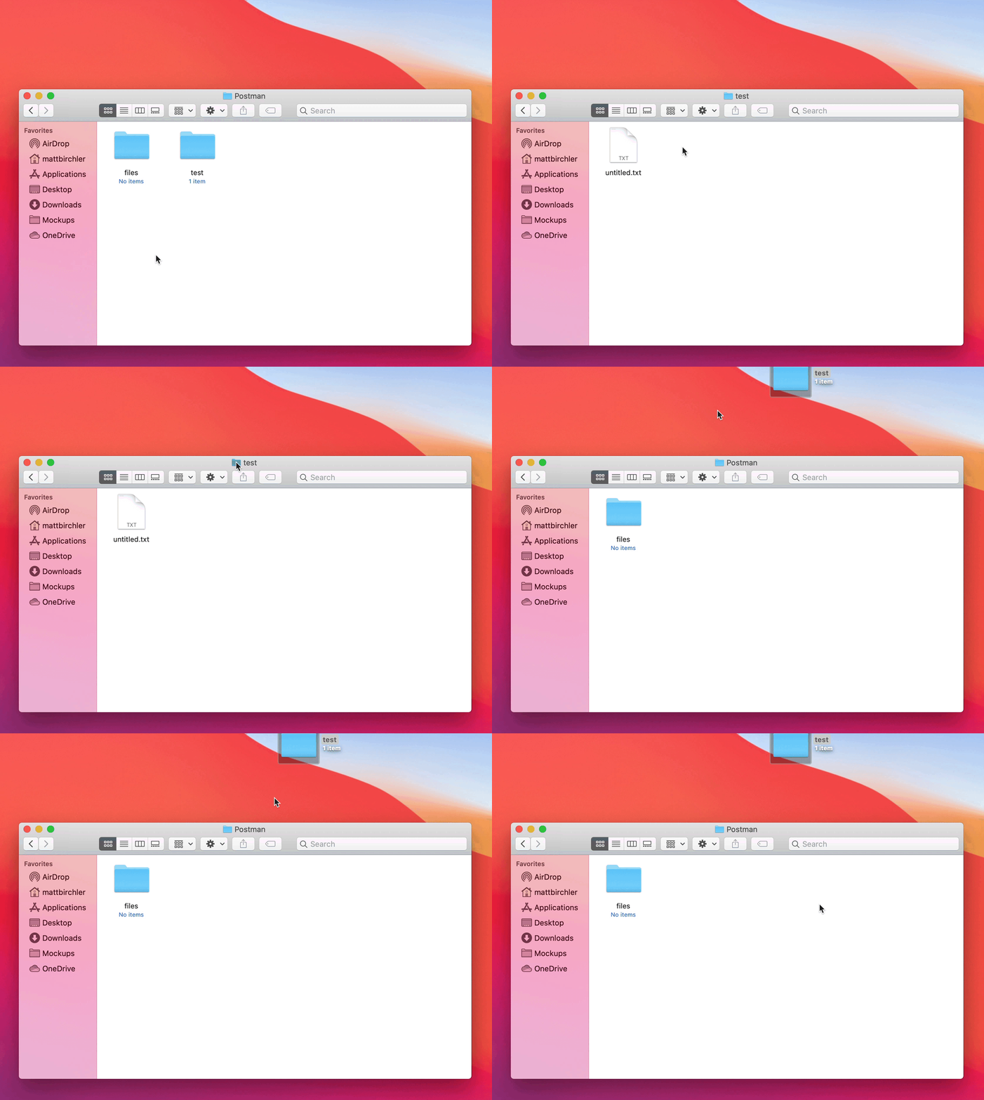
The best way I can describe it is to say it's exactly like the icon for a folder, app, or file in the Finder window, but it's in the window menubar. Here's an example of using it to move the folder you're looking at into a different location in the Finder:

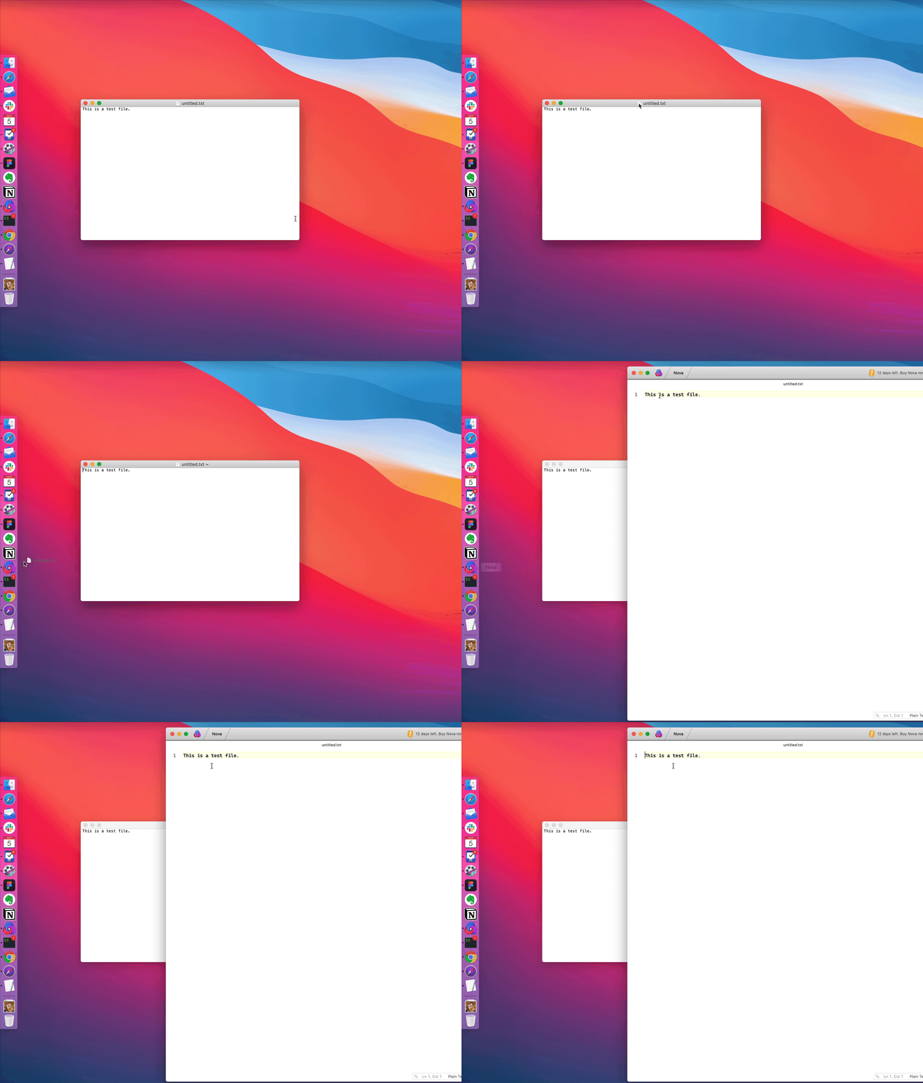
And here it is being used to open a file you already have open in one app into another app:

As I said, I've been a Mac user Since 1995 and I never knew this was a thing you could do. Now that I know it's a thing, I'm not sure what I'll do with it, but maybe I'll figure something out.
The Big Sur auto-hidden document-proxy icon is so frustrating — it hides functionality behind an invisible mode, and introduces a delay for anyone trying to use it.
— Marco Arment (@marcoarment) October 3, 2020
How does this help usability?
What problem does this solve?
Is anyone empowered at Apple to ask these questions? pic.twitter.com/JXYXhppHfD
If you knew about this and used it, then clearly Big Sur is a regression in this regard and you should be upset. That said, this is not a super discoverable feature and I would bet that the vast majority of Mac users have never used this before. I'm not saying that is a good reason to make it worse, more of a reminder that when it comes to user interfaces, everything you know is discoverable, and everything you don't know is undiscoverable. 🙃


