Who's getting wealthier in America?
One concept I'm obsessed with is the general idea of whether things (art, money, anything) are getting worse, or if we're just nostalgic for when we were younger and simply didn't know as much as we do today. I also like throwing data at my opinions about the world and seeing if they hold up.
Today, let's take a look at the Federal Reserve's data from 1989 through 2025 (which happens to be almost my entire lifetime) on wealth distribution in the US and see how my understanding of income inequality maps to some raw data. Their website has some good visualizations, but I downloaded a bunch of it as well and made my own charts to focus in on specific questions I had.
What age group has all the money?
Obviously, older people have more wealth than younger people, largely because they have had more time to grow in their career and to acquire assets like homes. But how have each age group done over my lifetime?
Below is a chart showing the inflation-adjusted wealth of each age group each year, and while every age group has gone up, there are some clear outliers.
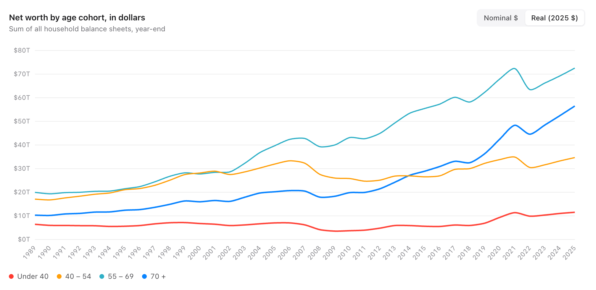
The under 40 segment have seen an 80% rise in wealth, while 40-54 year olds have seen a 120% rise. On its face, that seems okay, but the oldest Americans make those numbers look like nothing. I want to especially point out the 70+ age group, which has seen a 450% increase in wealth (again, inflation-adjusted).
In terms of broad trends, it's interesting that the 40-54 and 55-69 groups were pretty well in lock step through the 90s, and then in 2002 they diverged, with the older group taking off and the younger group basically holding steady for the next 20 years. Also, the growth of wealth in the retirement class is genuinely shocking, a trajectory shift that started in 2008 and has continued through today.
Visualizing these changes as a percentage of overall wealth helps illustrate this as well.
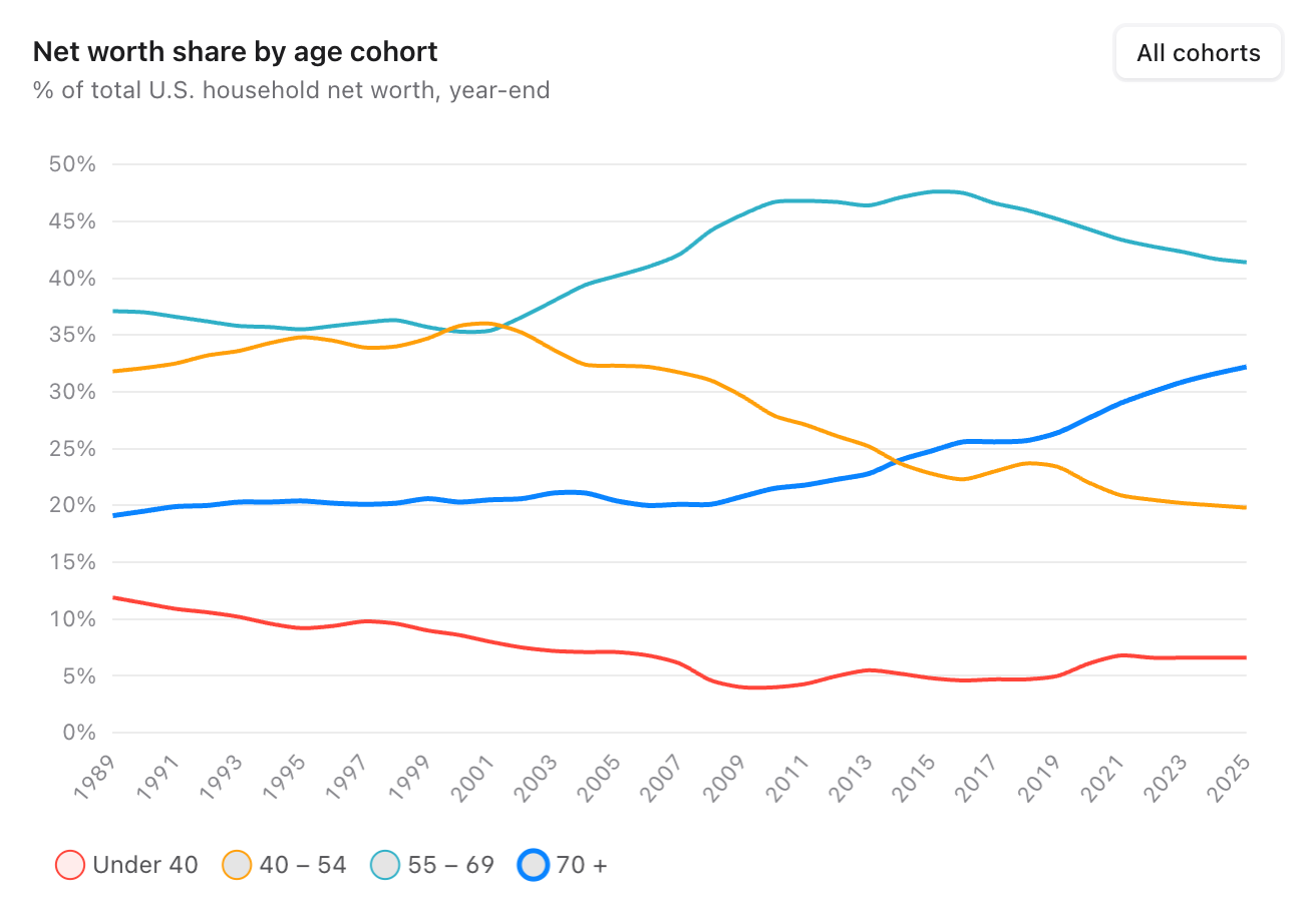
Those under 40 have seen their share of wealth in the US drop by half compared to other age groups. The story is about as bleak for the 40-54 age group as well. Meanwhile, the 70+ year olds are thriving, and the 55 and older age bracket controls 74% of all wealth today, compared to 56% of it in 1989.
My takeaway: wealth is centralizing in older Americans, while 54 and younger Americans have seen their part of the pie shrink considerably. You can't take it with you, but apparently old people are clinging to it as long as they can while they're here.
Is wealth centralizing at the top? Are the rich getting richer?
Income and wealth inequality is core to how I think about my economic policy positions, so it's probably a good idea to check in on whether the income distribution has moved towards the rich or if it's been more steady. Basically, I want to know when statements are made about the US economy growing, does that mean all of us are going up together, or are these gains being realized by one cohort more than another?
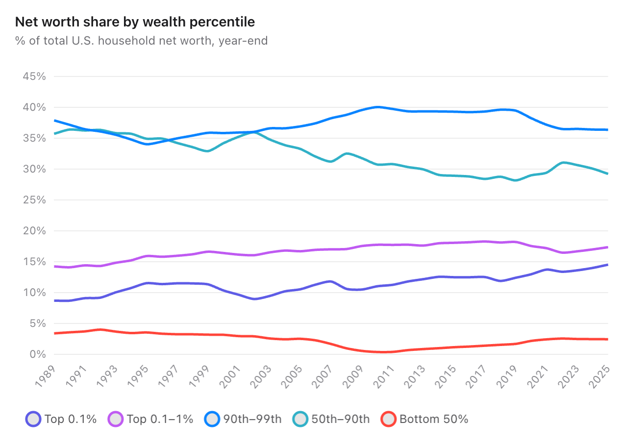
This chart is less dramatic than the age one, but I think there are some notable things here.
First off, look at the share from the bottom 50% of Americans, which I think shows some serious pain. They made up 3.5% of the wealth in 1989, and it's dropped to 2.5% today. but also look at how the 2008 financial crisis hurt each group — it's a blip for everyone else, but it was a massive hit to the bottom half of Americans. From 2006 to 2010, they lost 80% of their share of wealth. The good news, I guess, is that this group has recovered, although that recovery seems to have stalled once the pandemic hit.
Maybe most concerning here is the drop in the 50th-90th percentile, which has dropped quite a bit in their share of wealth pretty consistently through the 21st century. These are the people in the middle and upper middle class, and they've seen their power in the market drop consistently. This is supposed to be the "you made it!" group, but even this group is getting squeezed a bit.
In fact, there are only two cohorts that have seen their share of wealth in the US increase since 1989, and Bernie Sanders would be proud, it's the top 1% and the top 0.1%.
There are a few more interesting ways to process this data.
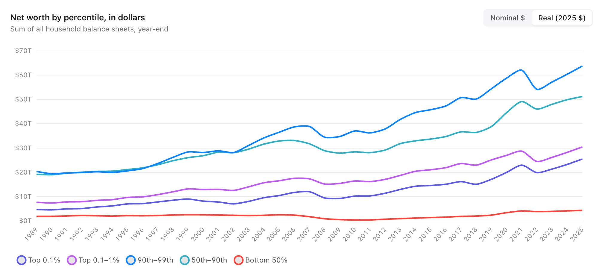
In terms of raw, inflation-adjusted wealth, you can see the higher wealth groups 3-5x their net worth, while the bottom 50% languish far below.
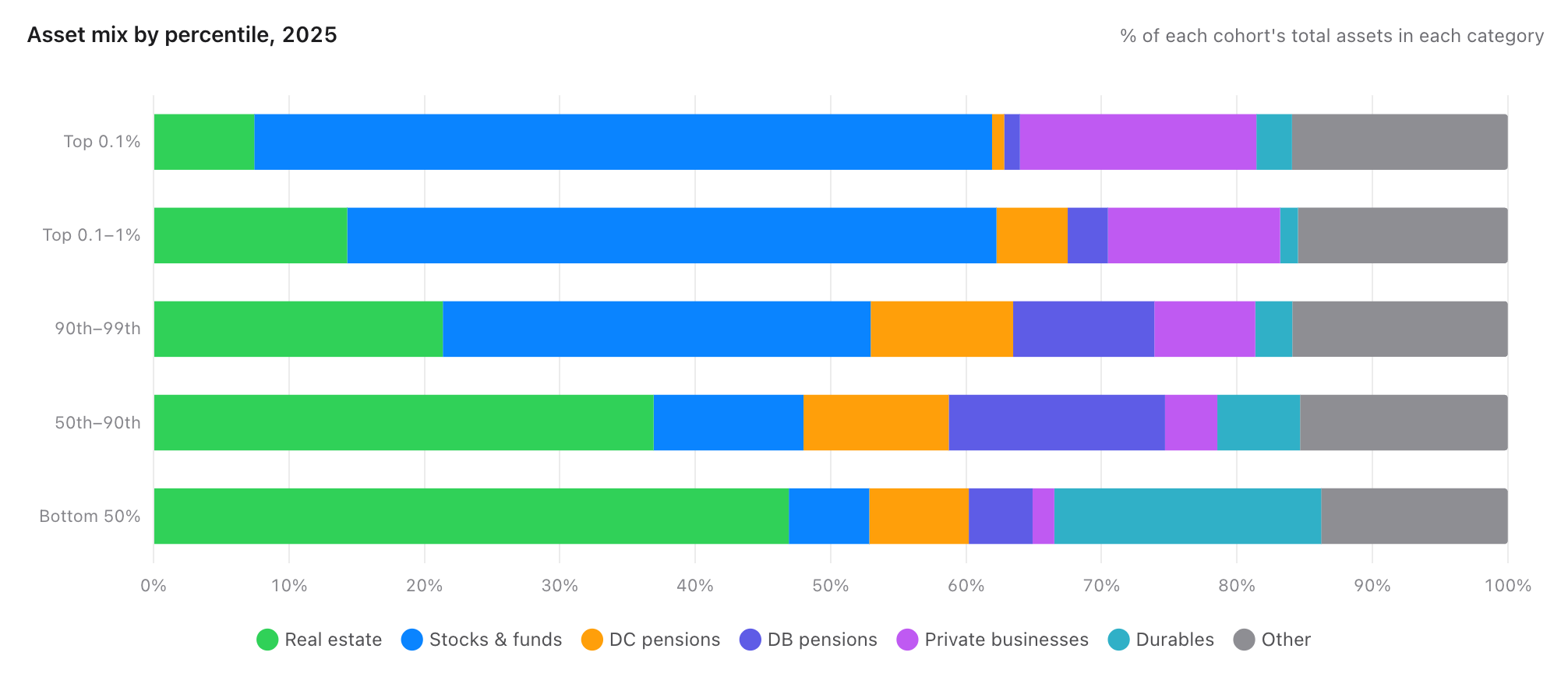
I think this is a good illustration of how wealth changes as you get richer. In the bottom 50% most of your net worth is a combination of your home, your car, and the consumer goods in your house. Meanwhile, the richer you get, the more your wealth is centralized in investments and businesses. I would just note that this is a good illustration of how not all wealth is equal. About 2/3 of the bottom 50%'s wealth comes from their home, cars, and physical goods, which may be "wealth" in economic terms, but it's not exactly liquid in a way that makes you feel wealthy day to day. I guess my car and my PS5 are "assets", but they don't help me pay the bills, and most of them depreciate in value over time.
With that in mind, let's take a look at income distribution.
Whose paychecks are going up?
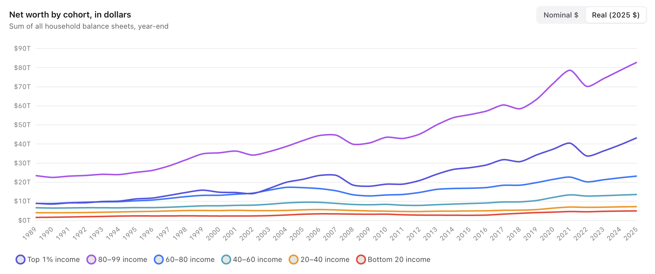
We get a bit of a different mix here than the wealth charts because income is different than wealth. The 70+ age group may have enormous wealth right now, but they're not taking home much of a paycheck these days. Likewise, for many reasons, income isn't something the super wealthy want to prioritize since they're not living paycheck to paycheck, and there are much more tax-friendly way to increase their financial situation.
Anyway, looking at these inflation-adjusted numbers, we certainly see a trend of the top 20% of earners breaking off from everyone else, once again since the turn of the century. The inflation-adjusted income of the bottom 60% of Americans has gone up 110% since 1989, which is good to see, but the top 40% have seen a 261% increase over that same period.
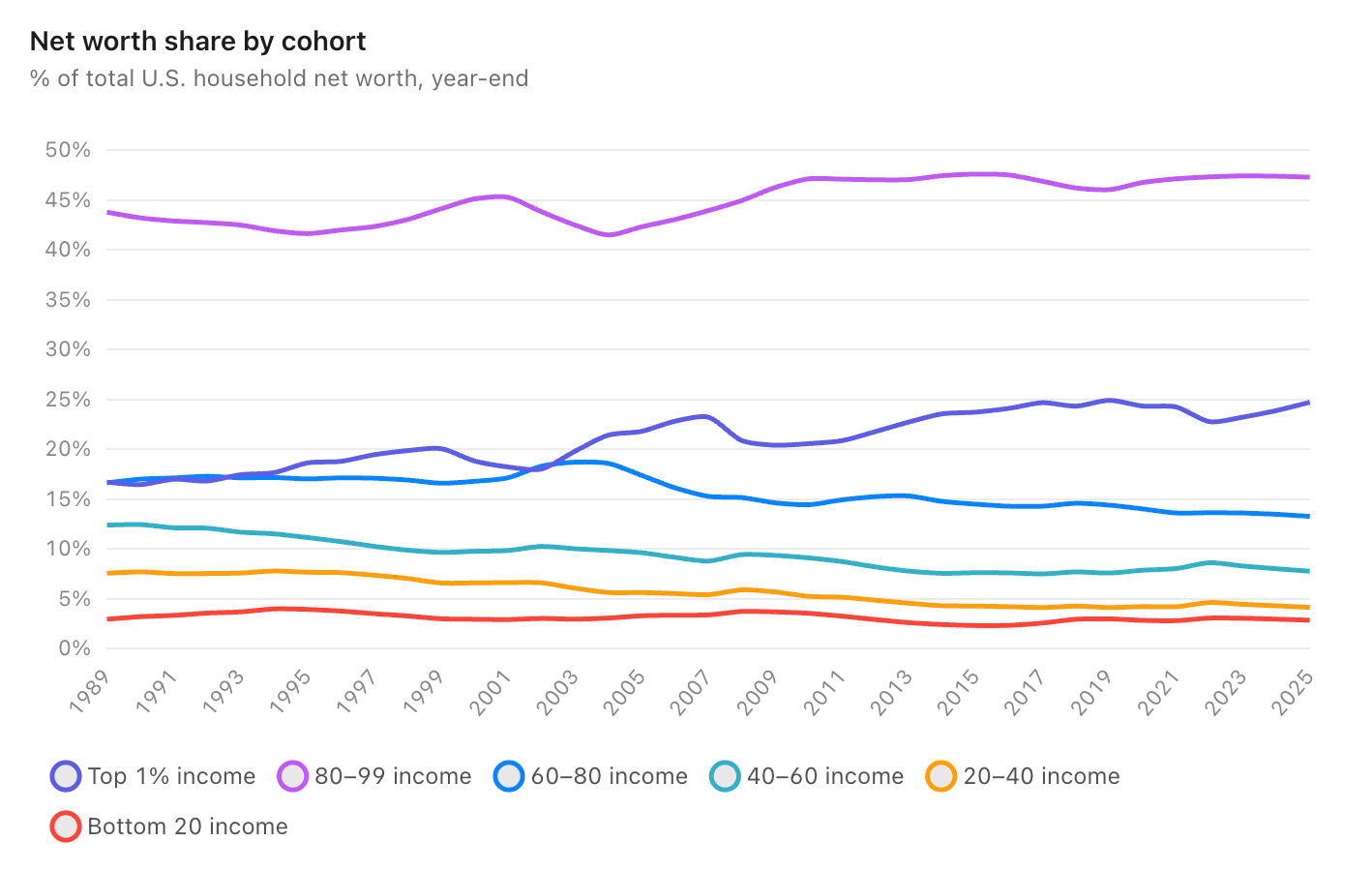
This is reflected in the income share, which shows the 80-99 percentile holding pretty steady over the decades, but every other income group has seen a drop in share while the top 1% increased their share of the pie.
Is education worth it?
Let's bring it home by talking about wealth by education level. Once again, here is the inflation-adjusted wealth since 1989 broken down by education level.
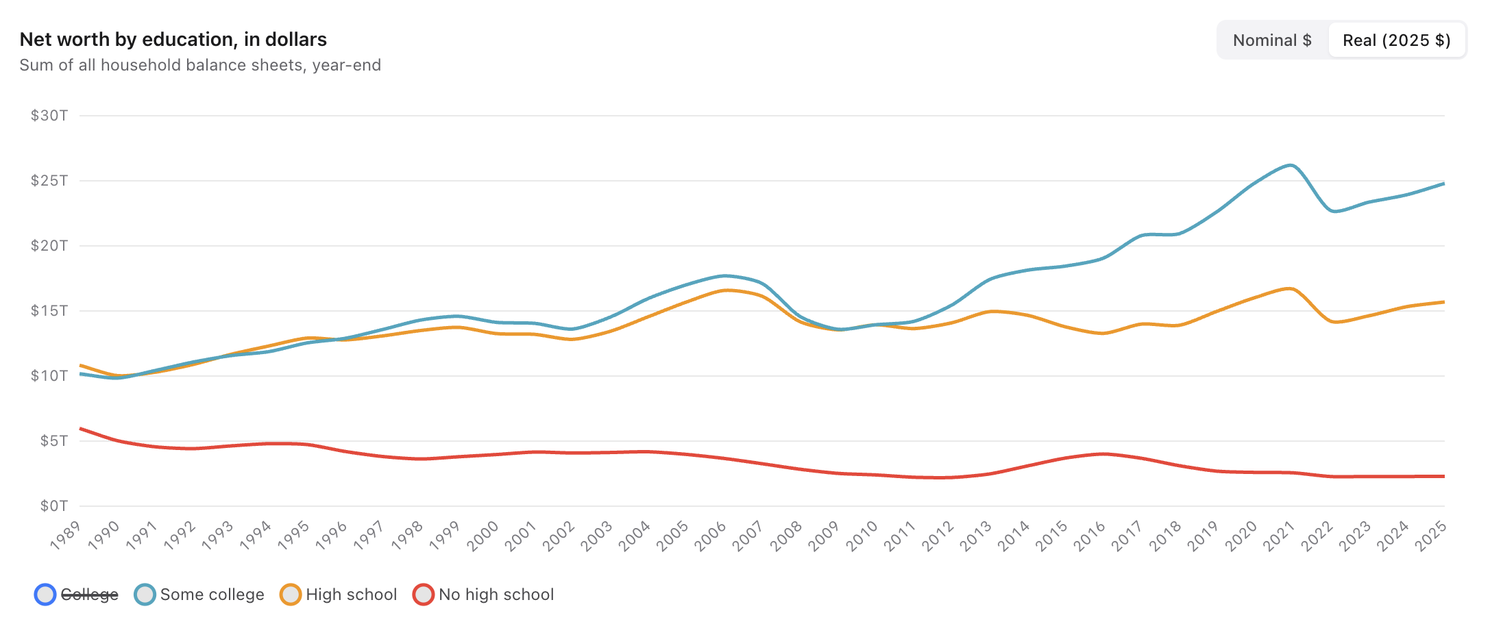
I'm omitting the college line for now, so this is how non-college graduate people are doing. Those who don't graduate high school are consistently dropping, which also aligns with the fact fewer people are dropping out of high school than ever as well. Now let's add in the college graduate group.
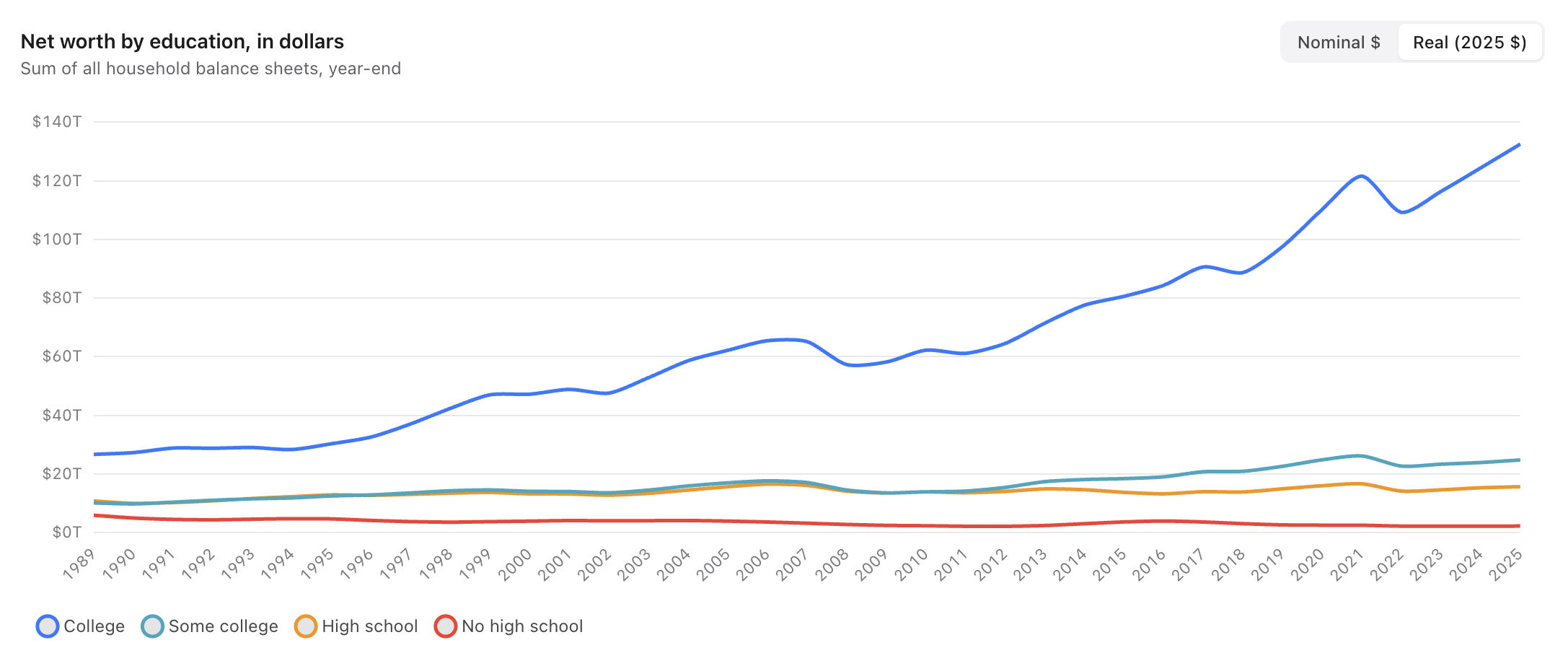
There you go, the vast majority of the wealth is going to people who graduate college. I hid the college line at first because it is so far above the other lines, it made them look flat. As of 2022, 48% of Americans over the age of 25 had a college degree, which means you know we need to look at the share of wealth held by that 48%.
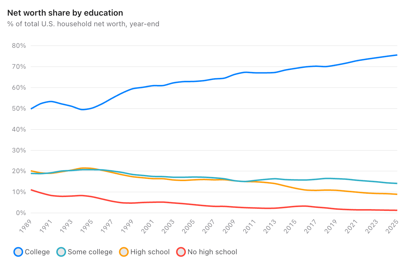
College graduates have 75% of the wealth, up from 50% in 1989. Interestingly, census data from 1989 shows 21% of American adults had a college degree back then, which tells me that while there certainly is a correlation between wealth and education level, it seems this shift in wealth share maps pretty linearly to the number of people getting degrees.
My takeaways
I tried my best to present this data as fairly as possible, and again, anyone can pull this data and do what they want with it. The data points that stood out the most to me were the age, income numbers, and where people's wealth is held. We really are seeing wealth stagnate with the oldest among us in a way that is genuinely different from what was like four decades ago.
It was also really shocking to see how the 2008 financial crisis impacted the wealth of different groups. It was an annoyance for everyone but it wiped out 80% of the bottom 50%'s share of the wealth in a couple years, which is kind of shocking.
On the income front I thought it was very notable to see how income for the top 20% of people has risen at a far greater rate than everyone below. Basically if you can get a really good job, then you're thriving but if you can't get to the top tier of incomes, then your share of the pie is shrinking every year.
And finally I think it is very notable the difference in where wealth is held in different tiers. I think there's a fundamental difference in what your net worth means when you are worth millions or billions versus when you're worth thousands. For most people your financial comfort is far more determined by the $1,000 in your checking account than whatever theoretical net worth you might have because of the car in the driveway or the gadgets in your house.