Why the new iPhones Seem Big
I have been reading and listening to a lot of Apple-centric pundits go through a roller coaster of emotions over the past few weeks as they come to terms with the "enormity" of the new iPhones. While I find it a little humorous since I have been using a big phone for just over 3 months now and am a big fan, these people do have a bit of a point. The new iPhones are big compared to their competitors at the same screen sizes.
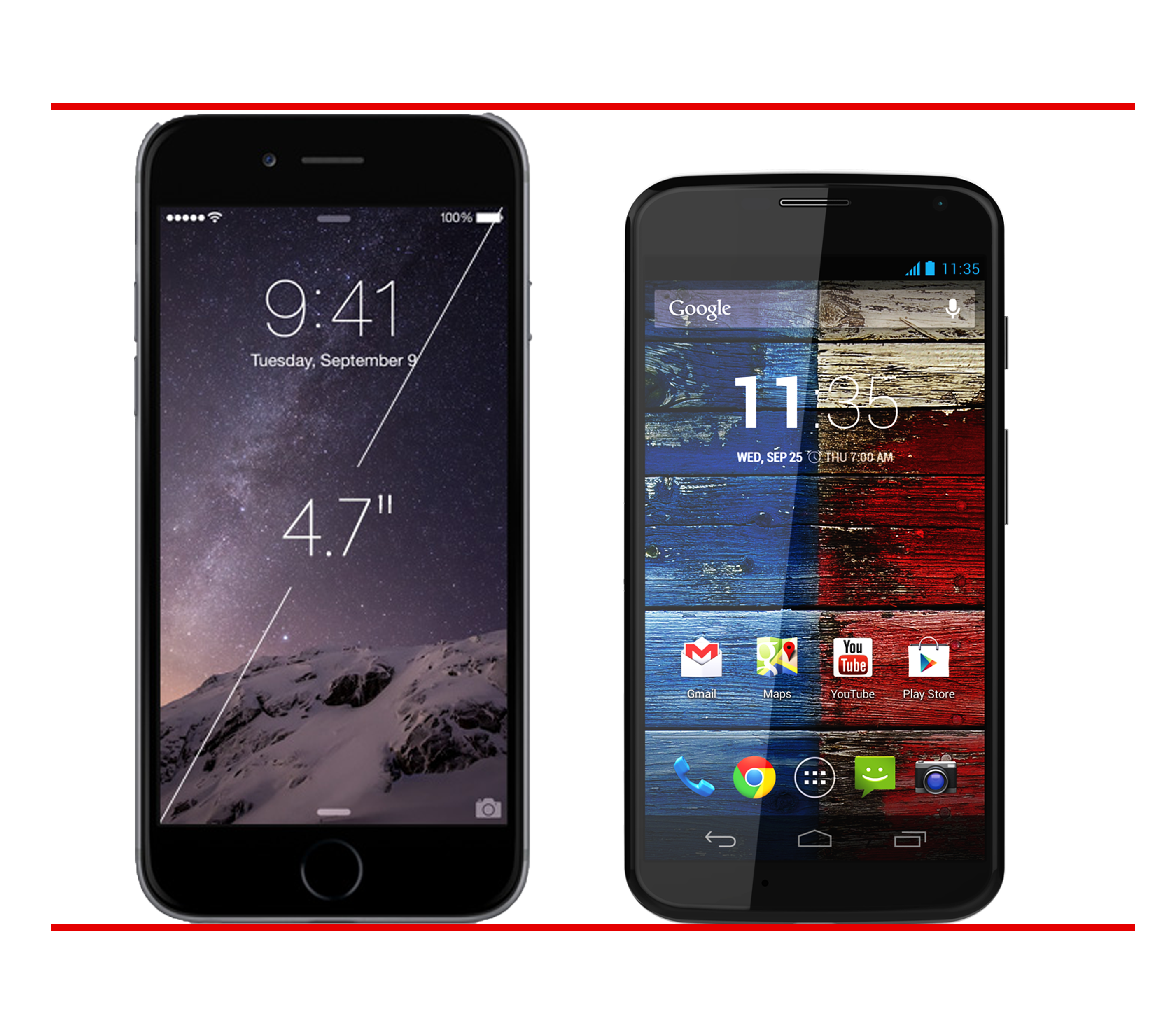
Here's a little graphic I made to illustrate the difference in size of the iPhone 6 and the 2013 Moto X.

As you can plainly see, the iPhone 6 is markedly larger than the Moto X even though they both have exactly the same size screens. Many have called the Moto X the most comfortable to hold and use phone ever made, and I don't think that's too far off. I used a Moto X for a few weeks this summer and adored the feel of the phone in my hands. At the time I said:
The Moto X feels marginally larger than the iPhone screen that I have been using everyday for the last year and a half. Having a bit more screen real estate is nice, but it’s not enough for me to feel like it changes anything I do on the phone.
That sentiment is not being shared by many people moving from the iPhone 5 to the 6 and I have to think that it has to do with the increased physical size of the phone and not just the size of the screen. In the above image, the difference in device size is rather startling.
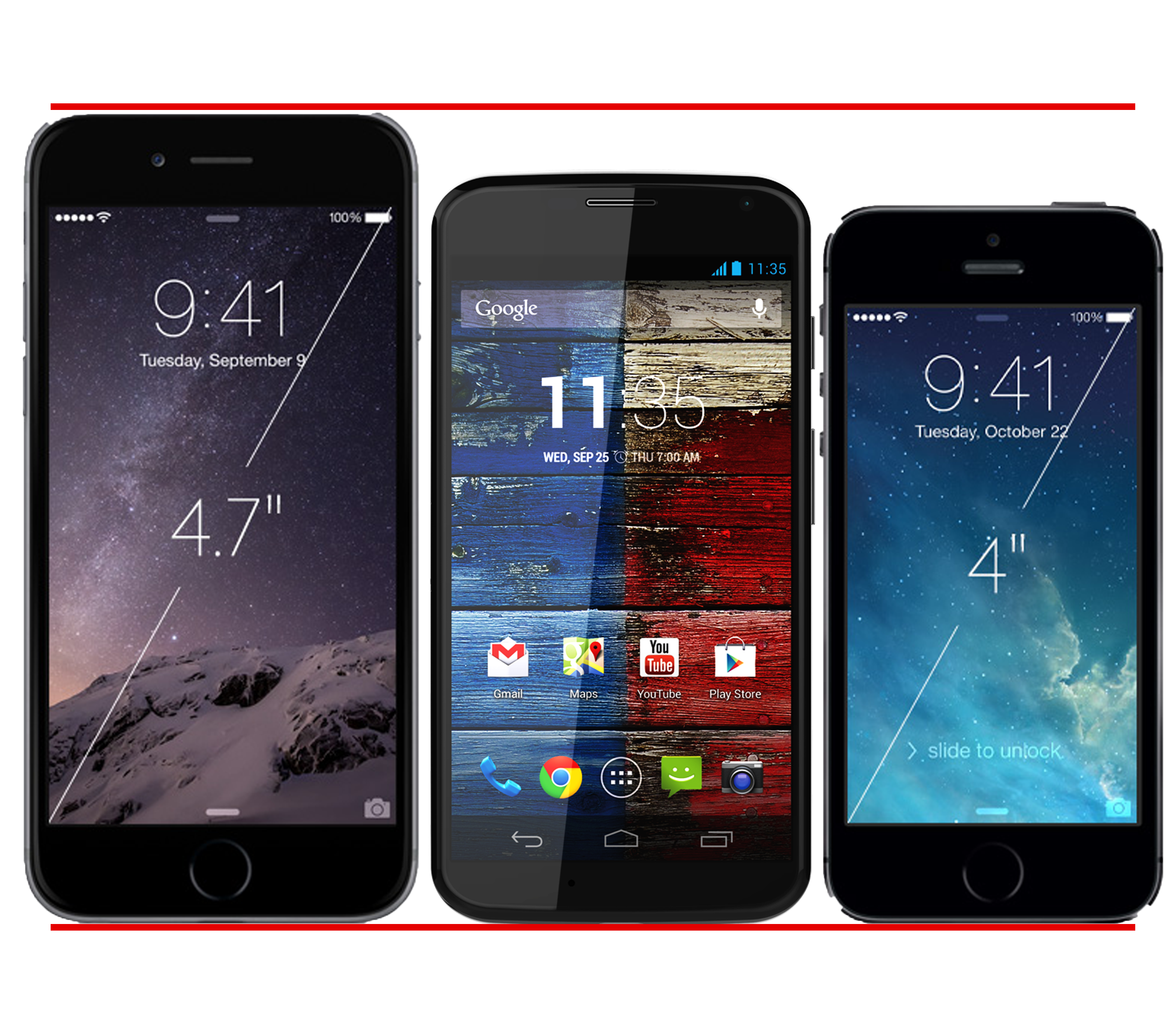
And it gets even more interesting when you throw the iPhone 5S into that comparison as well:

Yes, the Moto X is bigger than the iPhone 5S, but not by that much. The Moto X is living proof that we can have a smartphone with a bigger screen but not that much bigger a body. So why is Apple unable to do this?
There is one stand-out reason I can think of for why this is. Apple is sticking with a physical home button on the chin of the iPhone. That makes the bezel at the bottom of the screen twice as thick as that on the Moto X. Then, because Apple loves symmetry, they have the same sized bezel on top of the screen as well. That's a lot of space for a little speaker and camera...
Because of this sacrifice, Apple has a phone that has much more non-screen real estate than the Moto X. This means that your thumb has to travel farther to reach parts of the screen that are easily reachable on the smaller Moto X.
The people at Apple are no dummies, so surely they are getting something back for this design. For one, they can still have a physical home button instead of Android's on-screen controls, which is a good thing. It also means they can have Touch ID, a now critical feature of not only the iPhone but of Apple as a whole, built into that button.
I guess Apple could abandon the classic iPhone look (they will eventually, right?) and maybe go with a squatter home button similar to the ones found on Samsung's phones, but then that brings up questions of how they would bring Touch ID to a sensor like that (Samsung's first effort is not exactly rock solid). I don't have the answers here, but it's something Apple is going to have to tackle at some point.
In the end, I have to wonder what the Apple community would be thinking if we got an iPhone 6 with a 4.7" screen but with the Moto X's dimensions. With that design, you get the larger screen (good) and a total size that is very manageable with one hand (also good). It's the best of both worlds, and I hope that Apple moves on this quickly and gets rid of those chunky chins and foreheads from their phones. They've gotten to the point where they are responsible for decreased customer sat, and Tim Cook can't be happy about that.


