Windows Completely Breaks My Blogging Workflow
Writing for this site is a hobby I’ve had for close to a decade at this point, and in that time, the workflow for getting content from my head to the site has gone through a million variations and has changed a ton. As technology has improved and App Stores have have allowed more interesting services, these changes have almost always been for the better; removing steps and friction along the way.
My switch to Windows these past few weeks has not only blown up those workflows, which was expected, but it doesn’t seem to have any suitable replacements that feel like they’re any better than blogging on the Mac/iPad was 10 years ago.
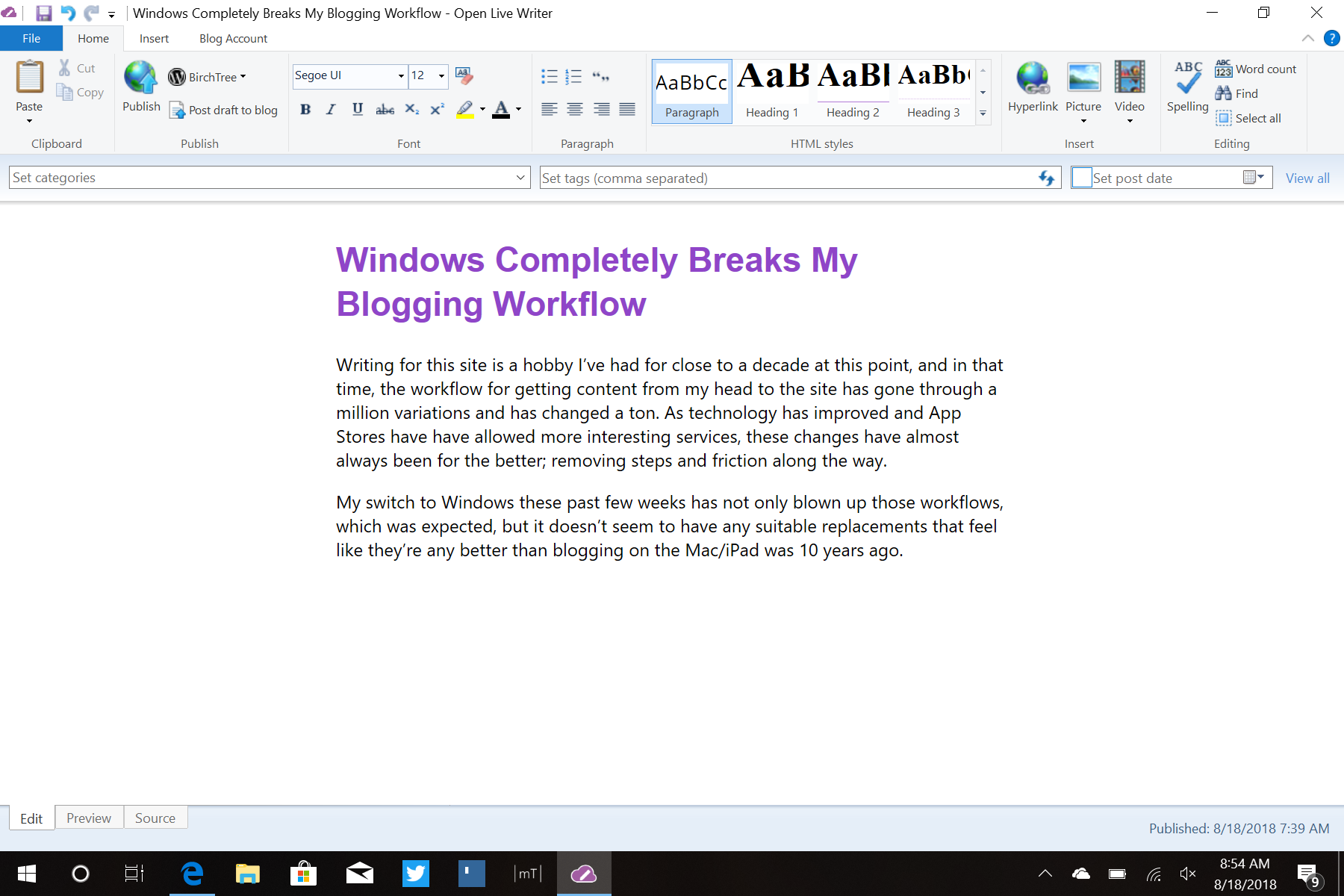
After a few weeks trying different solutions, this is what I’ve settled on as the best workspace for writing for BirchTree:

If you’re thinking “that looks like Word!” then you would be right. This is Open Live Writer, which is an open source version of an app Microsoft used to maintain, and it is basically a stripped down Word app with publishing tools. If you think writing blogs in Word is fun, then this if for you. If you want to write in a WYSIWYG editor then this might work for you, but I dramatically prefer Markdown. I know how my site renders the multitude of types of data a blog post can contain, and writing in Markdown (and switching to HTML if needed) is essential for me. Having an app convert my work to whatever HTML it thinks is right fills me with apprehension. I actually posted 3 drafts to the site from Open Live Writer before this post because I was trying to figure out how it would render things.
Beyond the WYSIWYG editor, this is also less useful for me in numerous other ways:
First, there is no way to quickly get information into the app for something like a link post. On the Mac there are extensions for apps like MarsEdit, and iOS has options that use Ulysses or Drafts to automatically pull multiple data points from a website and compile them into a new post with just a tap. With this it’s now bouncing back and forth between the site and app as I copy the post name, link, quote text, and post title one at a time.
Second, the publishing tools in the app are less robust than I’m used to with Ulysses. I can set a time, tags, and categories, but I lose the ability to do featured images, excerpts, custom URLs, and the option to post as Markdown instead of HTML.
Third, there is no way to make larger multi-part documents, which is something I rely on heavily for my longer pieces. My watchOS 5 review currently has 7 documents total and I’ve been able to move things around quite easily as the flow of the whole piece takes form as I write. No app I can find on Windows even has this concept in place at all. I would need to have one massive document with everything in it, which is a tough way to work.
And finally, this is a personal preference thing, but I really don’t find the interface to be pleasant at all. Like I said earlier, it feels very much like Microsoft Word, which is not an experience I cherish. Also, it just feels old. Check out the animation that plays when it’s publishing an article:

That takes me back to the Windows XP days.
I will strive to make this work for as long as I can, but it’s a markedly more painful way to work than what I had on all other platforms. Since I do this work a lot it’s going to be hard to not run screaming back to the iPad in a few days, but I’ll do my best. The watchOS 5 review is happening all on the iPad though, I literally don’t know how I’d make it work on Windows.
They told me the benefit of using Windows in a tablet was that it was the “no compromises” operating system. While there are a few small things I can do on Windows that aren’t possible on iOS, the vast majority of things I can do are basically defined by compromise. I’m compromising on app quality in almost everything I do.


