Workbench now in living color
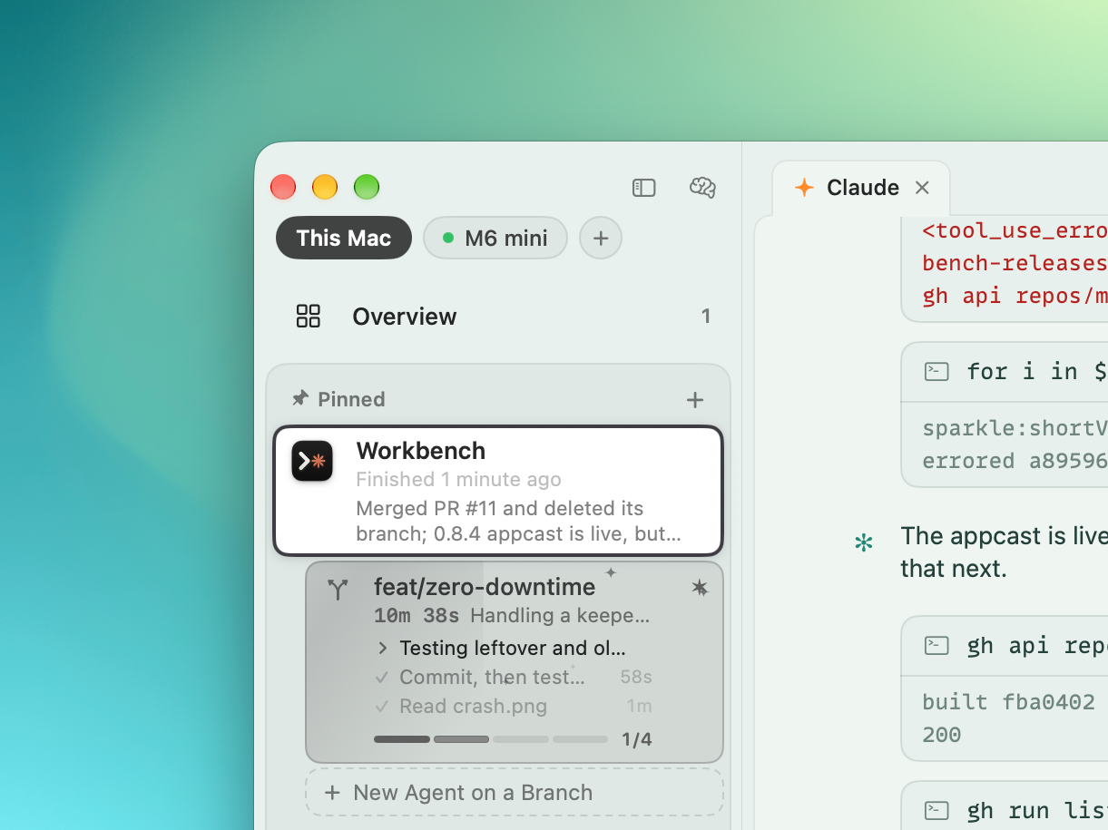
Today's update to Workbench has some good stuff.
Themes
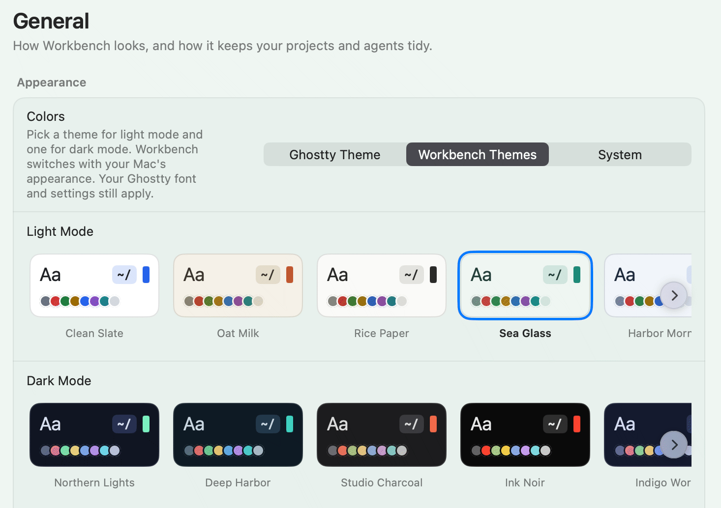
By default, Workbench uses your ghosty theme. But in this update, I've added an array of custom themes you can select from which will style the whole Workbench UI. A lot of the UI was built around orange accents, but now you'll see pretty much every part of the interface adapt to whatever your chosen theme is. This should create a more cohesive, personalized, and hopefully delightful experience.
Planning works in chat
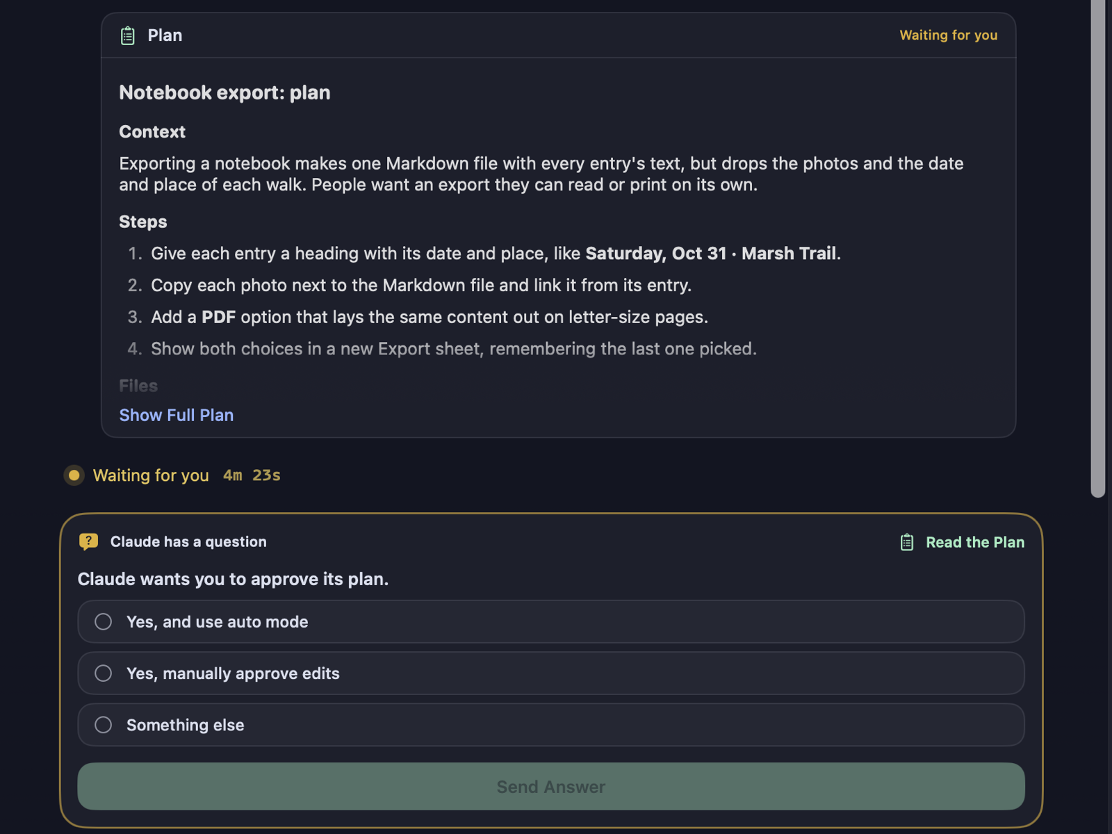
This must just be how I use Claude, but I actually never have this come up naturally. So I didn't realize it was an issue until someone else reported it. Basically, sometimes Claude will present you a plan for what it wants to do, and you can approve it. Before this update, you would have to toggle over to the terminal view to see the plan. Now you can do it all from the chat interface.
Better tab control
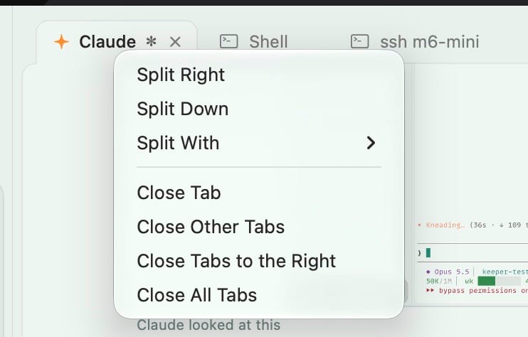
Right click on a tab to quickly split it or close any combination of tabs you have going in that project you can think of.
Other stuff
- Switching models is quicker and more reliable
- The sidebar doesn't have info bubbles when hovering anymore
- Settings pages behave better with all themes
- Instructions for pairing other Macs is more obvious
Again, all of this is available now in the Mac app, and the iOS app is currently in TestFlight.