6 Really Nice Things About the OnePlus 6
Now listen, the OnePlus 6 has a very low chance of dethroning my iPhone XS for my day-to-day phone, but there are some things I really like about it and had to share them here. And yes, I know OnePlus announced their OnePlus 6T today, but a lot of what I’m about to say is true of that phone too.
Speeeeeeed
The OnePlus 6 is a zippy phone. Not only does the phone have top-end specs, but OnePlus has sped up the system animations for things like opening and closing apps so that things just feel faster than on “stock Android.” With a Snapdragon 845 and 8GB RAM, these are about as high end as specs get in 2018, and they come in a package that’s half the price of most flagships this year.
The chin is totally fine
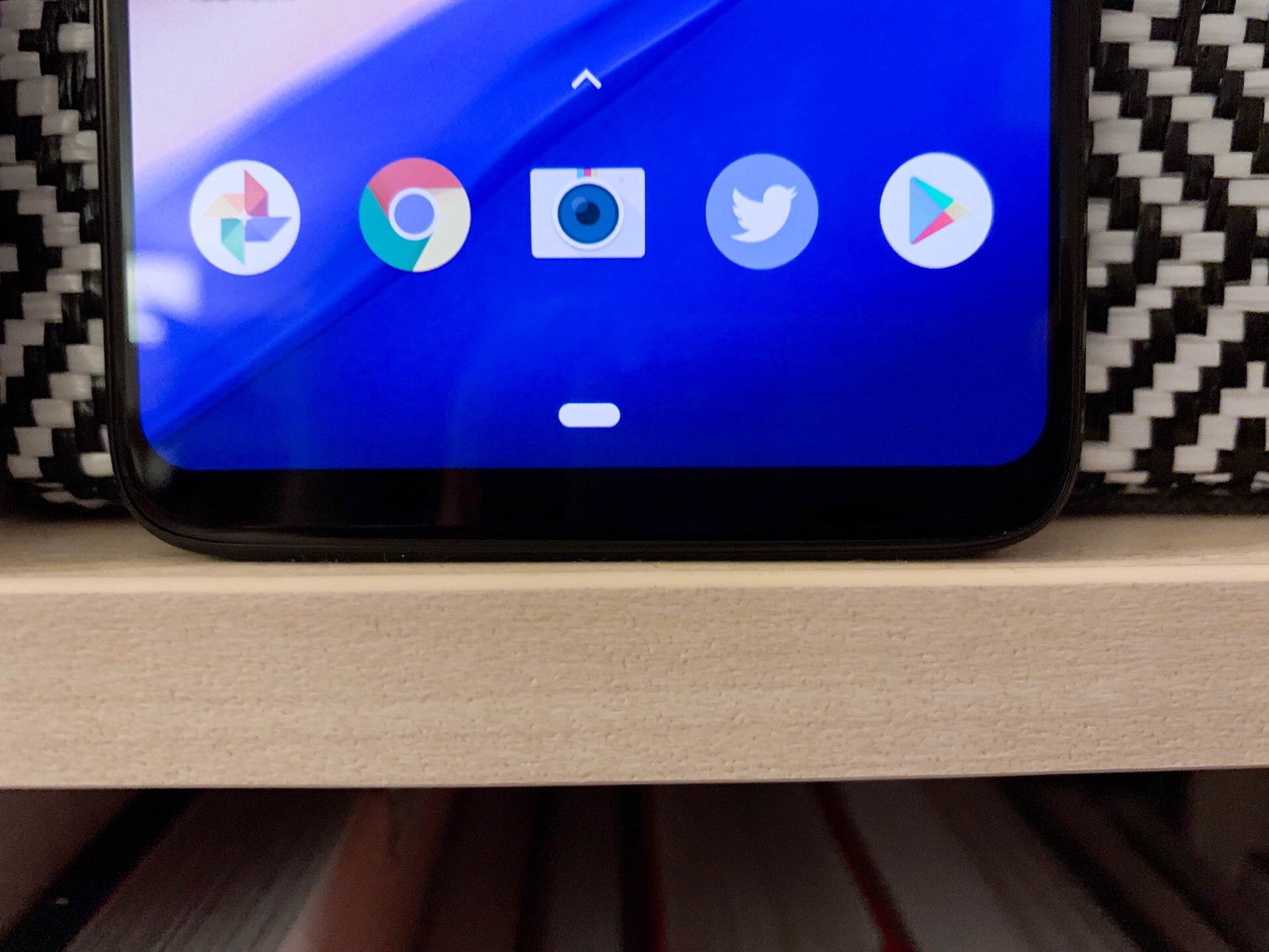
One thing that people (including me) love about the iPhone X line is that the chin is exactly the same as every other bezel on the phone. It’s hard to get the screen to need that little space on at least one end, and Apple gets top marks for getting as close as anyone to eliminating it.
That said, the tiny chin on the OnePlus 6 is a total non-issue in my opinion. Yes, it could be like 1-2mm smaller, but it’s not something I notice at all when using the phone.
The alert slider is one of a kind (on Android)
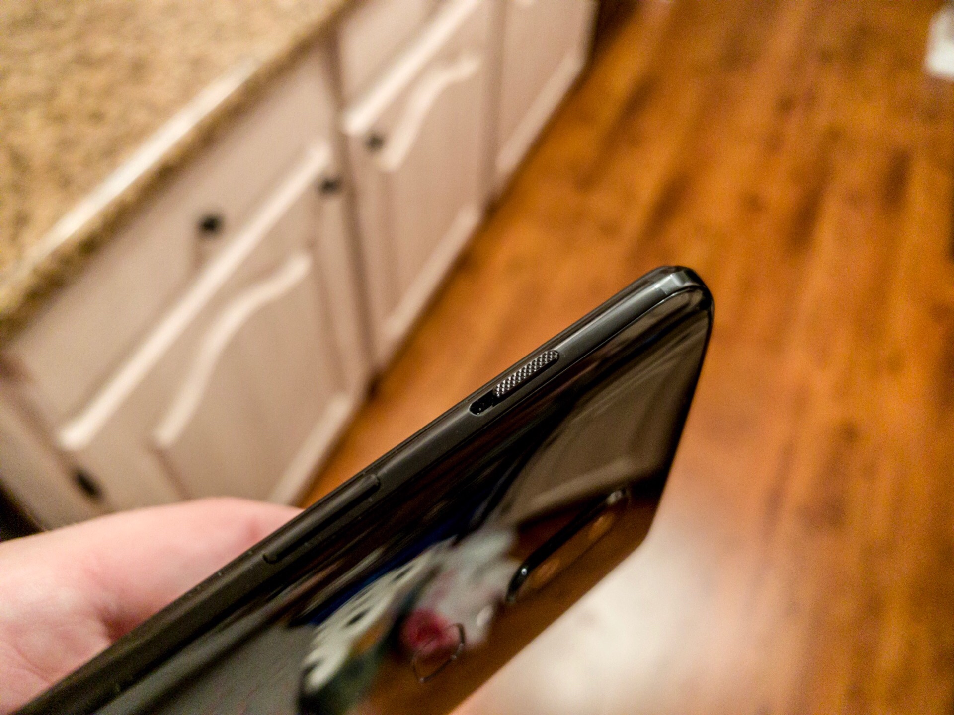
One of the things I miss the most whenever I switch to Android is the alert toggle on the iPhone. It’s been there since the start and it’s always been amazing. OnePlus has a very similar slider and I love having it.
Instead of Apple’s 2 state toggle, the OnePlus’s has 3 states (ring, vibrate, and silent) and slides up and down the side of the phone. I find this is a little less easy to toggle quickly and the 3 positions means you have to be a little careful with getting it on the right one (vibrate, which is in the middle), but it’s much better than what I’m used to with all the software-based options on other Android phones.
Those clicky buttons
While we’re on the topic of buttons, all of the buttons on the OnePlus 6 are satisfyingly clicky. They’re a tiny bit less premium than on the iPhone Xs but it’s damn close.
Dark theme all the things
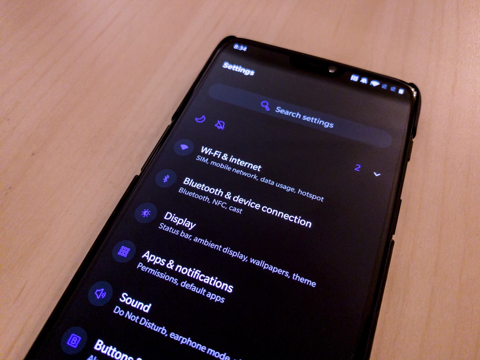
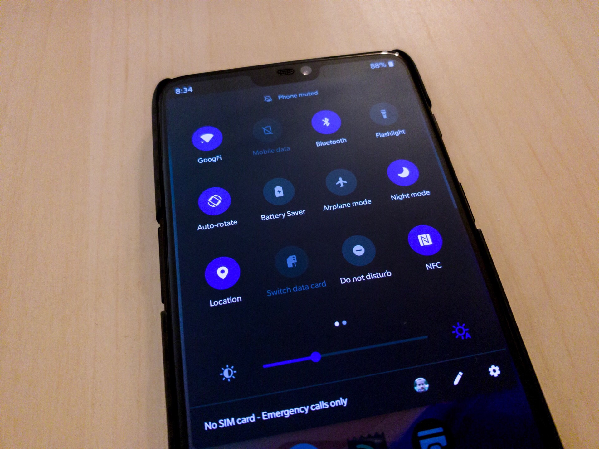
Credit to OnePlus for beating both Google and Apple to a real dark theme for their phone. Apple has nothing in this regard and Google added a “dark” mode in Pie that just made the notification shade darker, none of the actual system UI.
Meanwhile, OnePlus has a dark mode that actually turns the system UI black. It looks really nice on the OLED screen, and just like with their default light theme, you can select an color you’d like as your accent color.
The only downside of this is that since Android doesn’t have a dark mode, you need to hope every third party app (and Google app) that you use has a dark theme you can manually switch to. Otherwise it’s very much like dark mode on macOS right now: some apps have it and look great, while others have not updated and blind you when you open them.
The official case is excellent
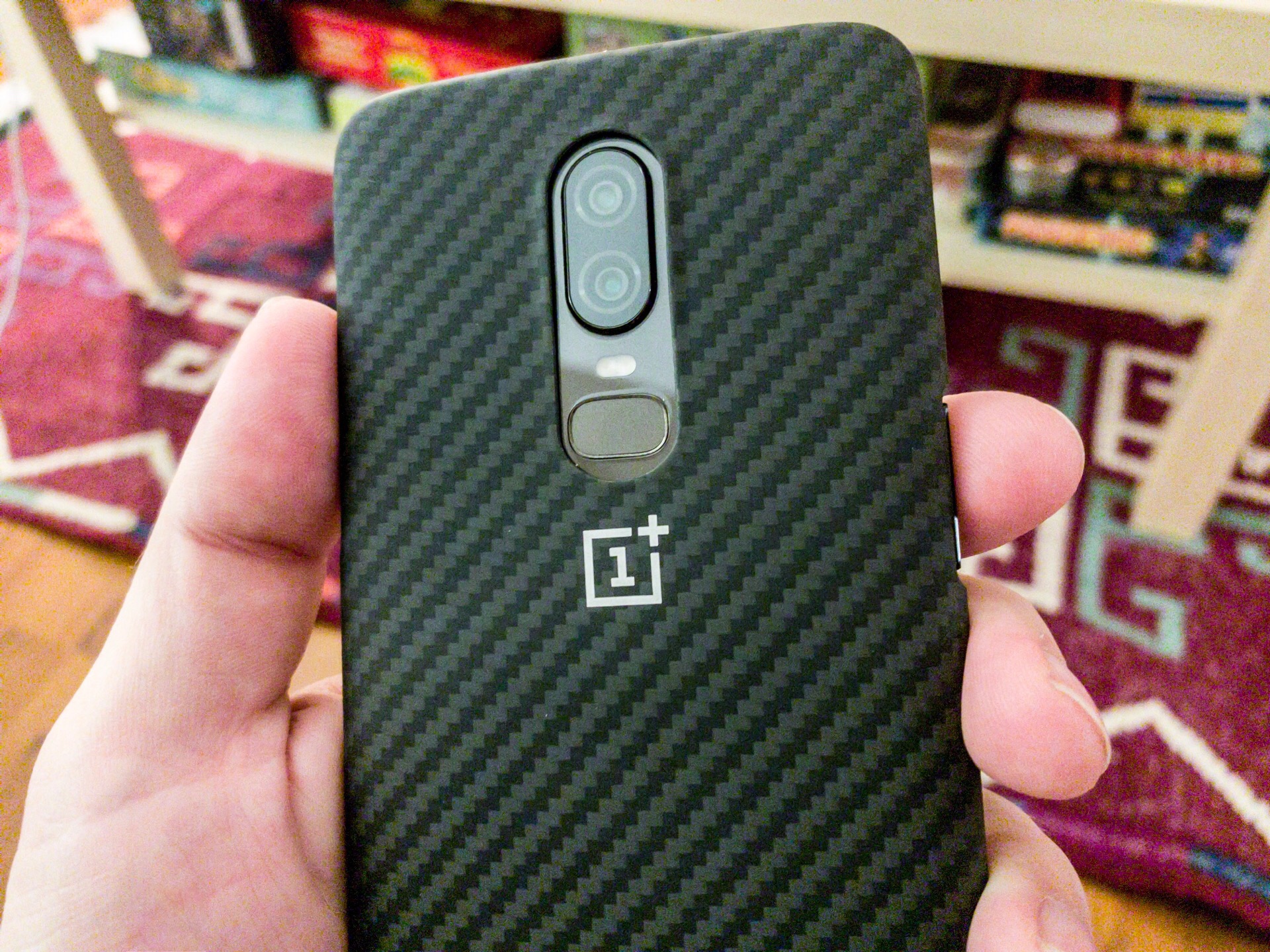
I’m not one for cases, but when I do, I try to go with ones made by the manufacturer of the phone. For my iPhone, this means the Apple Leather Case, which costs $49 and makes the phone feel secure in my hand and looks classy. OnePlus has the ”protective case” which is basically a very thin shell around the back and sides of the phone. Oh, and it’s half the price of the Apple one I like, so that’s nice.
I don’t know how much protection this thing actually provides for a drop, but it feels like it adds almost nothing to the bulk of the phone and it gives a little more grip to the back side as it’s made of a soft-touch plastic that just feels good.
I’ll have more to say about the OnePlus 6 in the near future, but these are some of the things that stood out to me as what makes the OnePlus experience something that could convert “stock Android” fans like myself.

