Everyone says they want opinionated design until they get it
Apple revealed their new design system this week built on a concept they're calling "liquid glass". This is partially a UI reskin, but it's also chock full of new UI concepts that break from iOS tradition. Yes, your old apps will still work and look like they always have, and app developers will still have the ability to do completely custom UIs, but the design language of iOS has changed and we're going to see some real changes to some of the apps we use day to day.
We can quibble about the details of the design system (as we should during this beta period), but I would suggest that the raft of "eww, I don't like it, what we had before was better," responses would be the same no matter what new design system Apple introduced. My evidence: literally every design system change in every piece of software ever. It's a tale as old as time:
- Company releases new design X
- People say they hate X and want the old design back
- Years pass
- Company releases new design Y
- People say they hate Y and want X back
So a part of this is inevitable, people are going to complain about new designs no matter what because the most powerful feature of software design is familiarity. That's not to say new designs are free from criticism, of course, they should absolutely be critiqued and Apple should take this feedback to heart and polish things up before the public launch this fall. So by all means, point out the things that are weird and wrong now because Apple is paying attention to The Discourse and this is the best chance they get to tweak things.
The other part of this that I find interesting is that the new design system is pretty darn opinionated. This is not just a neutral system where devs lead the way in terms of design trends, nor is it another slight refinement to the OS design they've been iterating one since iOS 7, it's got a clear opinion on what software design is for the next 10 years should look like. The challenge with opinionated design is that it's really hard to do when you have 1 billion users; the safe thing to do is to be generic and slowly iterate on what you already have. It's like flipping a house, painting all the walls white, and staging it with the most generic furniture you can find so as not to impart any personality or offend the sensibilities of anyone who walks in the front door.
It's objectively easier to keep iterating on what you already had, Apple didn't do that here, and at a very core level I'm excited that they took a big swing. Now let's hope they spend the summer refining this thing.
My current opinion
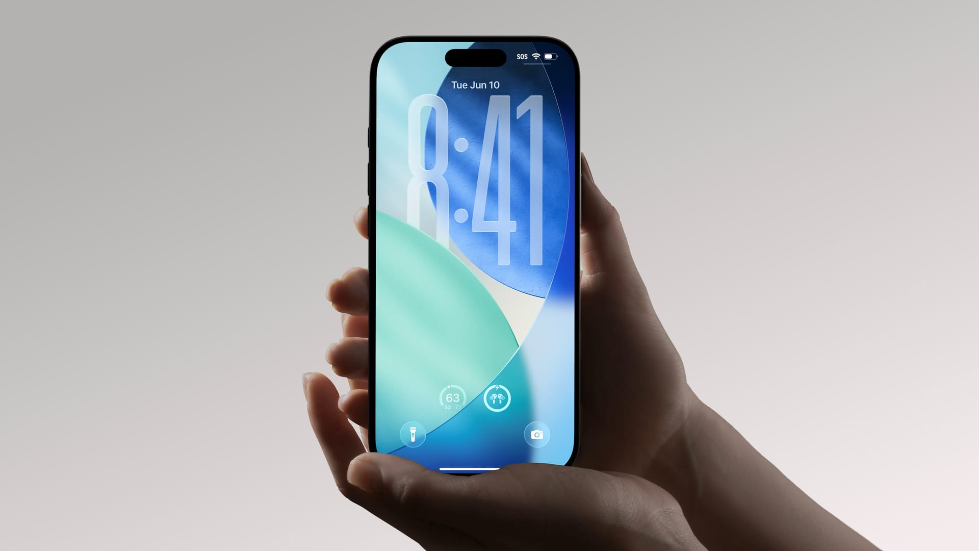
As for my opinion on liquid glass, I think it needs some work before the fall, but I believe it can get to a really good place by then. The biggest issue I've seen for far is contrast. Making your UI colors dependent on constantly changing content around them is fundamentally tricky. And there's a reason we haven't traditionally done this in software design. As a basic example, take a look at this bit of UI from the new Photos app:
Yeah, not exactly the contrast you would want for UI. In fact, it scores a shockingly low 1.03 contrast ratio (1.00 is literally the same color) and I'd expect 4.5 or higher to be reasonably optimized for legibility.
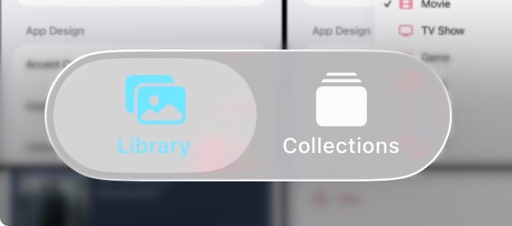
Then there's Mac apps like Finder and Safari that honestly look really funky with drop shadows for daaaaays. This is a fundamental issue with clear UI elements over white backgrounds…they look like nothing, so Apple's using aggressive shadows to build some separation here and I think it looks a bit too sloppy for my taste.
It does look better in dark mode, though.
But when it's working and background elements are refracting through the glass just right, it looks amazing. I look forward to how they iterate on this over the beta period, and hope these rough edges get sorted out because I'm excited about where this could go.
While I'm here, I do have a couple things I feel must be reiterated every year.
- I won't say the "I'm installing the dev betas, but you shouldn't" advice because I think it's stupid. You're an adult who can make decisions, so go ahead and install it if you want.
- Go into these betas with eyes open. I see so many people treating dev beta 1 as the public release and seemingly assuming every little bug and design quirk they see is going to ship in September. As stated above, we need to give feedback (social media, blog posts, even the Feedback Assistant app, etc.) so that Apple can make the changes that need to be made, but rest assured that this beta is not meant for everyone, it's what it says on the tin: a beta for developers to use to start building and testing their apps on the new platform. It's a playground for nerds who like to see new stuff early, but remember what this is. What we saw in the keynote is the refined version of this they hope to ship in September, but you’re not getting that in the first beta.