Microsoft's Walk Back on 3D Emoji is Just More of the Same (marketing assets vs the actual UI)
Microsoft backed away from giving us the most fun emoji yet:
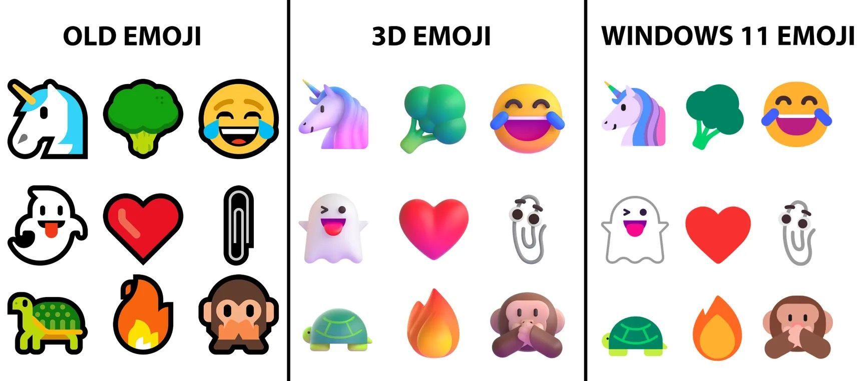
Microsoft originally promised new 3D emoji for Windows 11 and various other products earlier this year. Now the company has gone for a 2D flat look instead, with the new emoji debuting in Dev Channel builds of Windows 11 this week.
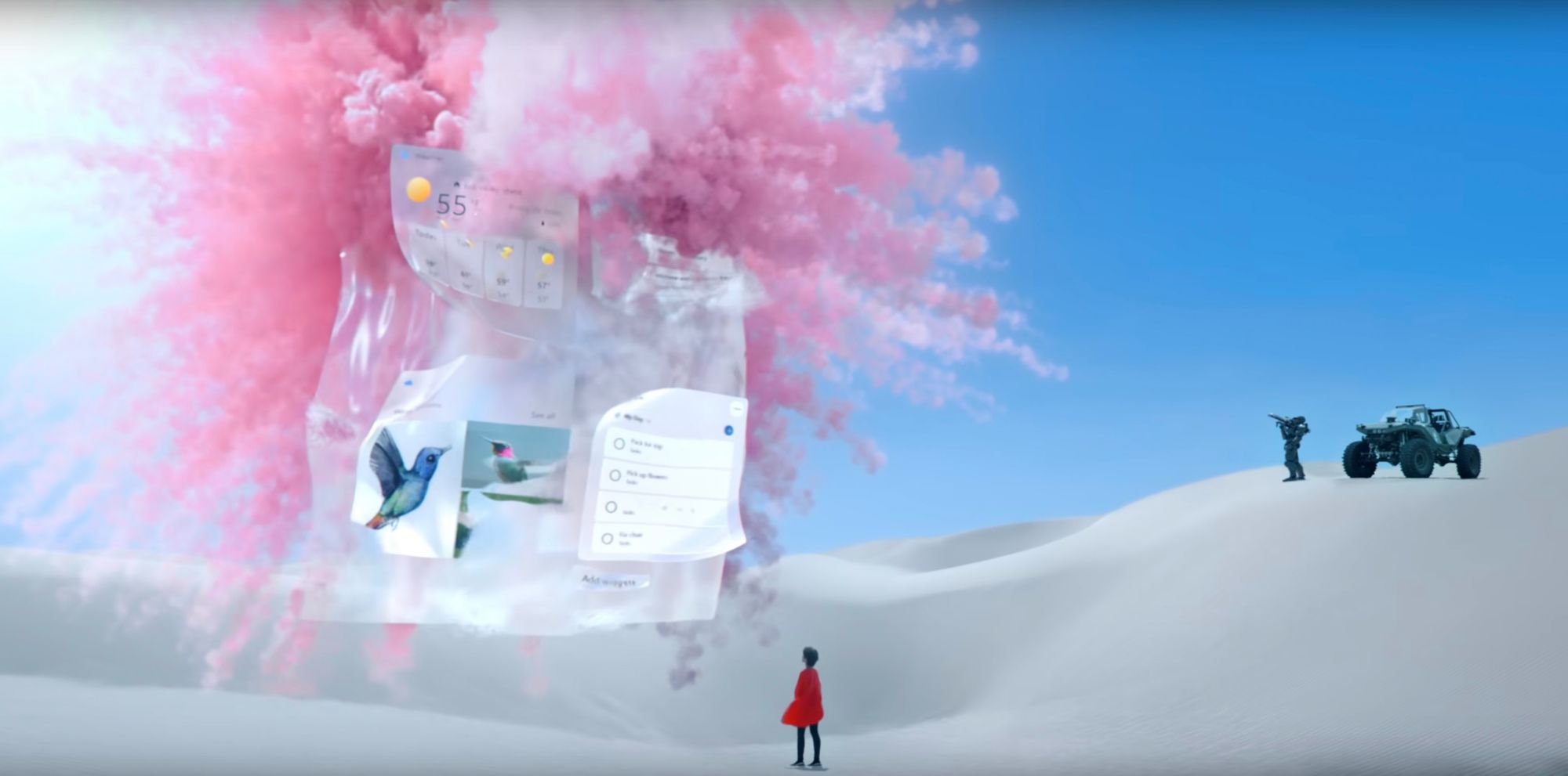
The new emoji are definitely better than before, but man, this really sums up Microsoft's design for me. Their marketing assets are great, and they show an experience that's a true delight, and then their actual UI is a watered down, less elegant version of that. I know that marketing always shows things from the best light possible, but the chasm for Microsoft products is bigger than most.
Think about Apple promos you've seen; Apple may show the products from exciting angles, and show exceptionally high resolution versions of their UIs on the devices in those commercials, but they're showing you the real products with the real UIs you get to run on those products.
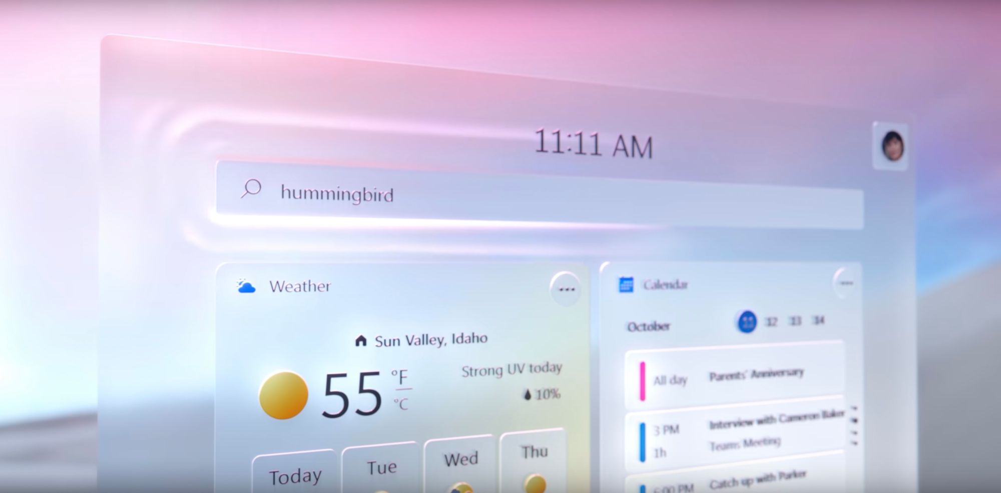
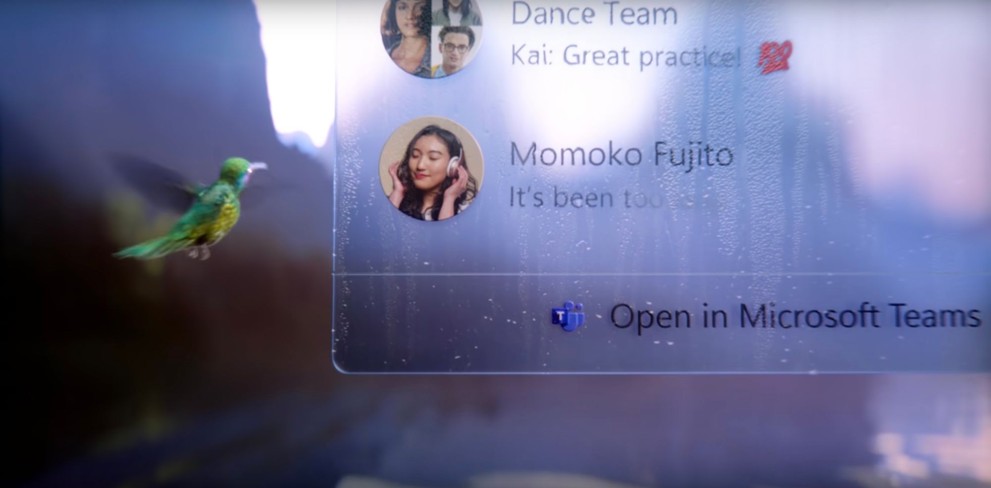
For example, here are a few stills from a Windows 11 ad recently released by Microsoft:
Now compare those to some from Apple's iPhone 13 ad:
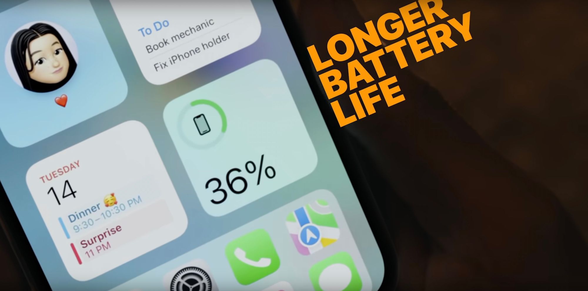
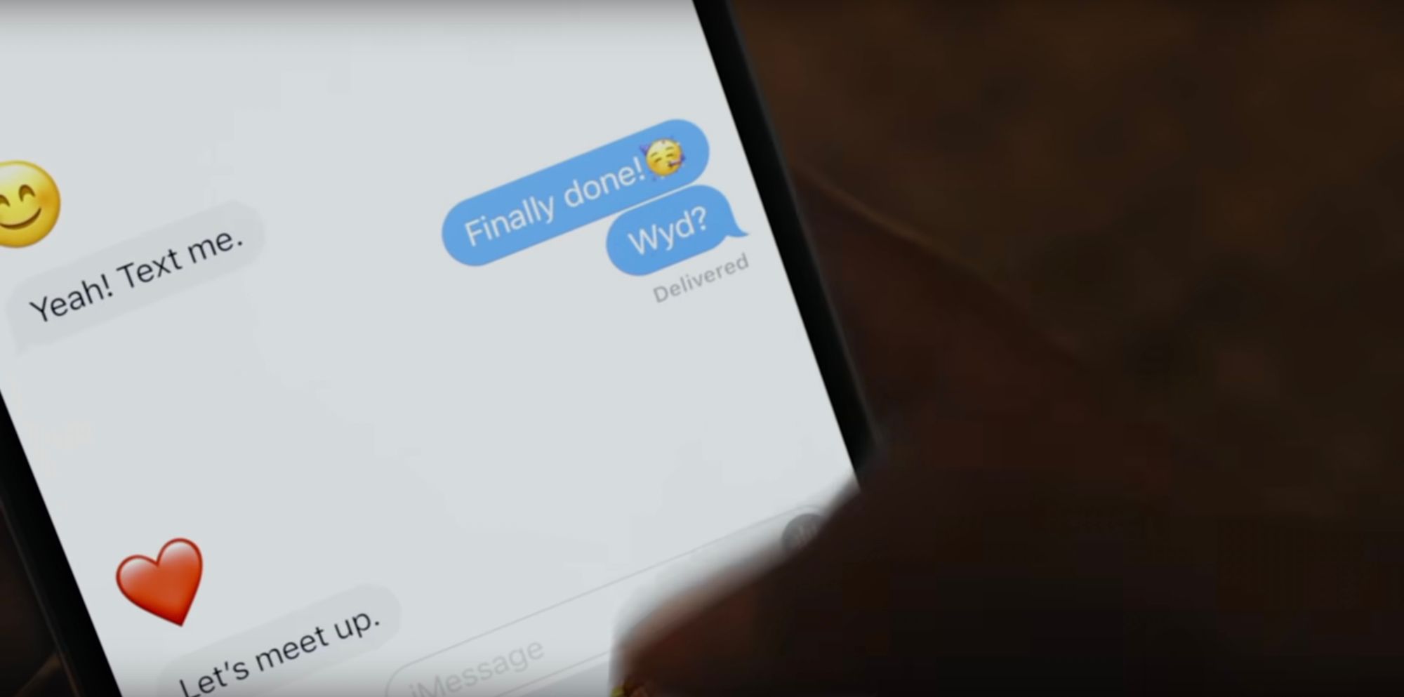
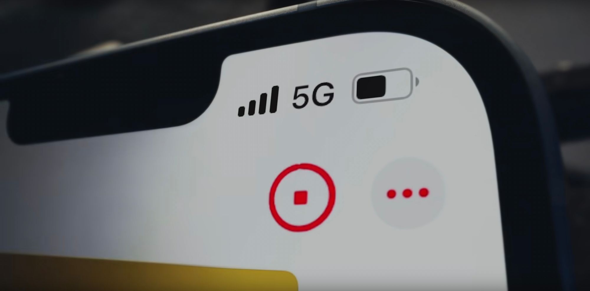

Obviously these shots are optimized to make the phone look best, but anyone who uses an iPhone can immediately recognize that yes, these are exactly what iPhone UIs look like.