In defense of the already-killed Tahoe beta 1 Finder icon
I’m old enough to remember when people in the Apple enthusiast crowd were disgusted by the new Finder icon. No, not the one released 2 weeks ago, the one released in macOS Yosemite in 2014. That icon was too bright, too “friendly”, and it didn’t respect the heritage of the icon that had existed for many years. That icon was created to put a new and distinct spin on a classic icon to match the new aesthetic of Apple’s software. I think it was brilliantly done and that Finder icon is now iconic.
In 2025 we find ourselves in a very similar situation, but admittedly with more pushback than I remember in 2014. Apple has a new design system for the Mac, that system has a new standard for icon design, and there’s a new Finder icon that’s ruffling feathers.
To be super clear, just because one design in the past ruffled feathers and turned out to be a winner doesn’t mean every icon that ruffles feathers is automatically a winner. I’m just bringing up the parallel as the past is often instructive to understanding the present.
Cards on the table, I’m a weirdo who actually liked the Finder icon in Tahoe developer beta 1. I think it looked great and was a proper reimagining of the icon I’d been staring at in my dock for the past few decades for the new design system in Tahoe. The layers of glass floating on top of a solid background match the rest of the system apps. Yes, the white and blue “switched sides” but I guess I wasn’t as bothered by that as some others were. I’m not saying I’m right or they’re right, I just think it was nice and made sense in the new system. Honestly, I didn't even think anything of the icon until I went online and saw people were very upset about this.
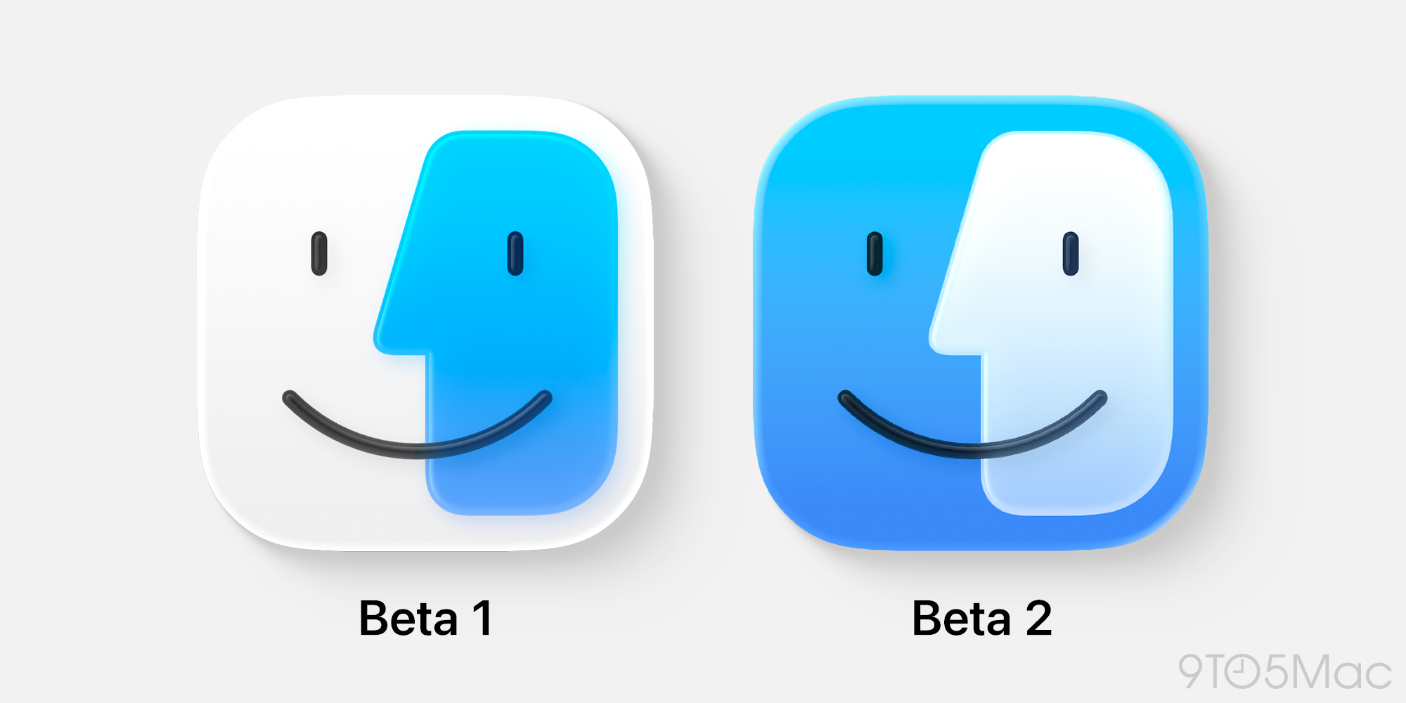
In beta 2, Apple clearly took the feedback and made a change which seems to have appeased a decent number of those who hated the first beta's icon. Personally, I think this new icon is good, but if I'm being totally honest I don't like it as much as the first one. The contrast is lower between the blue and white sides, something that's more noticeable when my dock is small rather than in large images like the one above. I'm not going to complain about it at length, and I think it's actually still pretty good, I just don't think it has the confidence of the last version.
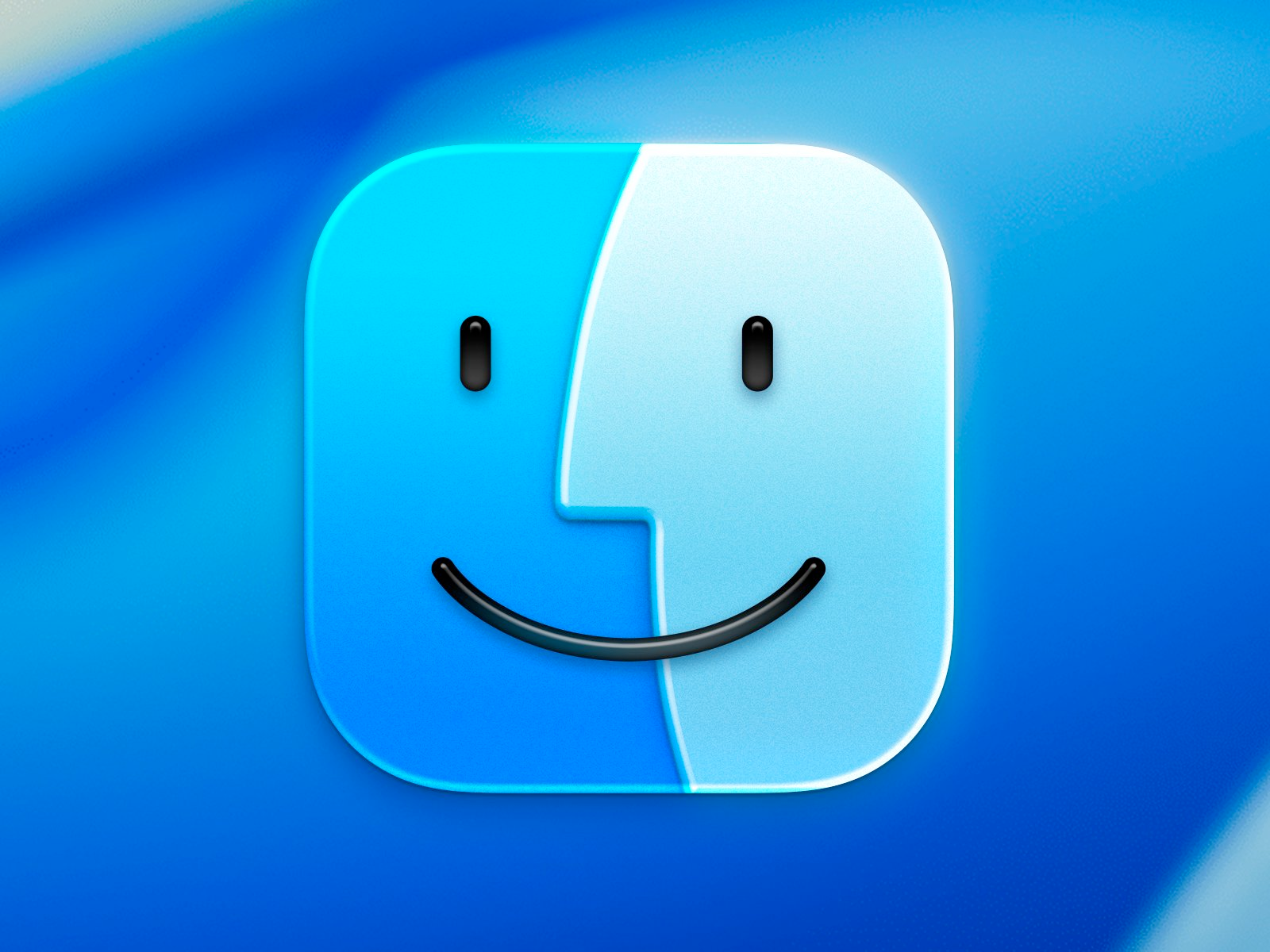
Then there's this mock up which has been floating around as the "clear solution" that Apple should just pay the creator Michael Flarup and use in macOS. I think this icon design is solid as well, but it really is a bit of a punt on trying anything new, it feels like just putting a glassy filter over the existing icon and calling it a day (again, recognizing this took more work than that to me, but that's what it looks like to me). It's also inconsistent with the design Apple is using for every other icon in the system on Tahoe, with no other icons featuring edge-to-edge glass layers like this. Maybe that's fine, and this will be more normal once we have more third party apps making icons using the new glass system, though!
Ultimately, I think all these icons are pretty good, and I'll be fine. I just wanted to give the beta 1 icon a bit of love before we likely never see it again. I know this opinion is straight up "wrong" to many people, but what’s the point in having a brain if you don't sometimes have different opinions, right?!