Interesting Tidbits from Apple's visionOS Design Docs

Apple unleashed visionOS on developers yesterday, and people are having tons of fun running visionOS in the simulator on their Macs (big iPadOS in 2010 energy, and I'm here for it!), but designers like me also get in on the action and there are some great resources available. The big ones I would suggest everyone look at are:
I haven't read through everything yet, but a few things popped out at me right away.
In general, people interact with Vision Pro using their eyes and hands. People perform most actions by looking at a virtual object to bring focus to it and making an indirect gesture, like a tap, to activate it. People can also use a direct gesture to interact with a virtual object by touching it with a finger.
Apple is expecting the default interaction to be using your eyes to focus, and the pinch gesture to interact with things in view. You can do direct manipulation of things in 3D space, but the current recommendation is to assume people will not be reaching out to your app most of the time.
This is one of those assumptions I keenly look forward to seeing how real users feel about this. Remember that the Apple Watch UI went through some pretty substantial changes over its first fe years as Apple came to terms with what people actually wanted.
By default, an app launches in the Shared Space where multiple apps can run side-by-side and people can open, close, and relocate windows. People can also choose to transition an app to a Full Space, where it’s the only app running.
Once again, Apple is pushing this as primarily augmenting your surroundings, not cutting you off from them. It sounds like apps will be able to launch you straight into a fully immersive experience, though.
The system helps maintain comfort by automatically placing content so it’s relative to the wearer’s head, regardless of the person’s height or whether they’re sitting, standing, or lying down.
I'm really curious how this thing works when I'm laying down.
Embrace the unique features of Apple Vision Pro. Take advantage of space, Spatial Audio, and immersion to bring life to your experiences, while integrating passthrough, focus, and gestures in ways that feel at home on the device.
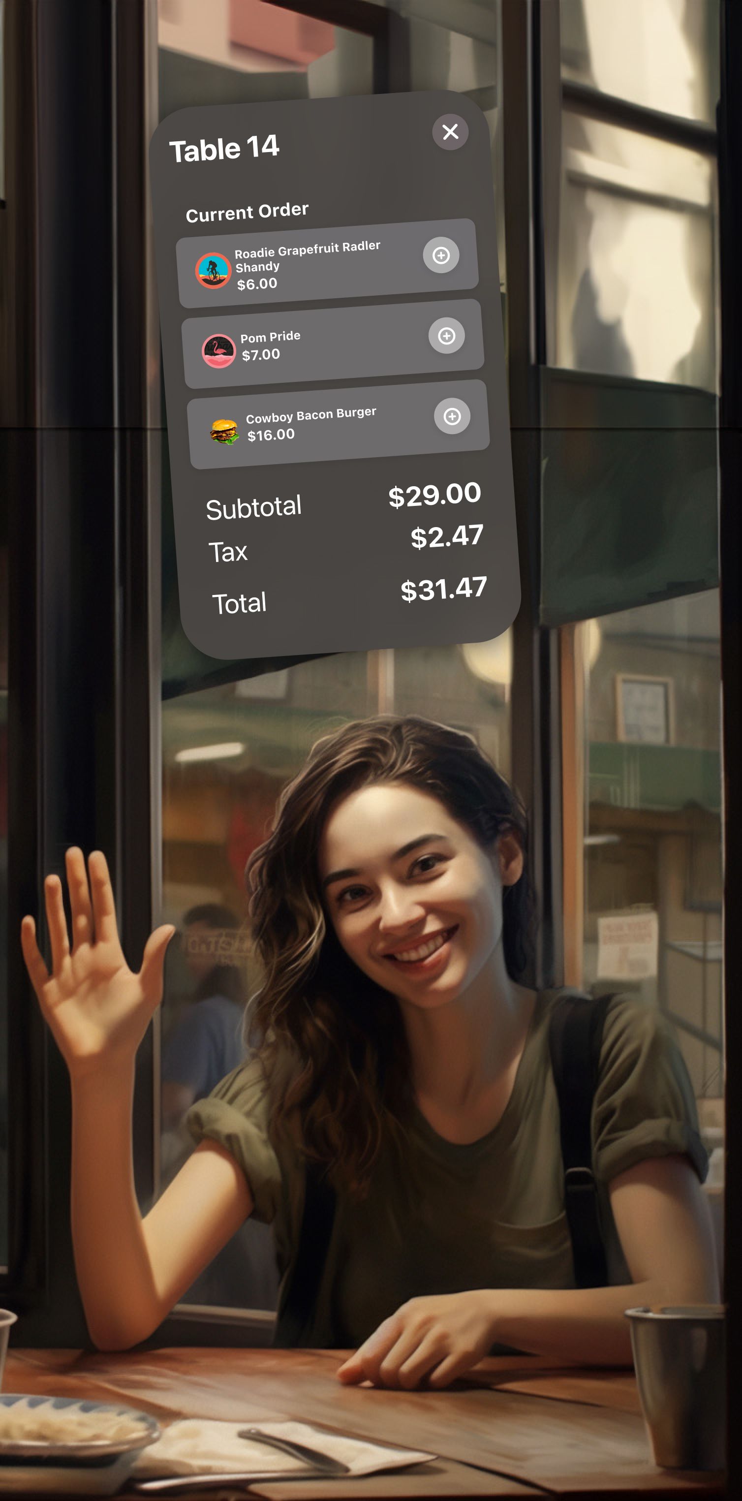
This is the big one: I think everyone is thinking about how iPad-style apps can be adapted to the visionOS UI, but the big opportunities here are in what apps you can make that fundamentally could not exist on any of our current computing platforms. I fell into this trap immediately when I mocked up this quick concept UI for a visionOS app restaurant servers could use for orders.
I think it looks great, but it's just an iPad/Mac UI with visionOS styling. Instead, an app like this could take advantage of pinned windows in 3D space and instead it would be more useful to have a window over each table that showed the server the order, as well as timers for how long they have been there and how long it's been since the server last checked in on them.

And that's just thinking about this for like 30 minutes. As the design process continued and as one got user feedback, the use cases would surely bloom and tons of new ways of interacting would become viable.
One thing's for sure: we live in exciting times, and if you do design or development for a living, I think you should at least have spatial computing in the back of your mind because I think this has legs once the hardware becomes cheaper and more socially accepted.
