iPhone XS Non-Review
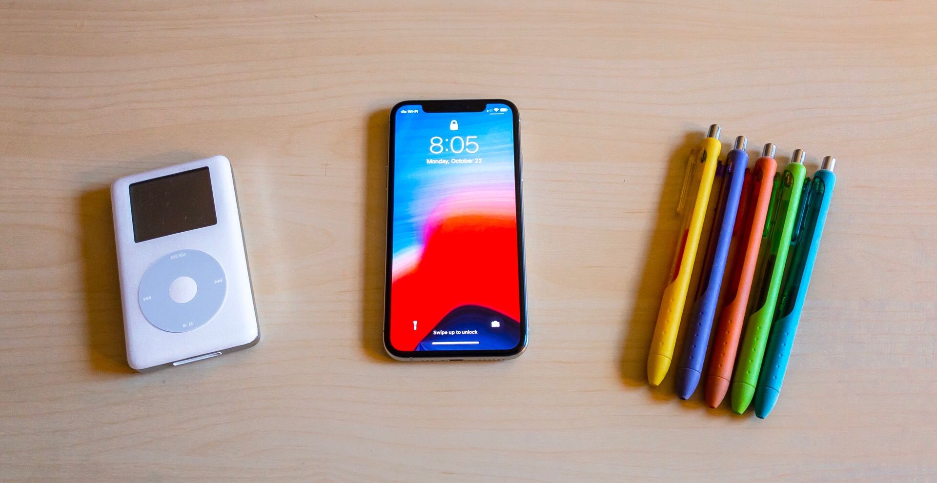
This is not an official review of the iPhone XS, but I’ve had the phone for a month and figured it was about time i share some of my thoughts on Apple’s latest and greatest phone. For some context, I’ve bought every iPhone since the iPhone 5 and, not that it matters a ton for this review, I spend close to half of my time with an Android phone, most recently the Pixel 2. I’m upgrading from the iPhone 8 Plus.
The Screen
The biggest difference between this phone and my last iPhone is the screen. This is old news to iPhone X users, but I am still in love with the nearly edge-to-edge screen on the XS. It looks outstanding, with colors that look sharp, but not exaggerated. It looks a smidge better than the screen on my iPhone 8 Plus, but frankly the difference is smaller to the untrained eye than I think some people make it out to be. It’s better, no doubt, but going back to my iPhone 8 Plus after a few days, I didn’t think it looked that bad in comparison.
And then there’s the compromise that screen is best known for: the notch. I am personally not bothered by this at all. It’s absolutely a compromise and in a few years we’ll surely be able to get rid of it, but for now I see it as an acceptable compromise to get more screen without sacrificing functionality on the front-facing cameras.
How people react to the notch is really a “glass half full or glass half empty” situation in my opinion. If you look at the notch as encroaching on your rectangular screen, then you’re going to have a more negative impression of it. On the other hand, if you’re like me and see the extra screen on either side of the notch as bonus pixels, then you are more accepting of it. Neither is wrong, but it’s why people have differing opinions on the notch.
In a similar vein, the rounded corners are a cause of some grumpiness as well, but I love them. I think that they give it a more friendly vibe and seem more futuristic than the squared off corners we have on most screens. My iPhone 8 Plus’s harsh corners look way too “clinical” for me after spending a little time with the XS.
Face ID
98% of the time I’m very happy with Face ID. The 2% is when I’m waking up in the morning and am trying to look at my notifications before getting out of bed. For whatever reason, Face ID almost always fails to recognize me right when I’m lying on my side in bed.
But all other times I’m totally in love with Face ID and have never had the slightest wish that the phone also had Touch ID. I get that other people have different experiences, but I can only speak for me and in my use it’s been perfect. It’s to the point where I often find myself forgetting that I even have any authentication at all on the phone. I just pull my phone out of my pocket, swipe up to unlock, and I see my home screen. There’s no delay, and I’m just in my phone. It’s great!
Also, I set up my “alternate look” as my wife’s face and she’s able to unlock it just as easily.
The Cameras
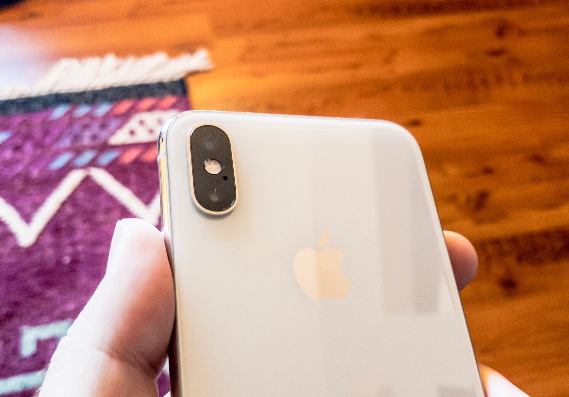
The worst thing about the iPhone XS cameras is how big the bump on the back of the phone is. I like to use my phones case-less, especially the iPhone XS because it just looks so damn cool, but the amount of wobble you get on a flat surface is worlds more than in any recent iPhone I’ve used. If you use a case then this isn’t really a problem, but it’s an annoyance every day for me.
But the photos these cameras take are amazing! Yes, they produce generally softer images than what you’ll get from the Google Pixel 2 or 3, but that’s a stylistic choice, and it happens to be one that I prefer. Without getting too far into the technical aspects, here are a few shots I’ve gotten in the past month.
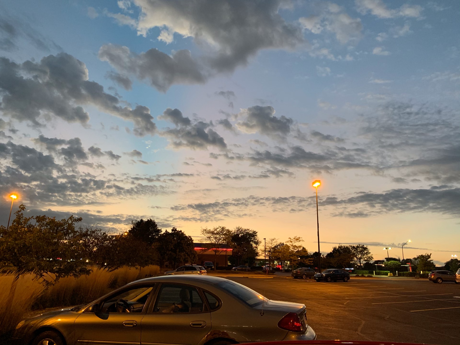

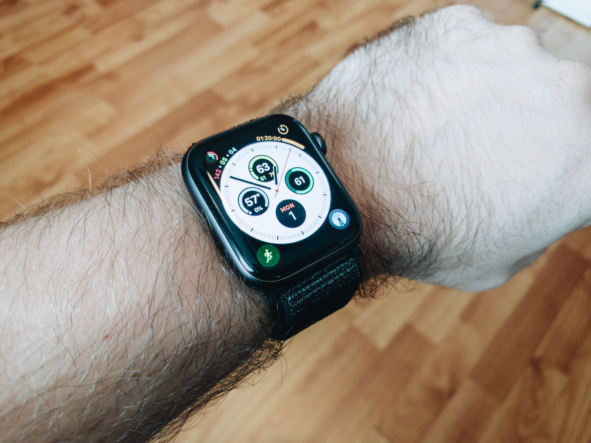

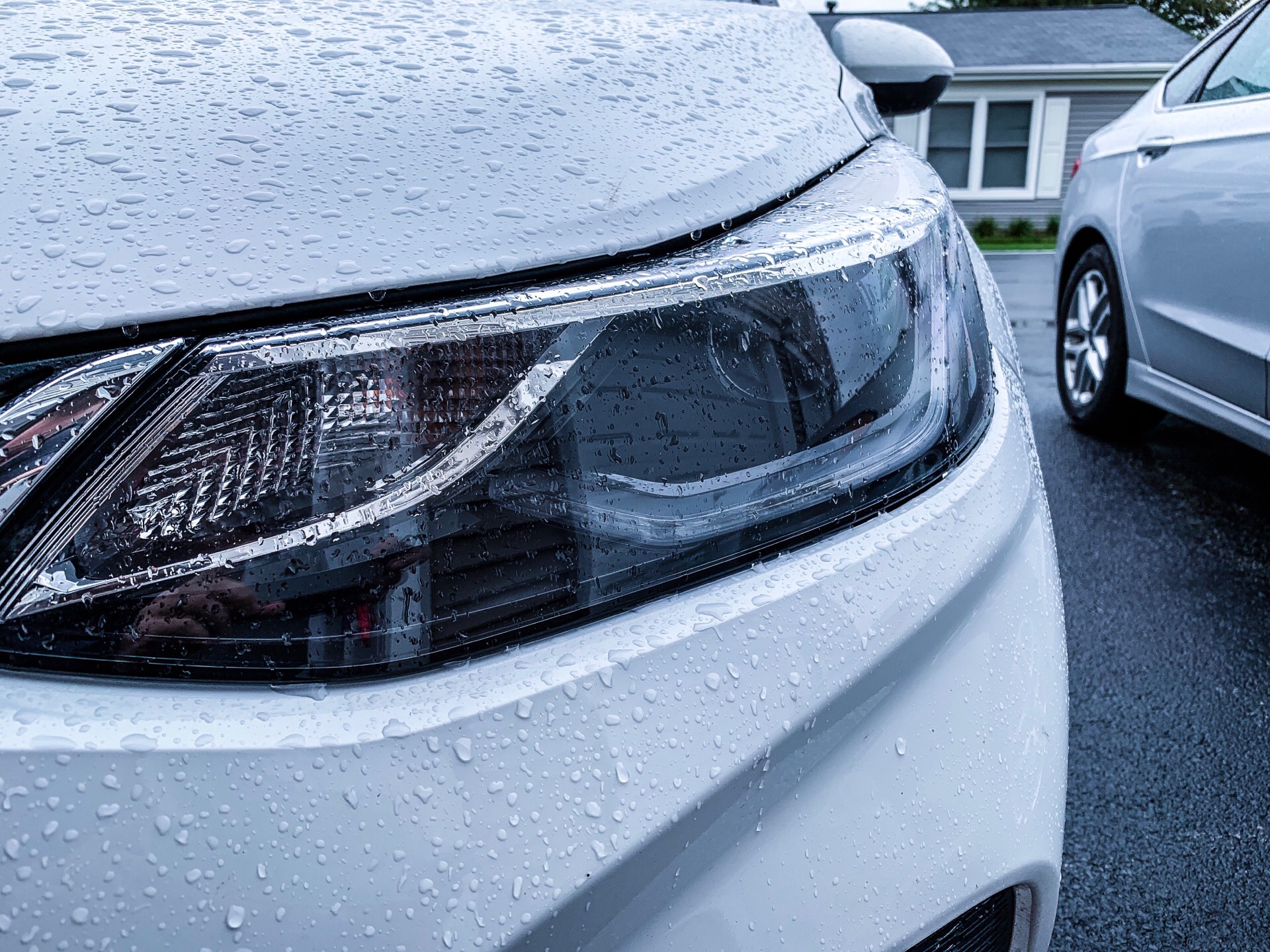

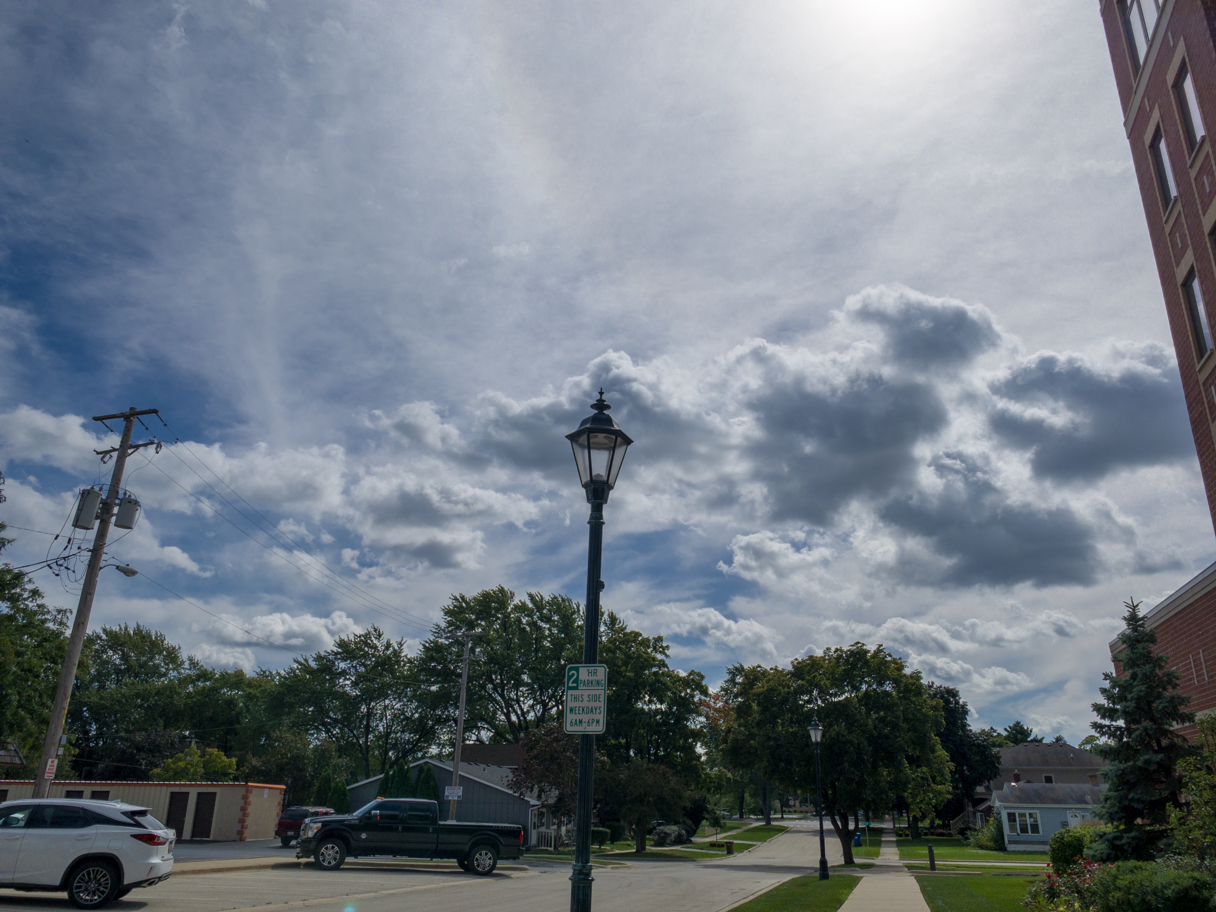

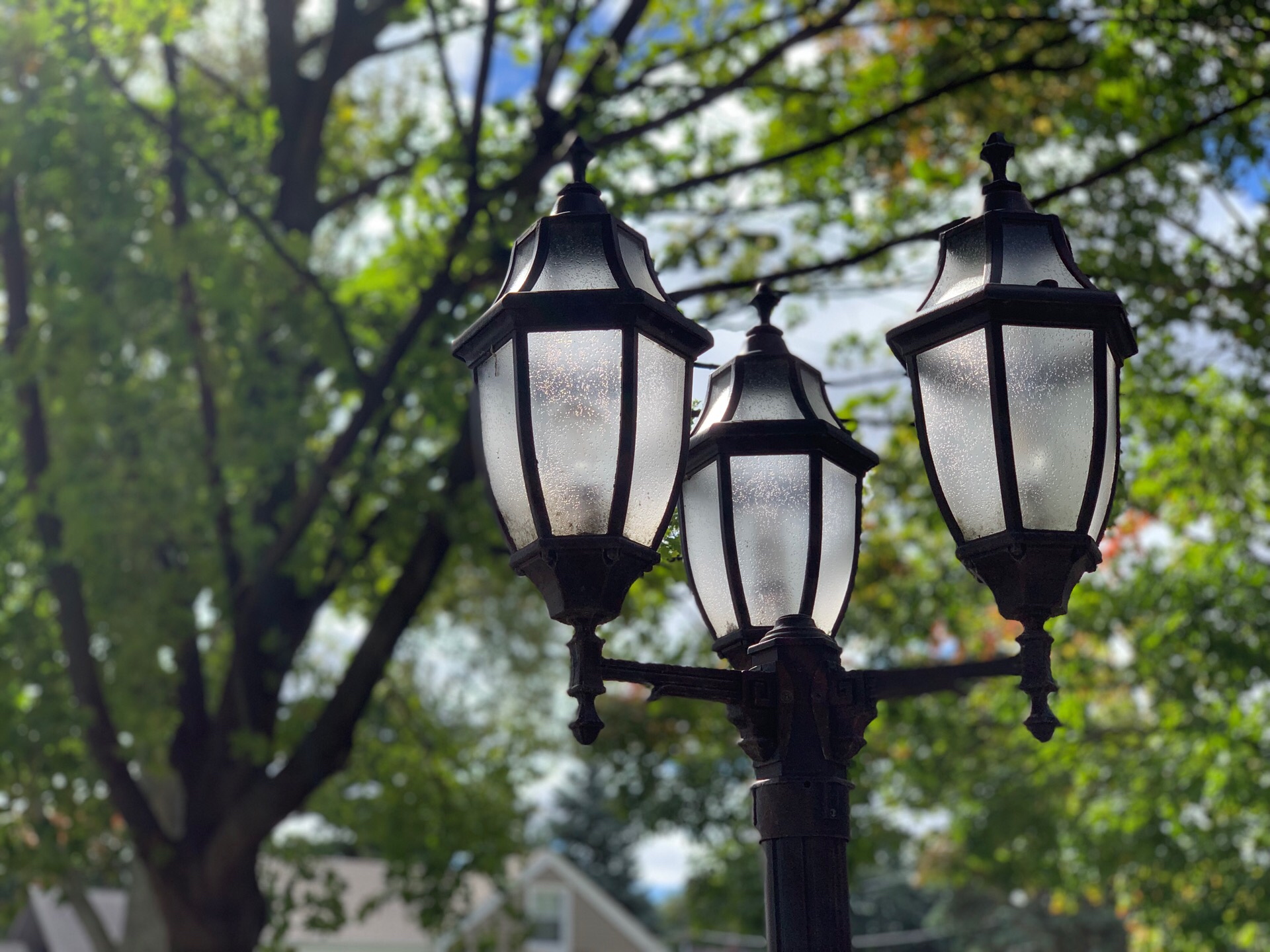


I’m taking most photos with the stock camera app, but if you want to get a different look, there are a myriad of third party apps that let you prioritize data differently and produce different images. I personally like using Adobe Lightroom to capture RAW image files and edit them to my heart’s content, but Halide is also a great app for taking photos with tons of different options.
On the video front, the new cameras take in more light and get much better video in harsh conditions. At night, things are way better, and things like going from light to dark and back to light situations work so much better than before. I’d highly recommend using 4k 30fps video to get the highest quality shots. This mode technically shoots at 60fps and combines frames to get a better overall picture, which is especially useful in lower light situations or spots where there is a lot of contrast between light and dark spots. You lose some of that magic when shooting at 60fps.
Gestures
This is old news for people who jumped on the iPhone X last year, but it’s new to me. The new gesture-based UI for iOS is excellent in almost every regard. I love the swipe up to close apps, as well as unlock the device.
I also adore the swipe left/right on the home indicator at the bottom of the screen to move between recent apps in a flash. This gesture is particularly useful since it essentially replicates Android’s back button, but in a way that actually makes a lick of sense. Swiping from the left edge of the screen on the indicator takes you back to the last app, which swiping from the left edge anywhere else on the screen takes you back in the app you’re currently in. It’s predictable behavior, which is what I want from a UI, and it’s not what Android allows.
Speaking of Android, the gesture controls overall are far more intuitive and enjoyable in iOS. When I use these controls I think “this is nice,” but when I use the Android gesture controls, I think “I guess this is the way it is now…”
Not all is perfect though. The gesture to bring up the app picker is a bit slow. Swiping up and holding is effective, but takes a hair too long for my liking. You should never feel like you can move faster than your computer, and the swipe up and hold gesture makes me feel like I’m waiting on my computer to understand what I’m asking it. I know you can do a swipe up and to the right gesture, but that’s a little more precise than I wish it was and I don’t find it to be as reliable.
Also, moving control center to the top of the phone makes some sense, but it absolutely makes getting to that part of the UI more difficult. I have to shimmy my phone around in my hand to make some basic system changes, and That’s a bit annoying. Also, because the control in control center are aligned to the top of the device, that means things like media controls are also way at the top and harder to access with one hand. The iPhone XS is the small iPhone in the lineup this year, but a tall 5.8” screen is still hard to reach with one hand.
Takeaway
And that’s it! My feelings overall are very positive on this phone. I am never happy to drop $1,000, and it would be lovely if this was still a $650 phone like iPhones were a couple years ago, but that’s not what the market was willing to pay and Apple is not leaving money on the table. That said, I do think this phone was worth the money. When I go back and pick up my 8 Plus I’m shocked by how old it feels, even after just a month. The bezels feel massive and the screen looks too squat.
The cameras also make me feel most like I’ve made a good decision in upgrading this year. I’m still flabbergasted by the photos I’m getting from this sensor, both from the stock camera app and through RAW apps like Lightroom and Halide.
My wife will get getting her iPhone XR delivered this Friday and I expect to play with it a little to see how noticeable the differences are from the $250 more expensive model I am enjoying immensely.

