Liquid glass gets a slider (and why liquid metal should be next)
I think it's fair to say nerds on the iOS betas this summer had feelings about Liquid Glass, ranging from love to absolute disdain. The question was how the general public would react to the interface material. My position was that I fundamentally didn't like it and was already tired of it by the time the public release happened, but I wasn't convinced regular people would revolt when they saw it. I didn't think they would love it, but I didn't think they would be as noisy as they were about something like the Photos app redesign last year.
Apple's never going to put out a press release that says we fucked up. So you have to look at their actions to see when they have made a miscalculation. For the Photos app, that meant seeing the company effectively completely revert the redesign from iOS 18 in iOS 26, and in the case of liquid glass, it's seeing this new setting coming just weeks after the public got their hands on the new UI element.
From what I've seen online and in my personal life, I have not seen a Photos-esque revolt from users, but there has been some frustration. Of course, my anecdotal data isn't much more relevant than your anecdotal data, we know something's gone wrong when Apple does something. I have no idea what the scale of the user frustration was, but clearly there was some, otherwise they won't have made this affordance.
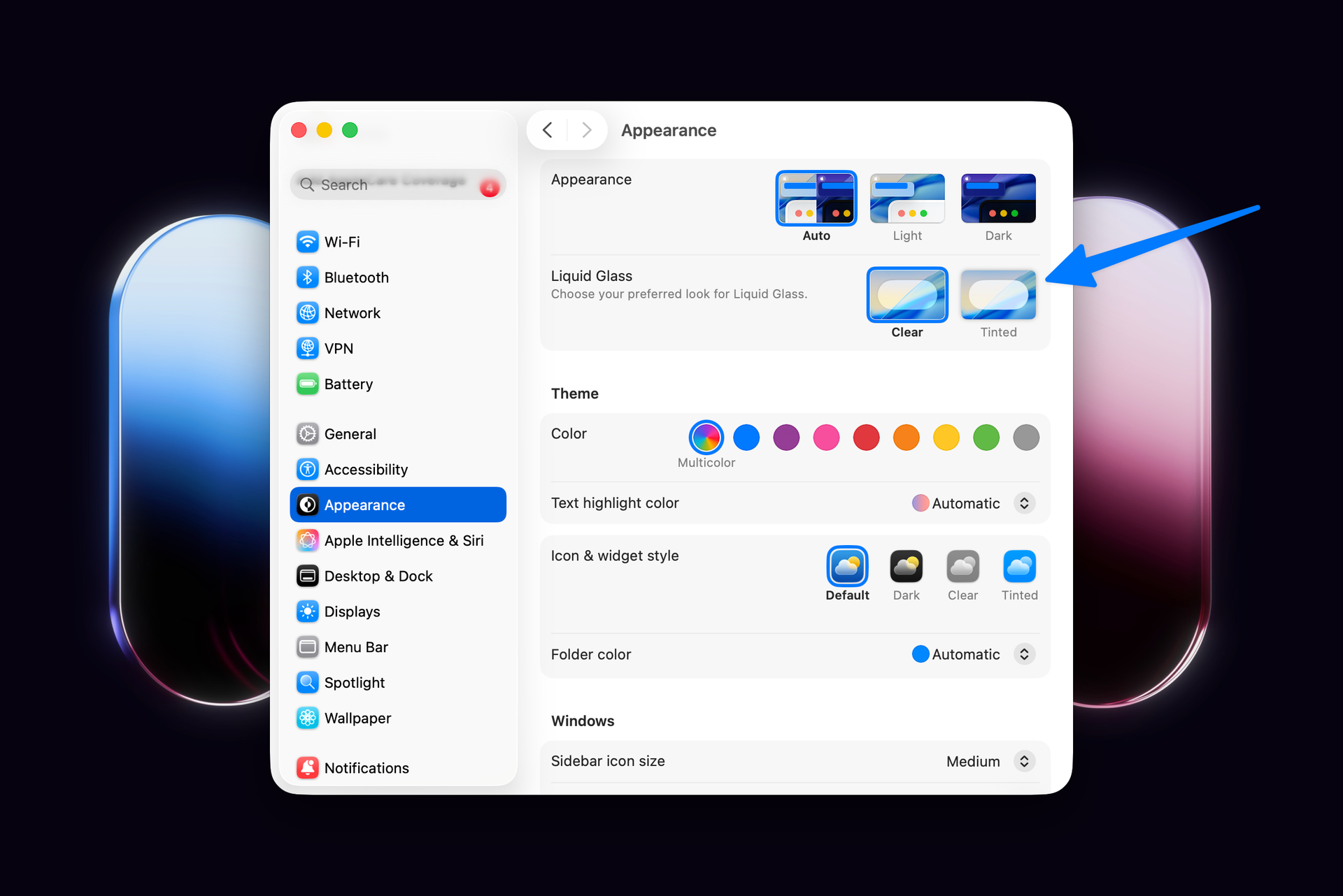
This new liquid glass setting is available on iOS, iPadOS, and macOS in Settings (Appearance page on the Mac and Display & Brightness page on iPhone and iPad). I've enabled it across all my devices and I do prefer it on the whole. Notifications in light mode are very bright and opaque, but everything is more reliably legible, which is a win in my book.
Liquid metal
I'm adding right here that my wish/prediction is that "liquid glass" is the first of several materials that can exist in the new, unified Apple design system. Clear liquid glass is the default right now, tinted liquid glass is the second one, and I think there's a good argument to be made that liquid metal is another material that would make a lot of sense.
I first started thinking about this after a few weeks of using watchOS 26 on my Apple Watch Ultra. There's a bit of a disconnect, in my opinion, going from the stark utilitarian physical design of the Apple Watch Ultra to the liquid glass design of watchOS 26. I also think there's a bit of a disconnect on the iPhone 17 Pro, as well as pro apps on the Mac, which we haven't seen get a liquid glass redesign yet. Having a liquid metal UI would allow for developers to use standard system components, but would make their better UIs suit their application (not all apps are content browsing experiences, which is what liquid glass seems to be exclusively optimized for). I'd love it to be a system-level option as well so that people who want a more utilitarian look to match their hardware would have a good option.
This isn't completely unheard of in Apple's history either. Apple has long had custom versions of AppKit that only worked in Final Cut Pro, Logic Pro, and Aperture.