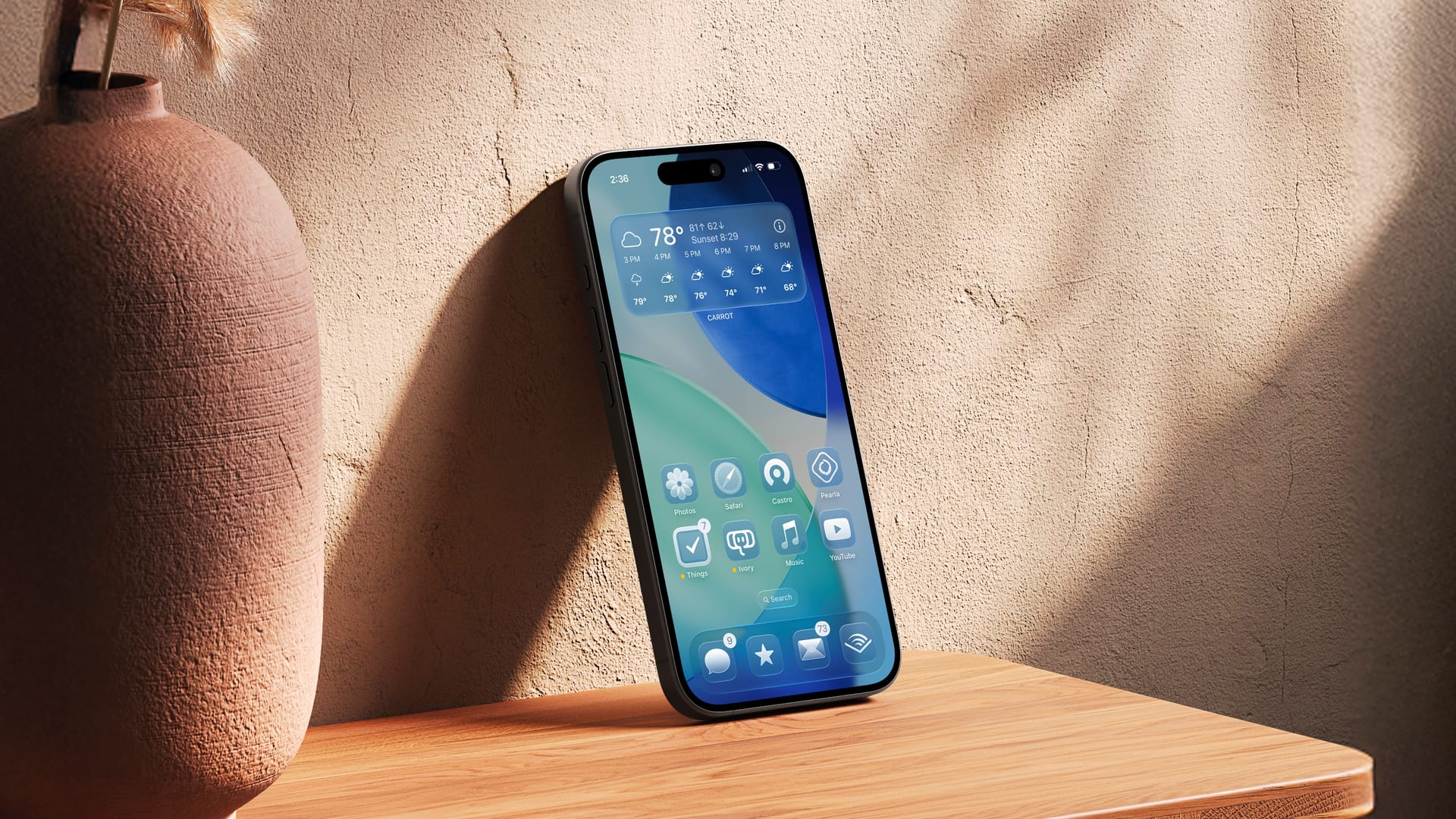
Liquid Glass isn’t Vista 2.0, it’s iOS 7 2.0

Like many others, I found myself thinking about iOS 7 during this week's WWDC where Apple showed us their new "liquid glass" UI. I was covering Apple back then (2013!), and I remember that being a controversial design and that Apple changed a bunch of things before the public release later that year. But as someone who tries to be mindful of my brain's tendency to create memories of the past that deviate a bit from reality, I decided to go back and watch the iOS 7 introduction in full, and I was really taken aback at how many things they said in 2013 are almost word-for-word what they said in 2025.
iOS 7 had a lot of UI changes, but themes such as having the UI get out of the way of your content and for the UI to have physical layers that let your wallpaper and apps impact how it looks as everything was some level of transparent, really felt like a lot of what I heard at this year's WWDC as well. The new liquid glass system is higher fidelity and the implementation details are largely different, but the concepts really do seem almost identical. It's almost as if they're trying the same thing again, but with new designers, new tech, and 12 years more experience building a mobile OS.
Another thing that hit me was how much less extreme iOS 7 in this keynote felt than when I saw it 12 years ago. Yes, it's a bit awkward and a bit "too much" as many of us have said we remember it, but it's not as bad as I had it in my head. My benefit today compared to 2013 Matt is that I'm used to white, flat interfaces, so a more primitive one with some rough edges and crazy interactions isn't as shocking as someone coming from the skeuomorphic age.
Also, I couldn't shake the idea that we might be going in decade-long circles in design. Obviously fashion is always drawn to the new, so whatever you have now and feels fresh will someday become stale and you'll crave something new. So it goes with software design, and it's hard not to see the cycle. 2007 brought Windows Vista, which was all about a transparent UI, only for that to be walked back in subsequent Windows versions. iOS 7 tried this again, only to see that platform evolve towards something more opaque like we have in iOS 18. Even early Android versions had the Holo UI which was a darker transparent concept that evolved into Material, which is very opaque. Now we have iOS 26 (and all Apple's platforms) going to a transparent UI. Time will tell, but it's probably a good bet that in 5-10 years we'll be using a more opaque version of iOS than we have in the current beta.
