Magic Keyboard for iPad First Impressions
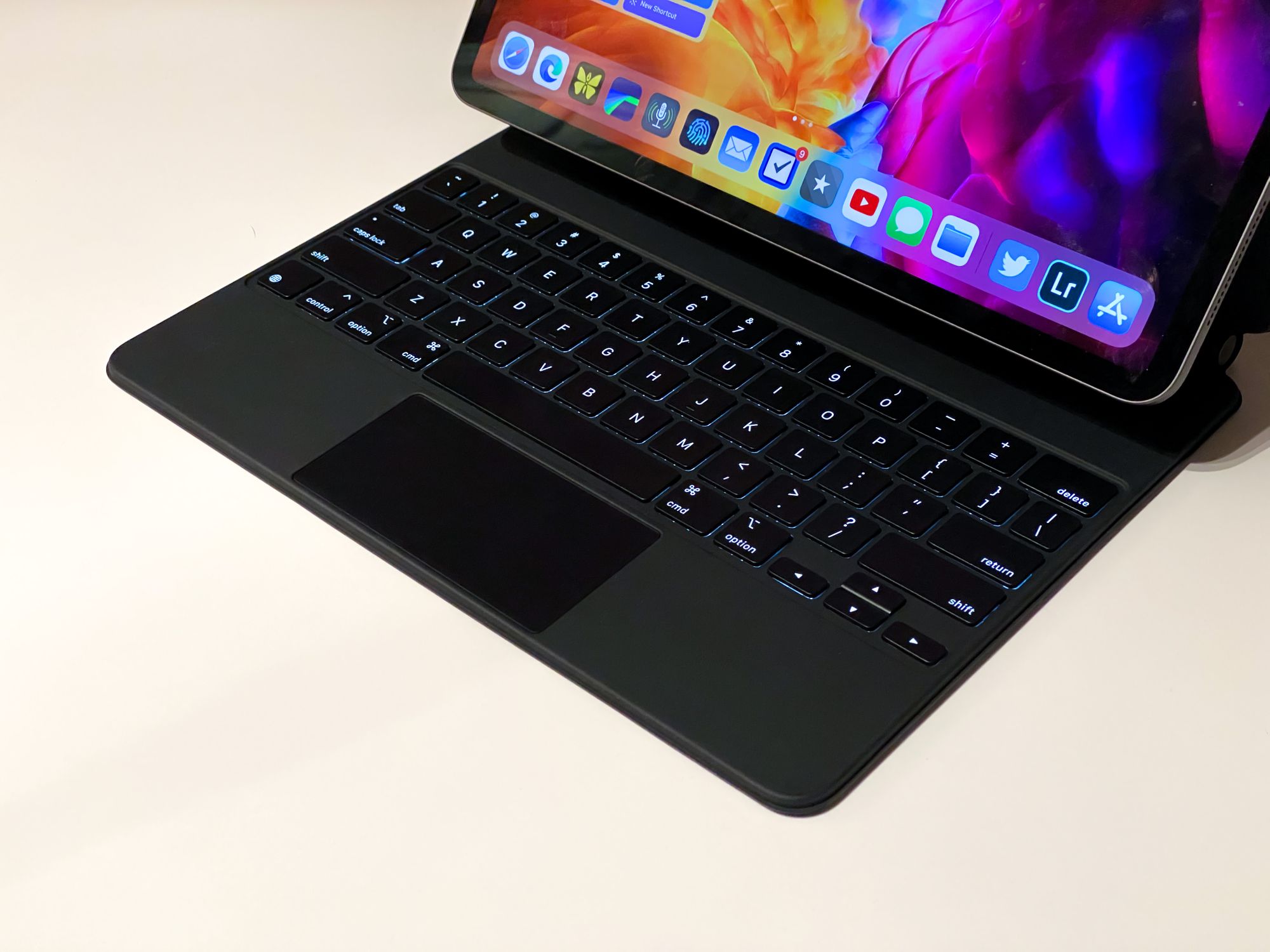
It’s a keyboard case…it’s an accessory…so let’s hit things quickly.
The Elephant in the Room (no pun intended)
In a recent episode of the wonderful Brooklyn Nine-Nine, a certain corgi is referred to as a “thicc king.” I didn’t know it at the time, but I think that is pretty good way to refer to the new Magic Keyboard for the iPad Pro.
This keyboard case makes the iPad Pro a comparatively heavy device, if not an objectively heavy one. I’m glad all the early reviews mentioned the weight because even with them, I was surprised how hefty this made my iPad. I’m coming from the Smart Keyboard Folio, and it feels like going from a 12” MacBook (RIP) to a 15: MacBook Pro. No, the MBP isn’t bad, but it’s a notable difference.
Quick note, I think I’ll be fine with the weight, and the product justifies it in other areas, but I think the dismissiveness some have around people saddened by the heft of this thing is misplaced. There are compromises with each of Apple’s keyboard options for the iPad Pro, and there are going to be people who can’t get the perfect one for them because of these trade offs (more below).
The Typing Experience
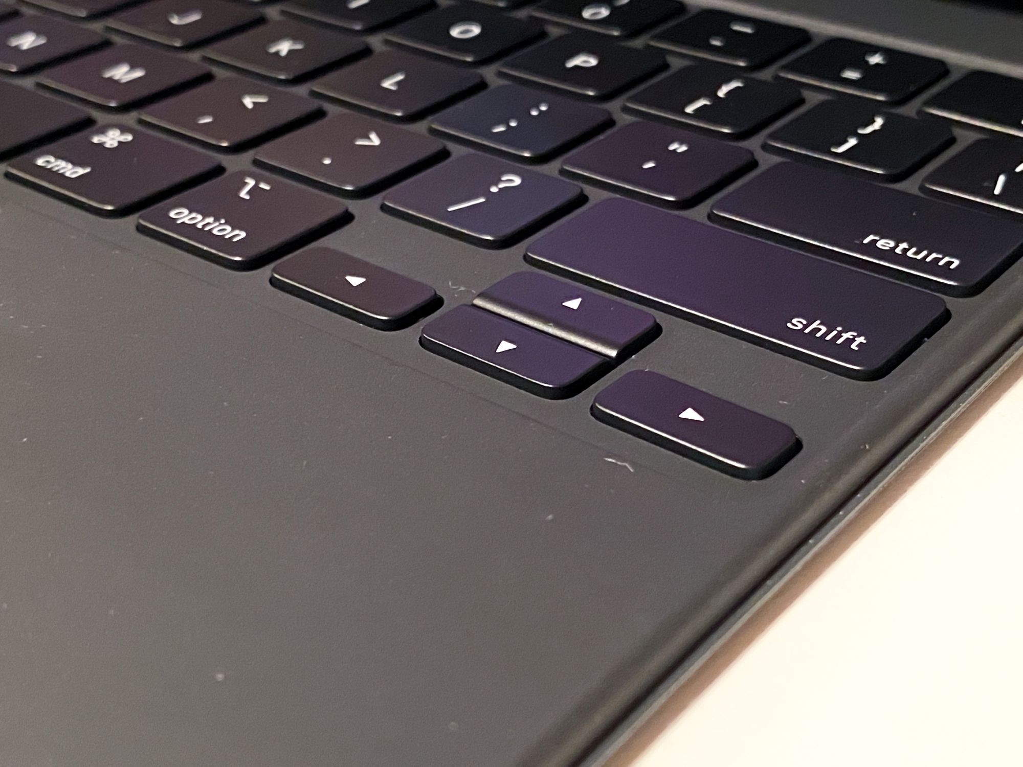
Ok, this will be quick! The keys feel great! The inverted-T arrows are a delight to have back, the spacing of the keys is perfect for figuring out where you are without looking at the keyboard, and the backlight is stunningly good.
And the base this keyboard sits on is solid as hell. There is no bend in this thing and on a lap it is better than the Smart Keyboard Folio, although it’s not as good as a Mac laptop. It’s fine, don’t get me wrong, but it gets a more hollow feeling when there’s nothing right below the keyboard.
Why No Function Keys?
Well, because there simply isn't room…with this design, at least. See, even with what’s there now, my fingers get dangerously close to hitting the keyboard when it’s leaned back as far as it will go. Another row would technically be accessible, but it would be somewhere between uncomfortable and unreachable.
I miss them, but having lived without them for years now, it’s not a deal breaker.
The Trackpad
It’s definitely small, but considering you’re likely not going to be doing everything with this all the time, it’s completely fine. The acceleration on this cursor movement is a little different from when I paired a Magic Trackpad with this, and it took a little getting used to, but again, shall be fine.
Gestures work great, and as a Mac-users you’ll know how to do some of the basics right away. It’s all smooth and quite frankly, a delight.
As for clicking, the trackpad is the first one Apple has shipped in many years that actually moves. After years of force touch trackpads that simulate movement, it’s technically a notable difference, but because the MacBook ones fake it so well, it’s hard to tell the difference in practice. As a bonus, you still get the ability to press anywhere on the trakcpad to
The Floating Design
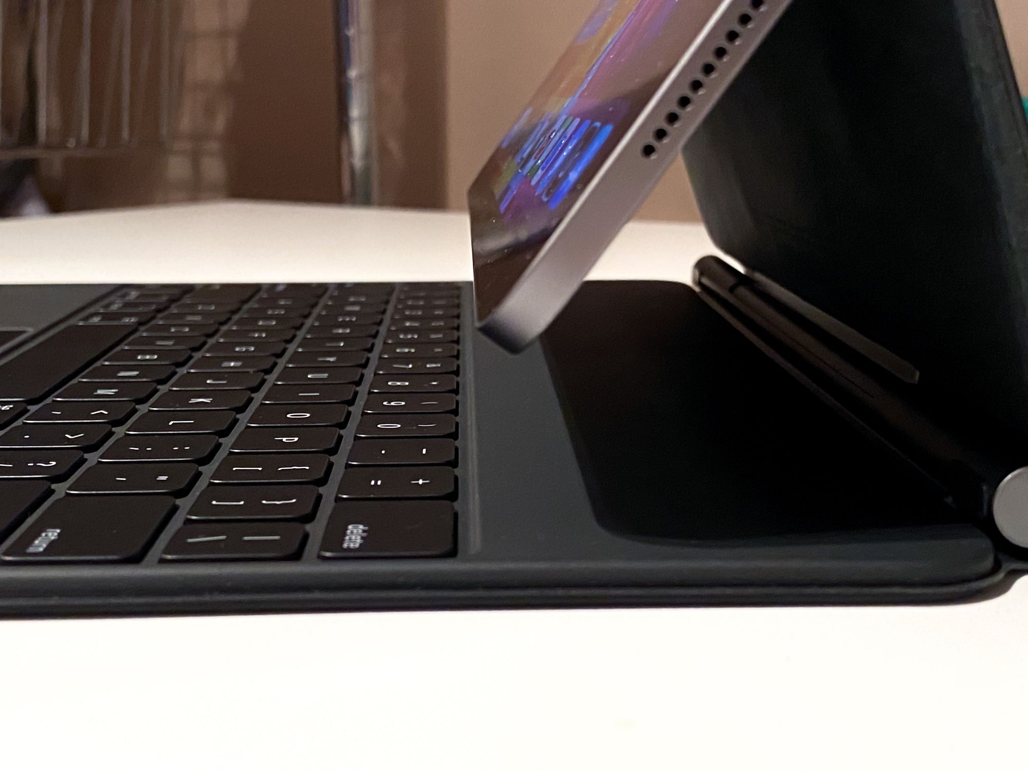
I’m not sure what I think about this yet. It certainly looks cool, though.
The worst part about this is that it makes the screen sit higher, and therefore be further away from my fingers for touch input. Despite the addition of a trackpad, iPadOS is still a touch-first operating system, and I touch the screen all the time when using my iPad, so making that a little more difficult is an odd choice.
Charging
The keyboard has a new USB-C post on the side that lets you charge the device. I’ve only used it briefly, but I had it plugged in while doing a 2 hour Zoom call last night and it appears to have charged the iPad up slightly faster than it was burning battery.
This will require more testing to see the speed difference from the main port.
Initial Thoughts
I think this accessory is exceptionally well made and feels like a very natural fit with the iPad Pro. Everything about it from an execution perspective is top notch and the few issues with weight, lacking function row, and limited angles, all have to do with fundamental choices the product team for this made.
If nothing else, this product shows there is room for more accessories in the iPad lineup. The Folio excels at minimum weight with an acceptable typing experience, but lacks full keys and a trackpad. The Magic Keyboard has those full keys and a trackpad, but loses the ability to flip around and adds some heft. Depending on your desires, you might find one of these to be perfect today, but there’s a good chance you’ll want a compromise solution, and that doesn’t exist yet.
Regardless, the trade offs are worth it to me so far and I expect to keep using this thing for the duration of owning this iPad.
