OS 27's best small update
One of the big problems with the glass redesign in OS 26 was that it was really optimized to look good when specific content was underneath it. This famously resulted in illegible text in buttons when complex content was behind it, and social media is full of examples of that. But the quieter problem was when there was nothing under them, they looked kind of dead. On macOS especially, Apple made these buttons stand out a bit from the background by placing an enormous drop shadow behind them as well, which I thought looked absolutely garish.
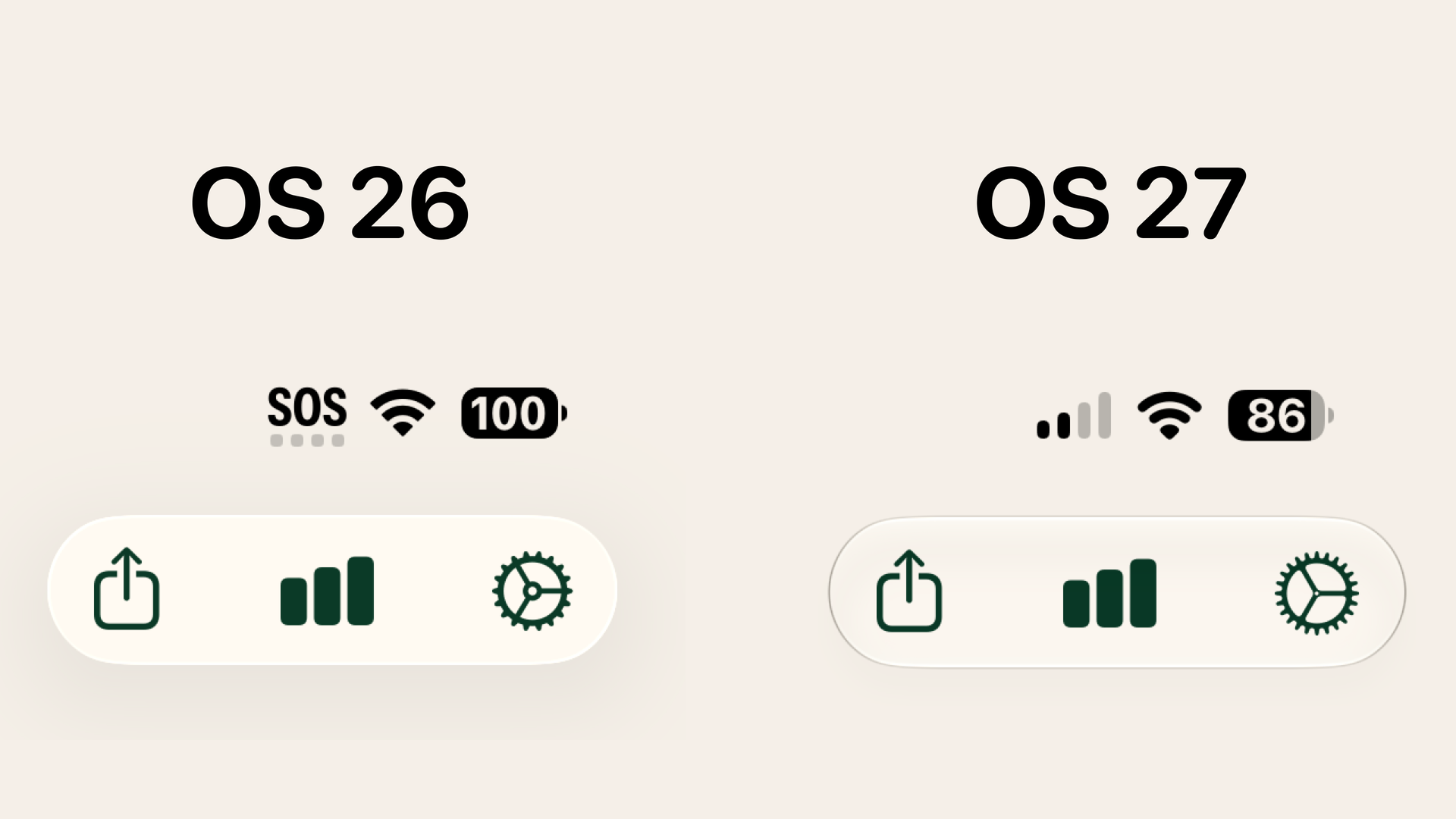
But the glass effect in OS 27 has a subtle change that I think goes a long way to making them feel better. At the top of this post, I have a comparison from my app, Yearly Run Goals, which has three buttons inside a single glass pill. In addition to getting a peek at some of the changes to SF symbols in the new update, you can also see that the glass element the buttons sit in has a subtly different look that I think looks really sharp.
I don't know if it really comes across in a screenshot like this, but when you're using the device, I think glass buttons feel a lot better on everything from my iPhone to my iPad to my Mac.
I mentioned the Mac specifically earlier, and let's take a look at Finder.
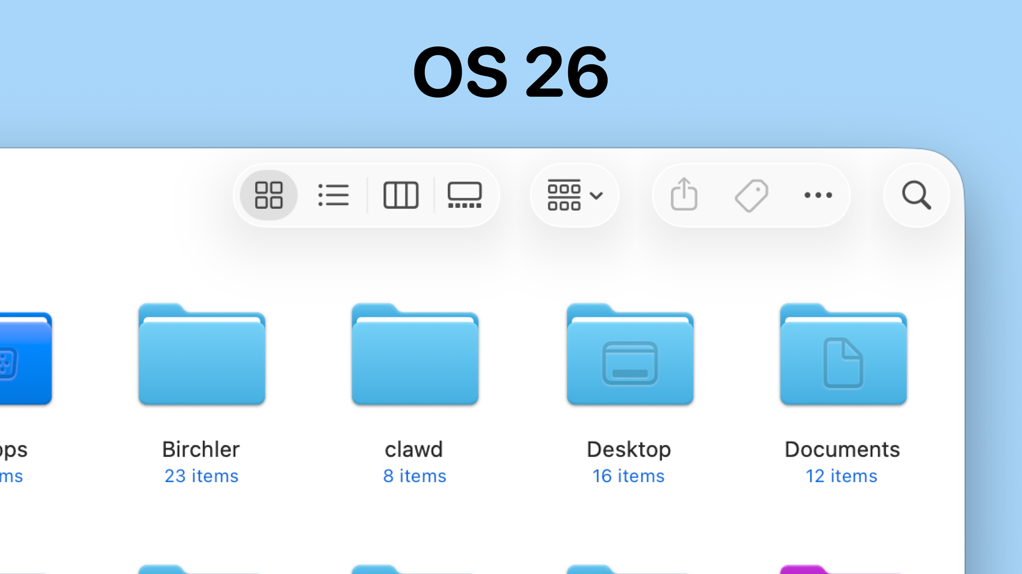
This is what the Finder toolbar looked like in OS 26, which is very low contrast and has again these garish background shadows that I think look really weird. Here's what the same thing looks like in OS 27.
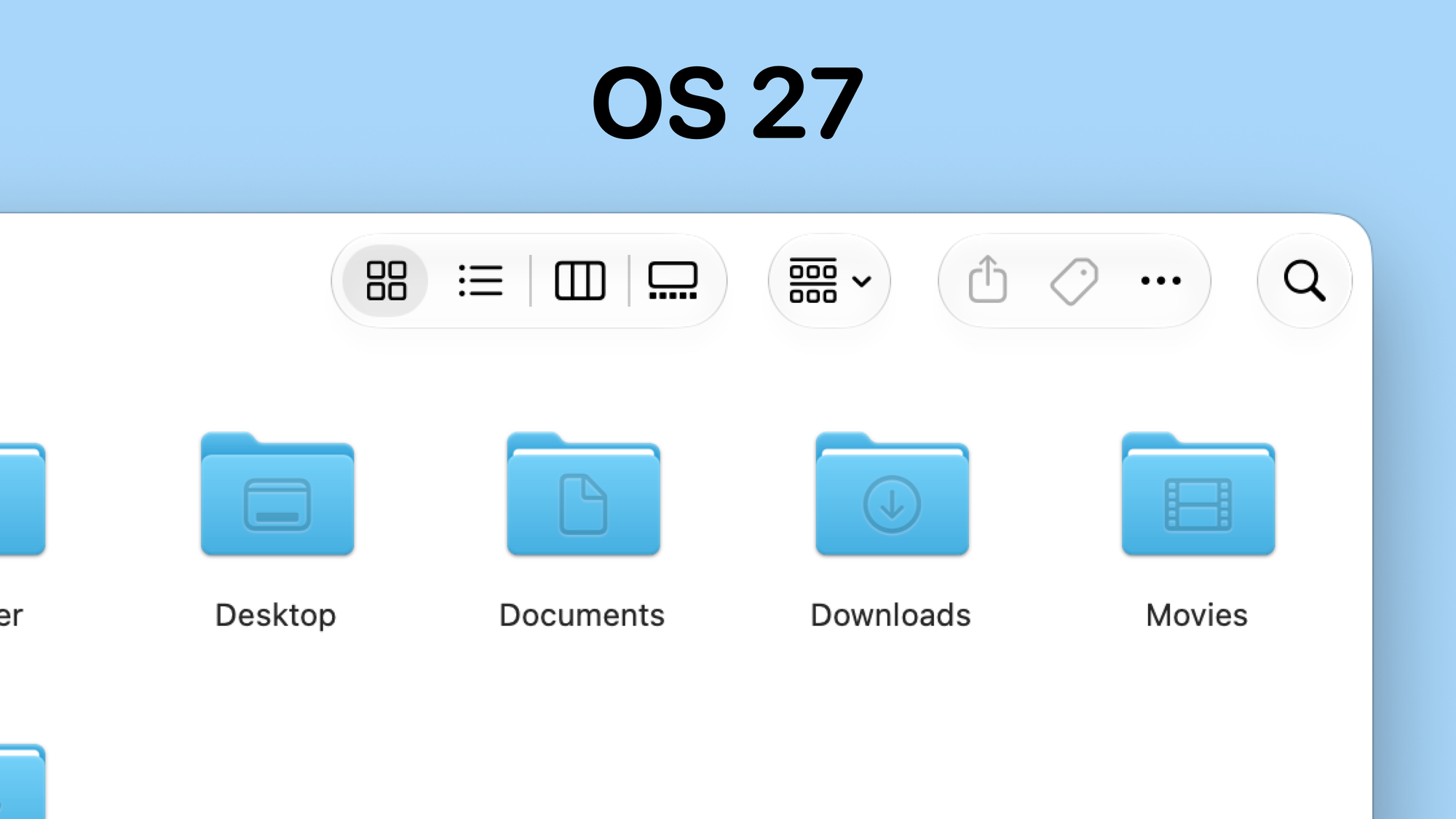
It's still not the most contrasty thing you've ever seen, but Apple's made a couple of changes that I think help here. The enormous shadows are basically gone because the new button outline lets the buttons stand out a bit more from the background. Apple's also gone further by making the buttons use a solid black color rather than a gray, as they did in Tahoe.
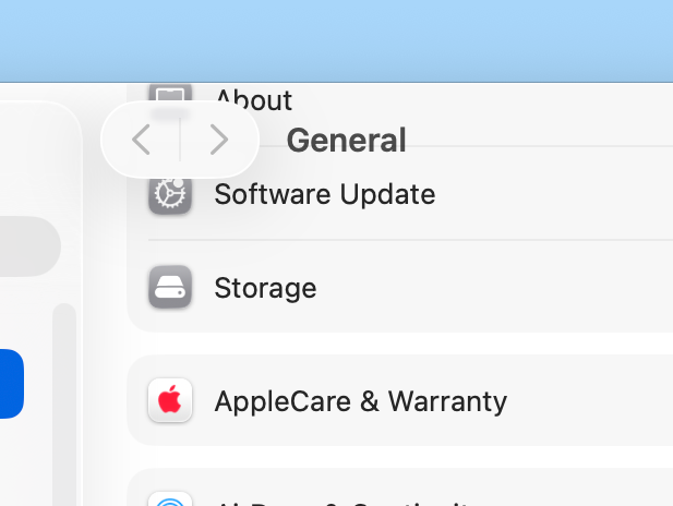
It's a slightly different thing, but a related change that I very much welcome is that toolbars get a background in OS 27. Here's the mess you saw when scrolling in OS 26:
And here's what it looks like in OS 27:
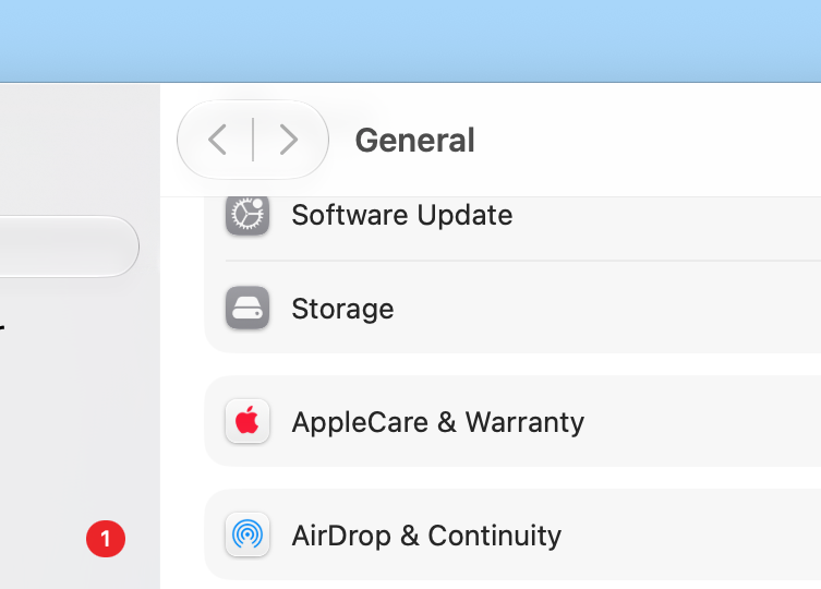
Ah, visual structure…what a concept!