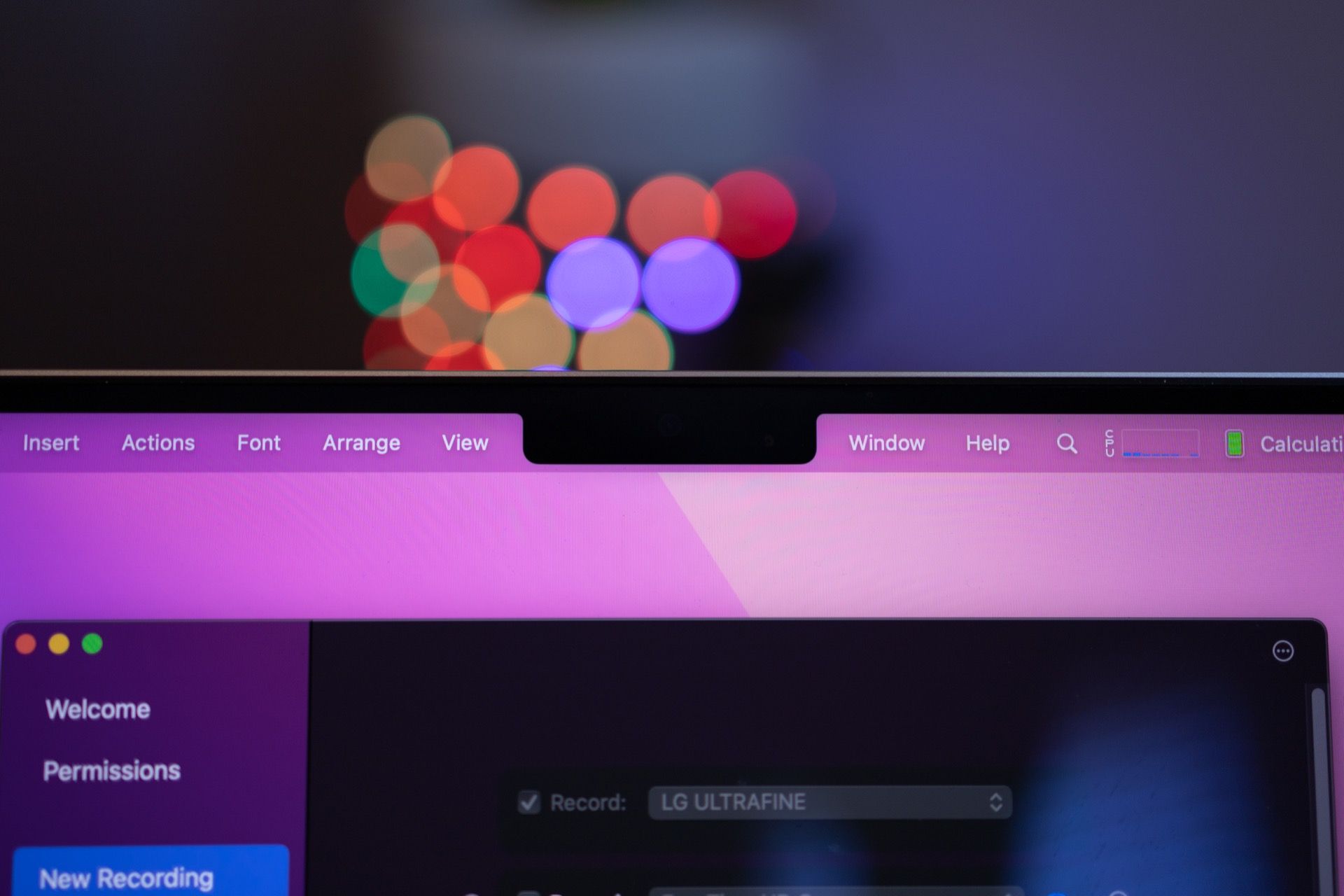
So, About the MacBook Pro Notch…

I’m here to say that yes, I notice the notch on the 2021 MacBook Pro every single time I use the computer, and yes, it’s annoying.
When these machines came out, everyone went out of their way to say something like, “I don’t even notice it!” and I just think, “really?” I’m honestly not sure how you wouldn’t at least notice it’s there and run into things you need to do to modify your Mac setup to get things working perfectly.
For me the main annoyance is that now an app like Bartender is absolutely required. I don’t have a ton of things in my menu bar, but I have enough that without a 3rd party tool, several items simply disappear into the notch and are completely inaccessible. I also needed to change my Bartender settings so that it displayed hidden items below the menu bar rather than inside it like normal since of course I can’t see them under the notch.
I know some will say, “the menu bar is wasted space, so the notch isn’t taking away anything,” but I’d 100% disagree. The menu bar has long been a space to put things like iStat Menus that let me monitor things on my Mac, or to put third party utilities like Hand Mirror that are important to me. The notch has made it so these are harder to use.
Maybe you keep a totally clean menu bar and this doesn’t impact you, and that’s great, but for me it’s absolutely an inconvenience. It’s not a disaster or anything, and I do value the increased vertical space I get for the rest of the screen, so don’t take this as an incitement of the whole computer, I just look forward to the day Apple can remove the notch from their Macs.
As of right now, the notch is something I need to modify my macOS usage to accommodate in a way I never had to before, which isn't quite the "you don't even notice it!" vibe I get from many others.
