Surface Go: Touch UI and the Type Cover
My first day with the brand new Microsoft Surface Go has been an interesting jump into a whole new world. I got this device because I wanted to see how it matches up with the iPad Pro in terms of productivity, as well as fun & games.
My initial impressions are that this is not the iPad-like experience I am used to. This is full on Windows 10, and it feels like almost zero effort has been put into making this operating system touch friendly. Everything about this operating system feels like a PC living in a tablet body, not necessarily an operating system that was built for this form factor.
The very first thing I've noticed is that everything on screen, even at the 150% zoom the device defaults to, leaves all UI elements far too small. I'm often squinting to see things and navigating the interface with touch is an exercise in precision. I need to play with the zoom settings a bit, but this feels like a struggle, while everything on the iPad is an appropriate size for touch interactions.
It's a small thing, but I think it's worth noting that Windows shows a little "blip" animation whenever you touch the screen, showing you where you tapped. This is the sort of thing that's nice for demoing touch interfaces on video, but in person it really feels like something tacked on and made me feel like taps were mouse clicks, which is not the feeling I want from a touch UI.
This feeling of being not touch-first continues when it comes to the on screen keyboard. The keyboard often takes a couple seconds to come up, and typing on it exhibits more lag than I'd expect. Some of this may have to do with the fact I'm using the most affordable Surface out there, but I use an iPad (2017) for a lot of my work at my day job and it has a far better typing experience than this.
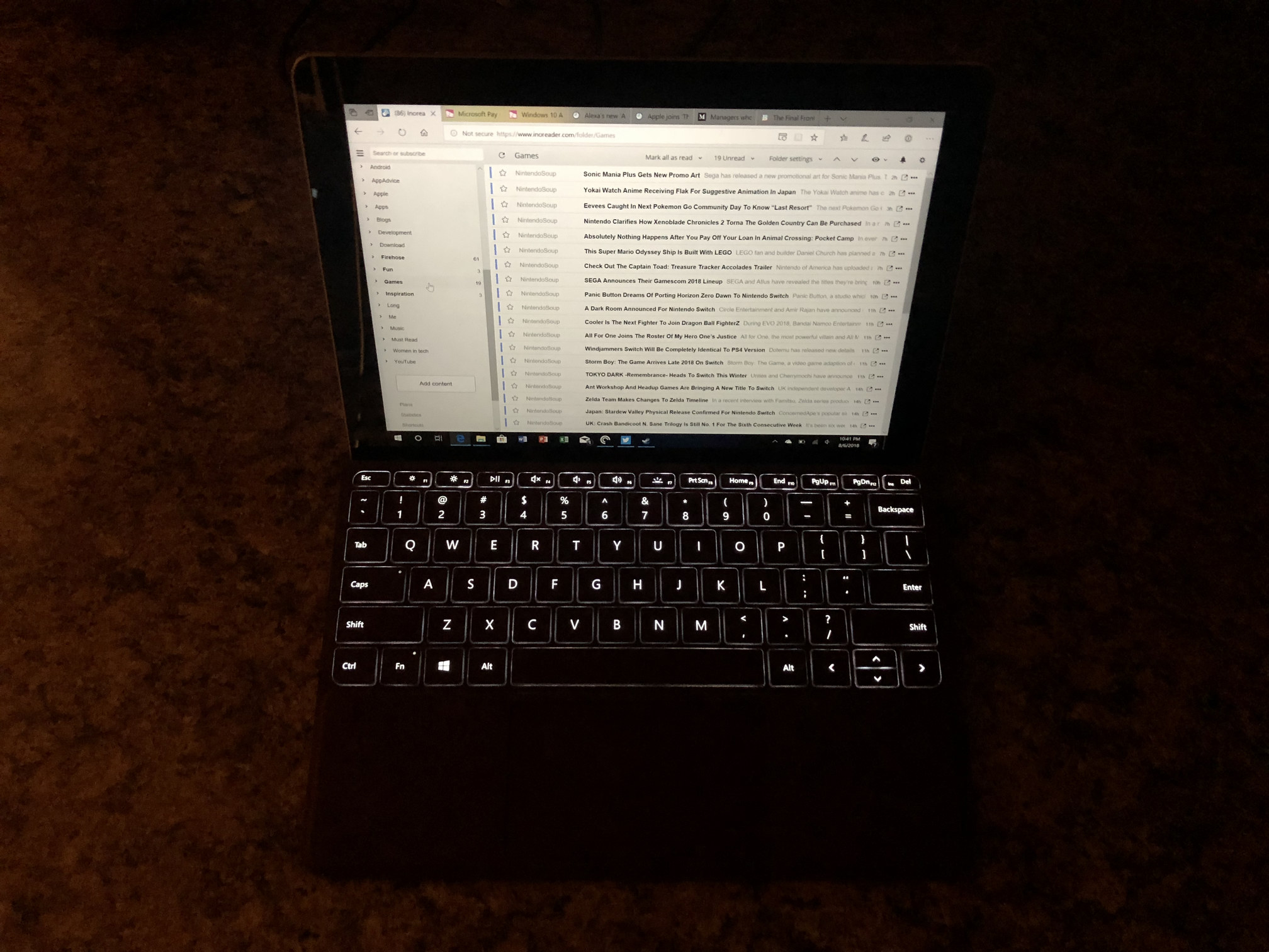
This has all meant that I use the Surface Go in laptop mode most of the time, using the Type Cover from Microsoft. This keyboard really is excellent, with keys that travel more than they do on some laptops (you know the ones I'm talking about) and feel really good. It's not quite full size, but as someone who does most of his computing on an iPad with Smart Keyboard, this is pretty normal for me. I don't know how much I'll like this in the long run compared to the Smart Keyboard, but it definitely one-ups Apple's offering by having a full function row with media controls, brightness, and even home, end, print screen, and delete keys.
In addition to a nice keyboard, the Type Cover has a very nice track pad. It's smaller than most modern trackpads, but it's about as big as it could be and is quite responsive. I don't think it's as responsive as a MacBook trackpad, but it's far and away the best I've ever experienced with Windows.
Oh, and did I mention that the keyboard is backlit? Yeah, pretty sweet.

I have a lot to uncover in the coming days and weeks, but the early signs are already pointing to this being a journey with many highs and lows. I'm encouraged by the Type Cover, as well as a few other features I'll be talking about in later pieces, but there are also some major concerns I have in terms of how this will work as a tablet interface, and not just a tiny PC.


