The little things that make Android so great and so terrible
Everyone reading this site likely knows I'm an iOS guy, but I've been spending the last week with Android 100% of the time. I have a Moto G4, which is a near stock Android phone with respectable specs and is running Android Marshmallow. Here are some of the little things I've noticed over the past week that make Android distinct from iOS in both good and bad ways.
The good stuff
Smart travel notifications

This is the sort of stuff I thought Apple was working on with their "proactive" features in iOS 9 and 10, but we haven't really seen them to this extent. Google knows where I live and where I work, and gives me this sort of passive notification when I'm somewhere new and might need directions home.
I got the above notification at my family's Christmas party in Chicago this past weekend and it was exactly what I needed. It didn't buzz my phone or anything, but when I pulled down to check my notifications it was there. A+ work here.
Location-based information
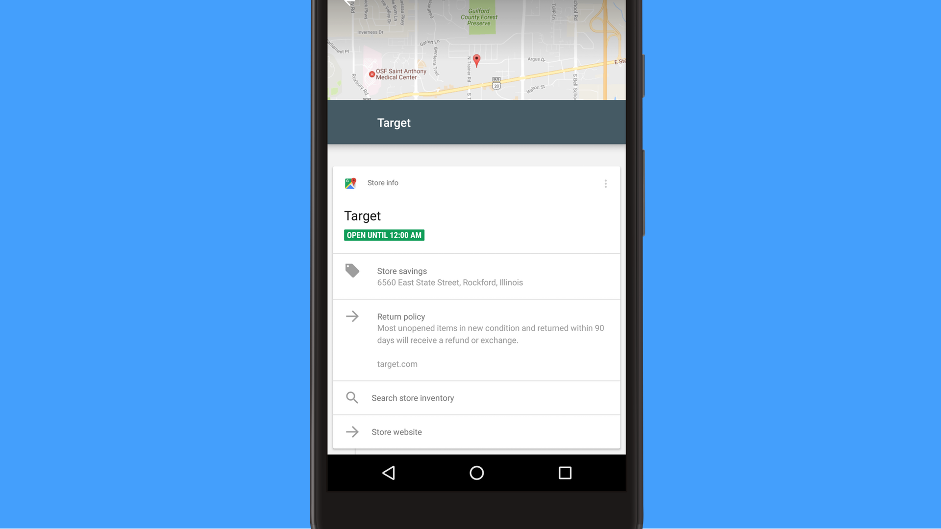
Along the same lines, I was shopping at a Target store and found a notification that said essentially "we see you're at Target, tap here for some info." Tapping into the notification revealed some information about the store I was in, including when they close, what their return policy is (nice), and the ability to search the store for products.
There's a section for "savings" but that just shows the store's address, so I feel like that should be showing something else...
But again, this was given to me without any interaction on my side asking for information about Target. The fact that it got me pertinent information on the specific location I was at was even more impressive.
Inline video
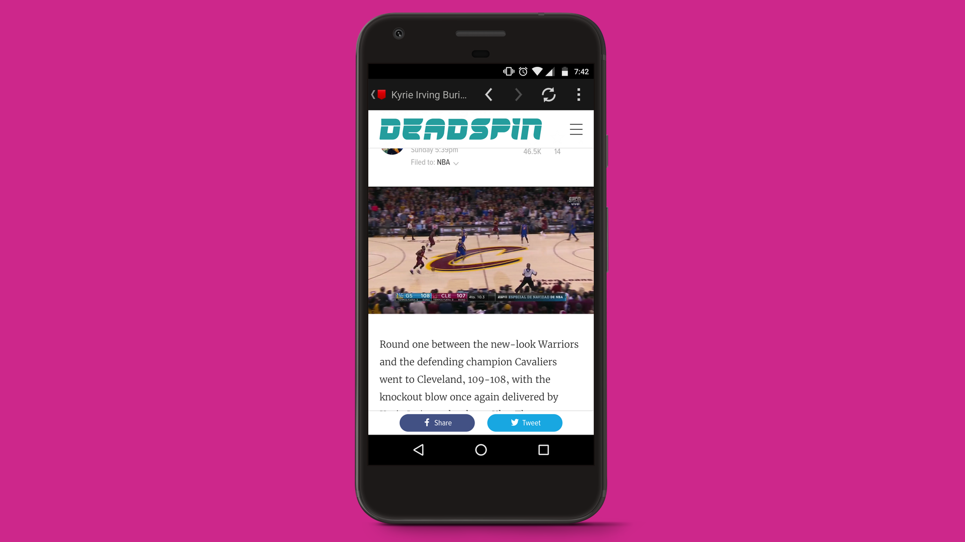
Apple added the ability for iPhones to play video inline in web pages in iOS 10, but Android's implementation is more in line with what I want from this feature. The important difference is that Android plays video inline by default and I can go full screen if I'd like. iOS goes full screen and then you have to shrink the video down manually. Video on iOS is better in every other way, but this is one part I think Android handles more smoothly.
Clearing up photo space
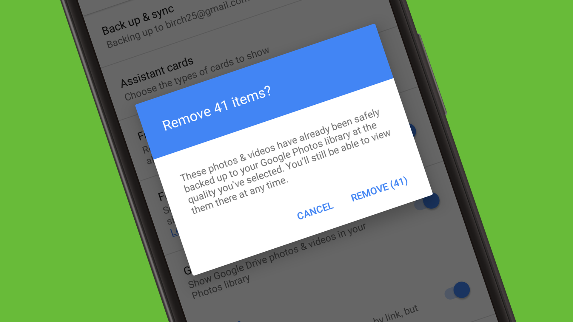
This dialogue box impressed me for 2 reasons. First, the clarity of what this action does is perfect. I'll be removing 41 images from my phone's storage, but they will still be accessible in my library. Second is that this is a feature that iOS simply doesn't have for iCloud Photos. Apple has smart storage, which automatically makes more or fewer of your photos stored locally depending on how much free space you have available on your phone.
Apple's solution may be technically just as good for most users, but there's something comforting about being able to remove local content manually.
Google Now/Google Now On Tap
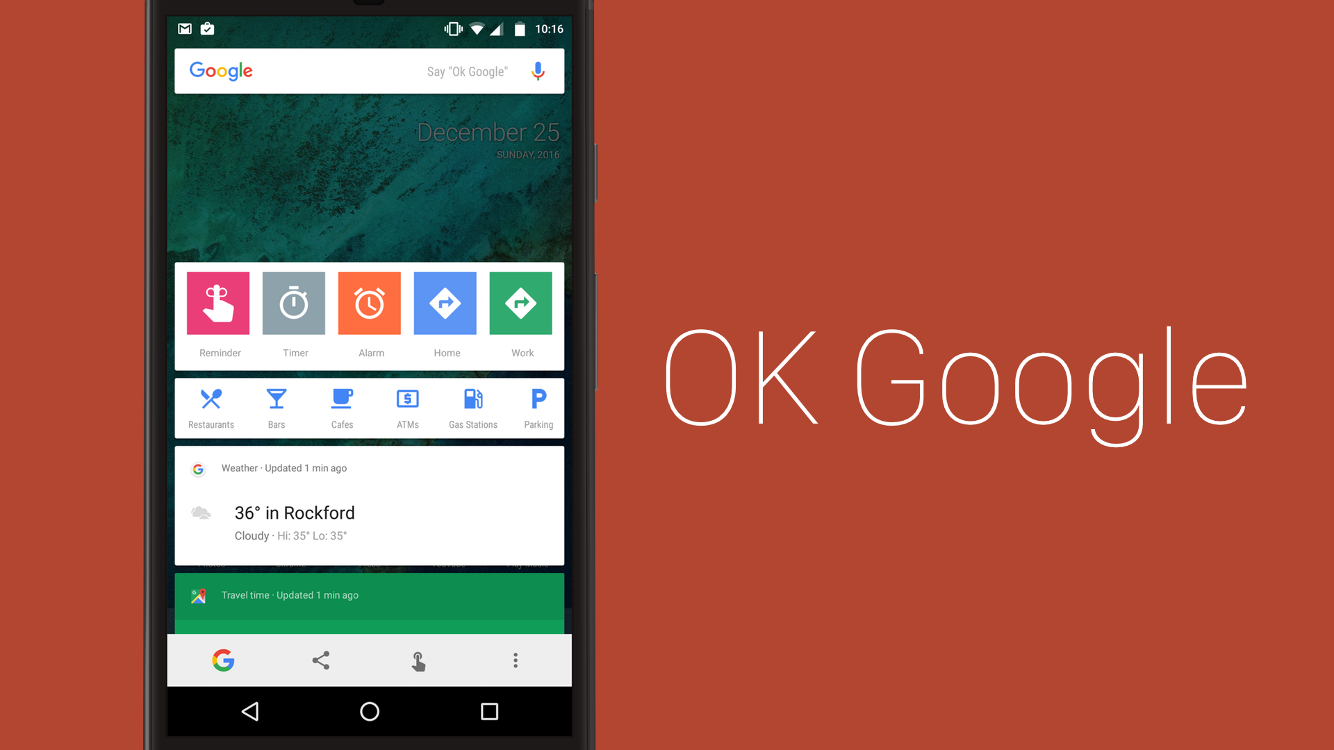
This is in the win column because it is cool tech, but I don't find it as amazing as I'd hoped. I like being able to hold down on the home button to do a Google search on whatever is on the screen, but I don't use it that often in practice.
When I do use it, it works quite well. I can hold down the home button on the home screen to get shortcuts to some actions such as setting a reminder and navigating to work, but it gets really cool when you hold down when looking at something. Here's what comes up when I was on the Amazon page for Deus Ex: Mankind Divided for Xbox One:
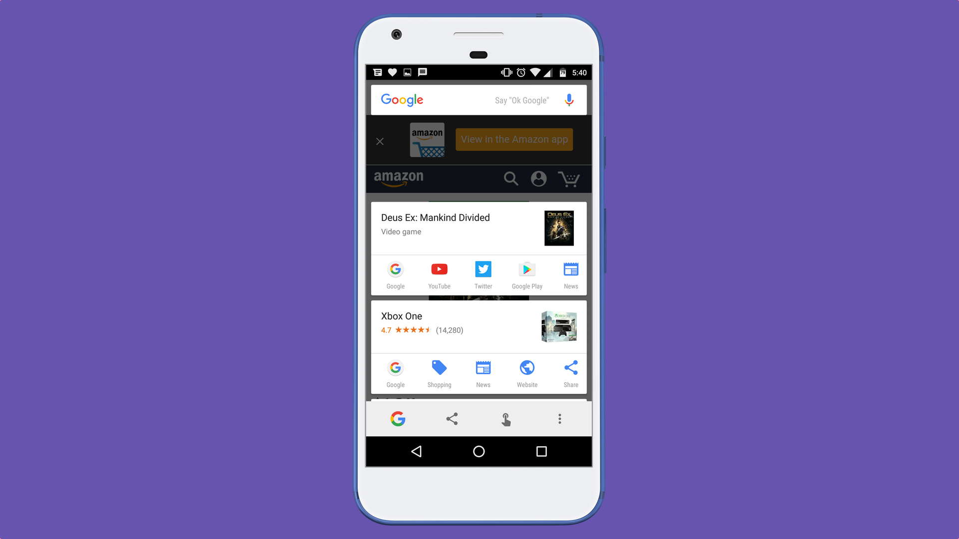
That's all convenient, and there are a lot of other results if I keep scrolling down. It's definitely clever, but I don't know if it's essential.
Charging time
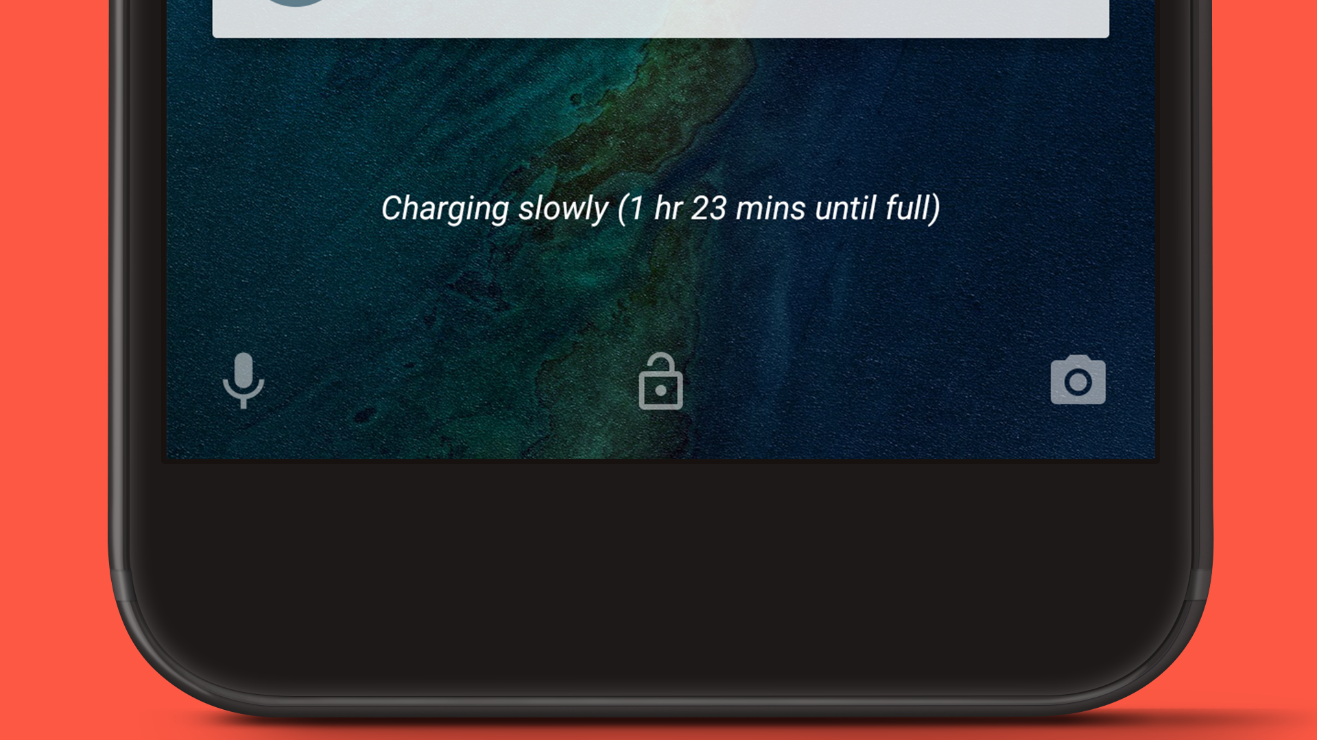
This is a little one, but I like how my phone can tell me if it's plugged into a normal charger, a turbo charger, or a weak charger. That helps me look for somewhere else to charge when I need a quick boost now and then. The "time until full" metric is also really nice to have.
Fixing duplicate email notifications
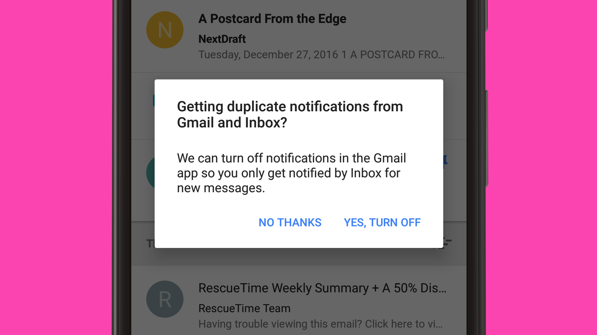
I have Gmail installed on my phone, but decided to give Inbox a whirl as well. I quickly started getting double notifications for new emails, which makes sense since I had asked both apps to notify me.
The above screen popped up the next time I launched Inbox and it offered to turn off Gmail's notifications so that I wouldn't get hit up twice every time a message came it. It was able to see outside itself and realize I was probably being annoyed by the notifications.
Stuff I hate
Emoji
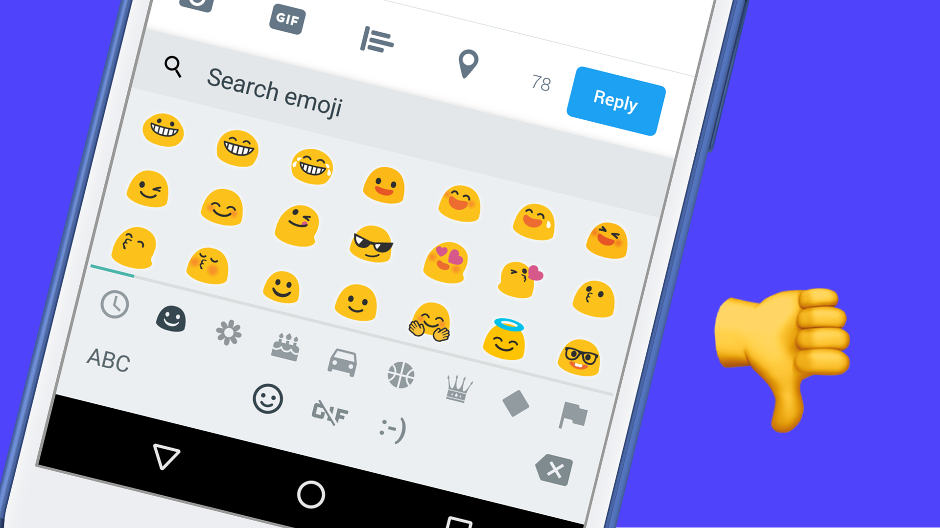
Sweet merciful Christ, what are these emoji?! They look so, so bad and there's not enough differentiation between them to pick out exactly what I want. iOS has some seriously better emoji game than Android. These are so bad they make me feel sad about all the emoji I have sent to Android users over the years.
What a tragedy that with all the customizations allowed by Android that you can not change your emoji without rooting.
Media controls
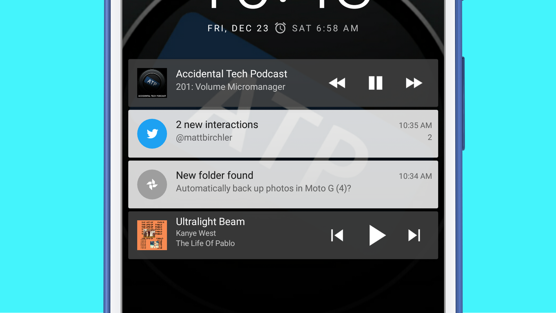
Apple really has a strong lead here with Control Center. Android bundles media controls into your notifications, which makes no sense to me. They're hard to reach on a 5.5 inch screen, and they're just not as powerful as iOS's.
In addition, multiple apps can display media controls at the same time. This may be a feature in some way, but it's just confusing at best and broken at worst. In the screenshot above, I have controls for Pocket Casts and Play Music. The fact that Google Play Music doesn't even get to sit at the top of notifications with Pocket Casts is also weird.
The share sheet is pure madness, an embarrassment 🤢
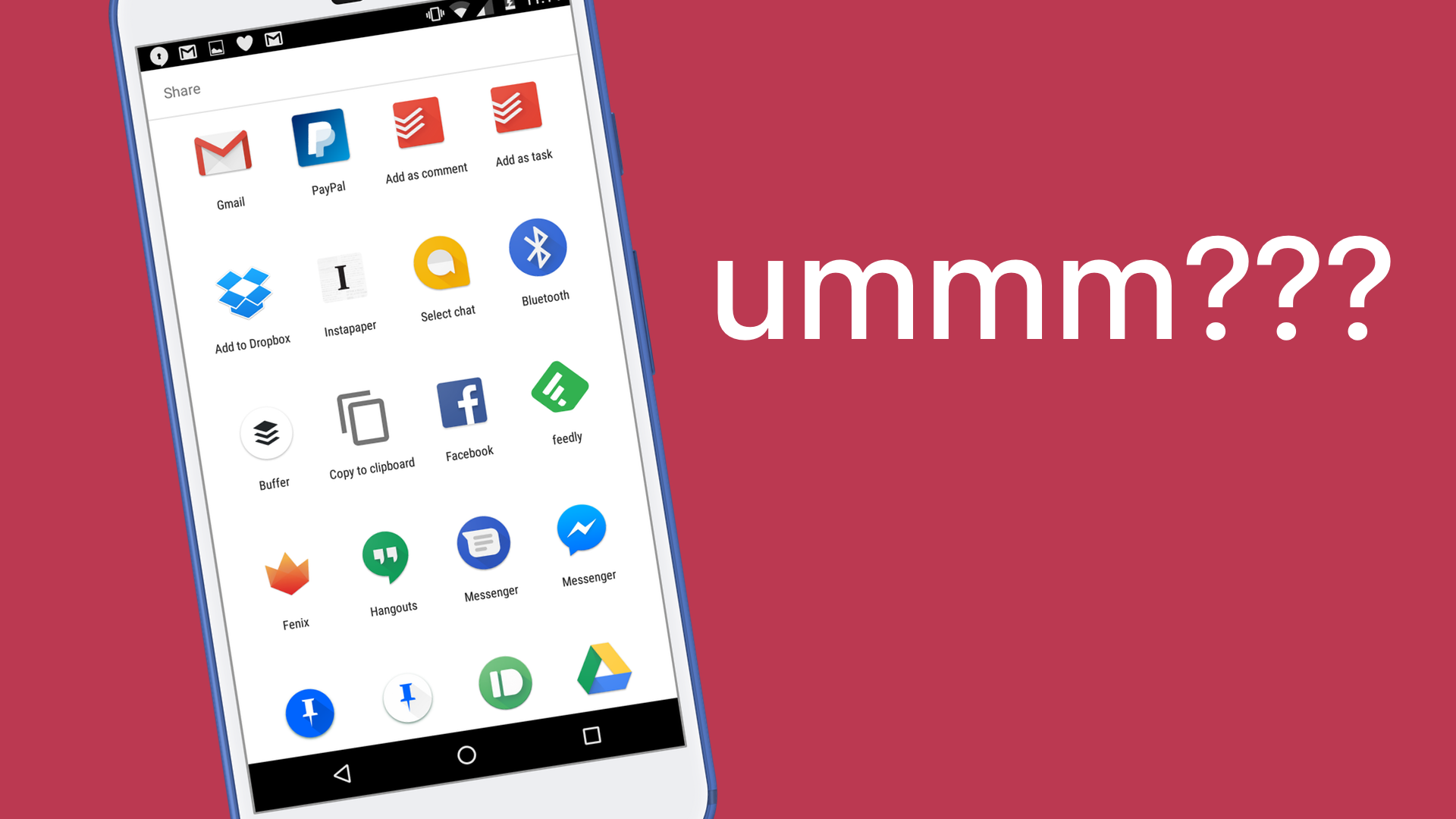
Remember when iOS 8 came out and people were upset that they weren't able to sort their app extensions in the share sheet exactly how they wanted and have them stay that way? Remember how we said that was a disaster? Well the share sheet in Android 6 Marshmallow is a fucking disaster on a scale us iOS users could never even believe.
I don't know what else to say other than it's simply madness. The order of apps is seemingly random, and the icons that sometimes appear (but not always, for some reason) at the top that give you specific people on specific services is even more random and unhelpful.
I would say 80% of the things I use the share sheet for is to send links to Pinboard, my bookmarking service. So then why in the sweet hell does that extension always fall to the bottom of the list and I have to scroll to it all the time? There are zero settings for sorting these and the order changes literally every time I access the sheet. Sometimes I see Pinboard near the top and think "yay, the system is learning how I work" and then not 10 seconds later I share another link and it's way at the bottom, or somewhere in the middle, or who the fuck knows where else?
This is trash UI at a scale I have not seen in a long time in mainstream software. Forgive my grandiose statements, but you need to really understand what a mess this is.
And all this mess for a system that feels more primitive than what we have in iOS 10. This feels like the basic app-to-app communication we had in iOS 8, but feels way out of date in 2016.
Rich notifications
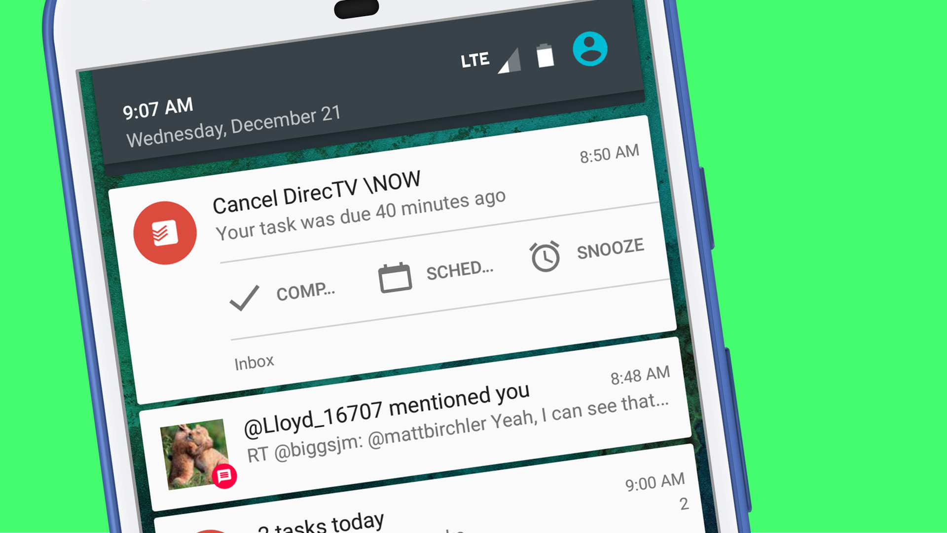
I understand notifications have gotten better in Android Nougat, but in Marshmallow they feel quite poor compared to iOS. Yes, some apps take advantage of Android's ability to group notifications from the same app, but most don't. Twitter is surprisingly an example of one that does, and it's quite nice to have one dense notification from Twitter instead of a dozen from them mixed together in a mess of other apps.
And some apps let you take actions on them, but that's about the end of it. iOS 10 has spoiled me with rich notifications that feel light years ahead of what I have here in Android. I get fully formatted emails and MLB video highlights in my iPhone notifications, so the mostly plain text I get in Android feels like stepping into the past.
Overall, I enjoy using Android, but it feels more like a platform I'd like to take a vacations in rather than live forever. My first impressions of Android in 2016 is that it's better than it's ever been and I could use it forever if I needed to, but iOS is my home. Not just because it's what I know, but because I genuinely think it's the better platform.
I'm still very early in this Android vacation, so I may change my mind in the future, but right now it seems like business as usual. Android is not as polished as iOS, and in a change of course, actually feels like the more powerful platform.

