The Mac-ification of iPadOS
Harry McCracken writing for Fast Company: iPadOS 26 Is Way More Mac-Like. Where Does That Lead?
However, as someone who’s used an iPad as my main computer for almost 14 years, I can’t join the chorus of unbridled enthusiasm for iPadOS 26’s embrace of Mac conventions such as floating, overlapping windows and a menu bar at the top of the screen. Apple may well be making the right decision to please the largest pool of people who want to get work done on its tablet. But it’s also moving decisively away from some of the philosophies that attracted me to the platform in the first place, and I’m trepidatious about where that might lead. (My Fast Company colleague Jesus Diaz expressed similar qualms right after the WWDC keynote.)
I linked to Diaz's article last month, and McCracken has similar anxieties about the iPad losing what made it distinct from the Mac. In that piece, I went through almost every new feature listed on the iPadOS 26 preview page on Apple's website and appended "just like the Mac" to each feature, because that's what this release is going to be. These features all undeniably make the iPad a more capable device, but I also feel like they're stripping away the things that justified it being a separate platform from macOS.
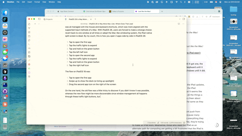
Take window management, for example. The iPad started by supporting one window at a time in full screen. 5 years into it's life, it got split screen, which was implemented in a limited, but very iPad-feeling way that embraced the touch UI and let you physically move apps next to each other to split the screen. macOS would get the same type of split screen shortly after, but that was all managed with the mouse and keyboard shortcuts, which was more aligned with the supported input methods of a Mac. With iPadOS 26, users are forced to make a strange choice: revert back to one window at all times or adopt the Mac-like windowing system, the iPad-native split screen is dead. By my count, this is how you open 2 apps side by side in iPadOS 26 using the standard UI:
- Tap to open the first app
- Tap the traffic lights to expand
- Tap and hold on the green button
- Tap the left half icon
- Tap to open the second app
- Tap the traffic lights to expand
- Tap and hold on the green button
- Tap the right half icon
The flow on iPadOS 18 was:
- Tap to open the first app
- Swipe up to show the dock (or bring up spotlight)
- Drag the second app icon on the right of the screen
On the one hand, the old flow was a little tricky to discover if you didn't know it was possible, whereas the new flow might be more discoverable since window management all happens through these traffic light buttons, but man, it feels more mouse-centric than touch-native to me.
UPDATE: Thanks to reader Harry for pointing out that there is a gesture for doing this, although it's a different "flick" gesture where you toss windows left and right to make them fill half the space. Pretty undiscoverable and fiddly compared to what I'm used to on the iPad and other platforms, though. Good to know there's something there, at least.
What makes this all the more frustrating to me is that amazing, now the Mac has a more physical, intuitive way to make two apps split the screen: just drag them.
Anyway, the longer this beta goes on, the more I'm seeing a split in the iPad fan base around this release. People like my friend Christopher Lawley love the update and find it makes them look less lustfully after the Mac, which people like McCracken and Diaz are frustrated that it's a big step towards taking away what they loved about the iPad to begin with.
I'll say it again because I can't say it enough: I think there is a large contingent of iPad power users who really want a Mac with touch and more iPad-style hardware. I know that's what I want.