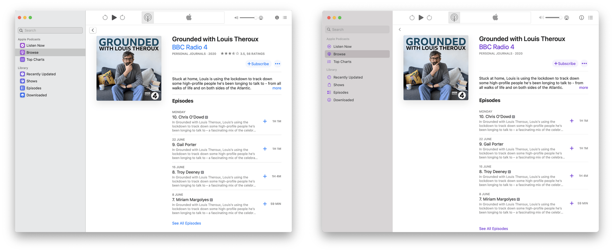
The UI Changes Between Catalina and Big Sur
Andrew Denty has a great collection of comparisons between the current and upcoming versions of macOS.

I have not installed Big Sur yet, mainly because the only Mac in my life is my work Mac, and while it is cleared for betas, I have no interest in risking anything breaking at this early stage in the developer beta. So for me, this comparison was super welcome and really well laid out to show the changes.
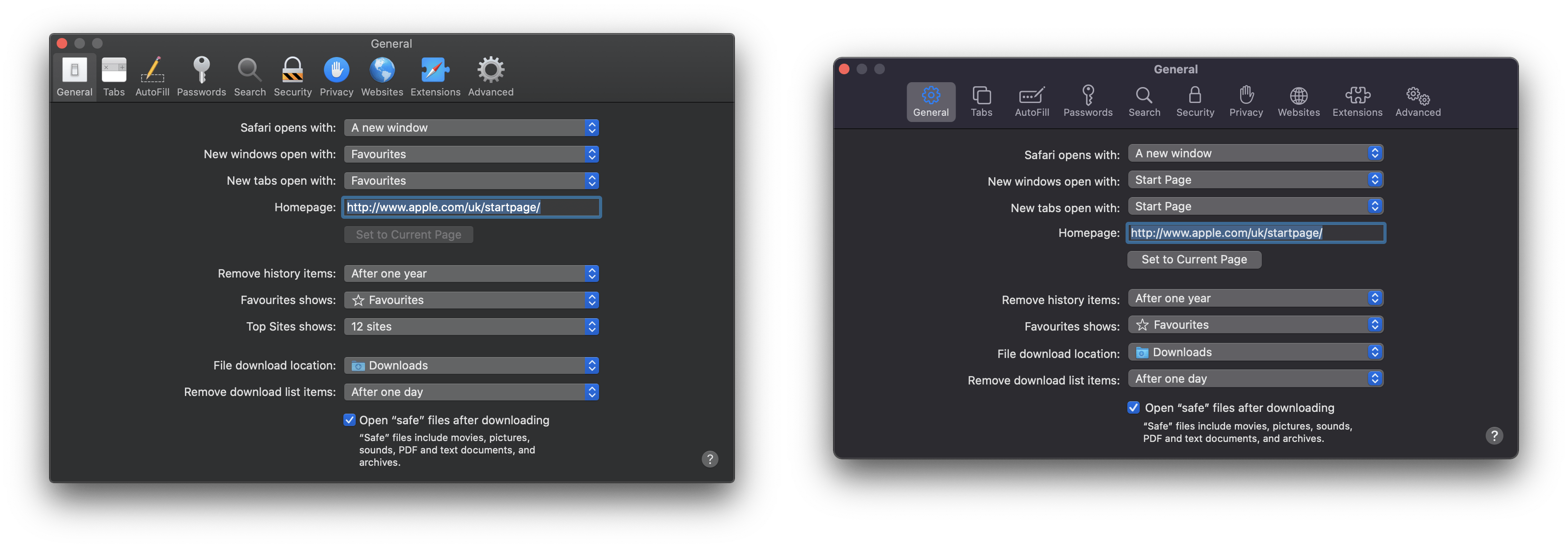
My take: I think as a whole, this is an improvement over the Mac's current look. Maybe I'm biased because I prefer the look of iPadOS, and this makes the Mac look a lot more like that, but I really think it's a good step outside of that personal feeling. My big concern is with the removal of colors on icons. I think the new iconography looks better, but taken as a complete package, my brain takes another second to think every time I look at some of these buttons. Here's a good example in Safari preferences:

Say what you will about the aesthetic differences here, but using color, I can more quickly tell where the security or extension settings are on the left than the right.
I'll eventually get Big Sur on my work machine, and I'm sure I'll have more opiniona then, but as of right now, the loss of color is the thing that jumps out to me most as a concern for glancability.
