Tweaking Android 11's New Media Controls
Update: As pointed out by Twitter user @monogon, Google shared some screenshots of what this may look like in the final build, which is pretty darn close to this mockup, which is great.
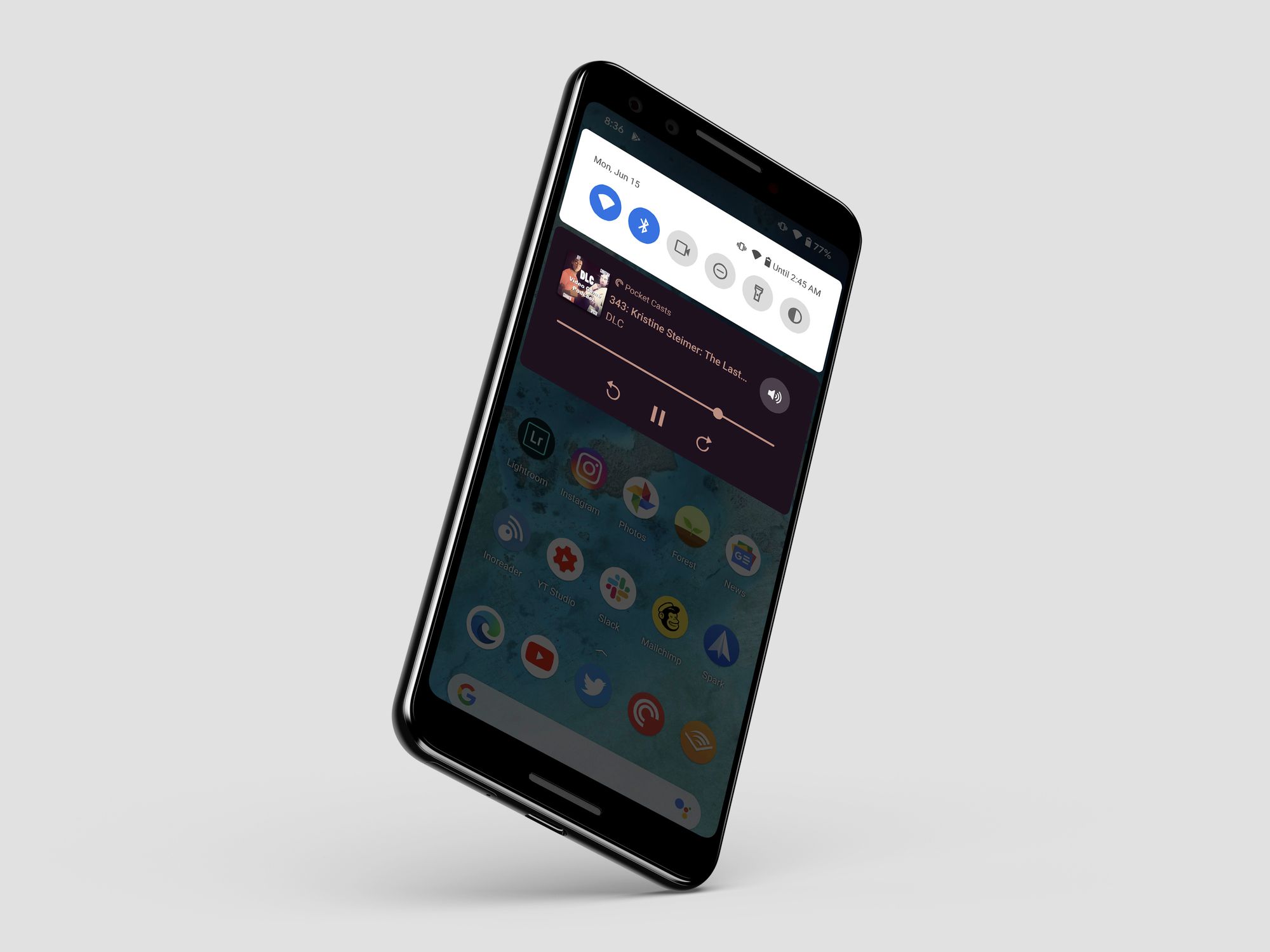
In the interest of doing as little work as possible since Google isn't going to start over on this feature now, I wanted to do a quick modifiecation to the new media controls in Android 11. For those who haven't see it, this is what it looks like today.

There are a couple problems, as far as I am concerned:
- You have to pull down twice to get access to a usable version of the controls. The one in the middle screenshot above is what you get when pulling down the notification shade and it's just not easy to use.
- Phones are tall, and this is supposed to be a convenient way to control your medie, but by putting it at the top of the page, it's as hard as possible to access.
- The UI is laid out in a way that makes everything cut off after just a few characters. The episode title cuts off after 13 characters and the default audio device (the phone itself) has an eplisis.
- Android 11 supports multiple media controls (say you have recently listened to Spotify and Pocket Casts) and lets you control them both. This is nice, but you can't tell from the screenshots above that Spotify is also available.
My change aims to address those problems.
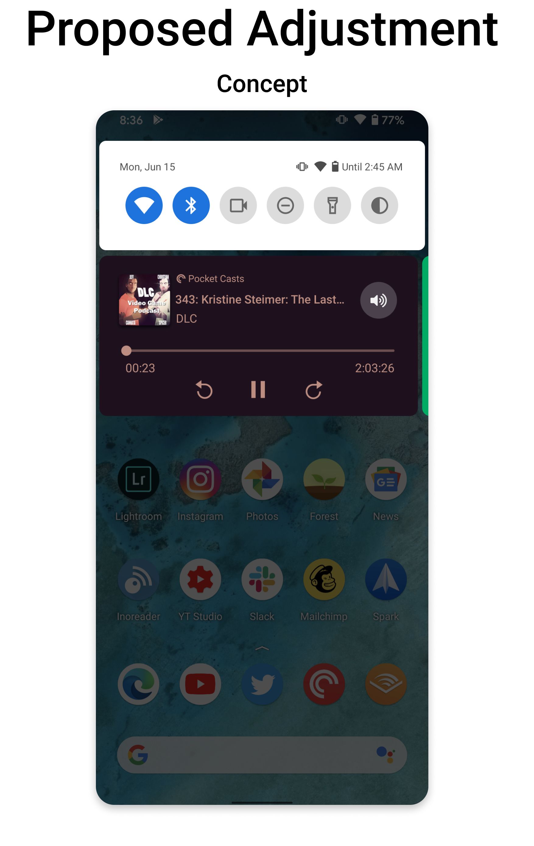
This takes us into a more iOS-style world, but I think the iOS version is better, so let’s just go with it.
- You get usable controls with a single pull down, not two.
- The controls are closer to your fingers, and while they're not as low as they could be, they're at least closer.
- The UI has more room to breath, allowing you to see more full names of everything from song titles to artists to podcast episode titles.
- The Spotify media card is just off screen and is visible, letting you know you can swipe to see it.
There is more tweaking one could make to this, but I feel like this is relatively doable given the tight timeline to release this whole new OS in a couple months (with the obvious disclaimer that anyone outside of a software project thinks what they want is "just a small code change").
And if this is too much to change now, my even more minor change would be this:
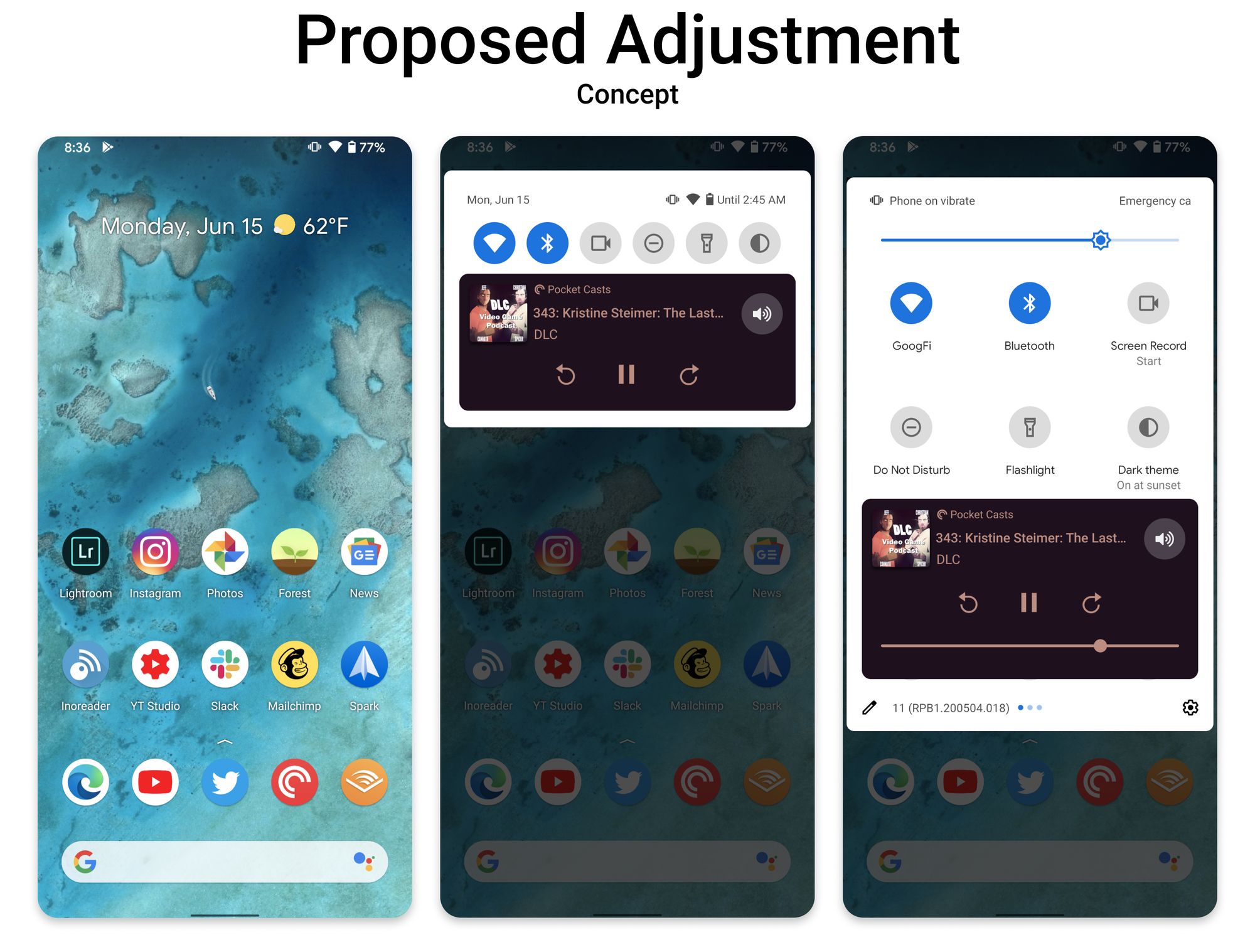
Ok, let's do 2 pull downs to get everything, but move both versions below the device controls and make the "small" version larger so it's more usable.

