watchOS 7: A BirchTree Concept
It’s no secret that I think the Apple Watch is a great product and that I believe Apple has done a very good job of evolving it over the years to be the premier smart watch on the market. Frankly, if you are using an iPhone, I think there is no question on which smart watch you should get. And if you’re on Android and are debating which smart watch to get, I suggest converting to the iPhone and getting an Apple Watch instead of dealing with that mess entirely.
But this lead isn’t permanent, and it’s not something Apple can hold onto by standing still. We’re obviously going to get watchOS 7 this autumn and Apple will have an assortment of new features they’re pushing to all of our wrists. Below is basically what I would pitch to my boss if I worked on the watchOS team at Apple on what I thought we should be doing. Since I don’t work there, though, this is my public wish list for the platform and I hope you agree and pass this along so it’s more likely to get in front of someone on the actual team as inspiration.
Also worth noting here that this is the 5th year I'm doing a concept like this. Check out the past versions below!
- The Best Health, Better Apps, and Outstanding Communication: My watchOS 3 Pitch
- watchOS 4: A Modest Pitch
- watchOS 5: A Relatively Modest Proposal
- watchOS 6: The BirchTree Concept
Fitness Enhancements
As has been clear since the very beginning, the Apple Watch thrives as a fitness device. As most Apple Watch users what they like about their watch, and almost everyone will tell you something about filling their rings, losing weight, or learning how little they stand throughout the day. As they do every year, Apple should work on enhancing the fitness offerings of the watchOS platform.
As a quick note, there could be more they can do here by adding hardware to the Series 6 hardware that surely will come out this fall, but this article won’t hypothesize about those features.
Sleep Tracking

I’m going to keep asking for this until it happens, but I think Apple should add native sleep tracking into watchOS. Apps like Autosleep and Napbot already do this, but there is so much headroom to do more in the space. I think Apple did an amazing job of moving the conversation from steps, a fine, but often unhelpful measure of health, to that of activity tracking. Their red “move ring” isn’t perfect either, but it’s a whole hell of a lot better than steps.
I’m simply going to resubmit my idea from last year since Apple did nothing since then and the requirements for human sleep have stayed, well, the same.
Customize Your Activity Rings
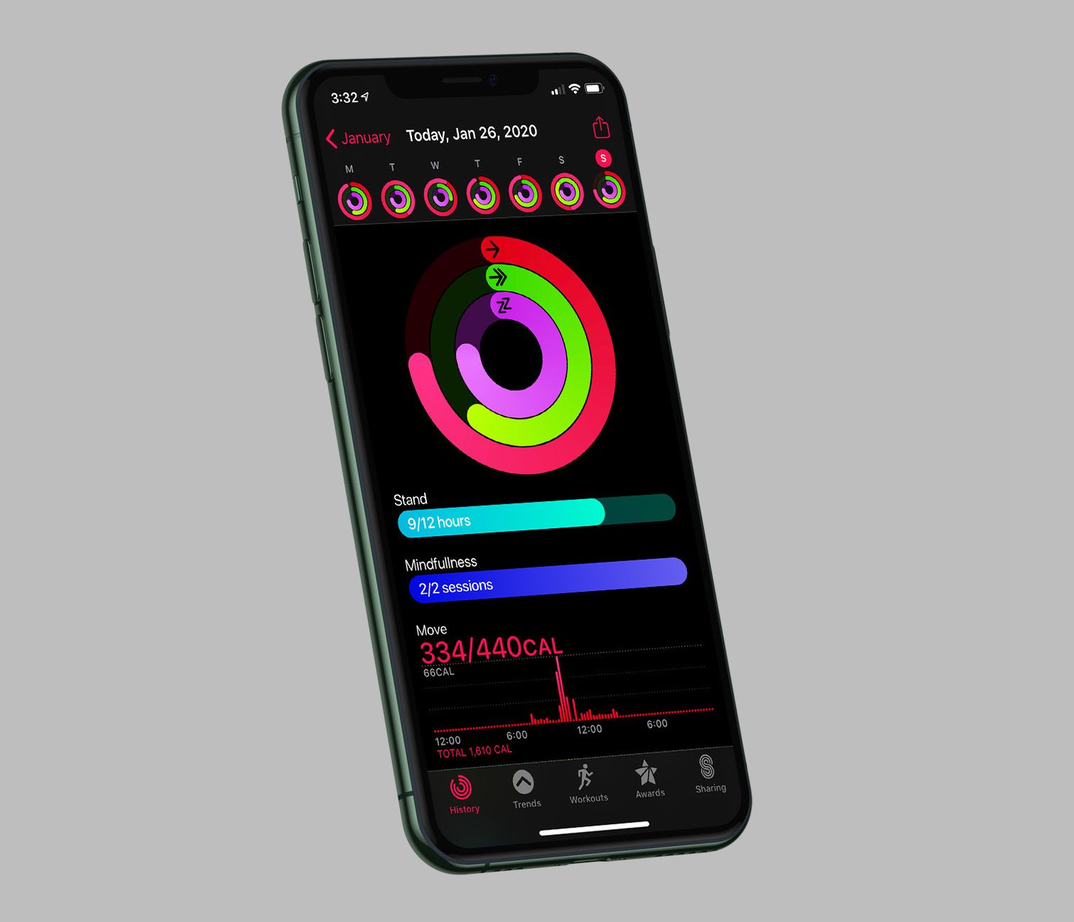
Since the very beginning, the Apple Watch has had 3 rings:
- Move: user-customizable number of “active calories” burned everyday
- Exercise: 30 minute goal of “active” minutes
- Stand: stand for at least 1 minute during 12 different hours
I think this year not only will Apple let you customize these rings more than before, but they’ll also add more rings. Want to add sleep or mindfulness: go right ahead.
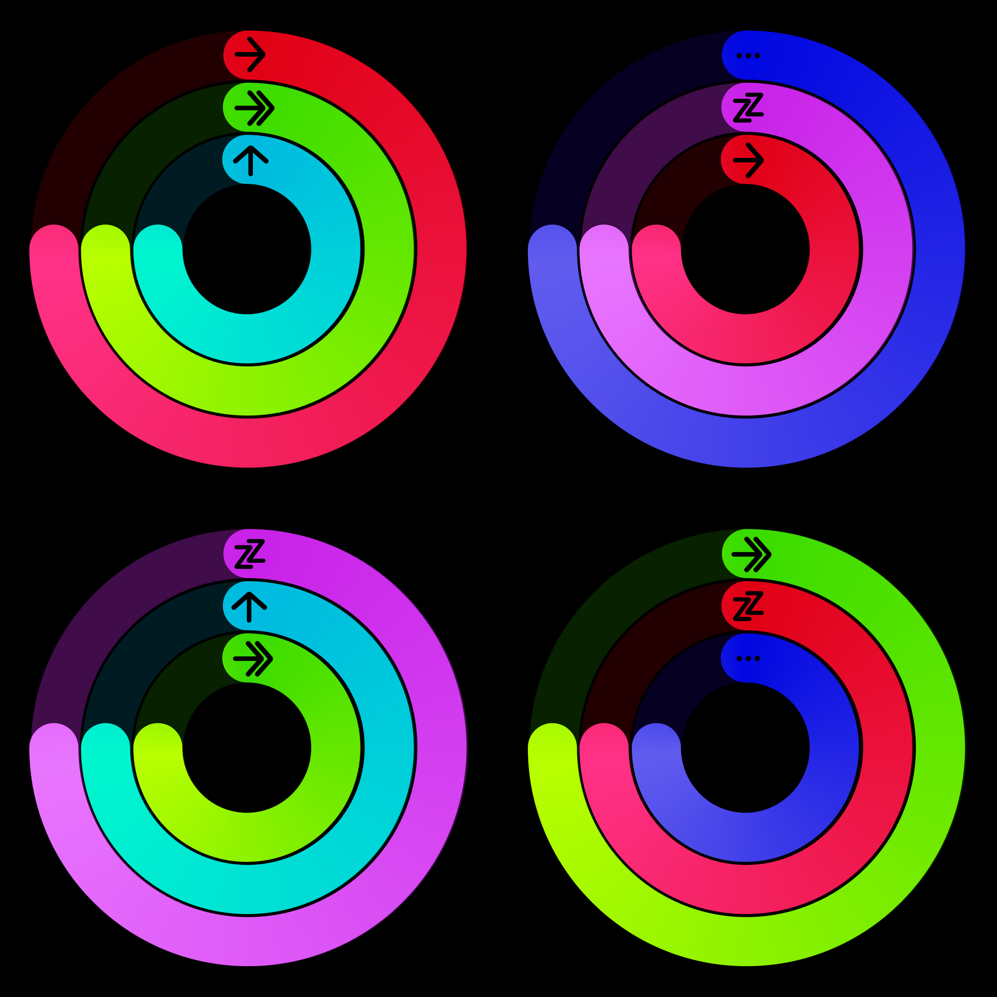
The Apple Watch face is only so large, so I think they’ll have all 5 of these rings available, but you’ll have to choose which 3 show up in your rings. Maybe you want the traditional 3, or maybe you want to swap out the stand ring for sleep. Maybe you find 30 minutes to be too easy to hit each day, and setting your activity ring to 45 minutes might be more useful. Any combination would be possible in this new Activity app.
Manage Workouts from the iPhone
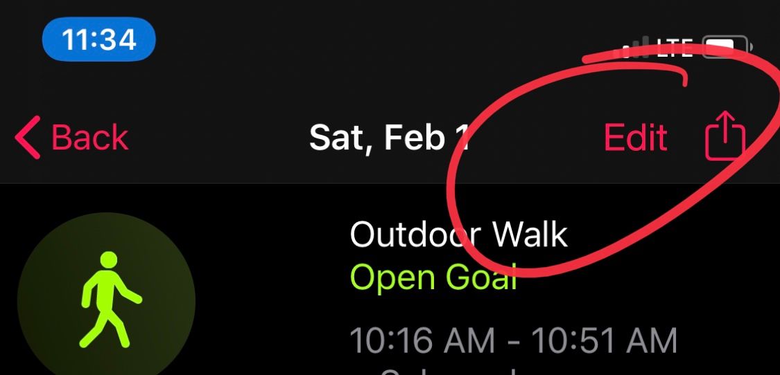
One of the things I run into on a semi-regular basis is forgetting to stop a workout after I’m done, and then getting a 60 minute workout on the books when I actually just walked for 20 minutes. Auto-stop should catch this, but it doesn’t always, and if you miss the notification that confirms you’re still working, then you can have an abnormally long workout.
Other times, I wish I could tell my watch I started walking or running a few minutes ago. There is a workout detection feature that was added a couple years ago, but it waits up to 10 minutes to ask you if you’re working out, so sometimes I’m 5 minutes into a walk, want to get credit for the walk, and have to decide, “do I start the workout now and lose the last 5 minutes, or do I wait and hope it asks me in a few minutes and potentially lose even more?”
I should be able to start a workout and tell the app that I started X minutes ago. it should use either my GPS data or extrapolate from my average speed/intensity to tell how much distance and calories to add. Along the same lines, after a workout I should be able to go into the Activity app on my phone and chop off the start or end of my workout to capture only the time I want.
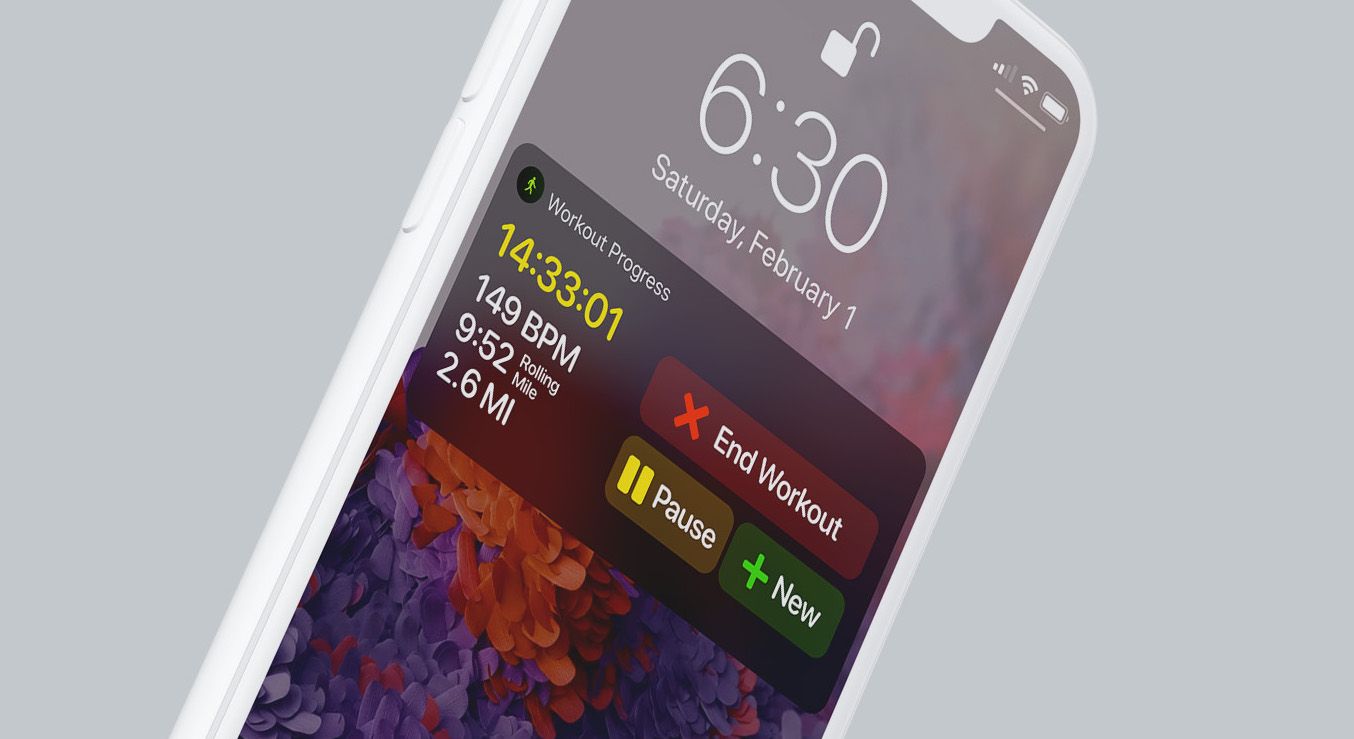
Finally, and this is a small one, but I would love to be able to perform the basic mid-workout actions from a notification on my iPhone as well. I’d have this live as a persistent notification on my lock screen with some interaction, similar to the Now Playing controls. This is rarely an issue since the watch is already on my wrist, but sometimes it would be easier to use the phone.
A Web UI and Data Export

I don’t think Apple will do this, but it would be great to have a way to see my activity data from iCloud.com, and while I’m there, how about a way to export my activity data into a CSV? Again, probably not something Apple has any interest in doing, but it would be nice to not feel like my workout data is so tied to Workouts. If I want to download my data as a CSV and run my own analytics on it, I should be allowed! If I want to start using RunKeeper and transfer my run history over there, I should be able to do that too.
A Damn Day Off
This has been a request for a long time as well, but the Apple Watch should allow us the ability to be human and take a day off every once in a while. People get attached to their streaks, and breaking one because you’re either sick or in a situation where you can’t work out should be more okay. Activity++ addresses this by giving you a rest day every week so you can take a break on Sunday and get back to it on Monday and not lose any active streak. This would be completely fine by me, but any solution that makes it so streaks don’t terminate after a single bad day would be great.
Communication Optimizations
Tell me if this sounds familiar to you:
I feel a tap on my wrist, I look at my Apple Watch, and see a new iMessage has come in. I read the message and immediately drop my wrist to grab my phone so I can actually respond.
I feel like this is how 90% of my message interaction is on the Apple Watch and I think it’s a huge opportunity for improvement. In terms of interacting with a 2 inch screen, I get that there are limitations, and Apple has done a good job of expanding the number of ways you can input text into it, but I think it’s still too hard and they could make things better in both easy and exceptionally hard ways.
Better Response Suggestions
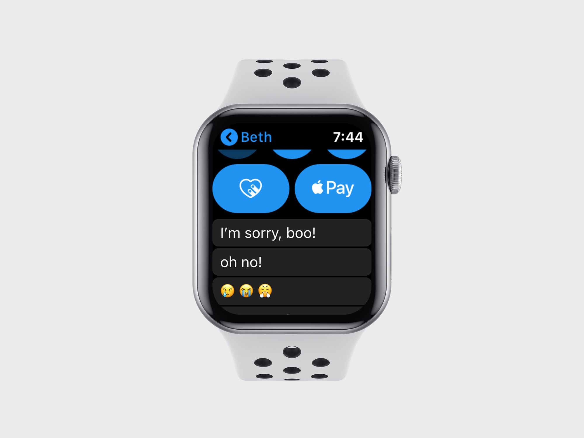
At the bottom of every iMessage thread, there are dozens of options to reply with a single tap. I love these sometimes, but they’re not always useful, nor do they match my style of speaking in messages. Here’s a great example: my wife just texted me “my head hurts” and the top reply options are:
- Thank you
- Thanks
- Ok
- Yes
- No
- Talk later?
- Hold on a sec…
- BRB
None of these are right, and some of them are going to result in a conversation with my wife later if I accidentally chose one of them.
First, watchOS should look at the last few messages in a thread and offer suggestions that are tailored to what is going on. I’d expect to see something like:
- I’m sorry
- Oh no!
- I’m so sorry
- How long has it hurt?
- Feel better!
- 😞
All of these would be more helpful than “Thanks!”
Second, watchOS should tailor the style of these messages to how I typically write messages. If I never capitalize my first letter or call my wife by a nickname, it should know that. Maybe that changes the responses to:
- I’m sorry, boo!
- oh no!
- I’m sooooo sorry!
- aw, boo, how long has it hurt?
- hope u feel better!
- 😢😭😤
This is obviously really hard to do right, and I might be asking too much, but I don’t think it’s wildly out of reach, and I think a lot of what Siri does with context detection must be useful in determining messages’ intents better than the totally generic stuff we have today.
Scribble with Autocomplete
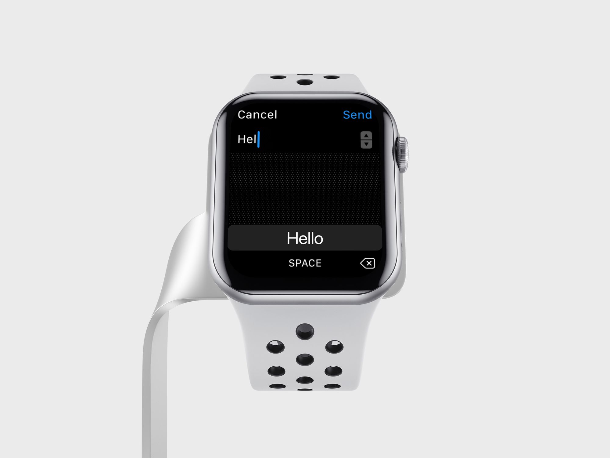
One of the nice things about iOS’s keyboard is that it suggests words to you as you type. Want to type “suggestion”? Type out s-u-g and the keyboard will almost certainly have the word there so you can tap it to finish the work quicker. Scribble on the Apple Watch is the fastest way to type something into the Apple Watch, but it still isn’t quick enough.
Apple should start suggesting words on screen as you scribble out your letters. Once you see the word you want, tap it and start scribbling the next word.
Battery Life
You may be asking, “how can we improve battery life without new hardware?” I’d answer that the Apple Watch needs a “low power mode”.
The simple truth is that the Apple Watch does far more than most people ever use it for, so I think there is room to cut functionality without creating too detrimental an experience for many people. Additionally, while I’m generally fine with charging my watch everyday, there are some cases where it would be nice not to have to worry about charging for 2, 3, or even 5 days.
There are currently 2 power modes on the Apple Watch:
- Normal, which is what we all use
- Battery saver, which turns off everything and shows the time when you click a button
Normal mode promises 18 hours and typically gets a bit more than that for most people . Battery saver mode effectively makes the watch useless, even as a watch since it takes about 2-5 seconds for the time to even show up after you press a button, which feels like an eternity. There should be a new mode between these that makes the Apple Watch useful, but sucks up a lot less power.
Introducing Weekend Getaway
This middle mode would make the Apple Watch function with most capabilities disabled, but would allow a few things to happen so that it still felt like a smart watch.
First on the chopping block is of course the always-on screen. This only helps the Series 5, but I don’t see how a lower power mode exists without this getting cut.
Second, I think we disable the ability to launch apps from the watch. Complications can continue to work, but you can’t tap them to launch into their apps, nor can you go to the “app honeycomb” page to even see anything else installed.
Third, all activity tracking is disabled. This one is going to be a hard hit, but I think disabling the pedometer, GPS, and heart rate monitor is a big win in terms of making the overall watch last much longer.
Fourth, kill all other watch faces, so you can’t swipe between them anymore. Maybe there is even a watch face you are required to use when in this mode.
Fifth, disable all iPhone connections and notifications, with the exception of messages (iMessage, SMS, WhatsApp, Telegram, etc.) and phone calls.
With these things removed, that basically leaves your watch face and essential notifications. You will be able to raise your wrist and see the time, basic complication data, and messaging notifications are they come in. It’s pretty basic, but for many people I bet it wouldn’t be too big of a change from how they use their watch most of the time. The biggest hit would come from activity tracking disappearing, but if you’re going to be out of town for a few days (and you’re not obsessed with your streak), that might be worth sacrificing.
The use cases for a mode like this are plentiful. I was out of town for 4 days recently, and it would have been nice to be able to leave my watch charger at home. If I’m going out of town overnight, it would let me keep the watch alive without bringing a charger. Camping for a couple days would be really nice to leave the charging puck and external battery pack at home. Or maybe I’m just at home, but forget to charge my watch daily and would like a little more room for error.
Maybe the ideas above don’t move the needle too much when it comes to conserving power, but I think there is a lot of potential here to make the watch more than a 1-day product.
---
I think Apple could do everything above and have a killer release in watchOS 7 this year. But there is more that I’d like them to do, so here are a few other ideas for making watchOS better across the board.
Always-On Improvements
The only real new feature in the 2019 Apple Watch was the always-on screen. As I wrote in my review, I think Apple has the best implementation in the game already, but there is definitely room for improvement.
First off, I’d like to drastically cut down on how often I see the generic always-on screen; aka the “a random app is on screen so I’m going to blur it out and put a white clock in the top right” view. Currently, you get a nice always-on mode when:
- On the watch face
- In the middle of a workout (in Workouts only, not Strava, for example)
That’s it, and that seems like a major missed opportunity. I get the argument for privacy and that you don’t want a notification showing to the world when you lower your wrist, but at the same time I feel like I see it far too often. My fix would be to add always-on support for a few more apps, and I think that would go a long way.
First, let’s add it to the timer and stopwatch apps. If you’re timing something, then you probably want to be able to see it at all times. Next, I’d add it to navigation in the Maps app so that I can see my next move on the always-on screen and not have to flip my wrist to see the next direction. Now Playing and all other media apps should get it so I can see what’s playing, as well as how far along in my book/podcast/song I am.
Along a similar line, I often get a notification, raise my wrist to read it, and then lower my wrist. When I do this, the weird “white clock on blurred background” mode stays active for about a minute, so when I go to look at my wrist again it looks janky. I’d like it to change so that if I raise my wrist to see a notification and then lower it, dismiss the notification in 5 seconds and return to the watch face.
And the other change I’d like to see is a bedtime mode for the watch. I use the always-on screen all day and love it, but I kind of hate it in bed. It’s quite dim, but in the pitch black of the night, it’s way too bright and it’s woken my wife up on a few occasions. I’d love it if it could get even darker, but in lieu of that, I’d be content with just being able to toggle a bedtime mode (link it with the downtime feature on iOS, even) that turns off the screen and only lets certain apps deliver notifications.
Third Party Watch Faces
How many times do we need to ask?! You know the reasons this would be good, so I won’t bore you with those, but if Apple wanted to breath some life into watchOS development, letting developers make watch faces (aka the main thing most people use) they could make opportunities for tons of people to express themselves in fun and interesting ways. This is their “most personal device ever” after all.
As an alternative, Apple could also ship some sort of “build your own watch face” tool on the Watch app for iPhone. While you can kind of do that already with the existing watch faces, maybe Apple could make a tool for dragging whatever complications and other elements around the screen to your heart's content. I don't know how useful this would be, but it could help people get closer to their perfect watch face.
At the very least, let's make it easier to share our watch faces. If I make a watch face with a certain color combo and complication set and let me share that on Twitter so anyone else can get that instantly.
Quicker Interactions
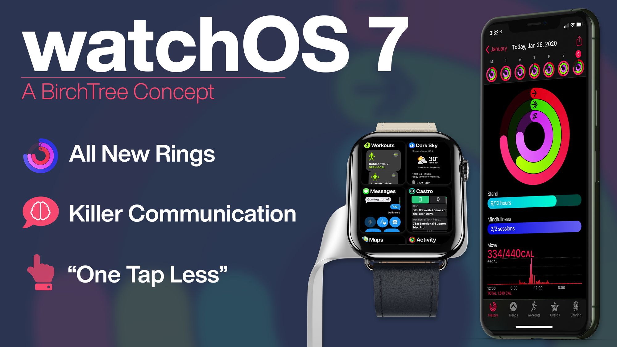
This one is pretty vague, but Apple should make a run through of the things you do on the watch and try to remove one tap from the process. This “one tap less” initiative would look at analytics for what people do on their watches most and would simply try to remove one tap from the process. We’re not rewriting the whole OS yet, but optimizing flows so people are more likely to do them on the watch than pull out their phone would help a lot.
Oh, and whatever is going on with Siri needs to be fixed. Most of the time Siri is great on my Series 5, but even now I get some occasions where I get the dreaded “I’ll tap you when I’m ready” messages. I’m not sure what the technical limitations are here, but they need to be sorted out so that Siri can be as fast as it should be.
Better Wireless Speeds
This is another technical issue that has plagued the Apple Watch forever, but for whatever reason, the Apple Watch takes forever to transfer data. Updates take forever and syncing podcasts and music is an exercise in frustration. Even the cellular watches that just talk to the cloud directly take much longer than my iPhone to download everything. This update may require hardware, but if there are any optimizations they can make on the software side, I’d love to see them.
Shortcuts
Currently, I’m not able to do anything really with my Apple Watch from Shortcuts. I’d like to be able to have actions like:
- Toggle theater mode
- Silence notifications
- Open a specific app
- Start a specific workout
- Turn off the always-on screen
iPad and Android Sync
The Apple Watch has had a good run with the iPhone, but much like the iPhone and iPad broke free of the Mac, I think the Apple Watch should get some more freedom from the iPhone. I don’t know if it’s ready to run entirely on its own, but it would be great to be able to pair it with different devices.
First, and more likely, is the iPad. There is no reason I couldn’t see my watch data on my iPad, especially if I have a cellular Apple Watch that doesn’t need an iPhone around at all times to handle the cellular connection.
The more pie-in-the-sky option would be to have Apple release an Apple Watch app for Android that let you set up and manage your watch from the Android device of your choice. Samsung’s devices show how deep into Android you can hook into, and while this will never be as good an experience as it would be when paired with an iPhone, it would instantly be the best option for Android users the world over. If Apple is interested in giving Apple Watch sales a shot in the arm, then this is how they could do it.
Oh, and making the Apple Watch work with Android sure feels a lot like Apple making the iPod work with Windows. It’s a “halo device” that gets people in the door with an Apple Watch purchase this year, and maybe an iPhone the next…
Conclusion
There’s a lot here, and if you made it this far, thank you! Please share this as far and wide as you can so that Apple sees some of these ideas and takes them into account as they continue to work on this platform that so many of us love. Apple is full of smart people and they do great work, but I can’t help but put my thoughts out there. Mocking up these concepts helps me think critically about the Apple Watch as a platform, and I hope it gave you some of your own ideas for what the future of this product can be.
History suggests I’m going to be let down on getting the exact things in this concept. Apple has their own plans and I hope that the actual watchOS 7 has a handful of features and enhancements that surprise and delight me.
In my review of watchOS 6 last year, I said:
The Apple Watch is at its best when it’s helping you do things quicker than you expect, so I’d love to see a whole UI redesign that focuses on this concept. The current app-centric model has served them well, but I think the platform is ready to do more.
…
I guess what I’m saying is that Apple is moving the Apple Watch forward, but it feels like it’s advancing at a comfortable pace right now, and maybe that’s just a cost of being a successful, 4 year old platform with very little real competition.
I still think there is a chance for Apple to make a bigger change to the Apple Watch’s fundamental interface than what I proposed here. My concept is an evolution, not a revolution in smartwatch design. If Apple decides to make a more dramatic change this year, I’ll be on the edge of my seat, just like you.
