iOS and Android are heading in completely opposite design directions
I'll just say it: liquid glass is a quintessential example of form over function. There are some UI changes as well to the OS 26 platforms, but the core visual design is clearly optimized for "it looks cool most of the time" rather than how practical it is to use.
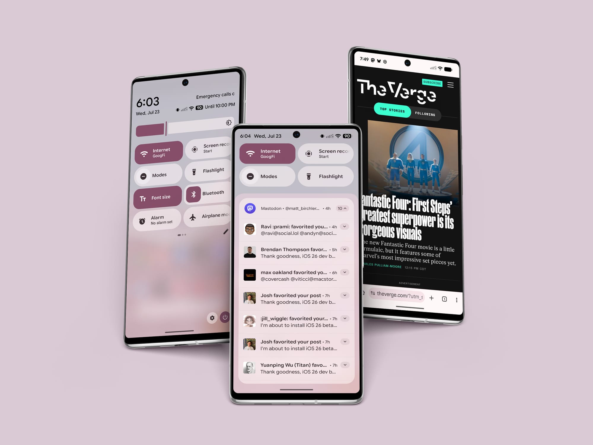
Meanwhile, I'm using Android's new Material Expressive design system on my Pixel 7 and it's like stepping into a completely different universe. I don't recall a time since maybe the "holo" Android design system where iOS and Android differed so greatly, and it's striking how clear it seems to me that Apple is going for the flashiest, more technically challenging design while Google is going for something simple, clean, and legible.
As a veery basic example, here's Steve Troughton-Smith showing off the new control bar in Apple Music:
Like what is happening here? How is this the UI we're going with?
To be clear, I'm not a liquid glass hater, I think it's pretty cool and makes going back to iOS 18 feel relatively dull by comparison. That said, it is pretty absurd how often there are situations where the UI is literally unreadable because the background is positioned in the wrong way. As shown by this user, there are even cases where it becomes unclear there's even a UI element there at all.
And then I start navigating around my Android phone and Material Expressive (on the current beta for Pixel users) looks like this:

Does it look as fancy as liquid glass? No, but it's infinitely easier to read and its legibility is not dependent on the content behind it. And don't over-index on the pink hue, the UI color defaults to blue on a white background, but Android lets you tint the system UI to suit your taste or match your wallpaper.
So where does this leave me feeling right now? I definitely feel conflicted. I think liquid glass is a far more ambitious design that excites me personally and does genuinely look amazing in some situations. On the other hand, it's hard to ignore the inconsistency of this UI design which relies entirely on the content behind it to determine if it's legible or not. It's troubling to me that I can unlock my Android phone and feel a sense of calm wash over me as I look at a UI that is fun and unique, but also consistently legible. The fact I'm feeling any relief looking at Android's UI is not a great sign. But then I scroll something behind the glass button that looks amazing and I want them to stick with this glass effect forever.
Ugh, it's easier to write these things when you feel 100% one way or another. It's hard to share a nuanced opinion to a group of readers I expect are primed to hear this as a takedown of liquid glass, even though that's not what I mean it to be. I meant what I said at the start, this is a design with form over function, but form is a big part of software as well. If we only cared about functional design, every website would be un-styled HTML, after all. "Liquid glass has some trade-offs but when it hits, it's really fucking rad," is the most honest way to pitch it in my book. It's just tough when a platform holder with over 1 billion users tries something bold.
All that said, I can't help shake the fact that every time I've seen a major platform adopt a new design system with heavy transparency, they have all retreated to more opaque designs in the years afterwards, and it's hard not to imagine this happening again.