Mujjo iPhone 16 Pro case and wallet review
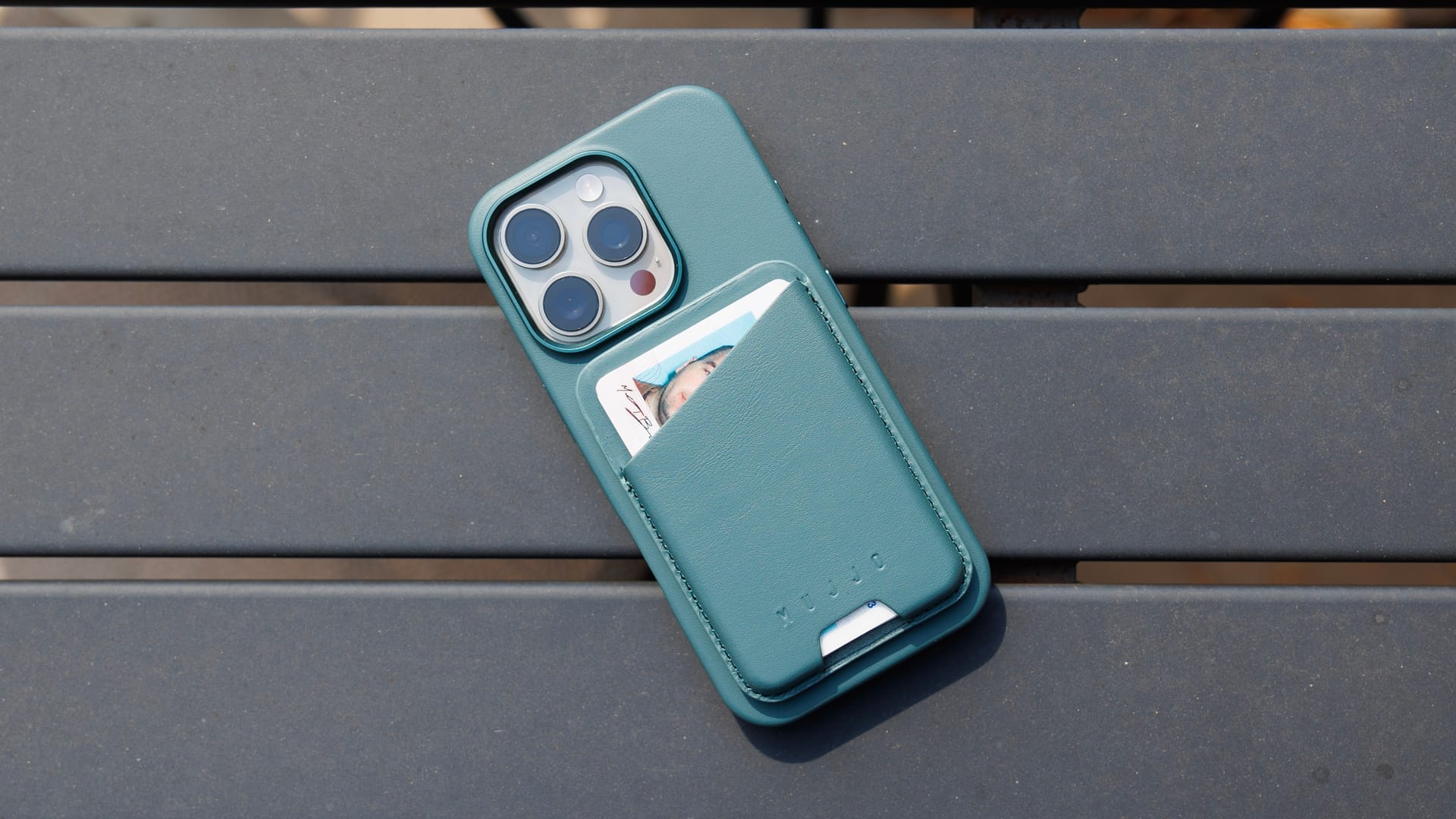
Last year, I thought Mujjo’s iPhone cases were excellent. I thought they were so good that when I realized I actually wanted the iPhone 15 Pro Max, I bought a second case from them without hesitation. So when they reached out to me this year to see if I was interested in reviewing their new case, I was happy to say yes. This review is based on using the case for one week on a trip to New York City.
Case and wallet provided by Mujjo, although they provided no guidance nor were given any promises about what I would say about the products. This review covers the “livid green” color variant for each product. Photos have been lightly edited to try and get across how this color looks in real life.
The case
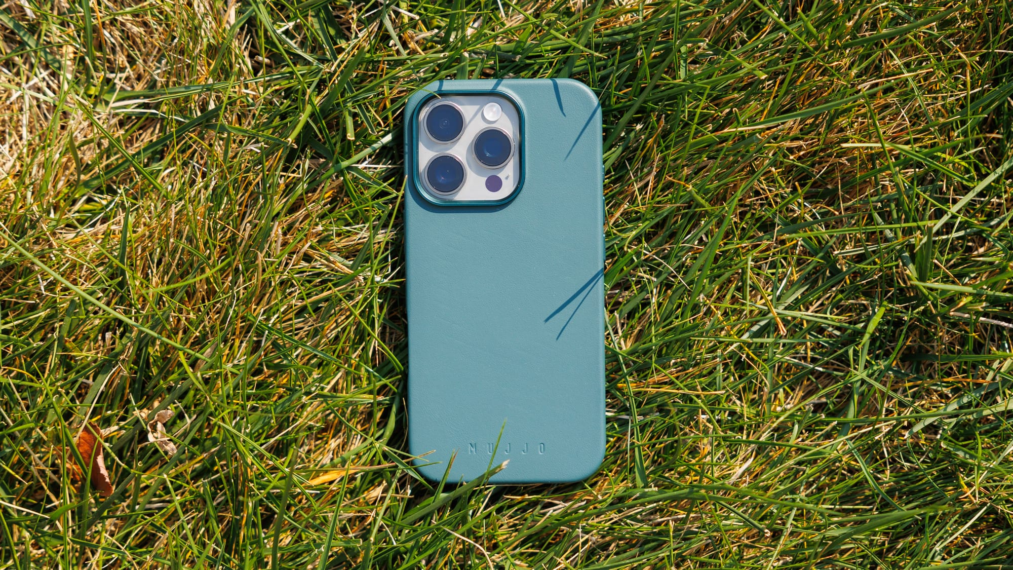
The case itself is identical to last year’s model, so I’ll defer to that review for most of my thoughts on the basics. In short, the leather feels great, the metal buttons are wonderful, the camera is a little chunky but in a way I enjoy, and after a year of use I can say ages very nicely. Oh, and the case is MagSafe-compatible, so it works great for magnetically mounting and charging with whatever MagSafe accessories you have.
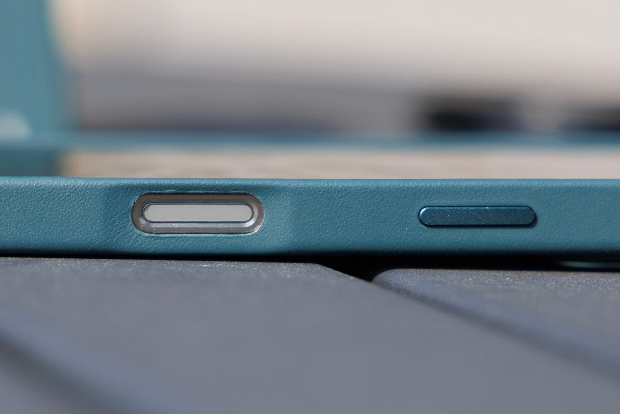
The only notable change this year is for the new camera control in the iPhone 16 Pro. Unfortunately, this is a miss for the case, and it actually hurts the overall experience of the case, even if you don’t use the camera control button at all. Like basically all third party cases at launch, they rely on a cutout to expose the camera control button. This makes using the button a little less convenient as it’s depressed into the case, which isn’t a huge deal as I don’t use it often myself, but it’s actually a bit of an annoyance when using the phone like normal. It’s not the end of the world, but I do find having a hole in the side of my phone that my fingers or palm fall into when just holding the phone like normal to be mildly annoying. Especially when the rest of the case feels so nice and premium, it’s a bummer that there’s this little annoyance on the side.
They do have a nice little taper down to the hole, but it is still a real hole in the side of the case and I’m just not a fan of it. Hopefully there will be a 2.0 version of this case with a touch-sensitive insert like Apple has put on their own cases and I find much more satisfying. I’m sure the folks at Mujjo would like this as well, and I bet they too see the cutout as a compromise. This was a brand new input and it wasn’t clear how it would work, so I get why no one besides Apple was able to get a perfect solution in place right away since they knew how the product would work, but now that it’s out there, I hope all these case makers are working to get new variants out as soon as they can.
Update, October 23, 2024: About a week after posting this review, I started to notice the buttons were a little "rattly" on the case. It was pretty subtle, but I could hear them make a little noise when placing my phone down on a table, and I could feel them slightly moving side to side when the case was on the phone. This did not happen on either of the Mujjo cases I bought and used all of last year, for what it's worth. This feels like a defect with my specific case, although I have no idea how likely this is to happen across all Mujjo cases out there.
I've completely fixed the issue by affixing a narrow strip of electrical tape to the inside of the case over the buttons and that's completely fixed the issue and the buttons feel great again.
The wallet
I’m quite impressed with the wallet, and I think it’s better-designed than Apple’s equivalent.
The wallet is MagSafe-compatible as well, which means it will magnetically attach and align to the back of your iPhone 12 or later, although since it’s not officially MagSafe certified, it won’t show any clever animations or anything when attaching it to your phone. Boo hoo, I know 😛
To be super clear, this wallet will work with any case that’s MagSafe-compatible, you don’t need to use a Mujjo case.

The materials seem to be the same as the case, which is to say leather on the outside and a microfibre interior on the back. The back which connects you your phone also has some diagonal rubber strips that look nice and help prevent sliding around. The only potential downside of these rubber strips is that they make the wallet a bit stickier to get out of your pocket when you’re not connecting it to your phone. I typically don’t like having the added bulk on my phone, so I use these wallets like this relatively frequently, so this was a very, very minor bit of friction (heh) when using this wallet.
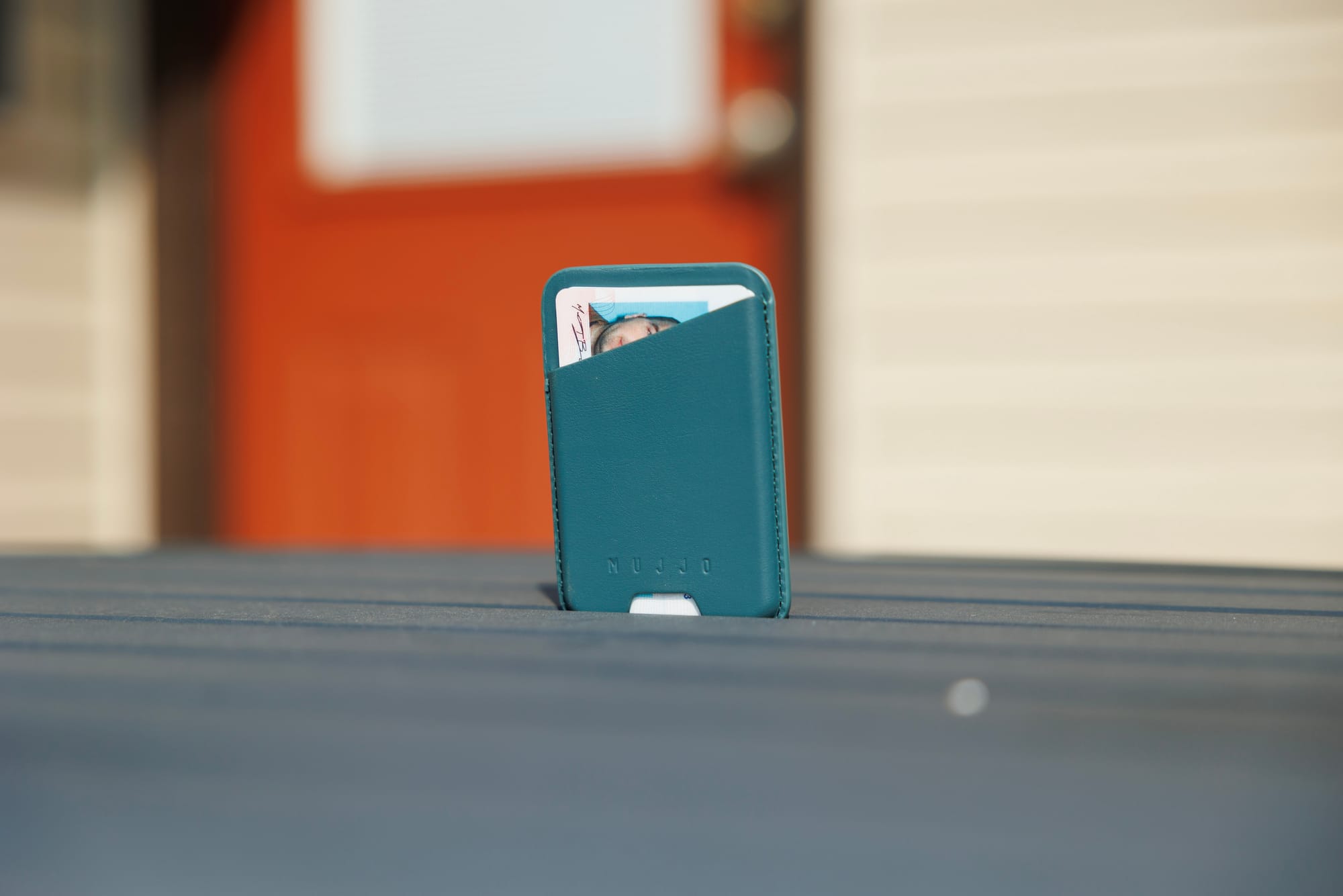
What separates this from Apple’s wallet is ease of accessing your cards. Apple’s requires you to pull them out from a few exposed millimeters at the top, but you have 3 options with the Mujjo, all of which work great.
- A diagonal top cutout exposes more card to grab onto and pull.
- A small cutout at the bottom lets you push the cards up a bit to make them easier to grab.
- A cutout on the back lets you slide out the back card with ease.
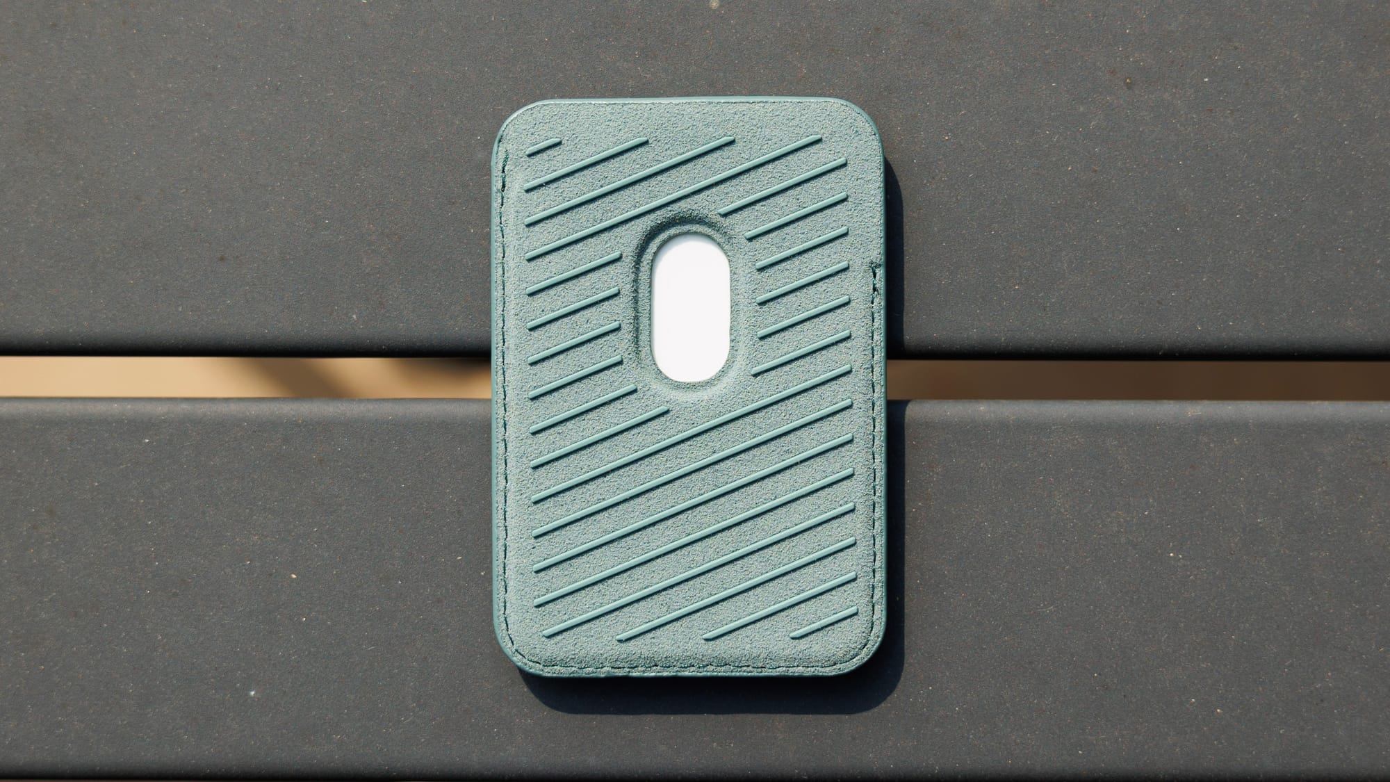
Like Apple’s wallet, Mujjo’s wallet is sized to fit up to 3 cards, which conveniently is exactly how many cards I personally carry around. They fit fine and are snug in the wallet. What’s nice is that there is a tiny spring mechanism in the case that presses slightly on the interior space so that even one card in the wallet will fit snugly. It’s a clever bit of engineering and material choices that leads to a great experience.
I’m actually really impressed with the details of this wallet. Maybe they’re totally common and every other magnetic wallet has these, but Apple’s wallet feels less thought through, and is my only other experience with a MagSafe wallet.
My recommendation
I think the wallet is a slam dunk if you’re into this sort of thing. It’s better than Apple’s and is $15 cheaper. Maybe there are other third party options that work well, but this one looks good, feels good, and is easy to use, so I think you’ll be happy if you get it.
The phone case is a bit trickier. It’s $10 more expensive than Apple’s silicon case, and while I’ll 100% use this over Apple’s case, I do find the cutout to be a regression over last year’s Mujjo case. Then again, that’s the same situation you’re going to get from basically any non-Apple case this year so far, so it’s hard to say I wouldn’t recommend it to people.
Here’s what I’ll say about the case: I own Apple’s silicon case as well, and I will choose Mujjo’s every time despite the cutout. However, if Mujjo revs this case mid-year with a capacitive insert that’s flush with the case, I’ll probably buy it day one.


