5 ways I’d like iOS 18 to improve the iPhone home screen
No intro, let’s just get into it!
More icons
It’s not the most important thing in the world, but I’d love to see iOS 18 bring with it the ability to create a tighter grid of icons on my iPhone’s home screen. Currently every iPhone from the mini to the Max gives you the same 6x4 grid on the home screen.
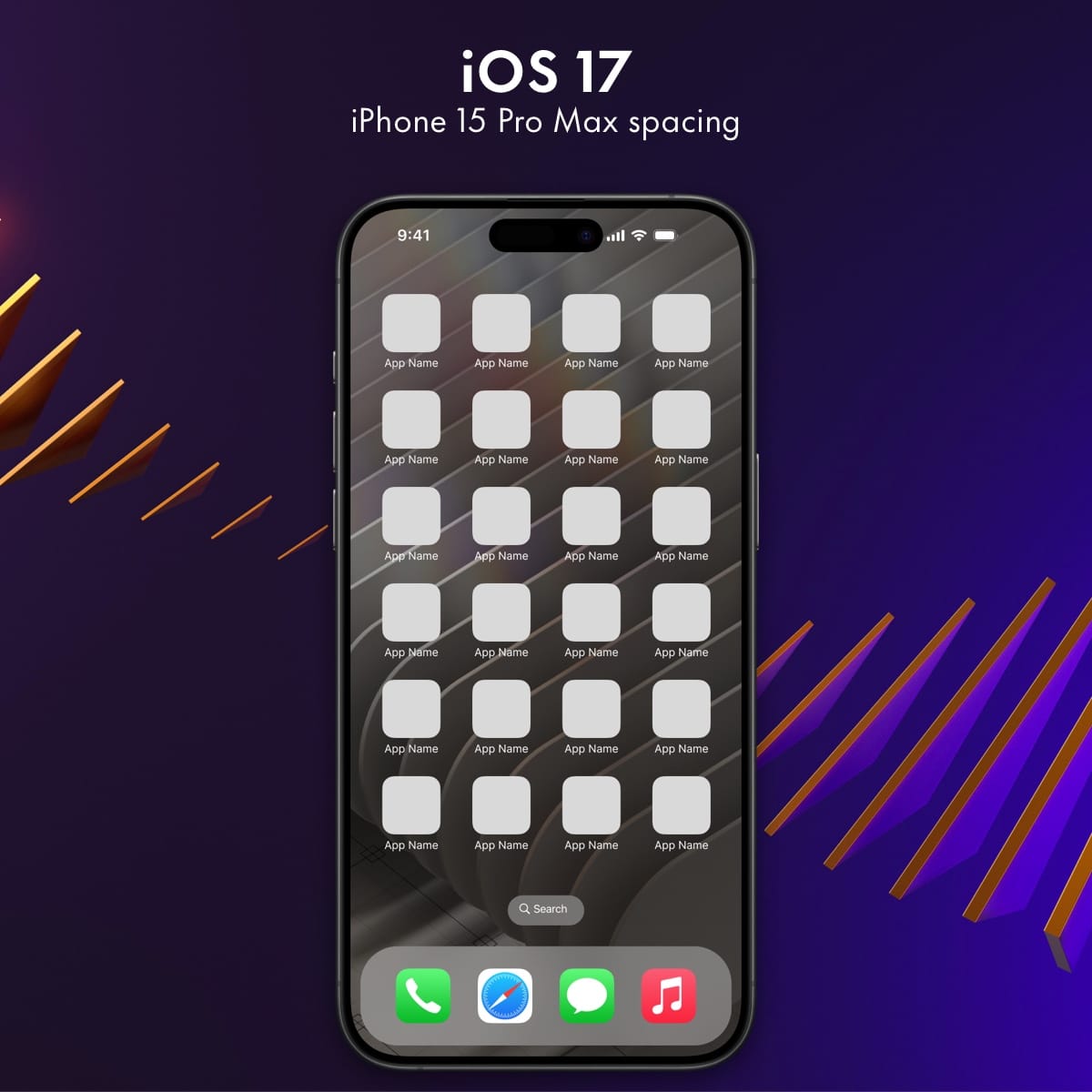
That’s a screenshot showing the icon size and spacing on an iPhone 15 Pro Max, but the number of available columns and row of icons is exactly the same on my comparably tiny iPhone 13 mini. You can go back as far as the iPhone 6 from 2014 (10 years ago!) and find this same number of icon spots on the home screen. Whether your iPhone is 4.7” or 6.7” you always get the same number of spots.
I don’t know if it’s reasonable to do this for every single supported iPhone screen size, but I think at least the Max and Plus lines could get this new layout density. Here’s what it would look like:
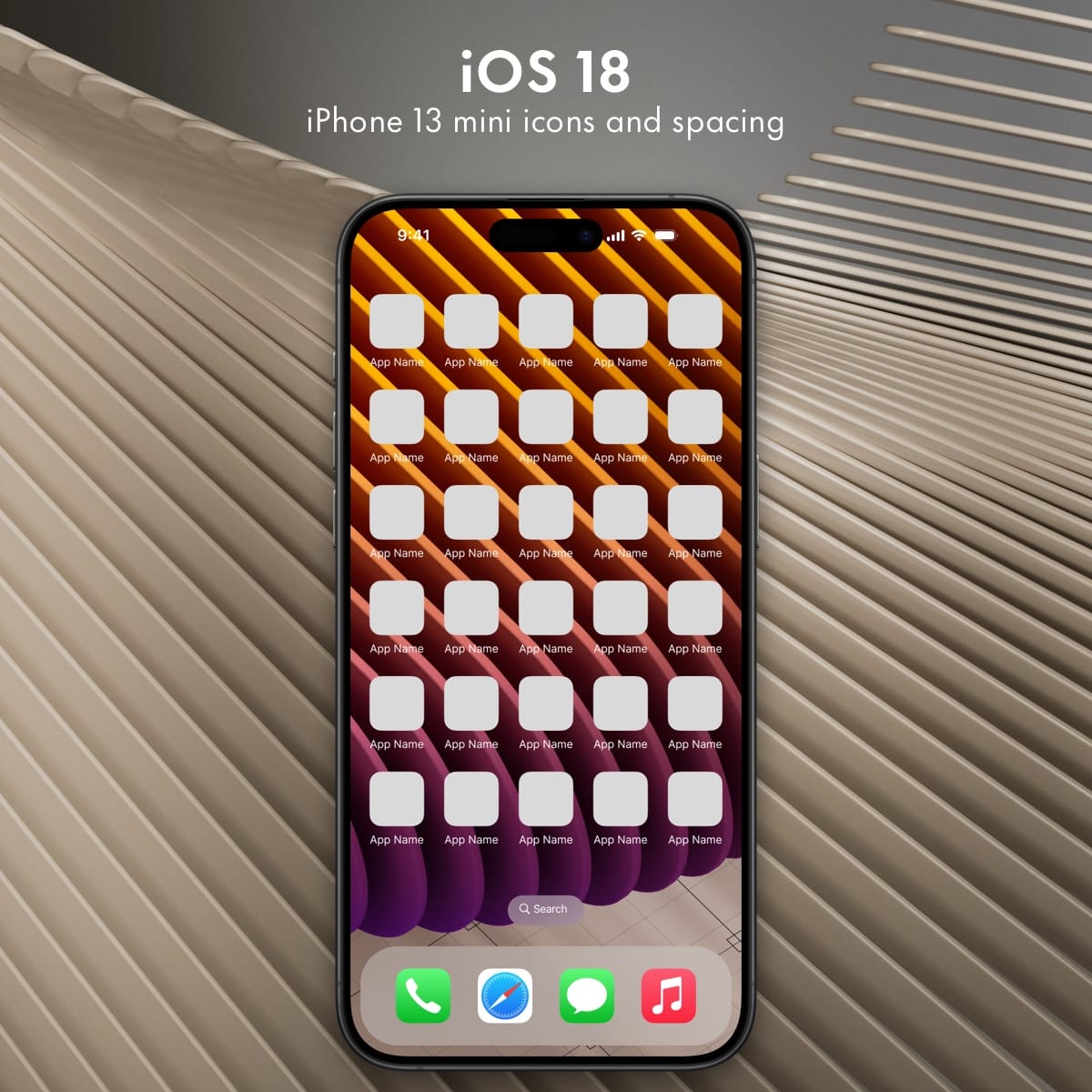
To make everything fit, I’ve made a few minor changes:
- Icons are the same size as icons on mini iPhones
- Horizontal and vertical spacing is around mini iPhone range, but slightly tighter
Basically, this takes what iPhone mini users already have, trims padding by about 8%, and gives it to big iPhone people.
Oh, and of course this would be opt in, so if you would never want this many icons available on your home screen, you wouldn’t have to change.
Let me remove icon labels
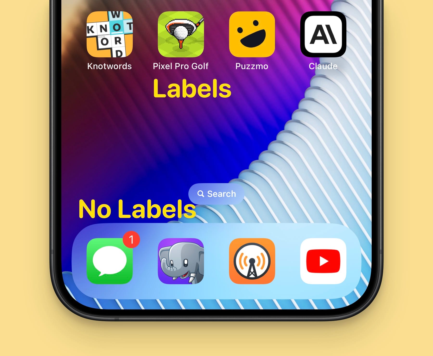
This one is pretty basic, but it sure would be nice to be able to turn off the icon label text on the home screen. Especially if we start putting more icons on the home screen, then being able to remove the labels seems like a nice way to make the UI a little cleaner.
There’s precedence for this in iOS already as the dock already omits label text, as does the main page in the app library. Once again, this should be an opt-in feature for those who want it.
(Icons) started from the bottom
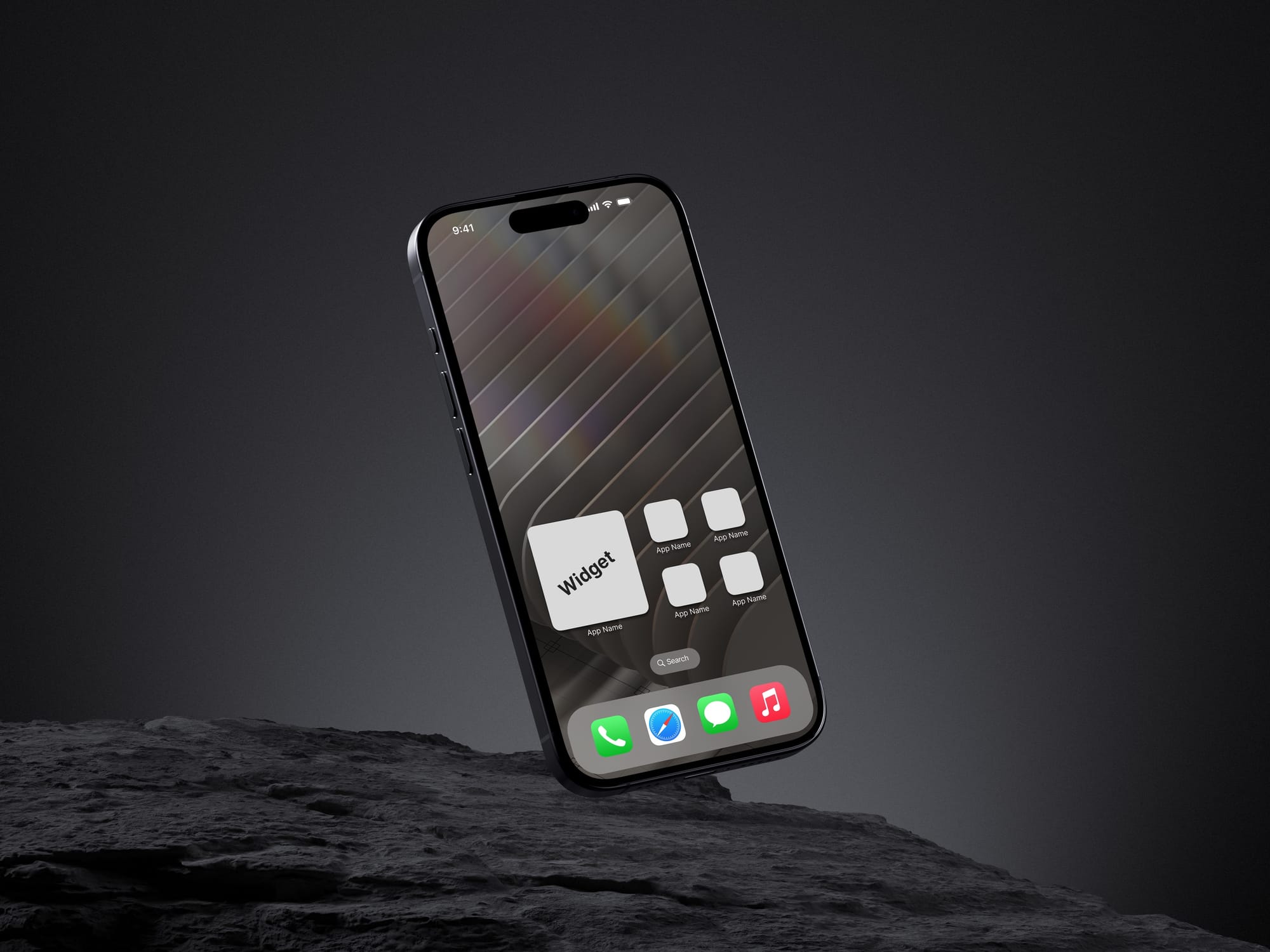
There have already been some rumblings about this one, but in the large phone era we’re in today, it would be great for comfort, accessibility, and simple aesthetics to be able to more easily get icons further down my home screen.
One way to improve here is a simple toggle that lets people have their icons and widgets flow from the top or the bottom of the screen. Another would be to let them freely place icons at any open spot on the grid that they want. Each option has its perks, and both give users more control over the look of their phone than they have today.
Smaller widgets
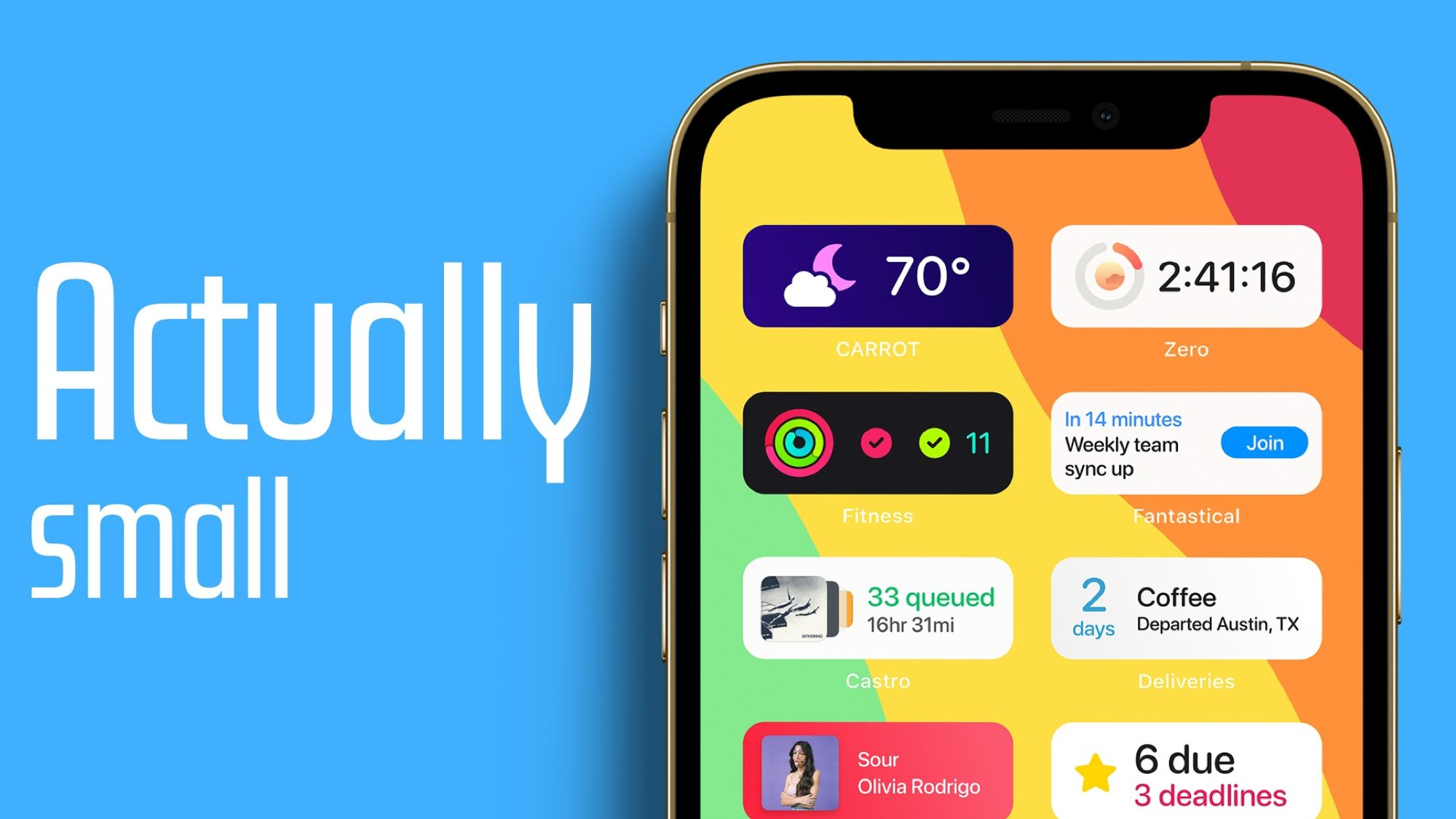
It’s been 3 whole years since I made this video where I proposed even smaller widgets than the current small size class. The thumbnail above really says it all, but currently the smallest widget uses a 2x2 grid on your home screen, and I would like to see 2x1 widgets be possible.
Another variant of this could be dynamic icons like you have on the Mac, although I’m a little more dubious about the utility of those in most situations.
Dynamic wallpapers
This one seems like it should have been here for years, but I would love to see support for dynamic wallpapers on iOS. Apple has a few iOS wallpapers that change throughout the day, but they’re only Apple’s own wallpapers, you can’t add your own.
For an idea what I’m hoping for, just look at macOS. For a number of years you have been able to install a dynamic wallpaper (like from this site) and when you use them as a wallpaper on your Mac, they will change throughout the day.
A use case for me would be to have a wallpaper that is bright during the day and then fades to a dark variant as the day goes on. You can accomplish something like this with focus mode automations, but that’s a pain and requires you to maintain at least two home screen layouts at all time.
As an aside, see here for my thoughts on having a “product mindset” vs a “support mindset” when it comes to responding to someone else’s software requests.
There’s probably more I could come up with if I spent some more time on this, but I’ll leave it there for today. Honestly if Apple did any of these things this year I’d be happy, so I’ve got my fingers crossed that Apple feels the same.
