First Impressions of the Apple Watch Series 4
I got the new Series 4 Apple Watch today and I really couldn’t resist sharing a few first impressions.
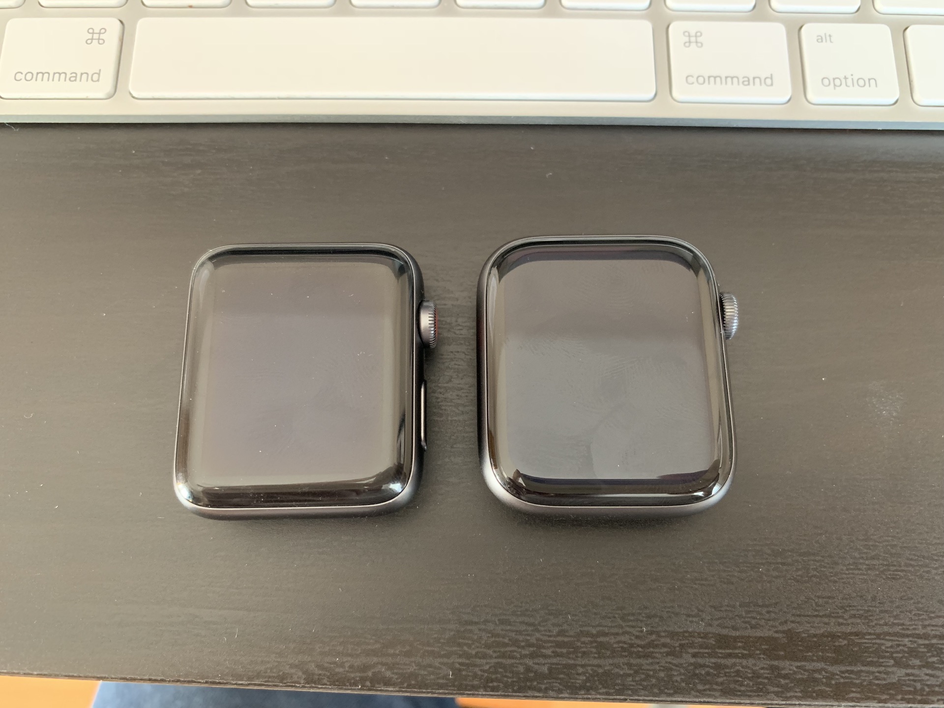
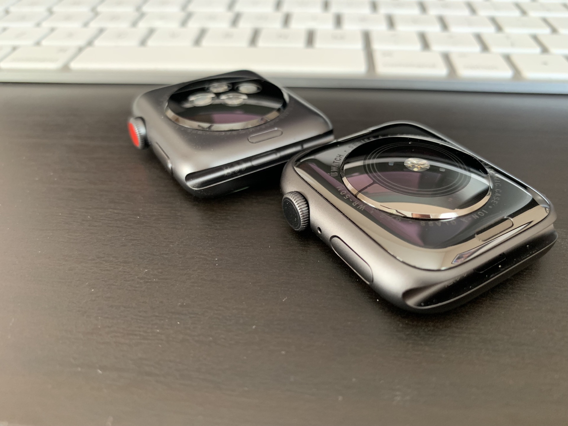
First, we have to talk about the size. I got all hyped up by a few watch people who had me convinced the difference between 42mm and 44mm watches was significant. Maybe for some people it is, but I personally don’t find the 44mm watch to feel any bigger on my wrist than the old 42mm ones. Yes, it looks a bit different, but I find the new shape to be far more noticeable than the extra 2mm in vertical height. I waffled back and forth about whether to get the 40 or 44mm models this year, and I’m supremely happy to have gone with the bigger one again.
Let’s take a look at these two sizes side-by-side:
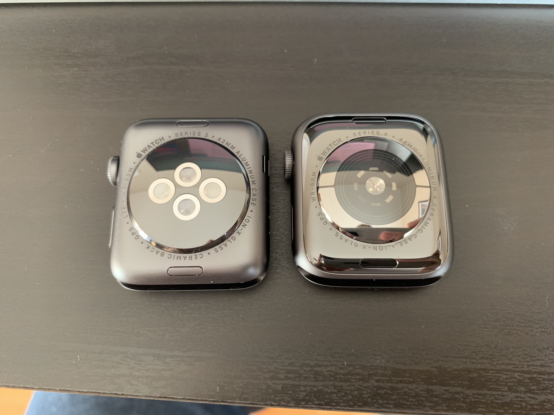
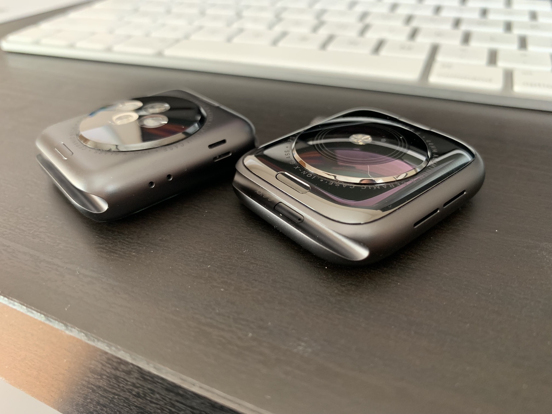
The next big thing I noticed, and this is a small thing, was the side button is now flush with the side of the watch.
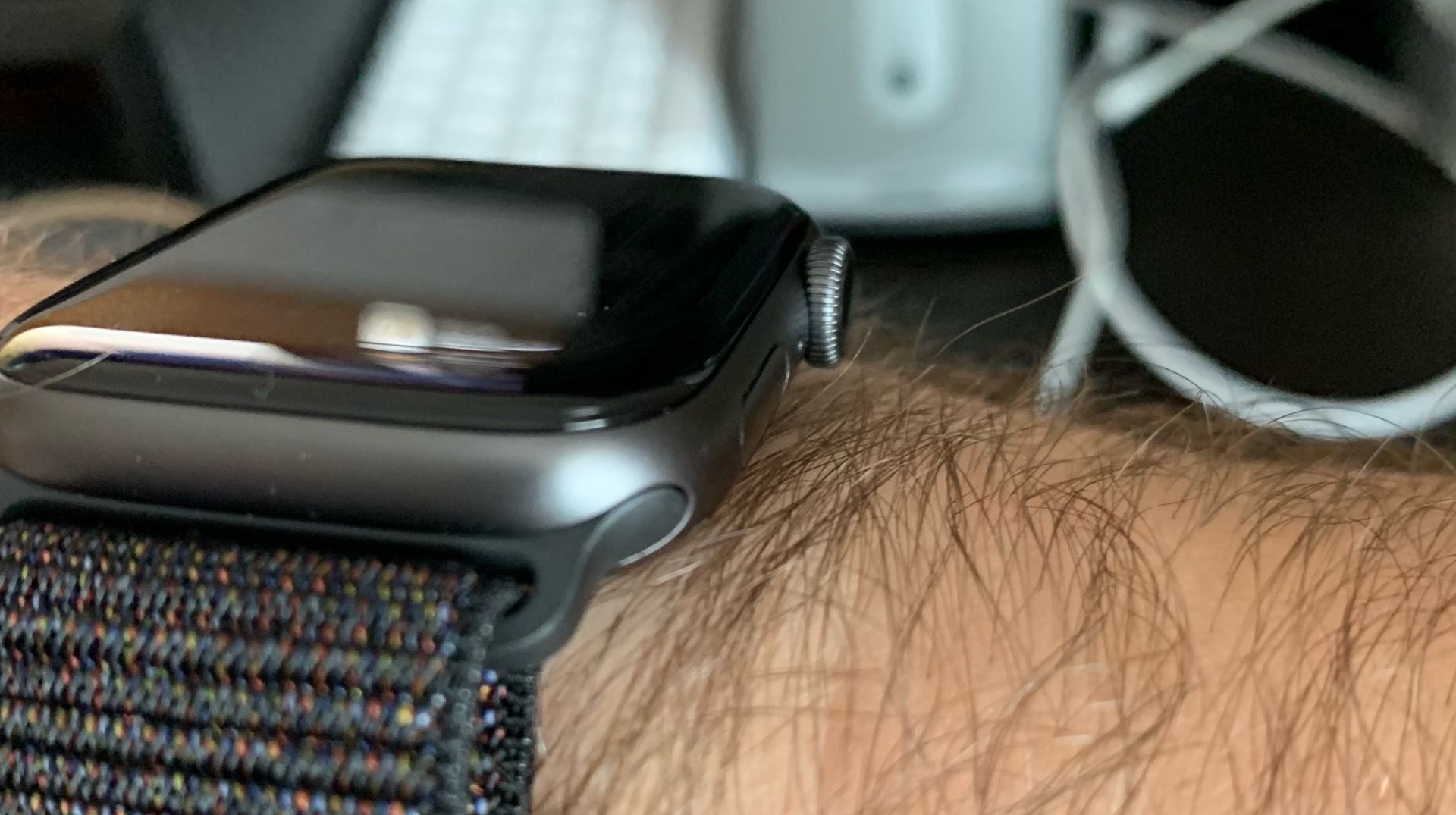
It’s likely not a big deal, and I may grow to like it, but it feels unnatural to me right now.
But then there’s that screen. OH BOY THAT SCREEN. The new screen is stunning! The Apple Watch already had a very nice display, but the addition of more screen area plus a higher res panel, and rounded corners make this a whole new beast.
The old Apple Watch had a 390x312px (303 ppi) screen, and the new model has a 448x368px (326 ppi) screen that looks absolutely gorgeous. It’s a small increase in pixel density, but for a thing you look at many times per day, it’s a noticeable change.
Then there’s the reduced bezels. watchOS does a good job of hiding the bezels most of the time, so you don’t really think about how big they are, but the new screen really makes you feel like there is now an ocean of space on your wrist. I am a little let down that rather than add more content to the screen, most apps simply show everything bigger than before. This can certainly be good for people who strained to see the old watch, but I do wish there was a bit more on screen. I’ll definitely explore this more and have more to say in the coming days.
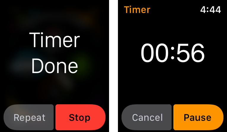
What I can say now is that some UI elements have been redesigned to look better on the larger screens. For example, the default buttons are more round than they were before:
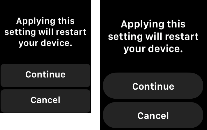
Similarly, buttons that already got redesigned in watchOS 5 got another look in this version of the watch.
In terms of performance, the watch feels slightly faster than the Series 3, but not by much. I recently tweeted about how I think the Series 3 does basically everything instantly. The Series 4 also does everything basically instantly, so I shall have to do some testing to see how much faster it actually is. The processor got a big upgrade, so I’m hoping I’ll notice it more as time goes on.
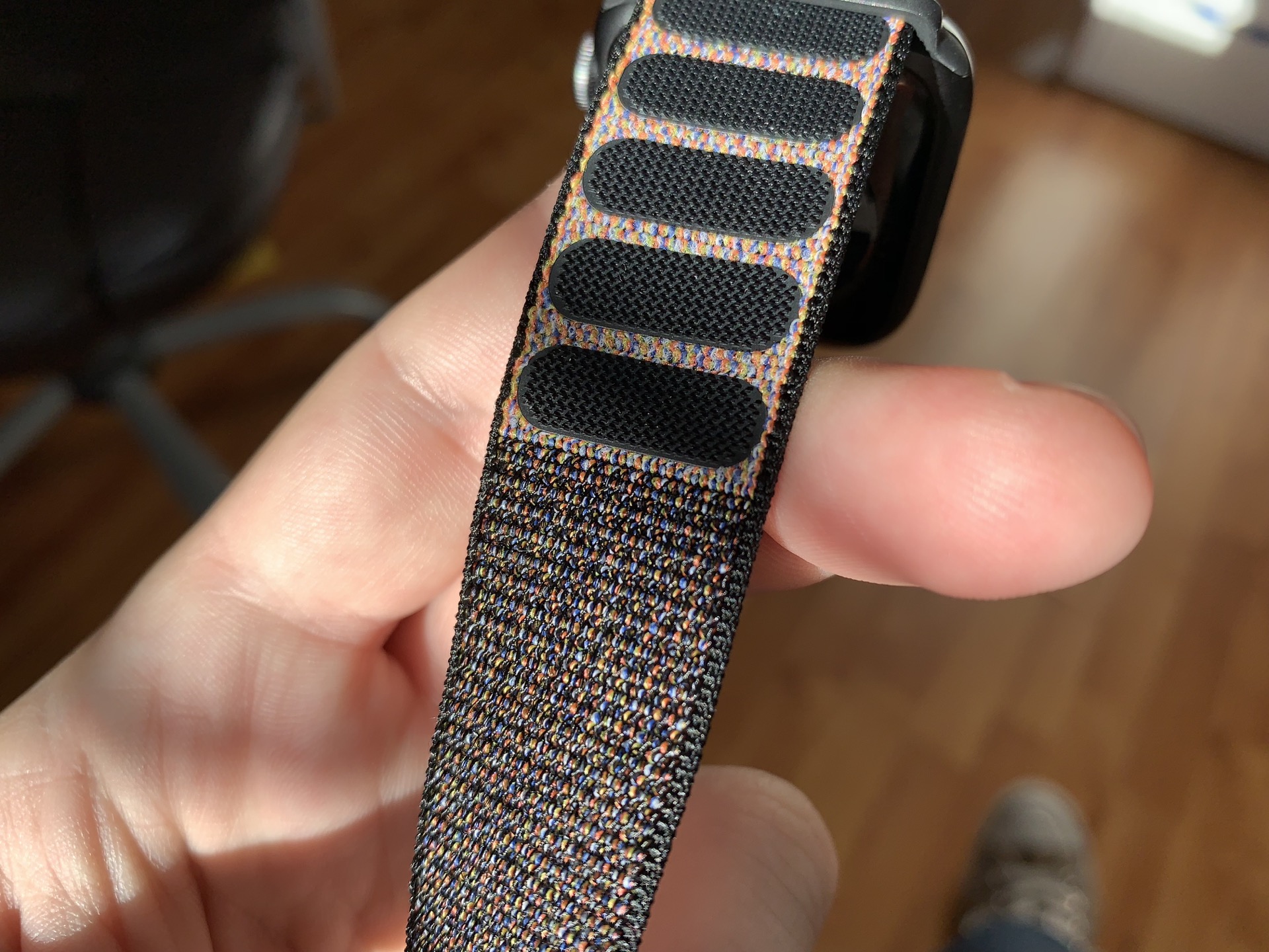
Finally, it’s worth noting that the “black” sport loop that comes with the Series 4 watch is not exactly pitch black. It does look black-ish, but it’s definitely got some color in there. I love it, but if you want that black-on-black look, then this might be a bit of a surprise.