macOS still isn't as small as you think
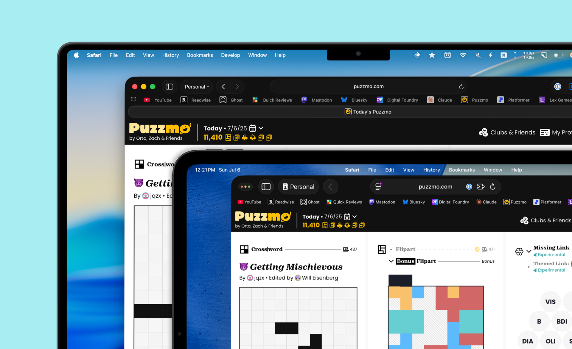
2 years ago I wrote a piece about how the macOS UI isn't as small as you think it is. The point of that piece was to challenge the accepted consensus that obviously the macOS UI is smaller than is ideal. Well, two years have passed since that post, and with the upcoming OS 26 updates coming this fall, macOS and iPadOS are getting even closer. In fact, at this point, if I shared a screenshot of my desktop with a few windows open, it would take most people a few seconds to deduce which OS they were looking at. As someone with both OS 26 betas on their personal devices, I wanted to look again and see how close things are going to be this fall.
This time, instead of just taking photos, I created the same setup on my 11" M4 iPad Pro and my 14" MacBook Pro and compared the size of the UIs in general. I resized the device frames to exactly match their relative physical size, which allows me to zoom way in and see the differences. This wouldn't be needed if there were clear differences, but the gap is so small it's going to require some massive zoom ins.
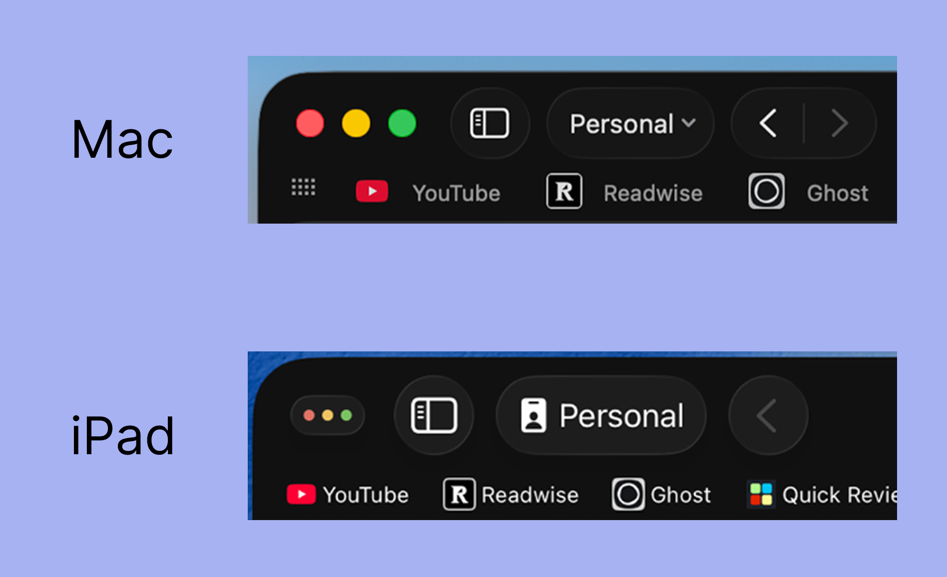
Here's Safari's toolbar and bookmarks bar on both devices, which look quite similar on first glance, although there are some very subtle differences.
- The Mac's "stoplight icons" take up more space, but each one technically has a little less space
- The bookmark targets are 5% taller and 18% wider on the Mac
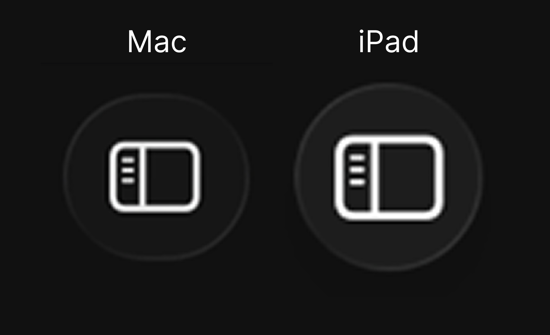
- The toolbar buttons are marginally larger on the iPad
That last item is really hard to measure, but here's a hyper-close up to compare:
And here they are overlaid on each other:
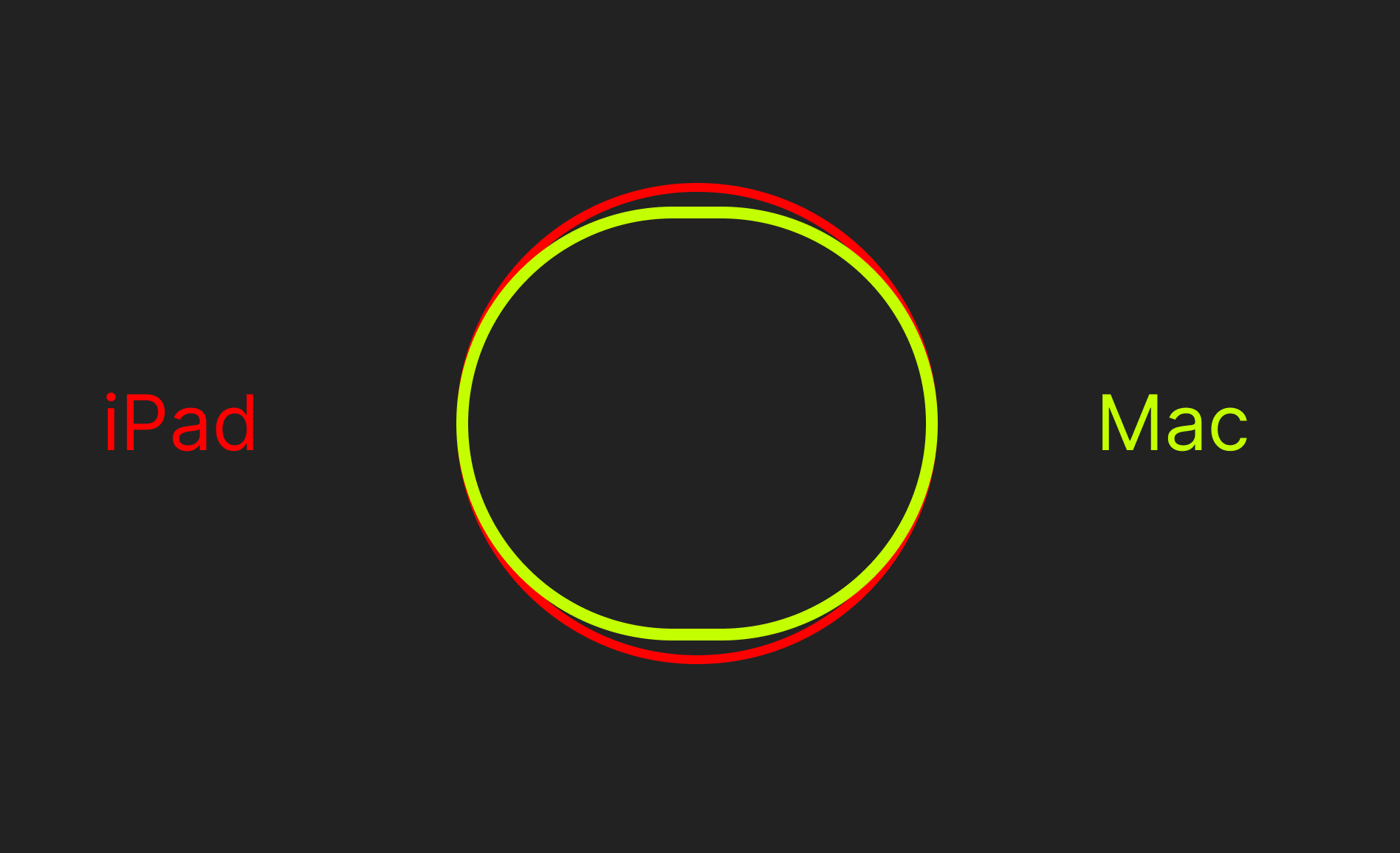
I will concede the touch targets on a Mac display would be a bit smaller than an 11" iPad Pros, but I gotta tell you, that's pretty damn close.
Finally, here's the menu bar for each:
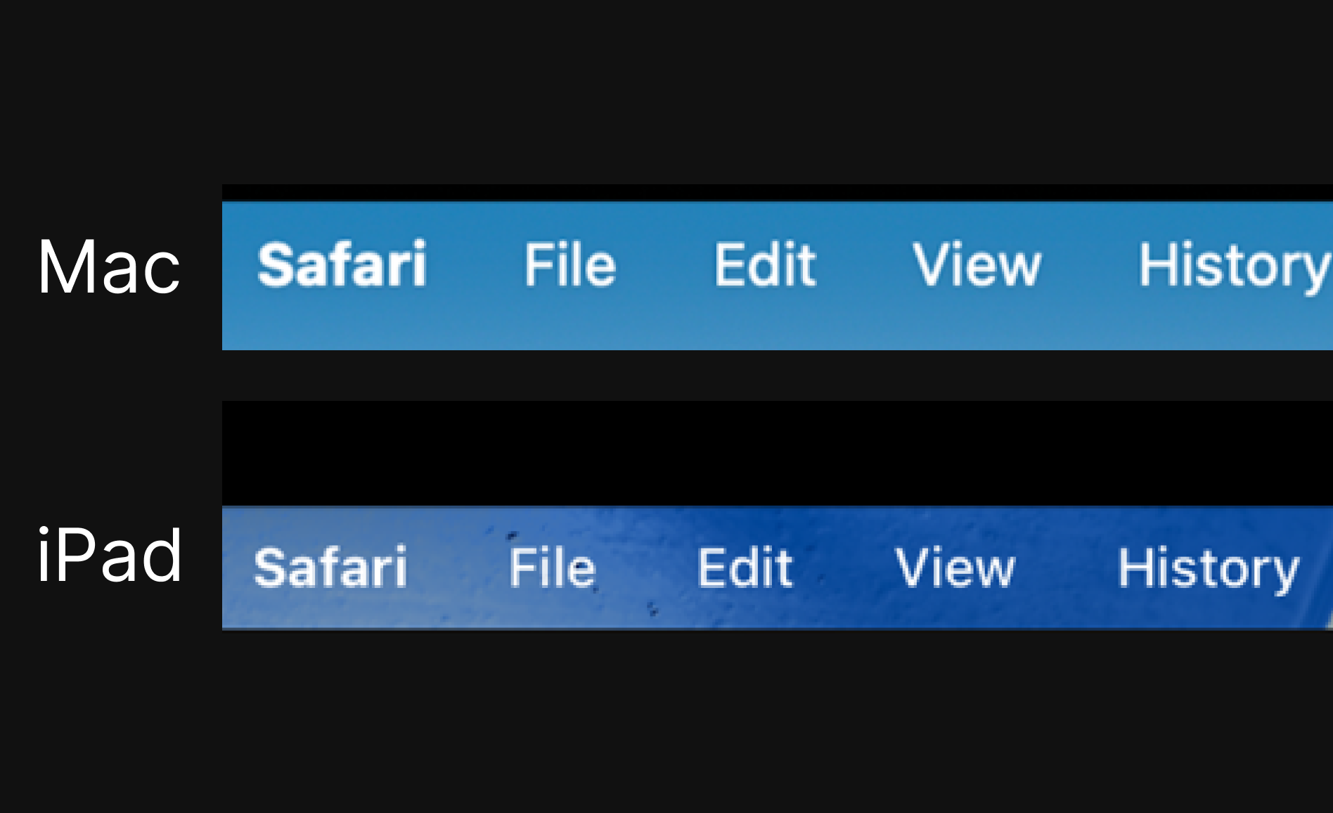
In this case, the Mac actually has notably larger touch targets than the iPad version. This one is particularly notable for me because the menu has long been the go-to example for why touch on the Mac would not work, and yet the iPad has an even smaller one.
What does this mean?
I don't mean to convince everyone that macOS on a touch-capable device would be good, I just mean to express why the "do you know how hard it would be to make the macOS UI work with touch???" argument doesn't land particularly well with me. It lands even worse when we just came out of a WWDC where Apple announced that they had redone every UI across all of their platforms, including updates to all the UI elements people say they would have to change to make touch Macs possible.
Adding good touch support to macOS would require things like enabling gestures for scrolling and pinch to zoom and adding a virtual keyboard when a physical one is not available, among other smaller things that surely add up to a good deal of work to do right. It would also require them to create a new form factor, because "slapping a touch screen on a Mac" is uninspired and not at all what I'm suggesting they do.
Or maybe the iPad is going to get to a place where it's the right OS for people like me and the millions of people who still rely on Macs for the thousands of reasons they do today, and that would be great too! I just think we need to move on from this "the macOS UI is tiny!" conceit because it wasn't particularly true 2 years ago, and it's even less true today.