Microsoft Surface Go Design Details
The design of the Surface Go is currently my favorite part of the device. It’s not quite as nice as the iPad Pro, but it’s certainly a compelling product by any other measure, especially when you consider this is a $399 tablet (plus $129 for the keyboard).
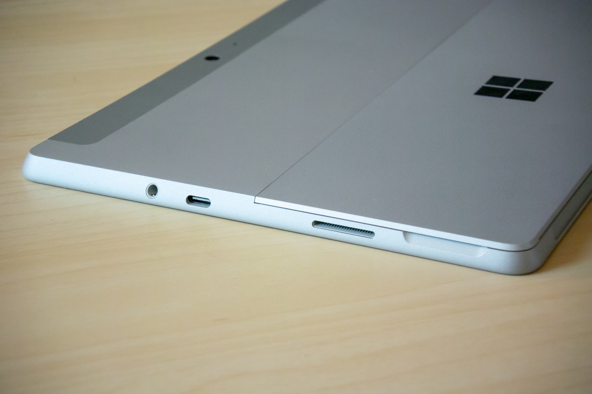
The Go has more ports than the iPad (and many MacBooks!) but they’re nicely built and each port results in a snug, fit when you plug something in. This is a problem on basically every non-Apple device I use, so it’s nice to see Microsoft ensuring the port situation is on point.
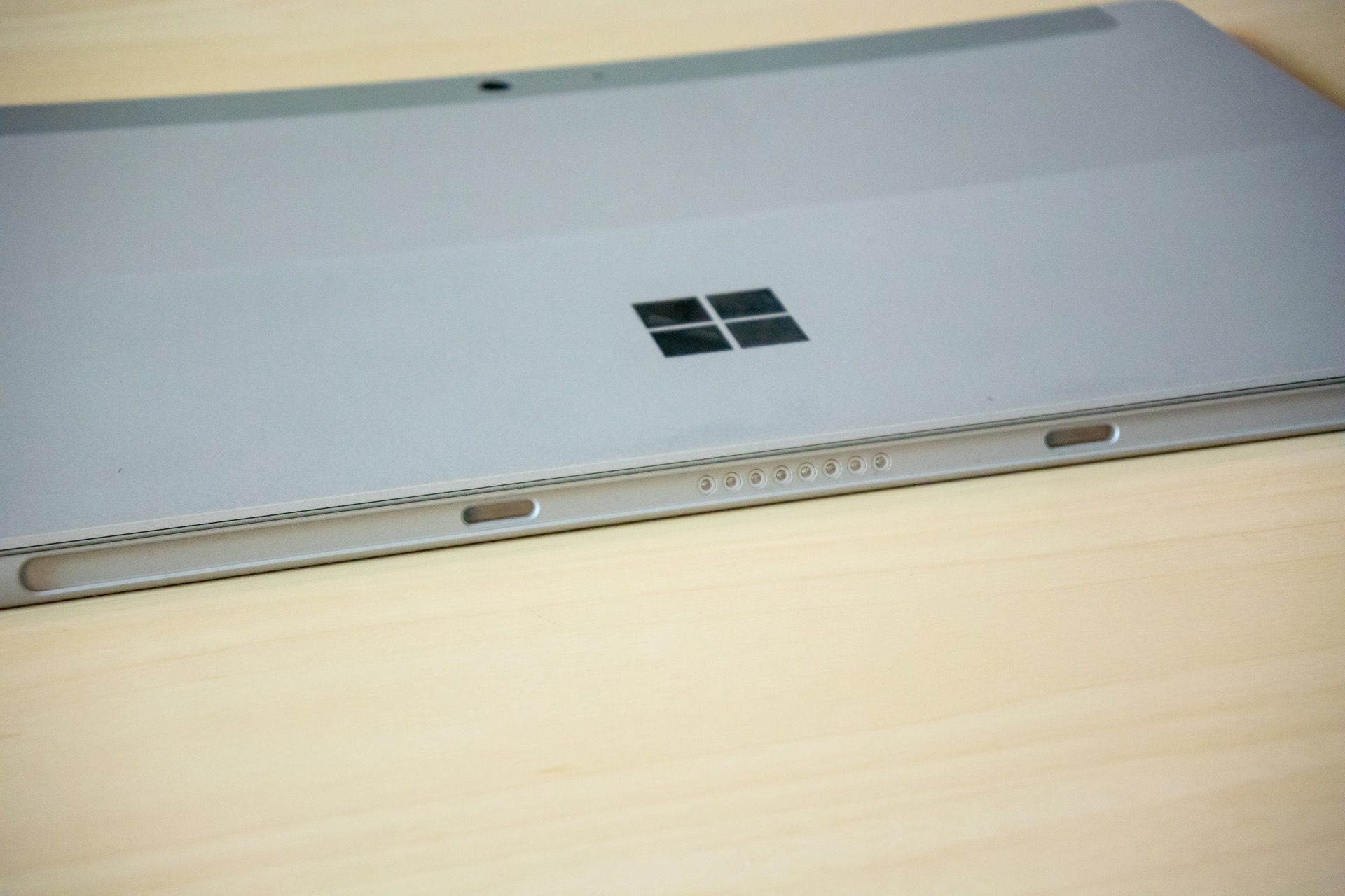
My only concern is with the alignment, as the spacing is weird all around, with only one centered port on the whole thing.
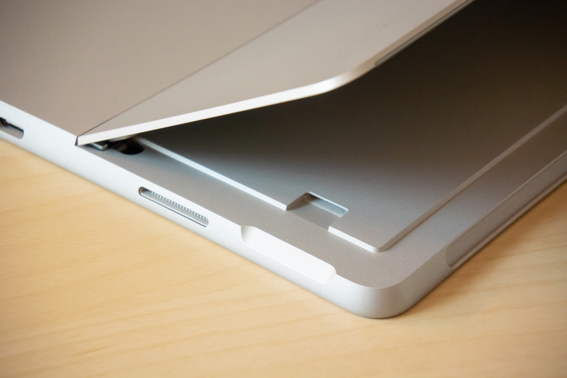
The Surface Go comes with 64 or 128GB of storage, depending on the model, so you very well may want to get additional storage, and you can do this via the built in, and tastefully hidden micro-SD card slot, which Microsoft says can use up to 512GB cards. I’m looking into getting a 128GB one for mine. You can also use the USB-C port to plug in any external hard drive you’d like, but that’s not really a full time solution for a portable device like this.
I really wish Windows was more like iOS in terms of how much space things take up. I have never felt like I needed more storage on my 64GB iPad Pro, but my 64GB Surface Go already feels mostly full after installing just a few apps. The OS itself is the real culprit here, filling up almost half of the hard drive out of the box.
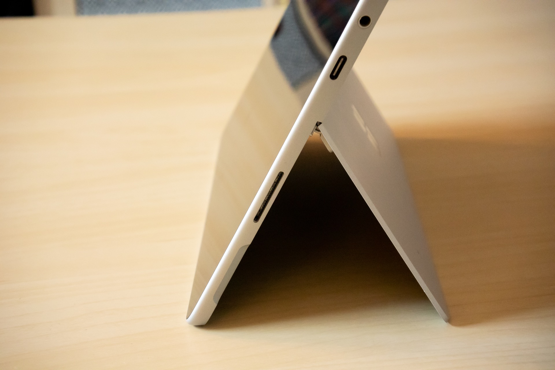
I’m in love with the kickstand that’s built right into the tablet as well. This blends very well into the back of the device so you don’t even notice it when using it handheld. This kickstand has infinitely tweak able angles, so you can go from anywhere from closed to 165° open. Whatever you need it to be, it’ll do for you. This is much more convenient than the iPad Pr’s Smart Keyboard’s single angle.
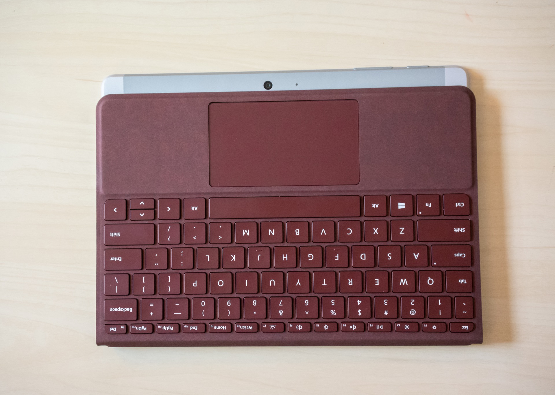
The keyboard wraps around the back of the device as one would expect, and it actually doesn’t go quite to the edge of the device. This is a little weird because it makes it feel a little bit wrong, but it also makes sure that the camera is open at all times and can be used for taking photographs, even if the keyboard is still connected to the device. I don’t know if this was worth it, since one almost never takes pictures with a tablet, but if you do want to do that, this case design has you covered…or not1.
And finally, here are a couple videos showing the rotation on the Go (yuck, slow, and ugh)…
…and another showing the keyboard connection (awesome) and a quick demo of basic performance…
- I couldn’t resist the pun. ↩


