My Simple Ask for Things 4
I love Things 3, but there are some aspects I think could be improved in the (hopefully) inevitable Things 4, and today I wanted to address one thing that would make things much better for me personally, and hopefully a bunch of other people as well.
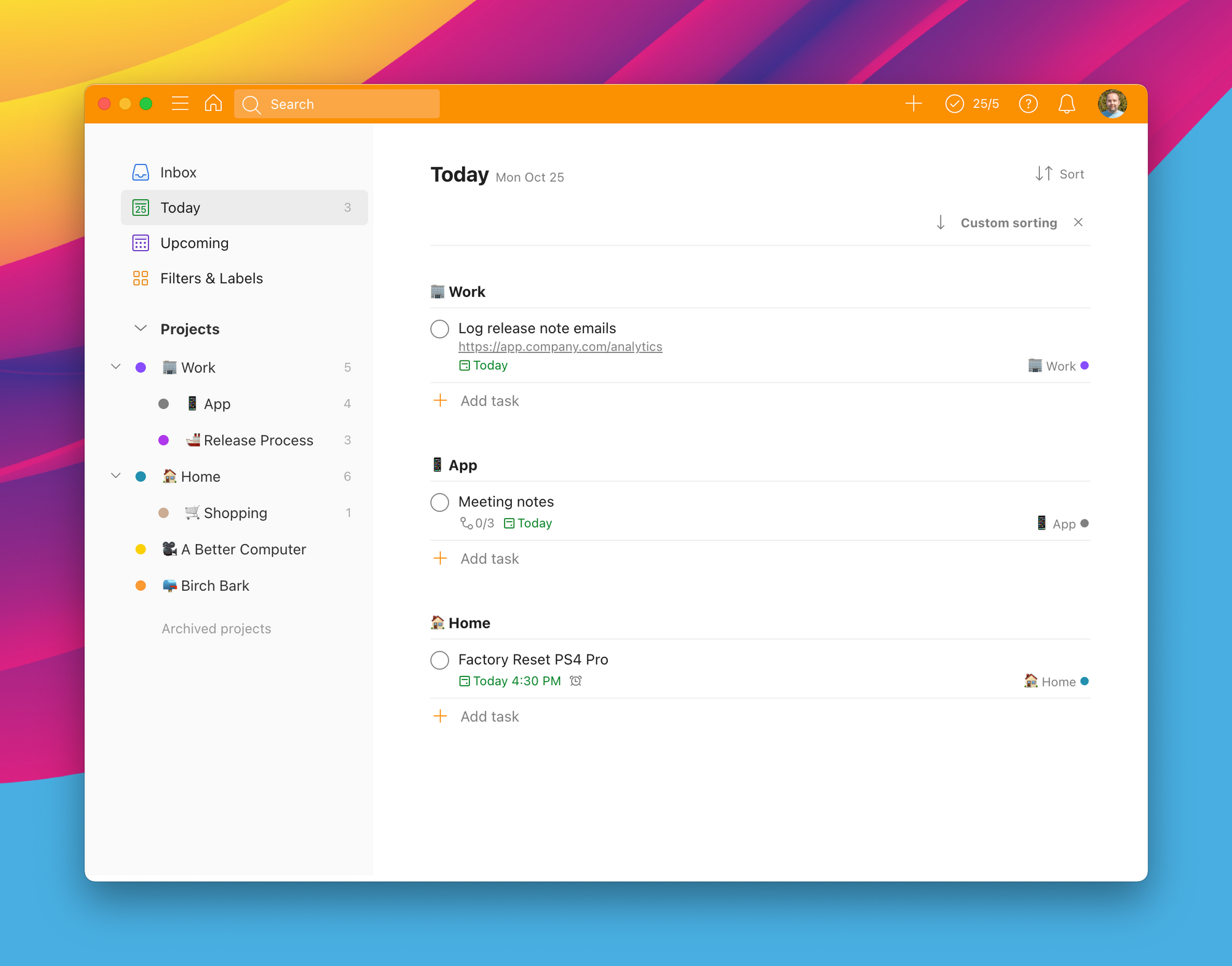
Here's the Things 3 today view we have today with a couple real tasks I have to do today:
Looks clean as all get out, but there's also a lack of information that comes with that clean design. The 3 things I need to do have a link in task notes, a checklist under another, and a due time in the last one. However, just looking at my tasks, I can't see any of that, I just get indicators next to each one telling me there's more there.
The Problem
To see critical information about these tasks, I need to click into each one. While not a catastrophe, this info could be easier to access.
The Solution
This isn't a full rethinking of the app, it's just a fairly obvious update to the existing design.
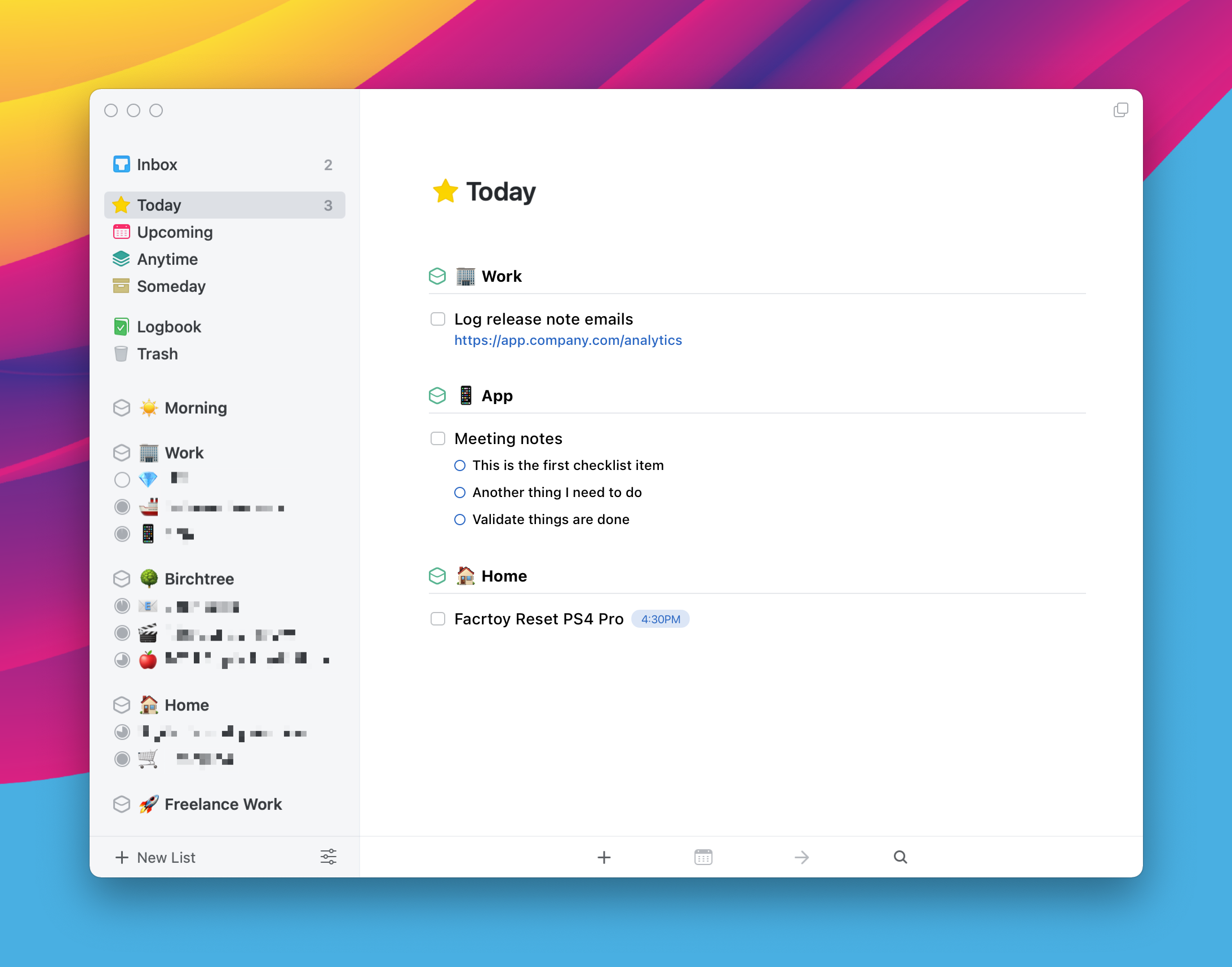
If a task has notes, then show the note (with fully clickable links) underneath the task title, show checklists below the title, and mark reminder times as a label next to the task.
This is the tip of the iceberg in terms of things I'd like to tweak about the app, so let me know on Twitter if this appeals to you, and what else you would like to tweak about Things!
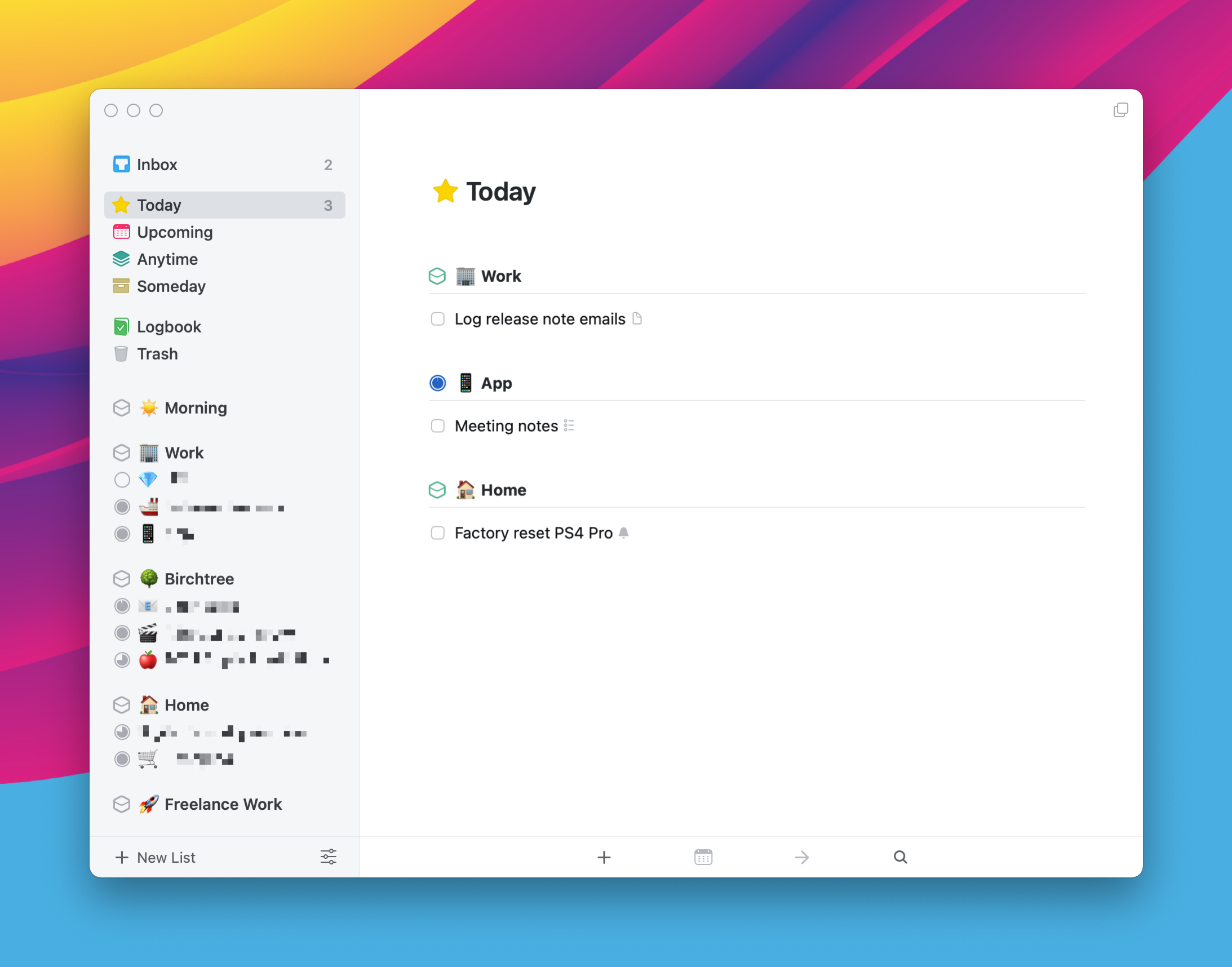
Update: I thought it would be good to add what Todoist looks like for comparison. Task notes are displayed and links are clickable, and due times are shown so I know when I'm supposed to do things. But even here, sub-tasks ("checklists" in Things) are hidden and require a UI that takes over the whole window to see. There's also just a lot more UI going on here (there are 4 "add task" buttons visible!), so it's not 100% there either.