Organizing a Web Browser's UI
File this under, "am I taking crazy pills?" but I've been quite confused by one specific part of the Safari 15 complaints I've seen over the summer. The complaint is basically that Safari 15 gets the order wrong of it's main 3 rows of chrome: address bar, tabs, and bookmarks. In previous versions of Safari it went:
- Address bar
- Bookmarks
- Tabs
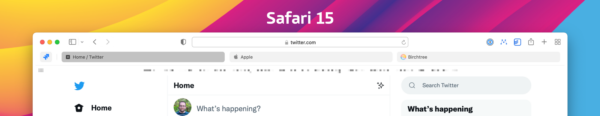
As you can see below, the order is now:
- Address bar
- Tabs
- Bookmarks
I get that this is a bit weird, but what really throws me is how often I've heard a variant of, "there was no need to change this, all the browser makers have agreed on the same layout, and it works." Here's a quote from a July 15 episode of Connected, for example (51:21 is where this quote starts):
The order, top to bottom, is address bar, tabs, and then your favorites. And every browser ever has had tabs closest to the content and you've had bookmarks between the address bar and the tabs.
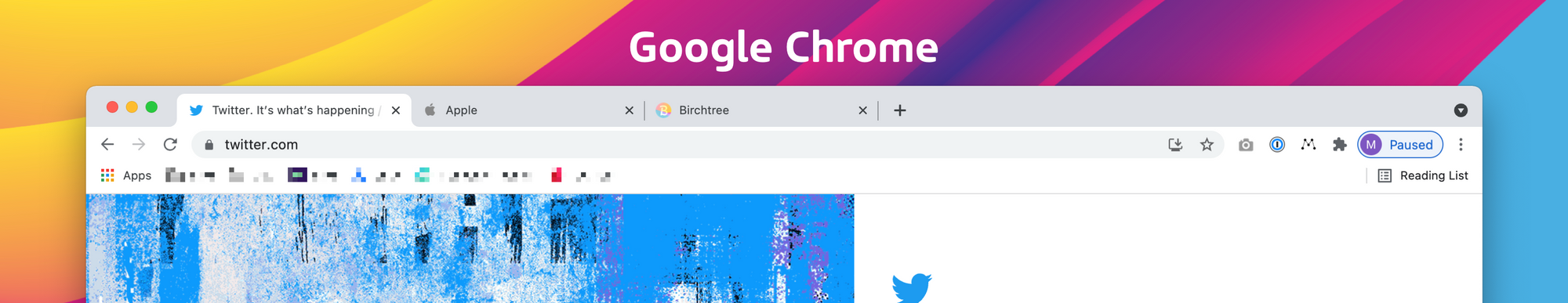
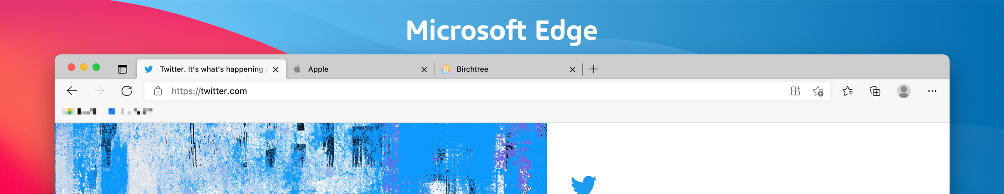
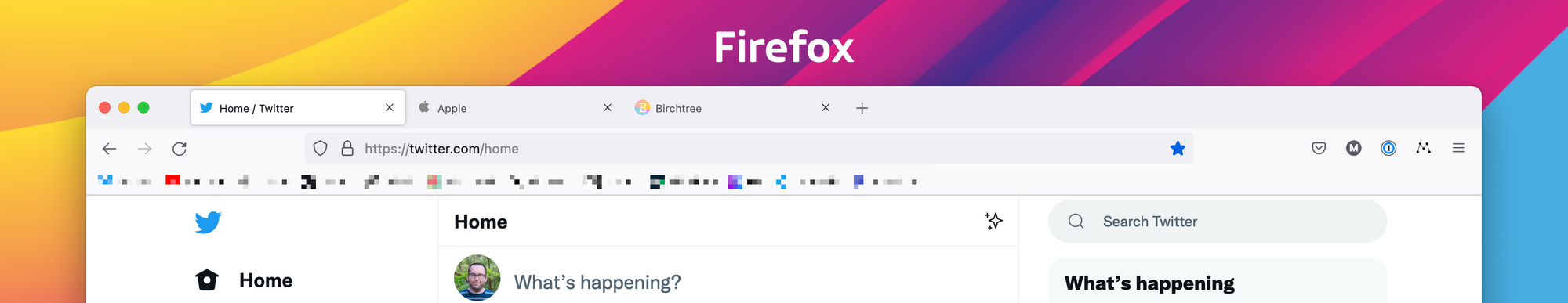
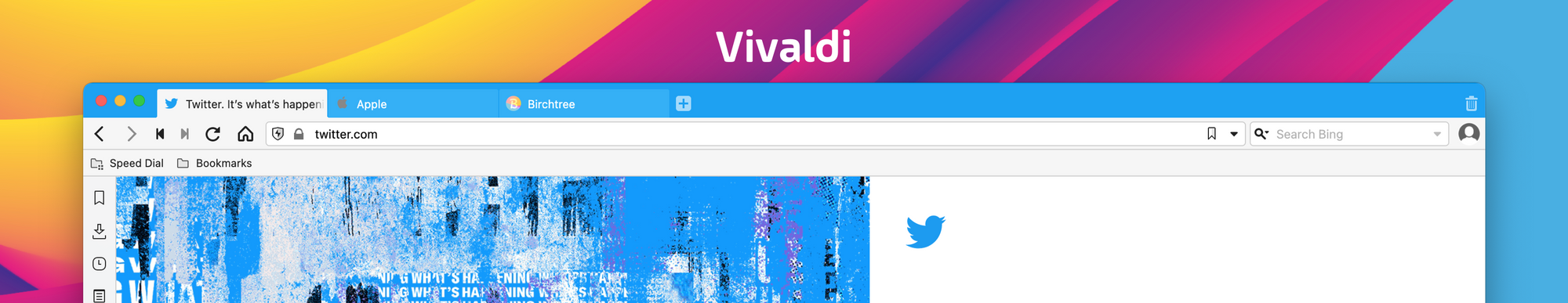
Despite hearing this on tons of podcasts this year, I'm really thrown because while I would agree that other browser makers have settled on the same thing, it's just that Safari has always been the outlier when it comes to this layout. Every other mainstream browser I know of uses this layout:
- Tabs
- Address bar
- Bookmarks
I don't have anything else to say here, this is just a tiny thing that's been eating at me all summer. Personally, I do think that metaphorically, Safari continues to be the one browser that doesn't quite make sense here.
P.S. This isn't a slight against the guys on Connected, I think they're great, I just happened to remember them talking about it and found the clip first ✌️