Vivaldi Offers a Usable UI when Matching the Web's Colors
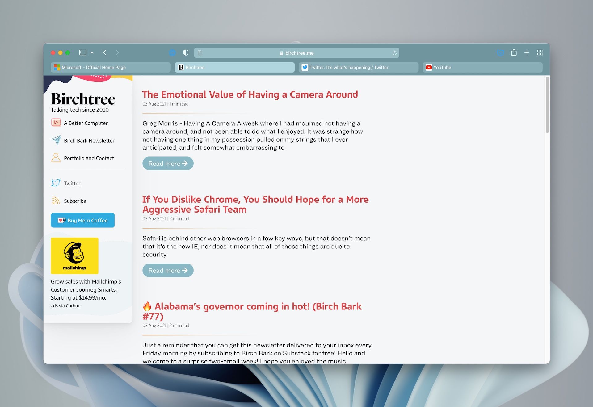
One of the key features in Safari 15 coming this fall is the fact that the browser will theme itself based on the website you're currently visiting. Here's what it looks like when viewing this site:

A couple things come to mind.
- It's a little hard to tell what tab is open. It's the brightest tab, but it's not always easy to tell which one is which, since the active tab color changes for every website.
- Several UI elements are always blue (1Password and Pocket for me), which works on a white background, but gets lost on blue-tinted sites.
- The light tab background plus the white site title text means the legibility is lower than is ideal.
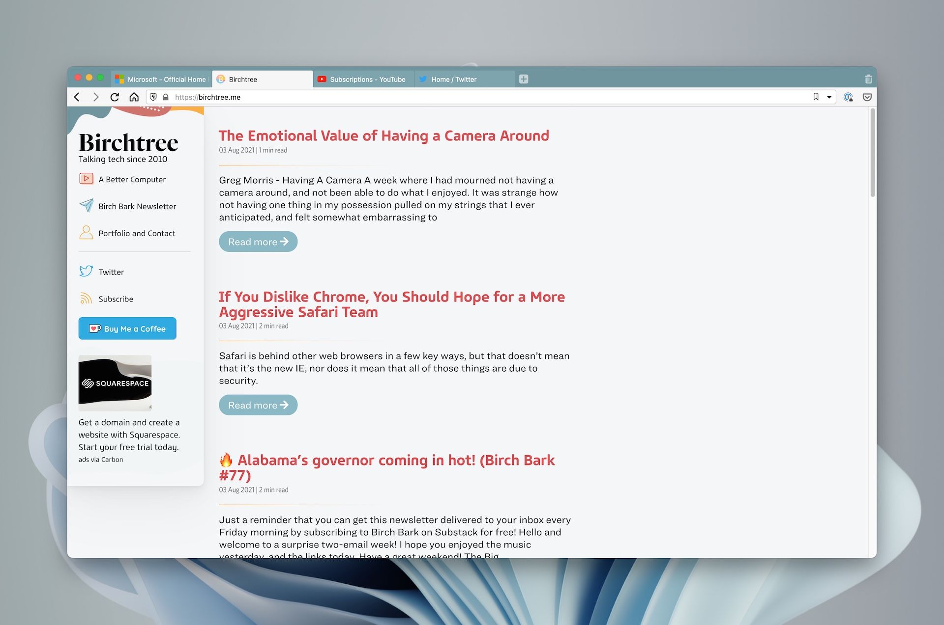
Here's what Vivaldi looks like when it's doing the same thing:

Vivaldi may not look as fancy as Safari, but I think it's hard to ague it's any less usable.
- The active tab is always the same color, so it always stands out.
- Most UI elements live in the always-white part of the app so they're always equally visible.
- The active tab is always white so the black text is always maximally contrasy.
I think Safari is in a better place today than it was a couple months ago, but it's still not living up to the usablity standards Apple holds its products to in my opinion. I do give Safari the edge in having larger tabs that show more of the website title in most cases, but this theming feature is not quite right yet. Hopefully Apple can make it great by when this ships in the fall.


