Mastodon working on nicer hashtags

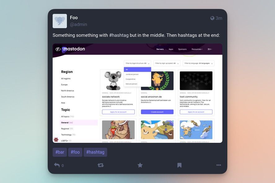
There is a pull request created by Mastodon head honcho Eugen Rochko called Change hashtags at the end of the post to render out-of-band that has me quite happy. In short, it is a change that would let users flip a setting that extracts hashtags from the bottom of posts and displays them in a group below posts in the web UI.
So basically, if your post was going to be:

Now that will render like this:

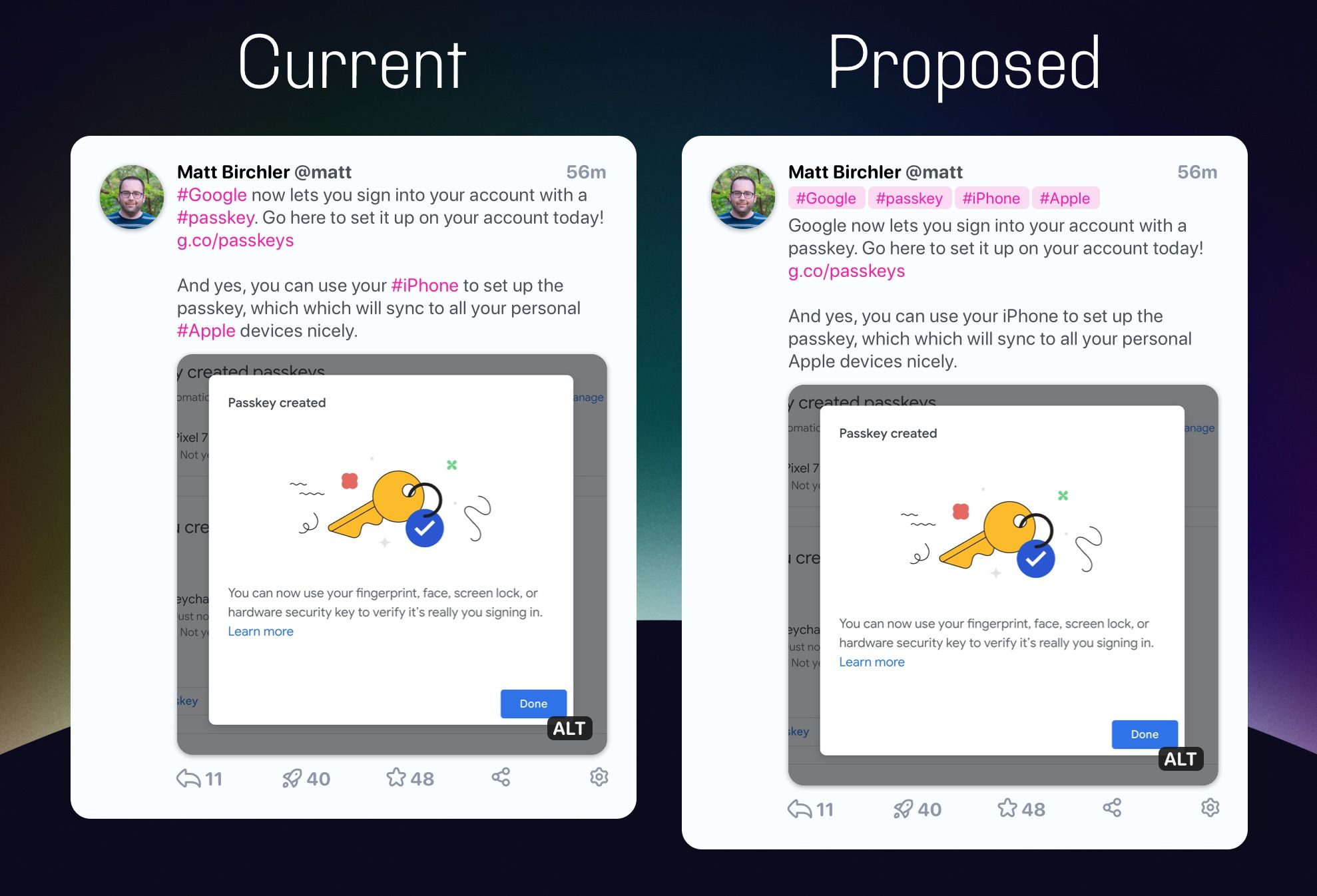
If this sounds familiar, it could be because you read my post in May where I argued that Mastodon should let users apply blog-style tags to posts so that we could utilize Mastodon's discovery features without cluttering up our posts with spammy hashtags. Here's the mock up:

At the time I listed 3 main reasons I thought this would be good:
- It's easier for people to write like humans, not as SEO machines.
- Legibility of posts goes up since it becomes plain text without any inline markup.
- Accessibility features like VoiceOver would work better since they would not need to read out the word "hashtag" in the middle of sentences.
So I was asking for post-level tags, so I could indicate a topic of my post was about the iPhone, for example, and then I could write whatever I wanted in the body of the post/toot. This change is not exactly that, but it does move in the right direction. I'd fully expect this new section to be contained in a new div on the page, so you could even use something like Arc's boosts to hide these appended hashtags if you don't want to see them.
So bring it on, I say! And app developers reading this post, I'd love it if you considered adding this to your apps as well (Ivory, my mock up is not-so-subtly based on your app 😛).
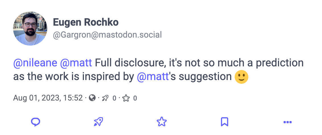
Update: Eugen Rochko confirmed that they were inspired by that original post. I'm over the moon ❤️

