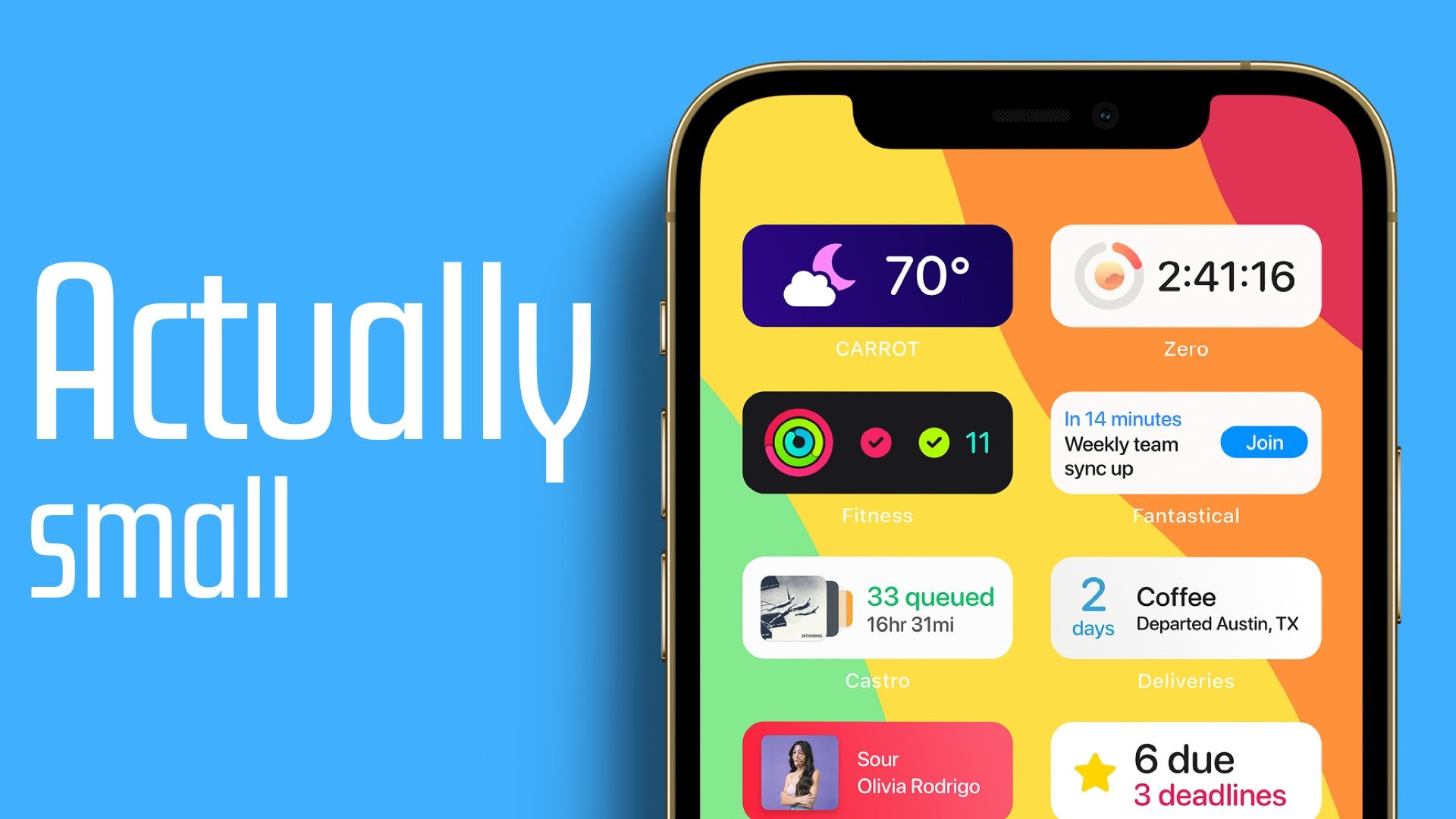
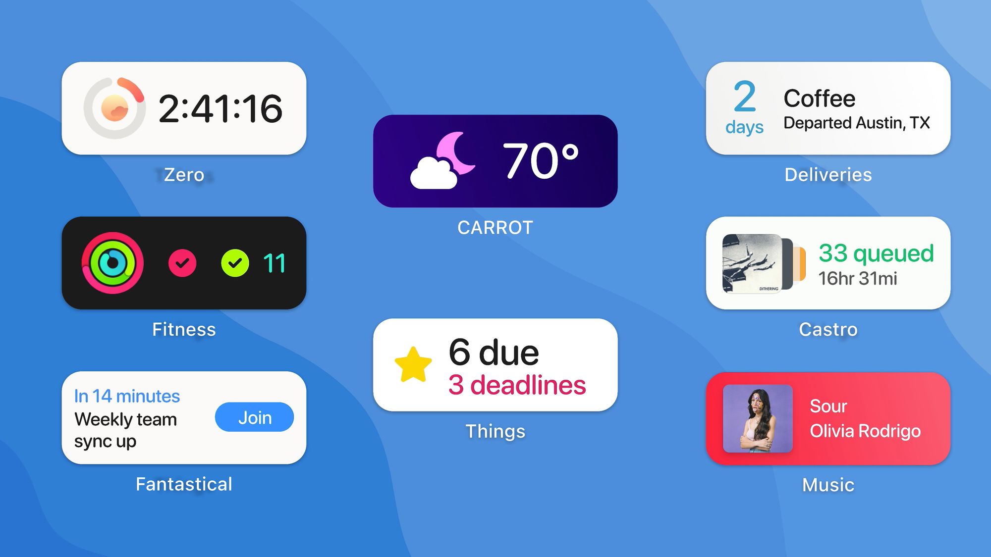
What if iOS actually had "small" widgets?

iOS 14 brought widgets to the iPhone, and they're awesome! I use a few on my home screen, and we saw more excitement around them than basically any new iOS feature I've seen in the past decade. These widgets came in 3 sizes: small, medium, and large. But let's be real, these are really medium, large, and huge, and I think there is room for a truly small widget.
This new widget size class would be 2 icons wide by 1 icon tall, or half the size of the current smallest option.
And frankly, after a year of using small widgets, I think most of these can show basically all the same information in less space and be totally fine. Why does it take the space of 4 icons to show me the current weather?!

I would make default design be a graphic on the left and text on the right. Developers could customize things a bit more, but in general I think this would work pretty well for most apps.
And hey, if an app needs to show more data at once, they can still use the larger widgets, they're not going anywhere.
So that's it, it's not the most innovative mock up of all time, but it's a small change that I think would make widgets a little bit nicer.
Bring on WWDC!
