A Terrible Misuse of Space
I want to take a few minutes and rant just a bit on the status bar on Android. Now since I know a lot of people will be reading this from iOS, here’s what my status bar looked like earlier today.
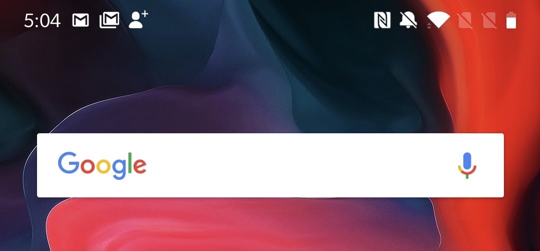
On the left we have the time and a couple notification icons for my most recent notifications. Cool, looks fine to me. I know not everyone is into the notification icons up there, but I happen to like them.
Then there’s a notch in the middle, which occupies the rest of the blank space. I’ll talk more about the specifics of this in the coming days, so stay tuned for that.
And then there’s the right side, which I would contend is a terrible, no good, very bad use of space. Space that I will remind you has never been more elusive now that we live in Notch City. In this sliver of space I see my NFC status, ringer setting, Wifi strength, that my SIM tray is empty, that my second SIM tray is empty, and my battery level.
All of that information takes up every sliver of space next to the notch on this phone. All of it!
Who actually thinks these are good things to show 100% of the time someone is using their phone? Does someone out there really happy that they get to see the status of their NFC chip?
You might as well have an icon that shows you if your CPU is still in the phone. And the SIM tray status…for both trays in this dual-SIM phone? REALLY?! I assume one of those will turn into a signal meter when I put a SIM card in, but what about the other one? Will it stay there forever when I’m like almost every other American and have a single SIM card?
The ringer status is less egregious, but it’s still a bit baffling to me why this has to be here all the time. First, who changes their ringer mode more than once a week, or even once a month? And second, when it’s time to make sure your phone is silenced for the movie or whatever you’re doing, you’re going to hit the hardware button to make doubly sure it’s down; you’re not going to just trust that icon hidden amongst a mess of other junk up there.
The Wifi, battery, and cellular meters should be up there because those change all the time. You care about you battery throughout the day, so you should absolutely see it all the time. Your Wifi and cellular status changes almost by the second, so you should always be able to see those to see how well your service is. These make sense, but the rest of the junk…nah.
I’m sure there are ways to get rid of some of these but (a) if they’re built into the system I have not been able to find them, and (b) if I need a third party app then this whole operating system is topsy turvy. Downloading more apps to make my phone simpler is not how it should go. Defaults should be simple and thoughtful, not a shotgun blast of things that “someone will want.” People who are more tech savvy and want to have a more complicated experience should have to turn those things on, you shouldn’t be asking those less savvy to do the work to get a more reasonable experience.


