Can We Improve the iOS 16 Battery Percentage Icon?

This tweet has been making the rounds today, and fair play to it, it's a really nice-looking mock up!
Just recreating the battery indicator pic.twitter.com/cK8PZDe9Y5
— Brian Michel (@brianmichel) August 9, 2022
My feedback on this would be "ok it looks great at a large size on a black background, but does it work everywhere?"
I happen to have access to Sketch and cam mock this up pretty quickly, so I get here:
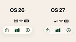
At 95% charge, this looks pretty good! I did remove the color from the meter since you don't want a green icon at all times, especially when they usually indicates the battery is currently charging up, but otherwise it looks good! The light background in the app works, as does my the view on the home screen.


Now let's see what it looks like when you're at 64% charge:


This middle section is where things get dicey. The number is still technically visible, but it's pretty hard to read. In my opinion, this is a regression over the current implementation in the beta, so how do we try to get the best of both worlds? Shift the text!
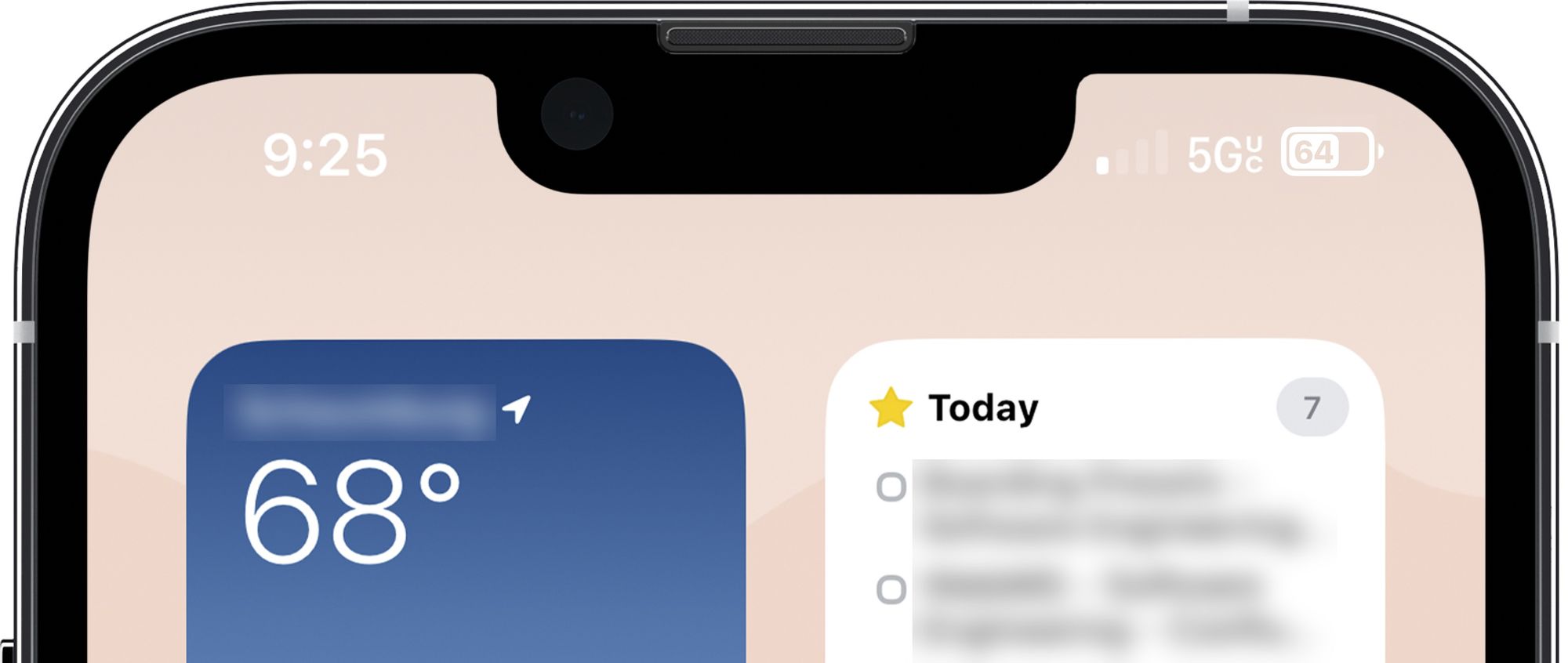
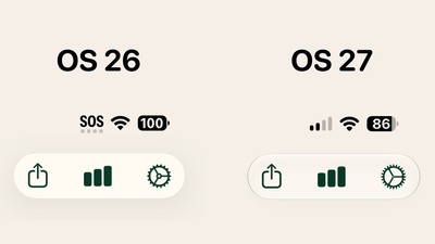
So now we've got the text centering itself in the meter so that it never overlaps and maintains contrast at all times. When it gets below 50%, then it could shoot over the right as well.


Maybe this is the answer, although it might be weird to have the text shifting around…it's hard to say without seeing this actually running on a device.
My Opinion
In my opinion, I think the way Apple has done this today is pretty solid, although I do understand why some are looking at this and thinking…

As always, we're on the outside thinking about this for a few minutes before making sweeping statements about how we can do better than Apple. Sometimes that actually is right and we get somewhere better, but often it's not because we're not thinking about everything, we're thinking about a narrow part of a feature and therefore don't need to consider everything.
I love the process of looking at a design, proposing something else, finding more problems in that proposal, and iterating until we get somewhere great. In this case, I think it makes sense to explore people's dissatisfaction with the new battery feature and see what we could do differently. I think the tweet above is a good variant, but I have legibility concerns. I made a few tweaks to their design that I think make it more accessible, but there's surely something I'm not thinking of either.
If you have an idea that you think improves things even more, I'd love to see them!